Become a MacRumors Supporter for $50/year with no ads, ability to filter front page stories, and private forums.
Dear Automakers,

Why do you leave so much windshield visible on either side of the rearview mirror? It would be much less distracting if you painted the top of the windshield black.

Thank you,
Notch-haters
 
But this space is not usable (I'm talking about left and right side of the notch). Thanks to the notch there's no space for many indicators that were always there (battery percentage etc).

For example, the battery percentage indicator was one of the features of the iPhone 3GS. Previous iPhones couldn't show it.

Making the upper bezel uniform would solve all these issues. It would be as Apple said about iMacs:

"It's just display and then no display. That's it. You are just completely consumed by that image. There's no a detail there that doesn't need to be there. There are no visual interruptions, distractions. There's just no other noise. Everything is about display and therefore everything is about your content."

Apple-ios-13-home-screen-iphone-xs-06032019_big.jpg.large.jpg

With a notch, a simple pull down from the right-top corner gives us all the information we need and the Control Center to boot.

It’s not ideal, but the tech is not ripe yet for the notch to get completely eliminated (under screen cameras & Touch ID scanners in the screen). They do exist in other phones, but probably do not meet Apple’s standards as yet. Right now Apple could put a front camera in a tiny hole and go back to Touch ID in the power button (like iPads 4-5 and iPad mini). But then again, you will have people wanting the convenience of Face ID back. Tricky…
 
  • Like
Reactions: 1557750 and Tagbert
I’m in favor of abolishing the front facing camera entirely, reverting to power button Touch ID, and not having a notch, hole punch, or anything like that. Use the ultra-wide camera on the back for “selfies”. You’ll get a better picture.

What about video calls?
 
  • Like
Reactions: 1557750
Dear Automakers,

Why do you leave so much windshield visible on either side of the rearview mirror? It would be much less distracting if you painted the top of the windshield black.

Thank you,
Notch-haters
This is golden… And with the majority of automakers adding “eyesight” to their vehicles, it literally looks like the notch when looking in from the outside. I prefer the notch on my car as well 😃
 
And this is why the SE model is still available. All the top bezel you could ever want 👊😃👍
Doesn't look too bad honestly ;-)

Phone2.jpg


And suddenly this becomes applicable again:

"It's just display and then no display. That's it. You are just completely consumed by that image. There's not a detail there that doesn't need to be there. There are no visual interruptions, distractions. There's just no other noise. Everything is about display and therefore everything is about your content."

 
Last edited:
  • Like
Reactions: Annv
I think Apple are it as a distinctive aesthetic much like the home button on the original classic iPhones. They could have housed the FaceID cameras on a thicker top bezel but they wanted it to be different to so many Android phones out there. When the screen is illuminated, the screen shape is synonymous with the iPhone and that is of course subliminal marketing.

It’s not popular to everybody and it’s insignificant to many too. We all know what company it’s associated with though so it’s worked to some degree.
I don't think this is the case.

If that was true, they would keep the curved stand on the iMac and the front logo. That was the signature design since 2004:

img5a.jpg


dims


The current iMac 24 is easy to confuse with any other all-in one

apple-imac-24-2021-header.jpg


81f7Jp81leL._AC_SX450_.jpg


c07904878.png
 
  • Like
Reactions: Tagbert
The top bezel always worked fine for that.
Sure, Apple could push that status bar area down into the content area and make the screen effectively smaller. But at least you would see a numeric battery percent instead of the graphic representation. Hallelujah! 😉
 
Doesn't look too bad honestly ;-)

View attachment 2036654

And suddenly this becomes applicable again:

"It's just display and then no display. That's it. You are just completely consumed by that image. There's not a detail there that doesn't need to be there. There are no visual interruptions, distractions. There's just no other noise. Everything is about display and therefore everything is about your content."

It doesn’t look bad if you don’t care about attention to detail. I personally wouldn’t want to see the nice flow of the curves in the bottom corners to be met with sharp corners at the top.

Even Apple makes the curves of the notch match the curves of everything else in their UI.

It’s endless discussion that comes down to taste. You either buy an SE with chin and forehead and do without Face ID (because the notch is too repulsive), wait for the inevitable evolution where Apple gets rid of it completely, or go to another brand. I explained my take on post #37 :)
 
It doesn’t look bad if you don’t care about attention to detail. I personally wouldn’t want to see the nice flow of the curves in the bottom corners to be met with sharp corners at the top

Haha true. But the point here is just to demonstrate the notchless possibility. You are welcome to draw a perfect render 😉

It’s endless discussion that comes down to taste. You either buy an SE with chin and forehead and do without Face ID (because the notch is too repulsive), wait for the inevitable evolution where Apple gets rid of it completely, or go to another brand. I explained my take on post #37

I agree with you, it all comes down to taste. I think that's why people are talking about the notch. It's something you don't expect from an iPhone.

Just a little throwback, compare the iPhone 3G to its competition at the time. iPhone had a simple, elegant and streamlined design. It was like something from the future.

sddefault.jpg


As Steve Jobs said about the first iMac: "It looks like something from another planet. And a good planet. A planet with better designers."


All that simplicity happened when other phones were trying to showcase and stress every feature they had in their design: that they had cameras (huge spaces around cameras on the back), that they had "so many" megapixels (written on the back as well) etc. Their design was driven by marketing rather than elegance and simplicity.


Talking about technology, there are always certain design decisions that are driven by hardware limitations. For example iPod shuffle didn't have space for a useful screen, so Apple ditched it altogether.

ipod_shuffle_2g.jpg
jx0yjk31qaz01.jpg


The result was a more elegant solution than something with a small and almost useless screen. One might argue as well that "yes, display makes the player uglier, but it's state of technology right now and soon it's gonna be better. And also I've got used to it."

The point is that we should design products that are perfect today. Because they are used today.
 
  • Like
Reactions: Annv
Haha true. But the point here is just to demonstrate the notchless possibility. You are welcome to draw a perfect render 😉


I agree with you, it all comes down to taste. I think that's why people are talking about the notch. It's something you don't expect from an iPhone.

Just a little throwback, compare the iPhone 3G to its competition at the time. iPhone had a simple, elegant and streamlined design. It was like something from the future.

sddefault.jpg


As Steve Jobs said about the first iMac: "It looks like something from another planet. And a good planet. A planet with better designers."


All that simplicity happened when other phones were trying to showcase and stress every feature they had in their design: that they had cameras (huge spaces around cameras on the back), that they had "so many" megapixels (written on the back as well) etc. Their design was driven by marketing rather than elegance and simplicity.


Talking about technology, there are always certain design decisions that are driven by hardware limitations. For example iPod shuffle didn't have space for a useful screen, so Apple ditched it altogether.

ipod_shuffle_2g.jpg
jx0yjk31qaz01.jpg


The result was a more elegant solution than something with a small and almost useless screen. One might argue as well that "yes, display makes the player uglier, but it's state of technology right now and soon it's gonna be better. And also I've got used to it."

The point is that we should design products that are perfect today. Because they are used today.
I’m well aware of past designs and how Apple has made things work while merging design and hardware. The OP asked why the notch existed and people (including me, post #37) replied.

I could easily draw a perfect render because design is what I do. Detail is what I do. And my perfect “render” would be a copy paste of the iPhone 13 Pro picture, notch included. It’s appealing to me. And once the evolution of it advances, I’ll be ready.

But as of now, Apple is moving forward with the design that works best with the hardware they provide. Hardware (Face ID) that is still miles ahead of any phone maker. They’re doing this because they don’t want to go back in time and add a big black forehead just to make the screen look fuller or to add a simple percentage number.

Example of what I do. IG name in profile 😋
 

Attachments

  • 7903FA4D-A81A-419A-95CF-BB7CC804056C.png
    7903FA4D-A81A-419A-95CF-BB7CC804056C.png
    3.2 MB · Views: 63
Last edited:
They’re doing this because they don’t want to go back in time and add a big black forehead just to make the screen look fuller or to add a simple percentage number.

They would do it to "design and build an incredibly mobile product but without compromise" 😉

 
I don't think this is the case.

If that was true, they would keep the curved stand on the iMac and the front logo. That was the signature design since 2004:

img5a.jpg


dims


The current iMac 24 is easy to confuse with any other all-in one

apple-imac-24-2021-header.jpg


81f7Jp81leL._AC_SX450_.jpg


c07904878.png

Design changes, that’s life. The old home button on iPhones has gone but it was a design from that era just like the notch is now until the design identity changes again.
 
  • Like
Reactions: Tagbert and 1557750
I barely notice the notch - now onto the Pill-and-Hole design.

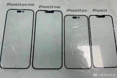
iphone-14-front-glass-display-panels.jpeg
If those are the final designs for the iPhone 14 line, then I don't see what we're really gaining. The base 14 and Max would still have a notch...and the pro and pro max would go from having a notch to having a pin-and-hole design that frankly takes up almost as much real estate as the decreased notch on the 13 phones and still presents the same so-called "problems" of it being in your way on the screen. That's a part of why I think the notch issue is so overblown.
 
  • Like
Reactions: 1557750
But will they bring back landscape mode for the home screen? My guess is that they won't.
Don't quote me, but there's a very slim chance they might bring this back. Part of the reason it was removed was because of the switch to FaceID. It didn't work in landscape so they likely got rid of the feature. As of iOS 16 FaceID works in landscape (on iphone 12 and newer?) so it could return.

100% conspiracy theory, but that's what I'm thinking.
 
  • Like
Reactions: Tagbert
That's a part of why I think the notch issue is so overblown.

Sometimes "you are aware that you are trying to convince yourself that something is actually better than, in your heart, you really know that it is".

"Sometimes you just have to look at yourself and go 'you know, it's just not really great. It's okay. It's good. But let's not fool ourselves and call it great' ".

 
Last edited:
"It doesn't provide more info on the screen"

Categorically false. The alternative is a larger bezel. The point of the notch is to enlarge the working space by moving the menu bar to either side of the notch.

That's why the MacBook Pro and iPhone screens got bigger and added more vertical pixels when they added the notch.
 
  • Like
Reactions: 1557750 and Tagbert
Sure, Apple could push that status bar area down into the content area and make the screen effectively smaller. But at least you would see a numeric battery percent instead of the graphic representation. Hallelujah! 😉
They already made the screen “effectively smaller” by changing the aspect ratio and making it narrower, just so they could go for the bezel-free look (which then necessitated the notch anyway).

Edit: unless you choose the Pro Max, I guess – straining your hand and wallet.
 
  • Like
Reactions: Andrew73875
Sometimes "you are aware that you are trying to convince yourself that something is actually better than, in your heart, you really know that it is".

"Sometimes you just have to look at yourself and go 'you know, it's just not really great. It's okay. It's good. But let's not fool ourselves and call it great' ".

Sorry, but no. The notch issue isn't a case of "trying to convincing ourselves that it is better than we know it is." Criticism for it is just flat-out overblown. Would the screen be better off without it? Sure. Is it worth all of the stupid hand-wringing we've encountered over the years? Absolutely not.
 
  • Like
Reactions: arkitect
Register on MacRumors! This sidebar will go away, and you'll see fewer ads.