Become a MacRumors Supporter for $50/year with no ads, ability to filter front page stories, and private forums.
Status
Not open for further replies.

Shacklebolt

macrumors 6502a
Original poster
Sep 2, 2004
596
0
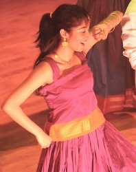
This was shot as a 12.3mp FINE jpeg, so there's a limited amount of stuff you can do to it, but I've sold a full-sized print of it. I'd just like some criticism, and criticism that keeps in mind that this picture has already been sold as is, so "this picture sucks" type stuff will be of precious little use to me. But I do value the opinion of folks on here.

w/Nikon D300
Nikkor 70-200mm f/2.8
f: 2.8
Focal Length: 130mm
ISO: 800
Shutter: 1/100

(Auditorium, no flash permitted, had to work with the light provided)
 

Attachments

  • NithyaPurpleSmall.jpg
    NithyaPurpleSmall.jpg
    113.8 KB · Views: 261

hobbbz

macrumors 6502a
Mar 8, 2005
605
4
The man's cutoff head bothers me and the woman's dress blends too easily with the overall orange tone of the image.
 

synth3tik

macrumors 68040
Oct 11, 2006
3,951
2
Minneapolis, MN
I agree with the cut off head. Also the color is off. I like the tone of the girls skin, but the wood floor is too red and blends in with her dress too much. I think a little color correction/white balance would really help out.
 

jwt

macrumors 6502
Mar 28, 2007
344
0
X2 on white balance/color shift. The man's arm is too orange, as is his clothing.
 

Shacklebolt

macrumors 6502a
Original poster
Sep 2, 2004
596
0
The man is Asian, so his skin is not going to lend itself to orangeness under that lighting, and secondly, if the picture is orange, it's because the lighting at that point was orange.

How does one correct for white balance in photo editing?
 

Digital Skunk

macrumors G3
Dec 23, 2006
8,100
930
In my imagination
The man is Asian, so his skin is not going to lend itself to orangeness under that lighting, and secondly, if the picture is orange, it's because the lighting at that point was orange.

How does one correct for white balance in photo editing?

The color for both the man and woman is off, but that has been said to death. Compositionally the photo leaves me wanting more information and emotion. Just by looking at it no one can really tell what is going on other than some theatrical performance, but which one, and what is going on?

A lower angle to get rid of the stage is the first choice, a wider angle since I would assume that the female isn't the center of focus for the entire play (either way I wouldn't know since it's not portrayed in the photos) is second, and even though there is no flash photography the aperture could have been set higher to get greater depth of field and sharper focus.

To change the WB in post you will need to work either the curves, hue/saturation/levels if you are editing a JPG. Or a combination of those three tools if you truly understand the minute differences and similarities about them.

Composition, Composition, Composition is the second most important part of photography, the first is your EYE/Imagination. The fifth is the camera body and glass.

p.s. You had a D300, why didn't you go to a higher ISO and stop up your shutter speed and DOF?
 

Shacklebolt

macrumors 6502a
Original poster
Sep 2, 2004
596
0
The person who is buying the photograph is the girl herself. She knows what the photo is about, so I'm not concerned about he composition so much as the color of it.
Ah, and the photo is already cropped a fair amount. The photo was shot from a good 60-80 feet away. I didn't think I would have gotten the same quality of a cropped photo at an ISO of, say, 1600.

By stop up to you mean, e.g. at 3.2? It was shot at 2.8 - the widest the aperture could be.
 

Digital Skunk

macrumors G3
Dec 23, 2006
8,100
930
In my imagination
The person who is buying the photograph is the girl herself. She knows what the photo is about, so I'm not concerned about he composition so much as the color of it.

Not to sound harsh, but it's something that should come to mind every time you hit the shutter. Not all of your future clients will think the way she does. The color isn't the most distracting element in the photo, the two random bodies standing off to the side are.
 

Shacklebolt

macrumors 6502a
Original poster
Sep 2, 2004
596
0
I think you miss the point - believe me, composition springs to my mind every time. As it is though, she is satisfied with the composition as is. I am fortunate in this regard as, indeed, the body to the side is distracting. So I have shifted my focus away from that and toward the color.
 

Digital Skunk

macrumors G3
Dec 23, 2006
8,100
930
In my imagination
I think you miss the point - believe me, composition springs to my mind every time. As it is though, she is satisfied with the composition as is. I am fortunate in this regard as, indeed, the body to the side is distracting. So I have shifted my focus away from that and toward the color.

Oh, okay... sorry about that. :)
 

Doylem

macrumors 68040
Dec 30, 2006
3,858
3,642
Wherever I hang my hat...
This was shot as a 12.3mp FINE jpeg, so there's a limited amount of stuff you can do to it, but I've sold a full-sized print of it. I'd just like some criticism, and criticism that keeps in mind that this picture has already been sold as is, so "this picture sucks" type stuff will be of precious little use to me. But I do value the opinion of folks on here.
You want criticism... but only within your own parameters... :rolleyes:

You've sold the picture to the one person who might want it...

Well, that's a result, isn't it?

If you genuinely want C & C, you let people say what they want.
 

Shacklebolt

macrumors 6502a
Original poster
Sep 2, 2004
596
0
I do want criticism - but I'm not opposed to being in a critical dialogue. For example, people say the white balance is off, and that I should work on the color saturation. That helps, and that's what I'm doing.

I'd just like people to get the whole side of the story. For example, I agree with Skunk that the composition isn't very good, but I'm trying to provide an explanation, not an excuse. I also think he misunderstood (or I probably didn't explain well enough) that I meant, how can I fix this photo as it is. And not, info to make better pictures in the future. That info is of course helpful, but I meant, photo editing-wise.
 

compuwar

macrumors 601
Oct 5, 2006
4,717
2
Northern/Central VA
I meant, how can I fix this photo as it is. And not, info to make better pictures in the future. That info is of course helpful, but I meant, photo editing-wise.

That wasn't apparent. The first thing I'd do (and I don't think the dress merging with the background is horrible- it depends on where you want the eye to focus) is I'd re-tone the white garment to some darker color. Your eye is immediately drawn to the lighter areas, and there's not anything "interesting" there to see. I'd start by toning it dark grey or black and see what that does to the overall dynamic.
 

Lovesong

macrumors 65816
Alright- as everyone has said, your color is off, but more specifically, it's too warm. There are some blown highlights, and there is a green cast on the man's shoulder and the girl's arm. . If you were to look at a histogram, you'd be able to tell that the image is flat, and thus needs more contrast, and, obviously, to be sharpened.

In you place, I'd start off with a cooling filter, then adjust the curves for a nice s-shaped curve. From there, you can heal-brush just the green cast off, which works very well for the man's shirt and well-enough for the girl's arm. Unsharp mask the thing, and call it a day. If it was shot as a jpg, there is little you can do to get back some of the highlights or shadows.
 

Shacklebolt

macrumors 6502a
Original poster
Sep 2, 2004
596
0
This any better? A bit of iPhoto editing/croppery. I worry that it won't print out well as it's been cropped a LOT at this point, and the image itself full sized is 1499x1883. I do like it more. I'd sacrifice the bottom of the dress for the guy getting cut out.
 

Attachments

  • NithyaMacrumors.jpg
    NithyaMacrumors.jpg
    155.2 KB · Views: 93

pprior

macrumors 65816
Aug 1, 2007
1,448
9
I'm not usually this blunt, but quite frankly I can't believe anyone paid money for that photo.

the composition is horrid and that pretty much means a delete in my workflow. Where you forced into that position to shoot from? Was your ability to zoom out (either with your feet or with focal length) impaired?

Ok, let's say this was the ONLY picture you had of this girl, and you had to use it (if so, let's talk about your settings and other choices made with the hardware limits you have) - the next thing that is apparent, as commented already is that the color balance is way off.

To fix that, you should ALWAYS in bad lighting conditions (and IMHO always in general unless you're a real good shooter) shoot RAW files. You can set white balance to whatever you want that way later. If the lighting is consistent - shoot a grey card or any other neutral grey item before or after your other pics and then you can use that to set white balance. I keep a small grey card in my camera bag and just take a quick snap whereever I'm shooting just in case. You can also use a white or neutral grey within the picture.

You can work white balance in jpg, but it's not near as good, especially if you have blown highlights, as you do in that picture.

I did a few minutes of PS work on that pic, just to quickly illustrate how composition would change this picture. I'm NOT a PS expert, and this is only a rough draft of what could be done, but it gives you an idea of what I would try to do, if I had ended up with that as my only shot to use. The vignette needs to be toned down and the clone stamp needs refining, but you get the basic idea of what I would try, for whatever it's worth.

I didn't correct color balance, because I'm not sure what things actually were.

277270161_3EgwS-XL.jpg


Not sure any of this is helpful, but it's mean to be constructive. I'm learning too so others may rightfully disagree with me.
 

alembic

macrumors regular
Oct 13, 2005
183
40
I think greater isolation of the subject would have helped (assuming you weren't after an ensemble shot) e.g. shooting from another angle, zooming in, or waiting until other people on stage were no longer in the viewfinder. Maybe you were trying to do this after the fact when you cropped the original image, but because the woman largely blends in with the background, my eyes are diverted to another area of the frame with a higher contrast in tonality: the white shirt. This dilutes the attention we want on the woman. But if we completely crop out the other person (try it by covering him with your fingers), or imagine him wearing much darker clothing, the woman's face and arms now become the high contrast areas (relatively) and that yields an image where the focus naturally falls on her and remains there.

This concept is much better explained here and here. Another example is illustrated by Japanese bunraku in which the puppeteers' black attire helps to create the illusion that the brighter costumed puppets are performing on stage by themselves.

Waiting for her to turn towards you might have also yielded better modeling of her face and capture more expression as well.

This shooting angle truncates her bent left arm (unfortunate timing). I'd like to have a broad-side view of her left arm also (like the right) not only because it looks better but it may also convey a greater sense of movement.

I don't know whether removing the color cast is necessary here but if you use Photoshop or Photoshop Elements, you may want to fool around with one of the iCorrect plug-ins. I use EditLab Pro on most JPGs I receive to quickly remove any color cast and improve contrast. It sure beats doing this manually.

Keep shooting!
 

rouxeny

macrumors 6502
Jan 22, 2008
275
19
I think pprior's version is a bit better. It gets rid of some of the distractions.

Without going over all of it again, the composition isn't the best. I'm not a big fan of headless torsos.

I'd agree with the "always shoot in RAW" comments, especially when the situation is not ideal, namely that you have poor lighting or inability to control it.

The biggest thing that bothers me, even more than the color, is that the shot does not tell a story. It doesn't convey that this person is on stage, nor what her role on that stage may be. Is she the lead? Is she one of many backup dancers or singers? A good portrait, which this is in some ways, should always tell you a little bit about the person. I don't know if this one does.

And I don't mean to be harsh, but have you considered giving her a copy of this picture instead of having her pay for it?

However harsh people may be, me included, remember that every artist started as an amateur and that everybody's photo collection is filled with 99% junk. Also, nothing is better than blunt criticism, it's the only way to learn.
 

mcavjame

macrumors 65816
Mar 10, 2008
1,031
1
phased to this universe
Yep... you need to compensate for the red cast you get from theatre lights. There are some goods suggestions already.

Things like amount of contrast and highlights are subjective. You'll recognize a photographer's style by how an image is shot and finished. I had a peer in college who had everyone in class shoot a portrait of him, then he shot himself holding each of the portraits. He did a great job of maintaining his own style in each of the photos, but what struck everyone was how we could pick out our own photographic style.

I am a little surprised that you don't recognize the misframing of the image. Do you already know what you think is wrong with the photo and are just confirming your analysis? The best part is you can cheat and reframe your image in post.
 

Digital Skunk

macrumors G3
Dec 23, 2006
8,100
930
In my imagination
Nice illustration pprior. Not to push the comp. topic but the image is easier to swallow with just the female.

A note on toning though. You don't need to have been there to tone. Set the white point and black point and adjust for the color that you know is there, like white, her skin tones, the dress, the floor. Or if you know there is too much casting turn that color down then tweak, tweak, tweak.
 

orpheus1120

macrumors 65816
Jan 23, 2008
1,425
55
Malaysia
You know what? I don't think we are ready for criticism... at all.

Surely all of us will have lotsa explanation for whatever we do. However that's also the reason why we need criticism -- our opinions can sometime be flawed and biased, which is why third-parties views are always invaluable in spotting personal bias.

I've known quite a few pro photographers on this board, so despite whatever explanation you might have for your work, save it for yourself. Learn to take criticism from these professionals and not talk back because this is one of the best way to learn from others. Remember, your thoughts/explanation for doing something that has obviously aroused comments and criticisms from others don't really matter at times, because what matters most is how others feel looking at it visually. Your explanations won't somehow change the visual perception of anyone unless you can somehow hypnotize them. Your work should convey your ideas and knowledge, if it doesn't and the creator has to voice them out, something is wrong.

Photoshopping a subject and changing its captured environment digitally are usually done moderately. The theme and spirit of the photograph must be preserved, which is what most photographers do, except minor tweaking. The major composition and structure of the photo is still preserved.

The altered reality that pprior had done preserves some of the spirits of the occasion, however that said, nothing beats a good capture and composition of the real event, if the photographer can manage to get a good shot at the subjects. If capturing good photos and compositions are that easy, everyone's a pro now.

Shacklebolt, the one thing I think you need to learn right now is how to take a good photograph with the special moment in it, with great composition of course. That's my 2 cents, so hope you don't take offence in what I say.
 

SolracSelbor

macrumors 6502
Nov 26, 2007
326
0
The photo just lacks all those qualities that differentiate a professional photo with a common snapshot. Theres absolutely no depth, thought, story, awe factor to this photo. Worst of all, I think the color makes the photo simply hard to look at. Simply, the composition sucks - flat out. For this reason, I don't think any amount of phtoshoping will make this photo anything beside tolerable. It's just one of those shots I look at and say, "Well, at least it'll make a good myspace picture."

I am, however, interested to know how much she offered to pay for it. Looking at this situation as an entrepreneur, the fact that she even paid allowed you to come out on top. However, looking at it as a professional photographer and artist...well you know what I mean.
 
Status
Not open for further replies.
Register on MacRumors! This sidebar will go away, and you'll see fewer ads.