Become a MacRumors Supporter for $50/year with no ads, ability to filter front page stories, and private forums.

GGJstudios

macrumors Westmere
May 16, 2008
44,556
950
Just and fyi, the glass desk is very heavy so if you dont live in a 1st floor or private home it could be hard to get in and assemble.....
That's nonsense. The glass top only weighs 70 lbs. That's very light and easy to carry. Assembly is simply setting the glass top on the legs. There may be good arguments for not getting glass, but yours isn't one of them.

I work on a glass desk all day. It's quite comfortable, functional and attractive, winter or summer.

OP: By the way, you can buy the glass top and use it with different legs, including the ones shown in the other desk you pictured. So if you like the top but not the legs, buy the glass separately and buy whatever support you prefer.
 

Angelo95210

macrumors 6502a
Original poster
Jan 7, 2009
972
15
Paris, France
Guys, thanks to you I have a much clearer vision on what to choose. I know these trestles are ugly as well ;) so I found a new model. But browsing the Ikea catalog I just found a new desk as well !! I am desperate lol I need your advice for the last time ! :)

Choice #1 : Glass desk with flowers (trestles would be same but black)
screenshot20091027at112.png
bureauikeavikaglasholm2.jpg


Choice #2 : Glass desk with text (trestles would be same but black)
screenshot20091027at112r.png
16963862224fa3840496.jpg


Choice #3 : Iron desk (both plate and feet)
screenshot20091027at112.png
81685pe206594s4a.jpg


So what do you guys think ? 1, 2 or 3 ?? :p
 

Ag3nt-Orang3

macrumors member
Oct 21, 2009
44
0
So what do you guys think ? 1, 2 or 3 ?? :p

I prefer the one with text, it seems really cool though I do not know what it says on there.

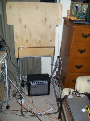
However, I hate the look of those tressels unless you like the look of a carpenter's desk. It looks like that tabletop should have a saw and power tools on top of it.
 

GGJstudios

macrumors Westmere
May 16, 2008
44,556
950
I prefer the one with text, it seems really cool though I do not know what it says on there.

However, I hate the look of those tressels unless you like the look of a carpenter's desk. It looks like that tabletop should have a saw and power tools on top of it.

The one with text has the word "Love" in multiple languages. The trestle looks good in black... the beige does look too rustic.
 

Angelo95210

macrumors 6502a
Original poster
Jan 7, 2009
972
15
Paris, France
Yeah I think they are really bad pictured here but in black they are not so bad... Thank you guy for your advice I love as well the "Love" motif...
 

Ag3nt-Orang3

macrumors member
Oct 21, 2009
44
0
It's not the color I have a qualm with; it's the positioning. The stands look so restricting on space for your legs. If they were positioned the other way you would have a significant amount more room...but, of course, this is one person's opinion :p
 
Register on MacRumors! This sidebar will go away, and you'll see fewer ads.