Got a tip for us?
Let us know
Become a MacRumors Supporter for $50/year with no ads, ability to filter front page stories, and private forums.
Which Looks Better?
- Thread starter emorydunn
- Start date
- Sort by reaction score
You are using an out of date browser. It may not display this or other websites correctly.
You should upgrade or use an alternative browser.
You should upgrade or use an alternative browser.
It looks a lot better without. If you hadn't said it was a cave top, then I never would've known what it was.
It looks a lot better without. If you hadn't said it was a cave top, then I never would've known what it was.
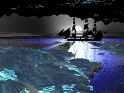
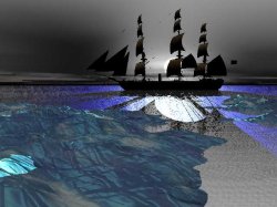
Exactly, cave top is not easily understandable as one..
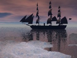
Thanks for your feedback so far. I saw a seggestion about making the ship bigger, so here, by "popular" request is a bigger ship:
I think both are pretty good but I prefer the small ship version. Not by far however.
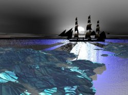
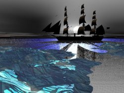
I have decided that the cave top is a bad idea and the larger ship is a good idea. But, I have also changed my mind about the sky, so here are the four option I am considering. After I choose a sky (with your input) I will post a link to the full resolution image if you would like to download it.
Attachments
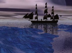
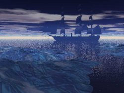
I like the second one the best (The one with the original sky), but the first one is not far behind. You should not use the last one.
I like the first of the 4 the best. Seems the boat is pretty close up to the ice/land... but it does look a lot better bigger (with more freeboard).
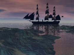
Ok, I get it: the lasy sky is bad- it was my leaste favorite too. And then I can assure you that according to the positioning of the ship in the 3D model the ship is about 250 feet offshore from the ice.
I would like to thank everyone who responded with a comment, it helped very much. Now, as promised here is a link to the full resolution image: http://www.emorydunn.com/Downloads/Ship.jpg
The resolution is 2560x1920, in 4:3 aspect ratio. Enjoy, if you would like it in a different aspect ratio just say so.
The resolution is 2560x1920, in 4:3 aspect ratio. Enjoy, if you would like it in a different aspect ratio just say so.
I know this might be a little late but there is just something bugging me about the scene and its the land, the mapping is just wrong (scale most likely, I dont use bryce), it doesn't look right and in my view doesnt fit in with the rest of the scene. I keep seeing what appears to be track lines going across the land.
If you can (unless thats how you want it) try reducing the size of the map and use more of them to fill the area. Think it would look better as a whole.
If you can (unless thats how you want it) try reducing the size of the map and use more of them to fill the area. Think it would look better as a whole.
The "tracks" I think you are talking about are simply the pattern of the ice. What do you mean by "reduce the size of the map"? Are you talking about the land? the water? Please be more specific.
I was talking about the land, the rest of it seems ok. And now you've told me it's ice its even worse, why is it green/blue colour  I could understand a very pale blue with hints of the other colours but the colours they are now made me think it was meant to be grass.
Reduce the size of the map. Ok in 3ds max you apply a map to create a texture or a specific appearance (in your case the ice) - also called material mapping etc. Bryce is using the same principles (but as I said I dont use bryce so cant say how exactly)
When you look at the picture the map is too large in relation of the land mass, you need to reduce the area being covered by the material map.
How can I put it so its easy to understand/explain - imagine looking at google maps (with sat imagery) where you see lots of the little squares to make up the big picture - you need to apply the same principle but with the same image mirrored/tiled to create a larger texture. This in return would give a superior "ice" appearance and may remove some of the green tint too. It will often take a little playing around to get the scaling right in context.
I could understand a very pale blue with hints of the other colours but the colours they are now made me think it was meant to be grass. Reduce the size of the map. Ok in 3ds max you apply a map to create a texture or a specific appearance (in your case the ice) - also called material mapping etc. Bryce is using the same principles (but as I said I dont use bryce so cant say how exactly)
When you look at the picture the map is too large in relation of the land mass, you need to reduce the area being covered by the material map.
How can I put it so its easy to understand/explain - imagine looking at google maps (with sat imagery) where you see lots of the little squares to make up the big picture - you need to apply the same principle but with the same image mirrored/tiled to create a larger texture. This in return would give a superior "ice" appearance and may remove some of the green tint too. It will often take a little playing around to get the scaling right in context.
Well, I kind of get what you mean, are you saying the land mass is to big for the picture and that it is out of proportion to everything else?
And the ice color and texture is a built in one called "ice burg", so apparently someone thought it was very ice burg like, but I will experiment with other ice textures.
And the ice color and texture is a built in one called "ice burg", so apparently someone thought it was very ice burg like, but I will experiment with other ice textures.
the picture overlaid is to big in comparison to the scene and model. You need lots of smaller ones to put it into scale with the water for example.
I'm still not quite getting what you are saying, so try this list:
Land Mass:
[ ] Too big
[ ] Too small
[ ] not the problem
Ship:
[ ] Too big
[ ] Too small
[ ] not the problem
Water:
[ ] not enough
[ ] Too much
[ ] not the problem
Lighting:
[ ] not enough
[ ] Too much
[ ] not the problem
Just try and boil it down to those things and if I'm still not getting it try adding some options to those, but keep them to a few words.
I did find a better terrain though, since I do agree with you, the ice was a bit... odd. It now has a snow texture.
Attachments
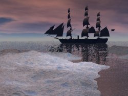
to me, there's a problem with the scale of the land mass as compared to the ship, water and sky. The land mass looks like it's a much more distant aerial view of miles of coast line, or an island, or whatever, but that's out of scale with the other elements
that's what it looks like to me anyway
that's what it looks like to me anyway
Ok, now I see what you are saying (if its the same thing LeviG is getting at).
I will do some measuring and see just how big the land mass really is, but I don't think its miles long. So your solution would be to shrink the land OR make the ship the same scale.
I will do some measuring and see just how big the land mass really is, but I don't think its miles long. So your solution would be to shrink the land OR make the ship the same scale.
Land Mass:
[ ] Too big
[ ] Too small
[x] not the problem
Ship:
[ ] Too big
[ ] Too small
[x] not the problem
Water:
[ ] not enough
[ ] Too much
[x] not the problem
Lighting:
[ ] not enough
[ ] Too much
[x] not the problem
the size of the land is nothing to do with the issue from me. Think in terms of perspective, the land is closer to the camera so it will be larger than say the ship.
Now continue thinking on terms of perspective and the land would have a larger size of grass than say if it was at the ship.
The size of the map being used on the land is too close in terms of perspective, you need to make the map look like its further away (make the image being used cover less of the land and use more of the images to cover the land - think patchwork quilt)
Having said that the new map does look better, still not perfect but better.
[ ] Too big
[ ] Too small
[x] not the problem
Ship:
[ ] Too big
[ ] Too small
[x] not the problem
Water:
[ ] not enough
[ ] Too much
[x] not the problem
Lighting:
[ ] not enough
[ ] Too much
[x] not the problem
the size of the land is nothing to do with the issue from me. Think in terms of perspective, the land is closer to the camera so it will be larger than say the ship.
Now continue thinking on terms of perspective and the land would have a larger size of grass than say if it was at the ship.
The size of the map being used on the land is too close in terms of perspective, you need to make the map look like its further away (make the image being used cover less of the land and use more of the images to cover the land - think patchwork quilt)
Having said that the new map does look better, still not perfect but better.
Register on MacRumors! This sidebar will go away, and you'll see fewer ads.