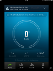
Let me put this into perspective. I have a Nike Fuelband and sync it to my iPad to review data at the end of the day. I use my iPod while I run with the Nike+ app, but again, review the data on the iPad. Why? Because the 4th gen iPod is laggy as hell on iOS6.
I'm glad you have the ability to know how everyone in the world uses their equipment or why they use it the way they do, in order to make your 'sad' comment.
And the point here is, when it comes to iOS there are tons of apps that just don't exist on iOS or aren't optimized for iPad, same as with Android. The difference though? On Android you don't have to look at a pixelated page. While the app may be a phone version, the screen is clear and the images, graphics and text is clear. This was my point. And yes, I only discussed the Nike apps, because these are the ones I use every day. I don't use my ipad for the app selection. I use it for web surfing, email and working out. Hopefully soon though, it will become my game rig once Apple has game controller support on more than just a handful of games.
Congratulations for pointing out 1 app that is meant to be used on an iPhone, not a 10" tablet. Those apps are companion apps, that much is obvious. And it is a companion app for working out. People who workout with a device don't strap a 10" device to their shoulder. Its simple logic buddy.
The fact remains that tablet apps still suck on Android. I have had my Nexus 7 since it came out and I came from an iPad. I know what a good tablet experience is. The Nexus 7 is far from it.
Apple talked about the 2012 Nexus 7 being poorly optimized in relation to the apps. Still a valid argument today, but maybe not to the same degree. They also talked about how landscape use is awful because of the aspect ratio and onscreen buttons.
https://www.youtube.com/watch?v=rb9...;cycles=-1;autoreplay=false;showoptions=false
But lets show a real world example of an app that actually has a special tablet optimized version, but it still not optimized for the screen size:

When watching a video through this "tablet optimized" app, you get less than half of the available pixels. You have a lot of factors at play here: landscape buttons that take up way too much space, feedly menu always visible, and menus from the website always visible. This is far from a good user experience.


