There is no objective definition for ugly. I’m talking about, say, a dark color on a dark background that makes it hard to see/doesn’t provide any contrast. Who is going to select that? It’s like people are playing with the sliders to come up with the worst possible look so they can then say ‘see, look how awful this is!’. Never mind the fact it’s 100% optional. Or that no one would actually chose that combination. No they‘re offended that Apple would even give the option.There's no accounting for some people's taste. But what's the issue? Apple created the palette... and if I make something that you thing is ugly, garish, or absurd, what's the harm? Apple fans have been asking for the ability to customize the home screen and to theme the icons... Apple finally made it possible, so it is what it is. Everyone can't be a Monet or a Rembrandt. We need the Picassos and the Andy Warhols too.
Got a tip for us?
Let us know
Become a MacRumors Supporter for $50/year with no ads, ability to filter front page stories, and private forums.
Why are people so upset about tinted icons?
- Thread starter Rogifan
- Start date
- Sort by reaction score
You are using an out of date browser. It may not display this or other websites correctly.
You should upgrade or use an alternative browser.
You should upgrade or use an alternative browser.
I’m not upset about the tinted icons (after all, as others have said - I don’t have to use them. 23 years ago. I had a hemorrhage in my left eye. recovered with the exception that certain colour combinations/contrasts are difficult for me to perceive.
Tom
As I’ll keep stating, I would find it much more useful to be able to set icon colour on a per choice basis *and* being able to add/insert images or change the actual icon.
Tom
As I’ll keep stating, I would find it much more useful to be able to set icon colour on a per choice basis *and* being able to add/insert images or change the actual icon.
Last edited:
Yeah I think this is a mistake. Devs can already offer dark mode icons if they choose to. The look and feel should always be controlled by the creators and brand owners.
I hope Apple pulls back from this Android-esque design monstrosity. All the experts agree this concept is wrong and completely unholy.
I hope Apple pulls back from this Android-esque design monstrosity. All the experts agree this concept is wrong and completely unholy.
Which experts? Again this is an option, you don't have to use it.Yeah I think this is a mistake. Devs can already offer dark mode icons if they choose to. The look and feel should always be controlled by the creators and brand owners.
I hope Apple pulls back from this Android-esque design monstrosity. All the experts agree this concept is wrong and completely unholy.
Have experts actually agreed on this? Which experts?All the experts agree
I agree that it's ugly, but it's optional same as custom icons have been for the last few years now.
Not because the feature is optional or the “do not use it if you do not need to”.
It is mainly because of Apples emphasis on such feature that it is cringe and therefore everything Pro was not shown - which in view of the M4 iPad is major let down for many.
It is mainly because of Apples emphasis on such feature that it is cringe and therefore everything Pro was not shown - which in view of the M4 iPad is major let down for many.
Both things can be true... You should be allowed to do whatever you want with your phone... and people should be allowed to give an opinion on it even if it's negative. That's the nature of online discussions... People are going to give differing opinions... you can't just shut down someone's opinion because you don't like it or agree with it... I bet if someone said "oh your phone looks nice I love it" then you wouldn't have an issue with it right?People get so weird about what other people do with their phones. I don't get it. I should be allowed to have an ugly home screen if I want.
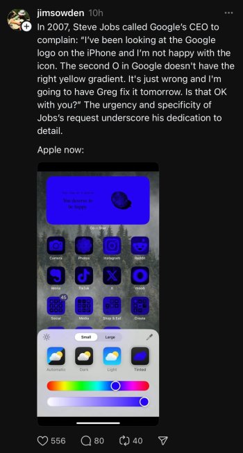
More people losing their minds over an optional feature. A feature that will most likely be refined over time. Also, who would actually set their phone to look like the first screen shot?
View attachment 2388627View attachment 2388628
Because it looks absolutely god awful, even Apples examples in the keynote which you would presume would show the very best settings of this feature are muddy icons set in black.
What Apple needs to do here is ask developers for a flat, white glyph of their app, this won’t be a deal as they already supply them for android. This glyph can then be applied to a coloured icon background of in light mode, or the glyph is coloured on a black background in dark mode.
So user selects green for example:
Light mode: White glyph on green background
Dark mode: Green glyph on black background.
And that’s it. Will look perfectly fine for those who want it. And as a stop gap for the odd developer who doesn’t immediately update their app, you can tint them like now if you really want to.
As it stands however it’s just awful. Rethink needed.
Some people just look for reasons to be angry. Also, some people lose the perspective that this is literally the very first beta in a series of betas that will last for at least 3 months before iOS 18 goes live, by which time many, many more third party app icons will be better adapted for tinting and dark mode. 🤷♂️
That said, I played with the tinting, looks cool, it's a smooth experience setting it up and, overall, I think they did a good job with it. Personally, I prefer the native colors of the icons since my eyes are trained to identify the app I'm looking for by sight and having them tinted really interferes with that even when I already know where they are.
So, not a feature I see myself using, but for those that want it, feels like a pretty nice implementation.
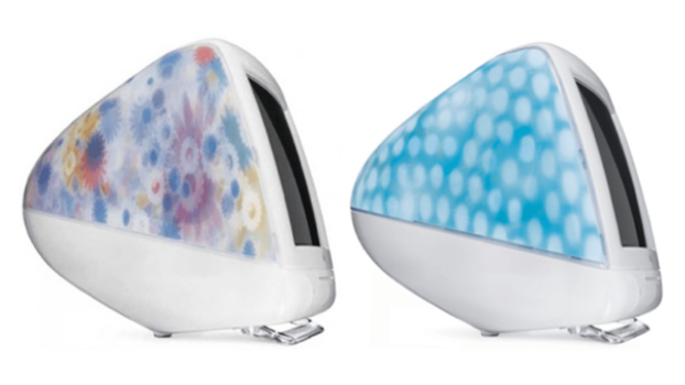
I’ve seen quite a few Threads posts mentioning Android. It’s almost like they think iOS allowing any sort of UI customization like Android does makes iOS dirty or lower class. It’s elitist. Also this notion that Apple was always the best arbiter of design is just flat out wrong. There were aspects of their skeuomorphic design that I hated and I know plenty hated iOS 7. Plus Steve Jobs approved designs like this:Some people just look for reasons to be angry. Also, some people lose the perspective that this is literally the very first beta in a series of betas that will last for at least 3 months before iOS 18 goes live, by which time many, many more third party app icons will be better adapted for tinting and dark mode. 🤷♂️
That said, I played with the tinting, looks cool, it's a smooth experience setting it up and, overall, I think they did a good job with it. Personally, I prefer the native colors of the icons since my eyes are trained to identify the app I'm looking for by sight and having them tinted really interferes with that even when I already know where they are.
So, not a feature I see myself using, but for those that want it, feels like a pretty nice implementation.

View attachment 2387971
Personally I love my dark mode tint. Can’t see why people have an issue with it, plus, just because you wouldn’t use something doesn’t mean others don’t want to.
But apart from the “I don’t want it” people, I would imagine a lot of app developers are complaining because “custom icons” for paid users has become popular.
To be honest, I've only found two options (including what you posted), that actually look okay. Every other slider combination is just horrible.
I love this tinting customisation personally. Ever since it’s been a thing on android I’ve wanted to to be able to do it on my iPhone. Looking at how good google has managed to pull it off I’m sure Apple‘s will be just as good if not better. So far I don’t like that it tints my photos widget (literally tints the photos) and I hope by official release they’ll let us keep the red notification badges or adjust the brightness so they actually pop at a quick glance.
Android has had tinted icons for several YEARS now. Most app developers make custom icons. If you don’t like it, then you can replace icons. It’s all up to the user.
Anyway….its a nice addition to IpadOS for sure. Even though, I prefer coloured icons, the transition between light/dark theme is well done.
Anyway….its a nice addition to IpadOS for sure. Even though, I prefer coloured icons, the transition between light/dark theme is well done.
This guy is not calm at all I can tell you, if he gets violent by such non-matter.View attachment 2387519
Because of tinted app icons? Seriously?
It's mostly Android fanboys who feel the need to tear down the competition because they have to do it to make them feel better about their choices.I’m mostly seeing it on Threads but man so much vitriol for something that is 100% optional. When the public beta drops I’ll try it out. If I don’t like it I’ll turn it off.
I think complaints about the photos app are more legit because that redesign isn’t optional; you’re stuck with it.
Apple are likely to iterate on the design, this is only beta 1, Beta 2 and 3 tend to have many more changes/additions and they tend to make small changes throughout the beta releases.
You are confusing that place with MR. MR has users who take icon tinting in the same kind of light the OP is speaking of. Their whole Apple ecosystem life is now doomed because of an option that many others like and can turn on and off at will. It doesn't matter if the triggered user doesn't plan on using the feature. He or she wants others to fall in line with them and be mad at Tim and Apple. Dysfunctional thinking to be sure.People on Threads are probably upset all the time, about anything.
It is always funny to read when Apple gives people the choice of something (even if Apple wants this or not - Sideloading, other browser engines) and people go crazy because they don't want it. No one is telling you to do. It's still your choice.
The same people would be complaining if Apple didn't offer it.
Totally understandable why app developers are complaining ; Apple just took a way a revenue stream from them. Now they can't use a different color icon as a feature to bait you into a paid app subscription.
Totally understandable why app developers are complaining ; Apple just took a way a revenue stream from them. Now they can't use a different color icon as a feature to bait you into a paid app subscription.
The same people would be complaining if Apple didn't offer it.
Totally understandable why app developers are complaining ; Apple just took a way a revenue stream from them. Now they can't use a different color icon as a feature to bait you into a paid app subscription.
Not true at all. Given the way Apple has is set up, the tint colors everything on the screen. If you don’t want everything yellow or blue or orange, custom icons from the devs are still absolutely doable and even desirable to the end user.
Register on MacRumors! This sidebar will go away, and you'll see fewer ads.


