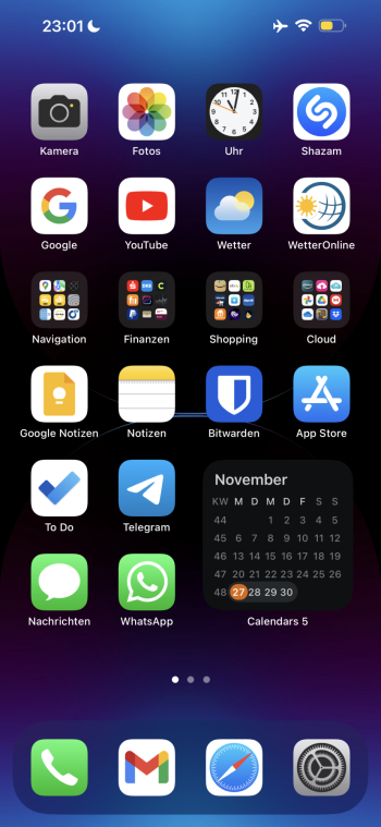
The icons have changed very iOS release since iOS 7 you just haven't noticed it. Apple is very sneaky at this so that customers don't lose their **** when things change.
Got a tip for us?
Let us know
Become a MacRumors Supporter for $50/year with no ads, ability to filter front page stories, and private forums.
Why doesn’t Apple put more effort into iOS icons and make them less ugly and toy-like?
- Thread starter AndronicusMaximus
- Start date
- Sort by reaction score
You are using an out of date browser. It may not display this or other websites correctly.
You should upgrade or use an alternative browser.
You should upgrade or use an alternative browser.
I feel like they are cartoonish
Like when I look at the home screen I feel like I’m looking at a toy
Like when I look at the home screen I feel like I’m looking at a toy
Which ones look cartoonish? What would you change? Do you have examples of icon styles you prefer? Or are you just looking to get a reaction from people?I feel like they are cartoonish
Like when I look at the home screen I feel like I’m looking at a toy
Better post this on reddit. Over there you’ll find an infinite number of losers who type their fingers to the bone on every topic, no matter how irrelevant.
Changing the wallpaper to a darker, sleeker one does a lot to eye-friendliness in my opinion.
I don’t like the inky-winky-colored Apple wallpapers. In your screenshot, the wallpaper makes it look cartoonish as you’re calling it.
Here‘s my (first) honescreen. It doesn’t look cartoonish to me personally.

I don’t like the inky-winky-colored Apple wallpapers. In your screenshot, the wallpaper makes it look cartoonish as you’re calling it.
Here‘s my (first) honescreen. It doesn’t look cartoonish to me personally.

Why not bothHow about concentrating on releasing less buggy software.. I could care less about the icons
If they could handle both I'm all for it. They've had buggy software since iOS12. iOS10 and 11 were adequate but they really did a nice job on iOS12..Why not both
Because calculator developers pay Apple 30% of their loot. It all adds up.Why after 10 years dont we have a calculator application for our IPADS?!
The icons look fine to me. Don’t change it for the sake of changing it.
The majority of people who use iPhones/iPads don't frequent these forums, or Reddit, or any technology focused media sites or information outlets. They don't care about the technology. They just want their devices to work. Once they learn how the devices work and become familiar with the visual design language, they don't want anything to change, otherwise, they will be easily confused. Familiarity drives their usage patterns as well as their future purchase decisions. This is especially true with younger iOS users and teenagers who are the future consumers and buyers. Apple knows this. If there is a UI overhaul, it would have to be incremental over many releases to reduce the risk of alienating these consumers familiar with the existing visual design language. Icons in particular are a cornerstone of the visual design language.
Best of both worlds would be for Apple to implement UI skins / tweaks and open such UI features officially to developers. Sometimes I do miss the early days of jailbreaking with all the crazy, wacky UI tweaks you could install. But alas, I'm an old fart now and really just want my iPhone to work the way it works right now, no changes
Best of both worlds would be for Apple to implement UI skins / tweaks and open such UI features officially to developers. Sometimes I do miss the early days of jailbreaking with all the crazy, wacky UI tweaks you could install. But alas, I'm an old fart now and really just want my iPhone to work the way it works right now, no changes
How long do you spend looking at the homescreen? It's just a gateway to the apps you want to use.
Who cares?
Who cares?
I think those are two different teams. It's not like there's ONLY one team working on iOS. I'm pretty sure there's a team that focuses more on the user interface and design language and that's not the same team as the one that writes the code for the software.How about concentrating on releasing less buggy software.. I could care less about the icons
So yes, we can ask for both improved UI and less buggy software.
Register on MacRumors! This sidebar will go away, and you'll see fewer ads.

