Become a MacRumors Supporter for $50/year with no ads, ability to filter front page stories, and private forums.

redpandadev

macrumors 6502
Jun 3, 2014
353
318
I normally use Path Finder as my current finder app but since Yosemite it no longer visually fits the theme of OSX.

The new finder looks great but lacks a lot of the features Pathfinder has such as dual window browsing, tabs, drop stacks, multiple side bars, highly customizable toolbars, built in unzipped, text editor and pdf viewer amongst many other things.

It strikes me that Finder hasn't really been updated since Leopard other than adding tags. Why have Apple neglected one of the most important facets of the OS?

1) It's easy enough to just open 2 separate windows
2) The Finder does have tabs (as of Mavericks)
3) Not sure what drop stacks are
4) Don't know why you'd need multiple sidebars
5) Actually the Finder's toolbars are quite customizable... you can put Apps, AppleScripts, Documents and more in the toolbar
6) Double click a zip file... it unzips not sure how this is different than being built in
7) I would argue that Text Editing is best left to a dedicated Text Editor. If need be to view a document, just press space bar to use Quick Look
8) PDF Viewer - just press space bar to activate Quick Look, also PDF documents are rendered in tiny versions in their icons (which you could make very large) as well as in Column View and Cover Flow

sorry but this alleged lack of features may just be the result of not understanding how to use some of the features it does have. I am by no means bashing third party tools like Path Finder - they certainly have their place and offer choice to users, but to say the Finder is so "lacking" far from an accurate statement.
 

Shocco

macrumors newbie
Original poster
Aug 7, 2012
17
0
1) It's easy enough to just open 2 separate windows
2) The Finder does have tabs (as of Mavericks)
3) Not sure what drop stacks are
4) Don't know why you'd need multiple sidebars
5) Actually the Finder's toolbars are quite customizable... you can put Apps, AppleScripts, Documents and more in the toolbar
6) Double click a zip file... it unzips not sure how this is different than being built in
7) I would argue that Text Editing is best left to a dedicated Text Editor. If need be to view a document, just press space bar to use Quick Look
8) PDF Viewer - just press space bar to activate Quick Look, also PDF documents are rendered in tiny versions in their icons (which you could make very large) as well as in Column View and Cover Flow

sorry but this alleged lack of features may just be the result of not understanding how to use some of the features it does have. I am by no means bashing third party tools like Path Finder - they certainly have their place and offer choice to users, but to say the Finder is so "lacking" far from an accurate statement.

Can I just ask have you ever used Pathfinder? Because once you do you can't go back.
 

Beavix

macrumors 6502a
Dec 1, 2010
705
549
Romania
I have tried PathFinder and I just didn't find it that useful. I don't need an advanced file manager simply because I don't spend much time managing files in Finder. I create and edit lots of files daily using various apps but I rarely use Finder to manage anything. The Open and Save dialogues together with DefaultFolderX is more than enough for me for basic file operations. Finder is perfect for the rest.
 

maflynn

macrumors Haswell
May 3, 2009
73,682
43,740
I have tried PathFinder and I just didn't find it that useful.
I don't like how the Finder does not use a directory tree to easily navigate the drive structure. That's where I prefer Path Finder. I also don't use much of its features, but what I do use, extends my ability to easily interact with my Mac :)
 

Shocco

macrumors newbie
Original poster
Aug 7, 2012
17
0
I don't like how the Finder does not use a directory tree to easily navigate the drive structure. That's where I prefer Path Finder. I also don't use much of its features, but what I do use, extends my ability to easily interact with my Mac :)

And it's very fast compared to finder which is good for me on my 2008 Macbook
 

leman

macrumors Core
Oct 14, 2008
19,516
19,664
I tried the PathFinder demo and I can't see what all the fuss is about. I thought it was clunky and the UI was messy. It tries to be too many things at once and it did not improve my file browsing experience in any way. I very much prefer the clean Finder, especially with the tags introduced by Mavericks. And I don't really see any point in dual-panel interface when I can have two or more open windows. to achieve the same thing. The drop stack is neat, but very situational.

P.S. Finder in 10.10, with the addition of Finder Sync plugins, will be absolutely amazing. It will make possible to solve my biggest issue with it, which is integration with VCS.
 

kuwxman

Cancelled
Jul 25, 2009
850
958
TotalFinder has a beta out that has preliminary Yosemite support. Have it installed on my machine and it seems to be working OK so far.
 

Fuchal

macrumors 68030
Sep 30, 2003
2,614
1,137
This doesn't involve any radical UI changes, but would make the Finder so much more usable. As it is we're still stuck with a Finder that is still only incrementally better than the Finder in OS 10.0, which is ludicrous, especially when it would be an ideal place to provide a convenient bridge between Spotlight searching, cloud services and so-on.

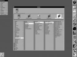
It's only incrementally better than File Viewer in NeXTSTEP!
 

Attachments

  • filev24.jpg
    filev24.jpg
    131.3 KB · Views: 142

abshole765

macrumors 6502a
Jun 10, 2013
670
0
One thing lacking though, is each time you open a directory, say on your Desktop, instead of opening a new tab window, it opens a new window....... AFAIK I never end up using them because of this bad behaviour. We should file this to Apple if this is not the behaviour that we want.

Even better is how every Finder window has its own settings.
 

Shocco

macrumors newbie
Original poster
Aug 7, 2012
17
0
I tried the PathFinder demo and I can't see what all the fuss is about. I thought it was clunky and the UI was messy. It tries to be too many things at once and it did not improve my file browsing experience in any way. I very much prefer the clean Finder, especially with the tags introduced by Mavericks. And I don't really see any point in dual-panel interface when I can have two or more open windows. to achieve the same thing. The drop stack is neat, but very situational.

P.S. Finder in 10.10, with the addition of Finder Sync plugins, will be absolutely amazing. It will make possible to solve my biggest issue with it, which is integration with VCS.

Yes when you first load up pathfinder it looks a mess but it's so customisable you can make it as simple/complex looking as you like. You can change fonts, icon sizes, folders , colours of tabs etc. Just need a bit of patience.
 

afsnyder

macrumors 65816
Jan 7, 2014
1,270
33
Yeah, Finder is definitely lacking.
I'll soon be a 10-years-old Mac user and I still prefer the Windows Explorer, the Finder has never grown on me.

Tabs helped a bit, but how come does double clicking on a folder on my Desktop open a new window instead of a new tab ? That is beyond me and is the reason why I've never actually used tabs (even though I'm one who asked for them).

The maximize button is also flawed throughout OS X (especially the Finder) and it's only getting worse with Yosemite, because you don't know if it's a maximize button or a full-screen button.

It's always a full-screen button. If you option+click or something, it'll do the old maximize behavior.
 

Traverse

macrumors 604
Mar 11, 2013
7,711
4,491
Here
I know it's an older thread, but I like the Finder. It's basic, but it gets the job done. I'm certainly not opposed to Apple adding more optional features.

Also, I hope Apple DOESN'T move away from file directories. I love being organized and often have 8-10 deep folder hierarchies to keep things in place. I hated Apple's "save in the application" approach. Still, if the masses love it *sigh*

---------------------------------

Side note. I checked out Pathfinder and TotalFinder and every time I see these "pro" utilities or a user claiming to be a "pro" user, they use column or list view.

Am I the only one who uses icon view :eek:. I've never actually tried list or column and it feels awkward to me. Still, when I have an 8 folder hierarchy that means I need 16+ clicks. With column or list view I just need 8+ with the expand triangle....
 

F1Mac

macrumors 65816
Feb 26, 2014
1,283
1,604
Side note. I checked out Pathfinder and TotalFinder and every time I see these "pro" utilities or a user claiming to be a "pro" user, they use column or list view.

Am I the only one who uses icon view :eek:. I've never actually tried list or column and it feels awkward to me. Still, when I have an 8 folder hierarchy that means I need 16+ clicks. With column or list view I just need 8+ with the expand triangle....

I use list/column view except for my desktop ;) It's really faster than icon view for me and I'm used to it. Maybe that's why I don't care for the icons' look/color...
 
Register on MacRumors! This sidebar will go away, and you'll see fewer ads.