Become a MacRumors Supporter for $50/year with no ads, ability to filter front page stories, and private forums.
Are you two being deaf on purpose because you like to disagree and try to spin people up? :) What safety standards mandate having the sculpted, decorative/eggcart bumper cover (fascia) be the outermost-projecting surface to first touch/contact something in a slow speed contact, having a high potential to leave a mark or broken plastic, instead of the “old school” (think: before Audi’s badge/shield grille) where the typical plastic bumper cover fascia seen in showrooms was designed to be unique and attractive and not obtrusive...ones designed with a slightly rounded surface that would be the first to contact an other similar bumper cover surface, distributing the contact force and usually resulting in zero marks or proof that there was even a contact? Please finally realize the discussion is about low-speed contact where only the plastic bumper cover fascia is flexed slightly but enough to leave a mark sometimes, and not deep enough to engage the needed pedestrian/passenger safety crumple features.

There are a multitude of examples in today’s showrooms where an automaker has finally moved on from copy-catting Audi‘s badge/shield grille bumper cover fascia while meeting all required safety standards.

I see great similarity between many of today’s form-first function-second oversized eggcart grille automotive bumper cover fascias and certain form-first aspects in app/website/interface elements discussed here. Take a refined, mature thing that’s well beyond the innovation/invention opportunity phase, and couple it with designers/companies needing to make a statement and/or justify their office hours, and, voila! iOS7! Flat Design! Material Design. Auto designs where every nook and cranny is a bit over-stylized, sometimes to the point of distraction.
Unfortunately your comment about "this is about low speed contact where only the plastic is slightly flexed" is incompatible with the comment Nick (which is what I was referring to) regarding the obliteration of a vehicle through deer impact.

Sorry. It must be tone deaf of me to read :) Carry on!
 
I think it was funny a page or so back where folks thought we wanting sites to go back to the good design of ~2012 equating to going back to the Geocities era of 1996. That's a bit of a stretch! 90s website design was about as awful as current website design; the only differences being that instead of having comic sans, flashing 'under construction' banners, hit counters and animated GIFs, we have ads posing as 'fake' download buttons, ads looking like fake virus pop-ups, and UI elements with a mind of their own and wanting to disappear for no reason like when I tried logging into the SiriusXM site.

People have made the jump when I mention wanting skeuo back being the same as me wanting System 6 back or DOS back. No, not even close. Some things improved since then. What we have NOW is more like going back to DOS or DeskMate or Windows 1.x only in higher resolution. It was garbage then and it's garbage now! Wanting the designs that seemed far more future-forward and easy to use is NOT the same as wanting back floppy disks and hard drives that are as large as washing machines.
By definition, you seem to desire something that mimics a physical object. Yet a lot of the functionality that exists today never existed as a physical object. In my opinion, you'd be stuck in the past when you long for digital things to remain looking like they did in the past.

A funny story about the British tax system as they did that; by law, it was laid out what a tax form should look like. So the early design/development teams took that and created a digital online version. That just doesn't work. I was asked to clean up the mess, take over the project, and do it properly. That also included having to change the law to no longer be stuck in the past. The figures don't lie, it was a great success. At the time it was a little weird as the UX design team spend a lot of time with focus groups, and people with lesser abilities to test it, and yes we were aiming for AAA and Bobby compliance. It worked, it is fast, easy to use, and no longer mimics a paper form and associated calculation sheets ;)

Back to Skeuo, there is a generation now that never used those physical devices. To me it was fun during the boom and the transition, but come on; let's not stay stuck in the past.
 
  • Like
Reactions: decafjava
I am starting to see neumorphic elements appearing on some webpages.
Call it neumorphim, skeumorphism, new-skew, I could care less. Just keep returning to prioritizing intuitive & efficient function, Apple! (And all the lemmings in the design world who follow anything Apple does!)

 
Back to Skeuo, there is a generation now that never used those physical devices. To me it was fun during the boom and the transition, but come on; let's not stay stuck in the past.
What do you say to those to install things like composite/steel shingles that look like real shingles, or Trex deck materials that look like wood, or window shutters that don’t even move, or hardi board siding that looks like clapboard siding, or veneer-stone trim that looks like real stacked stone, or floor tile that looks like stone, etc. In this age of minimalist interface, why is Apple’s phone icon based on a handset design that is in few of today’s houses? Why is the camera icon based on a DSLR design that fewer and fewer of us use or even own? Why is the mail icon an envelope when fewer and fewer send actual letters? I could go on. The point is, there are many things that work in life simply because they reflect an aspect of either life’s history or human instinct. It feels good to use them and they work well. They feel intuitively comfortable. Sure, a design anarchist can critique anyone “clinging to the past” should instead cover their brick house with aluminum sheets, replace their shingle roof with something more sleek & textureles, and replace their fake-cobblestone-look sidewalk with something not trying to be something else....but what about the loss of intuitive interface that just works, and that’s based on human nature just to look different than what the real world looks like? That’s what removing buttons and keeping to an all-white gridless/frameless/contextual-light interface design has been like, and is slowly being reversed back to the good, as I expected it would one day. :)
 
  • Like
Reactions: 2ndStreet
What do you say to those to install things like composite/steel shingles that look like real shingles, or Trex deck materials that look like wood, or window shutters that don’t even move, or hardi board siding that looks like clapboard siding, or veneer-stone trim that looks like real stacked stone, or floor tile that looks like stone, etc.
I'd say yuk, not my style to get such fake substitute products.

In this age of minimalist interface, why is Apple’s phone icon based on a handset design that is in few of today’s houses? Why is the camera icon based on a DSLR design that fewer and fewer of us use or even own? Why is the mail icon an envelope when fewer and fewer send actual letters? I could go on.
Still all elements that the current generation of users have used. My bet is that the telephone will be the first to drop. But still most households have one.

The point is, there are many things that work in life simply because they reflect an aspect of either life’s history or human instinct. It feels good to use them and they work well. They feel intuitively comfortable.
They also feel alien to those who never used them ;)

Sure, a design anarchist can critique anyone “clinging to the past” should instead cover their brick house with aluminum sheets, replace their shingle roof with something more sleek & textureles, and replace their fake-cobblestone-look sidewalk with something not trying to be something else....
??? Why? Nobody but you is making such a daft argument.

but what about the loss of intuitive interface that just works, and that’s based on human nature just to look different than what the real world looks like?
You are totally glossing over the points I made in context.

That’s what removing buttons and keeping to an all-white gridless/frameless/contextual-light interface design has been like, and is slowly being reversed back to the good, as I expected it would one day. :)
No it isn't, there is a realisation, sadly largely enforced by government policies but hey ho whatever it takes, to do this properly and with good responsive and accessible design so it works for everyone. There are still too many cowboys around, I'm working with an 'award' winning agency and one look at the work they done and it is not compliant with so many global laws and regulations it is unbelievable. A lot of people still have to learn a lot sadly, sadly because this is not new.
 
No it isn't, there is a realisation, sadly largely enforced by government policies but hey ho whatever it takes, to do this properly and with good responsive and accessible design so it works for everyone. There are still too many cowboys around, I'm working with an 'award' winning agency and one look at the work they done and it is not compliant with so many global laws and regulations it is unbelievable. A lot of people still have to learn a lot sadly, sadly because this is not new.
I’m surprised to hear what sounds like: my examples of interface elements that I think would help ANY user (promote efficiency and intuitive understanding) are being called worse for accessibility and wouldn’t work for everyone...

What’s a good example (or examples) of where these things are a negative against accessibility and which “don’t...work for everyone?”

- the return to slight visual cues that better-distinguish an actionable item to stand apart from the informational text (i.e., “Neumorphism” anti-flat design, and/or not using text-only as a “button” but instead giving a sizable “button” larger than a fingertip to help with visual recognition of having pressed the button)?

- using a normal/thicker, dark, higher-contrast color font on a white background instead of using thin font colored a light grey or light brown, etc.

- using slightly more distinct color/shading to help differentiate different areas in an interface (i.e., controls vs. content) instead of maintaining an all-one-color (usually white) workspace such that the controls blend in to the content to the point of distraction for the extra work it takes at times to stop and find and recognize the controls and then perform the work being done?

- More efficient page layout that doesn’t spread everything out so much that it repeats the same offering 3-4x on the same page but in slightly different ways, which often results in confusion as to whether a certain “button” is the same as the prior and next “buttons” (i.e., tall web pages that require much scrolling to take in the entire content).

Maybe we’re talking Apples and Giraffes here and completely not understanding one another, I don’t know. But I’m continually surprised to hear what sounds like “the least amount of detail in an interface is more adaptable and more intuitive and therefore better for accessibility and better all around.”
 
Last edited:
I didn't read this whole thread but I agree with OP. Modern site design suck, too cluttered, websites are just big images after image, and hard to navigate and find what you want. I hate it and browsing the web became hectic loaded with bloat. lets not forget about all the pop-ups, notices, and cookie agreements, and media plugged in. Just look at this beautiful design!

I am tired of websites sizes being larger than MS office, its all about form over function and it sucks. Some websites do it better than others. Example of nicer design, Example of horrific design.
The first is ok if a bit boring. Switch your last two examples and I would agree with you, the first is hard to read and looks disorganized.
 
The first is ok if a bit boring. Switch your last two examples and I would agree with you, the first is hard to read and looks disorganized.

The main point is that big photo, huge text, multimedia injected everywhere, heavy javascript, and 3rd party domain loading made websites cumbersome.
 
Until Neuomorphism stops being another variant of Material Design (which is still mostly flat!) I reserve my hope for when we see actual skeuo come back. Doing it half baked is still half baked.

So far this new design is limited to animations such as the Apple Watch Pay app, which shows a flyover of what appears to be a physical credit card complete with 'shine' effect. Or Material style animations, floating action buttons, pull tab drawers, etc. I want the knobs back, the switches back, the textures back and to see them scaled to dazzling 4K display tech. I'm sick of a bland UI (which is even worse in most apps today--being mostly text based thin text on white, just look at the current Credit Karma app) that feels like work, and something I just want to get over with fast. No app made today is as memorable or fun to use as the original Kindle app, or the original Google Maps, or the original S-Note app. Or in iOS, the original iBooks UI, or Music app.

The only ones living in the past are pro-flat UI folks. Flat UI was done before, in the 80s. Due to hardware limits at the time. There are no such limits today!

Good news for me though: It appears my HTC Thunderbolt still makes calls, does SMS, MMS, and is fully functional despite VoLTE being standard now. Luck of the draw, and good until LTE dies if it ever does. So maybe design will circle back by then? In fact, all my 'unsupported' handsets continue to work in 2021. Even the one I was getting emailed about losing service this billing cycle (which as come and gone already--yet still working! Galaxy S4 Mini)
 
Last edited:
Something else I detest in today’s website (and app and OS) design that’s more about maintaining a clean appearance than providing good function:

Too often, text is cut off in a file name or header or icon or button, lazily resorting to ellipses to let the user imagine what’s “to the right.”

Not only does this result in the user not understanding what is really there (or results in several similar-looking icons or folder names to look exactly alike due to the hidden text and then be indistinguishable), but it also results in another dumb facet of “today’s” interfaces in that it requires the user to sometimes perform an additional action for what used to be present instantly without a tap...often the ellipses after a text string sometimes are a “button” that can be pressed to expand the text...

Except when ellipses are not a button, and the ellipses are simply just text. Way too often it’s impossible to distinguish thanks to Flat Design, so one must explore and attempt, only to be maddeningly left with no resultant action half the time.

Out with flat design and cleaned-up empty-space-heavy websites, apps, etc. Raise the torches and pitchforks !! :)

3B958D90-6EE0-4574-8265-54082E2A0510.jpeg
 
The torches and pitchforks seemed aimed squarely at Microsoft during Windows 8's launch and reception, and sadly tossed out when Apple thought their attempt at what failed for Microsoft apparently succeeded.

It doesn't matter if it's crap or good; if Apple does it, it must be perfect! A lot of Android got iOS7-ified soon as Apple inspired Google. Then actual signs and logos went flat (why?) and yes, as I've said before, flat was a 70s-80s thing before computer graphics were really able to do more than draw text or straight pixelated vector-graphics lines.

Ironically, this isn't the end of our resurgence of the '70s just yet, oh no! Look at the recent change to the Pizza Hut and Burger King logos. Look familar? Yup! It's the same logos from the '70s-80s again!

It's an odd reversal though in movies. 3D animation has become the de-facto standard and replaced traditional 2-D animation that was around since the '20s. There's still some 2-D animation out there, if you're into the garbage looking shows such as Teen Titans Go!.
 
  • Like
Reactions: ghanwani
The day you tell me you have given up beer, juice, soda, and wine in favor of drinking just water because doing so makes for a simpler and less expensive life (so therefore it has to be better), I'll buy your point.
I drink water 90% of the time for the last 14 years.

Anyways, the gutters actually come from desktop due to the inconsistency of the desktop screen size and resolutions of them. It has been there for a long, long while. I guess it got exaggerated while tablets started picking up. So to be fair, it was due to tablets and not wanting to worry about a 3rd screen size for developers to have to do.

Mobile first development is the way to go. Most people are on mobile devices when browsing the web, even more so when it comes to e-commerce transactions. The reason sites that are usually successful for that because they get the user experience down for mobile, do not conflate design with user experience. Design is just one part of the user experience.

Because mobile first has been go to for the quickest to reach the largest possible audience, this is the way startups tend to go and bigger companies have seen the success. So the way a mobile site scales up to a desktop monitor leaves a lot of space. Sorry, desktop browsing is just not the target audience most of the time.

Now let’s talk about space between things, it’s because studies have found if people can focus on a smaller set of information with a specific focus, they get increases in interaction and overall site traction. There’s metrics that UX have captured to support that a more lean, specific, and focused gets people to stay longer and engages the site.

Not only has the design paid dividends there but it also has made loading the pages more quickly. There’s less rendering times too since most pages are no longer just static HTML.

Of course, that doesn’t work for your first site you shared.


Honestly, the first site you shared in your original post is very good. It focuses on media that centers around the products and the lifestyle that brand promotes. Navigation was very easy for me too. There were sometimes when navigation covered up the product which I disliked.

The reason the first site has so much media is because they’re focused on people with a lot of discretionary income and probably live in a city with fast internet speeds. They need to get excited about the lifestyle their going to attain with their brand.

I’m not saying that past designs don’t serve a propose but you also have to realize that design was most likely done by developers with no research behind it. And now that there’s so much more internet users and traffic, they’ve had to really focus on user experiences, part of that means adapting the design to a larger audience.

Hope that helps you understand the changes a bit more. Not saying that the changes benefit you but on a whole have benefited the majority, otherwise they wouldn’t be doing it.
 
Last edited:
I don't need to just get used to it, or adjust. If it's good, there shouldn't be any need to 'adjust' to it. Adjustment or 'getting used to it' implies it's bad or mediocre and with time we just get used to it being crap until it's just normal, similar to if you lived near a pig farm, at first it stinks, but with time, you stop noticing it so much--doesn't mean it's a good thing, though.

But I've taken control and I always get what I want so no matter what Apple, Google, Microsoft, et al, throw at me, I find ways of either avoiding it, circumventing it, or downgrading to a device incapable of the 'update'.

I am pretty tech literate (another trend is most modern things expect the user to be a moron, not someone who was taught how to read the manual, learn how to use, or even fix it when it breaks) so I know how to block updates at the router, install a hardware gateway (such as a Pihole) to redirect update requests to 127.0.0.1 or null, and oftentimes use VMs to get older OSs working on modern hardware. So no matter what, I have nothing to worry about. I can 'stagnate in peace' until I see fit to update when whatever I use now no longer serves my needs. There's no reason we should be letting corporations tell us when our devices no longer serve our needs.

Unless the laws of economics have changed, then companies should be responding to the demand of consumers, not telling the consumers what we should love or want. That's not how supply/demand works. No consumer asked Apple, Google or Microsoft to go flat or for website design to look like a Weebly.com template. When companies respond to negative feedback when they change too much by saying 'oh screw you guys, just get used to it, it will not be so bad once you get used to it!', well, that should basically EOL a company. In the 60s, you'd never get far as a company or business by telling your customers to GTFO. Why that doesn't kill a company today is because too many customers accept whatever they're told instead of actually doing something about it. If you complain, and company doesn't listen, then stop buying their products. Buying it anyway and then still complaining won't accomplish jack.

Also, nothing really morally wrong with those who prefer to live in the past. There are even certain towns that thrive on that. Dodge City, for example, seems to be doing quite well. I don't get this whole anger at anyone who prefers to live in the past. My grandmother who's 94 can't use a smartphone. She uses a phone that's technically unsupported on modern carriers that I forced to work through the same technicality that kept my Thunderbolt working after VoLTE got mandated. Why should she be forced to use a modern device because someone told her to? Why would anyone want the experience for some people to be worse? Doesn't make sense to me. Never will.

It may seem quite hard to believe in this day and age, but not everyone thinks alike. Some people like different things. Some people like 50s cars, some folks like modern cars. No one should be forcing anyone to do something they don't want to if they're not harming anyone in the process. This mindset that everyone must have the newest and latest or else feels hostile. Just makes you all look like jerks.
 
Last edited:
  • Love
Reactions: 2ndStreet
You might want to pay attention to search console - if the website is not mobile friendly (which nowadays is a must - at least 75% of web users are using mobile phones), it won't be ever shown in google search engine. Unless you're running a business or anything else which doesn't require motor search engine. All websites need today to be responsive.
 
  • Like
Reactions: decafjava
You might want to pay attention to search console - if the website is not mobile friendly (which nowadays is a must - at least 75% of web users are using mobile phones), it won't be ever shown in google search engine. Unless you're running a business or anything else which doesn't require motor search engine. All websites need today to be responsive.
Interesting. I take no issue with Responsive Design done well/intuitively/clearly/straighforwardly and not as if it were a submission to a contest for minimalism and/or most invasive hero image/video. Apple’s webpage for the new iPad Pro is excruciating. Way too much art/animation that got old years ago, delaying the time needed to get to the important stuff.
 
  • Like
Reactions: 2ndStreet
Interesting. I take no issue with Responsive Design done well/intuitively/clearly/straighforwardly and not as if it were a submission to a contest for minimalism and/or most invasive hero image/video. Apple’s webpage for the new iPad Pro is excruciating. Way too much art/animation that got old years ago, delaying the time needed to get to the important stuff.

I am only guessing that via marketing research they found people respond better to this type of design, its completely stupid. Websites back in the 90s on geocities had better form-follow-function design.
 
Interesting. I take no issue with Responsive Design done well/intuitively/clearly/straighforwardly and not as if it were a submission to a contest for minimalism and/or most invasive hero image/video. Apple’s webpage for the new iPad Pro is excruciating. Way too much art/animation that got old years ago, delaying the time needed to get to the important stuff.
And what is the important stuff according to you?
 
And what is the important stuff according to you?
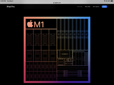
All the gyrations from the top of the page until this was rather useless and a bit of a timesuck. Lots of wasted space and truly unnecessary animations/gyrations as far as what info they conveyed vs. the time spent to get past them:

01193234-2BB2-49AB-BBB3-602171016519.png

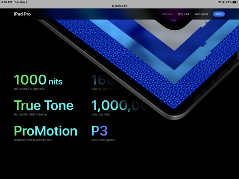
Some of the info after that was helpful but used more screen space than really necessary. Then, this next animation was actually the first helpful thing worth spending some time on. It illustrated the LED function. Finally, fancy animation/gyrations that helped provide context and educated me:

AB858EA8-0513-411A-B43A-20A6986CC907.png

Then pretty much everything from that until the below image (approximately 15-20 finger swipes) was pretty inefficiently space-wastingly laid out and more of a timesuck, I assume mostly for the sake of artists/designers to get a chance to display some vibrant wizardry of colors, and opportunities for a show of support from Apple to the now-mandatory corporate tipping of the hat illustrating as many different genders/cultures/races as possible, until this next screen, when we start to see some helpful new info:

976BFD86-7B74-42E0-B39C-E03D41D96DB3.png

Then pretty mech everything else was more of the same…large splash images with little helpful new content/info. Then I remembered to just jump to the Tech Specs link atop the page for the really helpful info.

The “Why iPad” link atop the page is even more tiresome/timesuck than the main iPad Pro page.

What I find funny is that Apple says everybody knows how to use a touchscreen now and can’t benefit from certain intuitive interface cues that were white washed away with iOS 7, but they’ll spend countless resources creating a much too tall website page full of repetitive info that most everybody familiar with the iPad already knows about.
 
Last edited:
  • Like
Reactions: iHorseHead
So you could have just clicked on the tech specs page and be happy. Good think they provided an alternative path :)
No. Did you miss the point of my response completely or did you intentionally not acknowledge my response, diverting away from what I described in order to keep up your preferred narrative?

You asked what I felt was “important” within that self-indulgent and repetitive opening webpage for the new iPad Pro that required so many swipes to get past. I pointed to the one animation/gyration which I felt provided truly useful information about the new LED lighting and was a smart use of the user-controlled animation in order to understand the new tech.

The remaining animations/gyrations that took too many swipes to get past were nothing more than optional art and portfolio-padding for the designers. Considering all the time & swiping required to unpack and get past it, those animations and contrasty illustrations provided no new, unique, or particularly insightful information and were simply another chance to view this year’s pretty iPad marketing wallpaper and other techy-marketing illustrating how revolutionary and newish the M1 is. Like fireworks. Or, like a birthday gift wrapped 10 times over. It was pretty fun the first time you came across one like that years ago. But then each next time it’s less fun and more of an eye-rolling timesuck for the opener but was likely much more fun for the creator who couldn’t wait to put their “gift” in front of the recipient.

When is enough self-indulgent large space-wasting & truly non-essential non-informative hero image/animation content enough? Can you defend any of the misc splash images/animations repeated from commercials and just iterations of last year’s “smiling iPad enthusiast enjoying their device” images that take up the majority of the scrolling time?

Extending that design idea outward for a test of its worth, would that page get better or worse if the page height was increased twofold with more of the same art/content, or even made into an infinite loop? Be honest with yourself and ponder that a bit.
 
Last edited:
I hate mobile sites (especially when they format to mobile when using a real laptop running macOS or Windows 10--Facebook, Apple support forums, etc all look garbage on a real computer) and believe they're cancer.

Remember in 2007 how Steve Jobs bragged about the ability of the then-new iPhone 'being able to browse the full web?' That phone did well for a 2007 device--I'd bank that a modern smartphone is more than capable of rendering a full desktop site (especially since they're essentially tablets now!) just fine. I can't stand mobile sites. Used to be a site expected the user to well, have a brain. Want the mobile site? append the URL with wap.site.com or m.site.com otherwise it shows the desktop site.

Mobile-first mentality is one of the main reasons we got such generic websites today.

My American Express app got a 'mandatory update' sadly today, but thankfully it now features a more readable bold font, and far less rainbow color UI than it did. It also doesn't take three steps to do what used to take one. Not many 'updates' do anything except mess with my muscle memory or look like they intended the user to have a LeapPad, but thankfully there are certain exceptions.

I don't blame them for having mobile first mentality. I think mobile traffic is like 70% now, we are lucky to still have a fully operational desktop site. People have moved from the personal computer to the personal phone. I can see their POV, if my smartphone can do everything I want, why buy an additional computer? I bet smartphones are more supported than Windows and MacOS now days, for example I am 100% sure there are more games on iOS than MacOS.

I'd bank that a modern smartphone is more than capable of rendering a full desktop site (especially since they're essentially tablets now!) just fine

Actually they are faster than modern computers. I am willing to bet iphone 12 PRO MAX is faster than a MacBook from 4 years ago.
 
No. Did you miss the point of my response completely or did you intentionally not acknowledge my response, diverting away from what I described in order to keep up your preferred narrative?

You asked what I felt was “important” within that self-indulgent and repetitive opening webpage for the new iPad Pro that required so many swipes to get past. I pointed to the one animation/gyration which I felt provided truly useful information about the new LED lighting and was a smart use of the user-controlled animation in order to understand the new tech.

The remaining animations/gyrations that took too many swipes to get past were nothing more than optional art and portfolio-padding for the designers. Considering all the time & swiping required to unpack and get past it, those animations and contrasty illustrations provided no new, unique, or particularly insightful information and were simply another chance to view this year’s pretty iPad marketing wallpaper and other techy-marketing illustrating how revolutionary and newish the M1 is. Like fireworks. Or, like a birthday gift wrapped 10 times over. It was pretty fun the first time you came across one like that years ago. But then each next time it’s less fun and more of an eye-rolling timesuck for the opener but was likely much more fun for the creator who couldn’t wait to put their “gift” in front of the recipient.

When is enough self-indulgent large space-wasting & truly non-essential non-informative hero image/animation content enough? Can you defend any of the misc splash images/animations repeated from commercials and just iterations of last year’s “smiling iPad enthusiast enjoying their device” images that take up the majority of the scrolling time?

Extending that design idea outward for a test of its worth, would that page get better or worse if the page height was increased twofold with more of the same art/content, or even made into an infinite loop? Be honest with yourself and ponder that a bit.
That is not what I asked at all. I asked and what is the important stuff to you. You explained that, and all that stuff is available under the tech specs for which there is a direct link. Clear concise and on topic.

but instead you seem to be going on some rant about how they display marketing material and yet again reflect your own preferences onto every one else. I quite like that page, but it is highly subjective. If you are only interested in the functional fact then just skips and go straight to the specs.

That is nothing to do with me needing to be honest with myself. It’s me providing some friendly advice and feedback of an alternative view that you seem to have missed.

That page works. It’s clear, looks great, works well on all devices and screen sizes and provides a ton of highly visual information. But I am honestly not surprised that you don’t seem to like it. There is a bit of trend of that isn’t there 🤣 In case it’s not clear that was a deliberate understatement 🤣👍
 
Register on MacRumors! This sidebar will go away, and you'll see fewer ads.