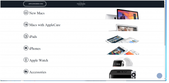
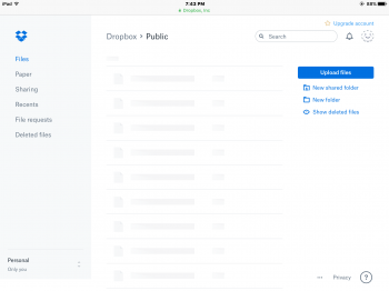
On the flip side, it feels like you're cherry picking websites that are "awful".
You're not going to find a lot of visual innovation from massive companies with marketing and data driven sites whose primary goal is convert sales.
You've also pigeonholed responsive sites as badly designed, but those are designed that way for reasons that have been mentioned many times in this conversation.
There are still lots of people doing interesting, artistic things on the web, they just aren't doing them on sites that have to process thousands of users an hour and convert them to sales.
I'm not asking for innovation and don't think innovation is needed if a site works well. I'm asking for the return of good non-faddish design that yes, some sites are still using and doing things well. There are just many other sites doing things so poorly, seemingly blindly following the white/blue/spaced-out fad that itself may have been an attempt to innovate beyond what used to work pretty well. In fact, many of them aren't even all about making a sale on that visit (like dropbox and paypal well after you've created an account), so it's not accurate to use the "must not entertain/distract customer, must make them move and think and buy quickly" excuse.
Amazon is a great example of a good site still doing things well, maybe the best I can offer. It's gently morphed with the times and occasionally trending more flat than say 5 years ago, but it's avoided several design sins that are the root of my critiques:
1. It's retained its basic layout for years. It was created well, it works well, it's aging well, and gentle refinements are implemented slowly, effectively, and for a reason that's not just for eye candy. This "do it right the first time then refine" was the Apple of pre-iOS7/2013.
2. It's retained a desktop/laptop-centric design that uses well the screen area available and usage of a mouse, instead of handicapping it to be a mobile-centric layout.
3. It's not morphed to an all-white frameless/borderless presentation with light-colored font (it smartly uses colors & "zones" to almost subconsciously guide the user and give that sense of "it just works")
4. It's not gone completely 100% flat just because Apple and some others did.
5. It uses bold font often, not uber-thin hard to focus-on font.
6. It's retained the use of key buttons that look like buttons and help the user realize where actionable key functions are.
7. It's retained an actual search "window/box" in plain sight that you can click into just once and start typing instead instead of following the followers by using a magnifying glass icon requiring two clicks, one to unhide the window/box text and then one for typing in it.
7a. The white search window/box doesn't have words like "Enter text here" or "Search" in darkish font pre-filled out which often confuse you into thinking you need to first delete that text.
8. It's retained individual popular/typical functions or actions up top and in plain sight so that only one click is all that's needed to get going, rather than hide them behind a hamburger/ellipses/gear icon for that supposed "clean/minimal interface" that requires 2 or 3 clicks each time.
9. Those items in #8 are specifically located up top so that you can perform 99% of the interactions you need from Amazon at first-look and without having to scroll down and hunt/look around. It's utterly amazing how many web designers today have forgotten the usefulness of seeing everything or at least 99% of everything you need to view at the first page load and without having to scroll up-and-down and up-and-down to get the full picture.
10. It's retained a stacked list of other popular functions at the bottom, and arranged smartly close together and not with a bunch of wasted space requiring more scrolling than you should need.
Websites that blow most or all those items are too numerous. Too much wasted space...thin fonts but with lots of wasted space, sacrificing the ability to see plenty of info on one screen (dropbox & paypal are especially bad compared to their prior layouts that used text/lines more efficiently)...mobile-centric-looking-screen-space-wasting layouts...
Dropbox.com
paypal.com
Microsoft.com
intel.com
cnet.com
I'll add others as I think of them.


