Become a MacRumors Supporter for $50/year with no ads, ability to filter front page stories, and private forums.
Here's the thing I hate:

As a designer you'll spend a lot of time creating a beautiful website on your desktop computer with a giant monitor...

But if people even visit your website these days (instead of your Facebook page) they're probably on a phone.

Thank goodness for responsive web design... but browsing from a phone eliminates most of your "design"

:(
 
  • Like
Reactions: BarracksSi
Here's the thing I hate:

As a designer you'll spend a lot of time creating a beautiful website on your desktop computer with a giant monitor...

But if people even visit your website these days (instead of your Facebook page) they're probably on a phone.

Thank goodness for responsive web design... but browsing from a phone eliminates most of your "design"

:(

Therein lies perhaps the biggest problem. Focusing on the designer’s need more than the user’s need. Focusing on mobile because of placing more importance on a perception of its being used most often, with the additional error of designing the desktop experience with mobile in mind, rather than vice versa.

Number one, most of us spend more time on a desktop then mobile, considering time spent in front of a computer at work and at home. Number two, mobile devices are getting increasingly large, not that I think that’s a good thing, but it takes away the real estate question more and more. Number three, quality of experience should be emphasized more than quantity of experience. I spend more of my waking day wearing shoes and sitting on a car seat or firm seat at work than being barefoot and sitting on a comfy chair or mattress at home, but I would never want to be required to wear shoes when I sleep or have my mattress or couch be as firm as my work chair just because I am in the work chair most often.

Awful emphasis nowadays on the mobile experience driving every other website experience, especially when today’s mobile experience designs du jour across platforms are so flat and vague.

Whoever decided pinch and zoom is so awful? Pinch and zoom a beautiful website with intuitive design on my iPhone versus a dumbed-down responsive design on my phone & desktop. I’ll take option A every day of the week.
 
Last edited:
Therein lies perhaps the biggest problem. Focusing on the designer’s need more than the user’s need. Focusing on mobile because of placing more importance on it’s perception as being used most often, with the additional error of designing the desktop experience with mobile in mind, rather than vice versa.

Number one, most of us spend more time on a desktop then mobile, considering time spent in front of a computer at work and at home. Number two, mobile devices are getting increasingly large, not that I think that’s a good thing, but it takes away the real estate question more and more. Number three, quality of experience should be emphasized more than quantity of experience. I spend more of my waking day wearing shoes and sitting on a car seat or firm seat at work than being barefoot and sitting on a comfy chair or mattress at home, but I would never want to be required to wear shoes when I sleep or have my mattress or couch be as firm as my work chair just because I am in the work chair most often.

Awful emphasis nowadays on the mobile experience driving every other website experience, especially when today’s mobile experience designs du jour across platforms are so flat and vague.

Yeah... most of us spend more time on a desktop computer... but the average person does not. Any web browsing they do will mostly be done on a phone.

My point was... there's not much "design" you can do to make a website look great on a phone. It all ends up getting crammed in a narrow single column with no personality.

You could make a website that looks amazing on a desktop... but there's a good change that most of its visitors will be viewing on a phone.

BTW... I wasn't really commenting on your initial topic. Though I agree with it. I hate the "white space" and "thin font" trends too.

I was just commenting on my frustration that most people are browsing on mobile devices... so your websites end up being over-simplified because of phone screen layout. :)

When I build a website... of course I'm starting with the desktop design. There's such a large canvas to play within. Even with something as simple as the navigation menu, I carefully choose fonts and spacing for the menu links, the rollover colors and dropdowns when you move your mouse pointer over each link, etc.

But on mobile... the menu is reduced to a hamburger.

And in the body it's the same story. You design a multiple column layout that looks great on a desktop... but it all flows into a single long column on a phone.

For the record... I do consider the mobile users... since most visitors will be using a phone.

I'm just saying I hate it... since all my hard work with designing a beautiful desktop website will not be seen by a phone user. :p
 
  • Like
Reactions: Tozovac
Ha, oh I hear you! But - why is pinch & zoom such the non-option? Think about it - content on a page is off-screen and accessed only via scrolling. So why not expect the user to pinch & zoom?

Sure, sure...one finger access, yadda yadda yadda. You can't have it all. It's a small phone, not a big screen. Too many of the web design and even computer application have thrown in the towel for good, balanced design in favor of mobile-first.

For me, quality over quantity any day of the week !
 
Last edited:
Surely it depends on who your audience is? What devices they use. And most important what the objective of the visit is.
 
Surely it depends on who your audience is? What devices they use. And most important what the objective of the visit is.

I'd agree. Too often, however, developers spew utter crap into a website that is technical in nature and used rather often on a laptop/desktop. Apple user community support pages being one of the best worst examples. It's minimalistic white/grey stripped down environment is 10 steps back from what it used to be. A completely unnecessary "improvement" just for the the sake of change.
 
  • Like
Reactions: xoAnna
Whenever I come across a webpage so badly designed that it really annoys me (looking at you, britishairways.com) I just open iTunes and imagine how much worse the UI could be.
.
.
.
.
.
.
.
.
.
.
.
.
.
.
.

Obligatory whitespace above.
 
  • Like
Reactions: eyeseeyou and Altis
Whenever I come across a webpage so badly designed that it really annoys me (looking at you, britishairways.com) I just open iTunes and imagine how much worse the UI could be.
.
.
.
.
.
.
.
.
.
.
.
.
.
.
.

Obligatory whitespace above.

That is a painful site. Where the !@#$#@% to begin??????

Last night I was looking for somewhere to take my girlfriend's young son. The site for this bounce park was utterly painful to navigate. The screen movement is so kitschy (on my macbook air) that it's difficult to focus on just one thing and get orientated as to where to start. Instead you waste time scrolling looking head-scratching. The dizzying effect seems to not show up when viewing the site on my iPad, however. Yet another site designed to please a designer's urge to be creative first and foremost.

http://flighttrampolinepark.com/pittsburgh/

Also check out the useless hamburger icon repeating the menu options at the top screen, but not exactly...letting you wonder whether it offers something different....or not.... or ???
 
Last edited:
  • Like
Reactions: adrianlondon
Microsoft may be leading the pack with awful, awful websites & apps & programs. Everything is flat, borderless, and light blue & white. Ever log into hotmail recently? No borders, all white, and lots of vagueness. New unread messages are not treated in any obvious/intuitive way such as bold text (how a new email has been designated for the past thousand years). No....now there's an "underline" but to the left and not under the email Subject.

Then there's a new Beta "updated" version of hotmail that's EVEN WORSE, as if that could be. But it be.

Why people. Why are you trying so hard? When will "good," intuitive design return?
 
  • Like
Reactions: Michael Scrip
Microsoft may be leading the pack with awful, awful websites & apps & programs. Everything is flat, borderless, and light blue & white.
Except for Sitecore (which is a Microsoft product, right), which is red, black, and white.

Other than that, it's just like you say, at least on the eLearning part of Sitecore's site, which I'm working through now (as a student, that is).

My main beef: There's no "Next" button. I complete one task in a course, then I have to go back to the main page for the course, scroll down, find the one I haven't done yet, start it, then click Complete -- which takes THREE clicks -- then go back to the main page again and find the next one.

Every other online tutorial thing I've seen so far as a "NEXT" button. But not Sitecore's. Why.
[doublepost=1515607274][/doublepost]
Here’s a sense of the crap I’m talking about. Obligatory medium blue, light blue, white layout; emails no longer arranged in small lines that are easily sortable but now looking intentionally like a Facebook feed.

When will this madness end?

https://blogs.office.com/en-us/2017/08/08/introducing-the-outlook-com-beta/

We need more voices like these:

https://outlook.uservoice.com/forum...ed-the-old-hotmail-from-the-late-nineties-bet
And this, in the comments in your second link (bolded emphasis mine):
Please, bring back the OLD INTERFACE of HOTMAIL. Was LIGHTER and FASTER for brazilians internet. Beta has a lot of unnecessary information on the interface that make it slow and havier. Isnt runnig well on PC's used to work, that hasnt good and expensive components.

It blows my mind how it looks like fewer elements are being drawn onscreen while more junk gets loaded where you can't see it. It's like the page designers are using the latest dozen-core desktops with gaming graphics to load locally-hosted sites, but never check to see if their sites work on older machines.

I visited a web development shop in 2016 and one of the devs had a G4 iBook, apparently to test compatibility with older machines and browsers. That's how it should be done.

I'm just a simple mechanical engineer with no app/web development experience outside of using iWeb in the mid-00's until Apple removed it, I guess because it was too helpful, too good, too easy, too customer-pleasing.

But a same thought applies to the overwrought reworking of iOS icons starting with iOS7, which I believe went to vector graphics in place gifs (or simple images)?

Given that Apple/Jony Ive supremely dumbed-down icon design starting with iOS7 to flat-design white-letter-or-shape-on-simple-monotone-background icons (sometimes enhanced with gradient), why again was vector-drawn icons needed, where I sometimes can see the wireframes being slowly drawn overtop of on my aging iPhone 5 that's getting slower each month it seems?

Even in the behind-the-scenes stuff, it seems over-complexity reinventions are happening just for the sake of change, and not ultimately for general customer experience enhancement, no?

You're absolutely right. The iOS icons got worse when they gave many of them a white background around an icon... it looks like they're unfinished.

While I'm on it, why on Earth did Apple make it so you can't tell when your phone or computer is shutting off? Both my phone and MacBook take a while to shut off, and I can't turn it on again until they're off... but I have absolutely no idea when they're finished shutting down.

I end up just retrying the power button every few seconds. You used to be able to see it shutting down and when the screen went blank, it was off.

There's no benefit to what they changed it to, like so many other changes they've made in the past few years.
 
You're absolutely right. The iOS icons got worse when they gave many of them a white background around an icon... it looks like they're unfinished.

The white-out plague that looks so unprofessional and unfinished is a scourge on all of app/web/iOS.

Even 4 years after iOS7 introduced all this white-out faint grey font pastel colored crap, each and every time I see iPhone or OSX screenshots like the below Apple marketing materials, I still feel this uncomfortable inner wincing as if I'm looking at Apple Amateur Hour...or unfinished product that was mistakenly released by engineering & Marketing.

Try this for fun. Take a screenshot of something like the below screens then post it in Instagram or Facebook which have both similarly adopted the white-out borderless aesthetic. Then scroll up and down and enjoy the confusion of trying to figure out where your image begins and ends amongst the similar borderless low-contrast white/grey environment. What crap. Can't wait till this fad passes and/or someone with *real* design talent at Apple rescues iOS/OS so that all the web design & 3rd party app developer lemmings outside of Apple can lemmingly follow suit and bring back some sensible, tasteful design again that looks like it took real talent to create.

ios11designchanges-800x524.jpg


apple-music-friends-ios-11-1.png


Screen Shot 2018-01-10 at 7.41.17 PM.png
 
  • Like
Reactions: Makayla and Altis
“Is it time for design to once again take a back seat to function? Let us know below.”

https://mspoweruser.com/science-proves-flat-design-mistake/

Yes!!! Design should never have ever taken a back seat. Further proof that Jony Ive is not as “genius” a designer nor good a visionary/leader that people give him credit for. Same for Tim and others over-prioritizing things like redesigning Apple stores via hiring an over-paid over-hyped fashion designer. There was nothing broken or in need of radical improvement before in the stores....just like ios/OS/website drsign.

The return to enjoyable non-frustrating Apple products and web design is hopefully upon us.
 
Who uses citicbank/citicards credit cards?

Well, citicards redid their site. Used to be you could download statements in different formats at the same page. Pdf, CSV, etc. Now it's "improved" to where you can only download statements in PDF format on one page. It tells you to go to your "Account Details" page to download other formats. Except when you go to what you think is your Account Details page (because it's not titled Account Details or called Account Details anywhere), there's no place to download a CSV format.

More steps to do what used to be done in a single step...flat design in grey & light blue & white....more crappy website design. Thank you and good night.
 
  • Like
Reactions: adrianlondon
If you look at websites from say 10 years ago to today, you will notice two very common themes which in my opinion are very negative of many of today's websites, social media focused and 'keep you' focused.

Many forums have changed their structure to simulate a kind of social media presence, in that they want you to feel like you are reading quickly written notes rather than a structured, border using, rigid forum structure. The other kind is the 'keep you' websites. They explode you with large professionally designed images/photos, forcing you to scroll down because of it being human nature to be intrigued as to what is going to appear next. Your then forced to click big print words or pictures or logo's to progress you further into the website, the whole premise into trying to keep you there as long as possible and why do they want to you to stay there? Advertisers, the longer you stay on a site, the easier it becomes for website owners to market their site at advertisers using site data claiming the average user stays on the site for x amount of seconds/minutes.

Now if you was to compare sites from 10 years ago, it would be a case of having nearly everything you wanted about the website actually in front of you on the main page. You looked at what you wanted, left then moved onto another site. Advertisement has put pay to this. Site's can measure how long a site visitor stays on the site and use this data to try and get advertisers to pay to advertise on their site. A paying advertiser is not going to want visitors leaving the site in a few seconds, they want them to stay so website designers have to design sites in such a way to try and keep visitors fixed to the site for longer, hence the big pictures, flashy images, bit text websites that we see today.

Remember, websites used to funded by the companies that owned them. Now they are funded by paid advertisements and it is these advertisers who are changing they way websites are designed. Designed to keep people on sites much longer.
 
  • Like
Reactions: BarracksSi
I don’t know...both sites look fine to me on my iPad....I don’t have issues with either Rolex, nor Tag....Well not their websites at least, I’m not a fan of Tag as they simply don’t suit me generally...
(I had posted links to Rolex and Tag Heuer websites)

https://www.tagheuer.com/en-us
This is crap. That carousel at the top? I haven't scrolled down, but the top chunk is totally missing from my view. I can't read it. No matter how much I try to scroll and see it, it won't come into full view. "blah blah EXPANDS". Then it automatically scrolls to eventually show a slide that says, "_____ Anniversary Autavia", but the "_____" part is off the top of the screen.

Who approved this? Did anyone test it?

Okay, let's go browse their watches:
https://www.tagheuer.com/en-us/watches

I guess it's easy enough to use the left sidebar to narrow it down by clicking Men's Automatic Blue-dialed watches. But man, that's a lot of scrolling.
(second and third screenshots)

Okay, let's pick the blue Link model. Big "hero photo" here, but it's kinda far down the window -- but it's fully visible and looks nice. But the stack of buttons on the right is half-missing when, instead, it could occupy the big empty field in the upper-right quarter of the window. It's forcing me to scroll if I want to do anything, so I scroll down to find more big empty space (and the dickbar that "responsively" appears across the top).

Two full scroll actions to see four small nuggets of information about the watch, plus enough white space to make me wonder if I'll need to shovel my driveway in the morning.

Oh hey, near the bottom of this section is a link for All Technical Information. Let's click it.

(the German page for the FAQ appears)

I'm not kidding. I've been on the English-language site and now a German version of a page came up in a new window. I DID NOT FABRICATE THIS IN ANY WAY. THIS IS EXACTLY WHAT HAPPENED.

Well, that's stupid. Let's close it, go back to the page for the Link watch, and hit the Back button in the browser. I want to see the other blue-dialed automatic men's watches.

(browser window full of every watch, starting with quartz-driven multicolored ladies' watches)

WTF. I'm back to where I started. Now I'll have to click through the feature selection sidebar again.
[doublepost=1516042637][/doublepost]
If you look at websites from say 10 years ago to today, you will notice two very common themes which in my opinion are very negative of many of today's websites, social media focused and 'keep you' focused.

Many forums have changed their structure to simulate a kind of social media presence, in that they want you to feel like you are reading quickly written notes rather than a structured, border using, rigid forum structure. The other kind is the 'keep you' websites.
..... [snipped for brevity]
Now if you was to compare sites from 10 years ago, it would be a case of having nearly everything you wanted about the website actually in front of you on the main page. You looked at what you wanted, left then moved onto another site. Advertisement has put pay to this.
.....
Remember, websites used to funded by the companies that owned them. Now they are funded by paid advertisements and it is these advertisers who are changing they way websites are designed. Designed to keep people on sites much longer.
John Gruber made a note about how Facebook is changing how they'll be counting user engagement (*barf*) in a way that'll make it clearer what counts as mere "traffic".
https://daringfireball.net/linked/2018/01/12/facebook-news-feed

He also linked to a tweet from Casey Newton: "So many publishers think they have audiences, when what they really have is traffic. I think we're about to find out who has an audience."
https://twitter.com/CaseyNewton/status/951619699829219328
 

Attachments

  • Screen Shot 2018-01-15 at 13.07.02.png
    Screen Shot 2018-01-15 at 13.07.02.png
    524.9 KB · Views: 264
  • Screen Shot 2018-01-15 at 13.19.39.png
    Screen Shot 2018-01-15 at 13.19.39.png
    421.2 KB · Views: 259
  • Screen Shot 2018-01-15 at 13.19.51.png
    Screen Shot 2018-01-15 at 13.19.51.png
    388.8 KB · Views: 264
  • Screen Shot 2018-01-15 at 13.20.07.png
    Screen Shot 2018-01-15 at 13.20.07.png
    475.1 KB · Views: 240
  • Screen Shot 2018-01-15 at 13.20.29.png
    Screen Shot 2018-01-15 at 13.20.29.png
    170.6 KB · Views: 232
  • Screen Shot 2018-01-15 at 13.20.33.png
    Screen Shot 2018-01-15 at 13.20.33.png
    174.6 KB · Views: 227
  • Screen Shot 2018-01-15 at 13.20.42.png
    Screen Shot 2018-01-15 at 13.20.42.png
    137.8 KB · Views: 243
  • Screen Shot 2018-01-15 at 13.20.49.png
    Screen Shot 2018-01-15 at 13.20.49.png
    98.2 KB · Views: 262
  • Screen Shot 2018-01-15 at 13.29.26.png
    Screen Shot 2018-01-15 at 13.29.26.png
    978.5 KB · Views: 281
  • Screen Shot 2018-01-15 at 13.31.46.png
    Screen Shot 2018-01-15 at 13.31.46.png
    306.5 KB · Views: 194
(I had posted links to Rolex and Tag Heuer websites)

https://www.tagheuer.com/en-us
This is crap. That carousel at the top? I haven't scrolled down, but the top chunk is totally missing from my view. I can't read it. No matter how much I try to scroll and see it, it won't come into full view. "blah blah EXPANDS". Then it automatically scrolls to eventually show a slide that says, "_____ Anniversary Autavia", but the "_____" part is off the top of the screen.

Who approved this? Did anyone test it?

Okay, let's go browse their watches:
https://www.tagheuer.com/en-us/watches

I guess it's easy enough to use the left sidebar to narrow it down by clicking Men's Automatic Blue-dialed watches. But man, that's a lot of scrolling.
(second and third screenshots)

Okay, let's pick the blue Link model. Big "hero photo" here, but it's kinda far down the window -- but it's fully visible and looks nice. But the stack of buttons on the right is half-missing when, instead, it could occupy the big empty field in the upper-right quarter of the window. It's forcing me to scroll if I want to do anything, so I scroll down to find more big empty space (and the dickbar that "responsively" appears across the top).

Two full scroll actions to see four small nuggets of information about the watch, plus enough white space to make me wonder if I'll need to shovel my driveway in the morning.

Oh hey, near the bottom of this section is a link for All Technical Information. Let's click it.

(the German page for the FAQ appears)

I'm not kidding. I've been on the English-language site and now a German version of a page came up in a new window. I DID NOT FABRICATE THIS IN ANY WAY. THIS IS EXACTLY WHAT HAPPENED.

Well, that's stupid. Let's close it, go back to the page for the Link watch, and hit the Back button in the browser. I want to see the other blue-dialed automatic men's watches.

(browser window full of every watch, starting with quartz-driven multicolored ladies' watches)

WTF. I'm back to where I started. Now I'll have to click through the feature selection sidebar again.
[doublepost=1516042637][/doublepost]
John Gruber made a note about how Facebook is changing how they'll be counting user engagement (*barf*) in a way that'll make it clearer what counts as mere "traffic".
https://daringfireball.net/linked/2018/01/12/facebook-news-feed

He also linked to a tweet from Casey Newton: "So many publishers think they have audiences, when what they really have is traffic. I think we're about to find out who has an audience."
https://twitter.com/CaseyNewton/status/951619699829219328

https://www.linkedin.com/in/paulo-venâncio-62615010 (IT project manager at Tag Heuer)
https://www.linkedin.com/in/alexandre-regard-8a924ab0 (IT digital manager at Tag Heuer)
Hit'em up!
 
  • Like
Reactions: BarracksSi
WTF. I'm back to where I started. Now I'll have to click through the feature selection sidebar again.

It's amazing, isn't it?

Thank God these genius web designers and their brilliant ways of doing things haven't gotten to my silverware drawer.

Before 2013: Open drawer. Shiny knives, forks, spoons, special utensils/bottle opener, and maybe soup spoons are all instantly presented in a nice bamboo organizer.

After 2013: Open drawer. Watch movie/animation of a fashionable hipster couple in a way-cool kitchen creating a fantastic dinner each time you open drawer. Scroll open the drawer more to finally see white flat-design forks on a blue-grey flat 2D background, but only forks. WTH? Open/scroll the drawer more and see knives, open more to get to the spoons. No other special utensils, bottle opener, etc. Scroll way back up (close the drawer) and find the hamburger button which opens up a new animation to present the special utensils.

This wacky New Order of inefficient, flat, monochromatic, space-wasting, hidden-menu website, app, and OSX design just plain sucks.
 
Last edited:
  • Like
Reactions: Michael Scrip
This wacky New Order of inefficient, flat, monochromatic, space-wasting, hidden-menu website, app, and OSX design just plain sucks.
This stuff has more in common with Win10 than it does with OSX (although I also think that iOS has had a big hand in it... but the last Windows Mobile was worse).
 
So why again do websites have to have barely-discernible light grey text?

http://www.wheelandwedge.com/about.html

Being that even cavemen used light grey font to signify "unavailable option" on their websites & apps, why again is light grey deemed appropriate for the main information being conveyed on websites today?

The only reason I can find is because all the lemmings followed Jony Ive and Apple's lead with their made-up new UI elements after iOS7 which used way too much thin, light-colored font. Any other reason?
 
  • Like
Reactions: Michael Scrip
Here we go again. Now Simplisafe has ruined their previously efficient and easy-to-use website with the flat design blue-grey-white space-wasting poison.

The "new and improved" website, with lots of great wasted space, with way oversized flat white/blue buttons because the older way of doing things was difficult.

Screen Shot 2018-04-03 at 9.31.31 PM.png


The older horribly convenient and efficient website is below, where a ton of useful info was instantly shown on ONE SCREEN without having to scroll & hunt around, and where it was very clear as to what was information-only and what was pressable/actionable for more information. Check out the new design for how awesomely difficult it is to read some of the text at the very bottom: thin white font on a blue background, very reminiscent of ios7’s crap UI and doing a great job of being difficult to read quickly and easily.

ss1.png


Please, who decided this horrible fad of blue/white/grey flat design space-wasting bullcrap web design is world-class? The funny thing is, Apple's UI was quite blue/white before. Hell, even the prior Simplisafe site was light blue-white. But the overall UI and approach was GOOD, using proven UI principles. The older way of website/iOS UI was GOOD! The newer way is NOT.

Is the new design at the top that much better than how things were, and I'm just not getting something?? What's going on here.
 
Last edited:
can anyone answer why websites today tend to have so much wasted space, large text, large photos, and seemingly no organization to steer the user? Take for instance:

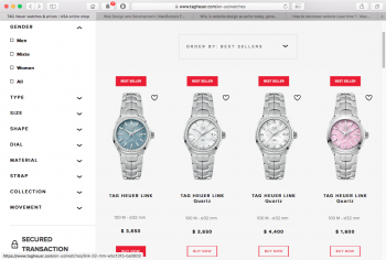
https://www.mvmtwatches.com/?utm_content=not_purchased&gclid=CJ2oq-K739QCFV2HswodErYIJw

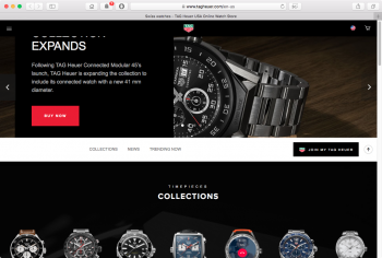
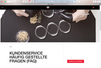
You have to scroll forever to see everything, and by the time you get to the bottom you've forgotten what existed up on top. Used to be that only websites for things like "how to meet girls," "how to lose weight," "how to spy on your neighbor," etc. consisted of one big seemingly never-ending page that required you to scroll "forever." Now even your bank's website "treats" you to a useless hero image (or video) or two or four you have to spend time moving past to get the useful stuff which is now typically large but whispy-thin low-contrast light-blue or grey color text on white backgrounds, often with no borders or gridlines and pretty much always displaying only 50-75% on the screen as what used to be shown, requiring too much additional scrolling than before.

Where did this come from? Was it from trying to make a website work for both desktop and mobile devices (where you tryi to please everybody but wind up pleasing nobody), so you just try to list everything on one of you, with large photos and wasted space, to seemingly be optimized for an iPhone or iPad but then shaft the desktop user?

Why the lack of gridlines/borders and why all the wasted empty white space at an extreme loss of organization and efficient use?

There's been a definite shift in website design from just a few years ago. Where did this come from?

Oh it's on purpose. o_O I think it is the dumbest trend ever. I put it right up there with modern achitecture and modern art. Basically, garbage. :eek:


"The hottest trend in Web design is making intentionally ugly, difficult sites

There’s an interesting trend in Web design these days: Making websites that look, well … bad.

Look at Hacker News. Pinboard. The Drudge Report. Adult Swim. Bloomberg Businessweek features. All of these sites — some years old, some built recently — and hundreds more like them, eschew the templated, user-friendly interfaces that have long been the industry’s best practice. Instead they’re built on imperfect, hand-coded HTML and take their design cues from ’90s graphics.

[The counterintuitive, GIF-tastic plan to redeem the modern Internet]

The name of this school, if you could call it that, is “Web brutalism” — and there’s no question that much of the recent interest stems from the work of Pascal Deville.

In 2014 Deville, now Creative Director at the Freundliche Grüsse ad agency in Zurich, Switzerland, founded brutalistwebsites.com. He meant it as a place to showcase websites that he thought fit the “brutalist” aesthetic: Design marked by a “ruggedness and lack of concern to look comfortable or easy” in “reaction by a younger generation to the lightness, optimism, and frivolity of today’s Web design.” (In architecture, brutalism describes a ’70s architectural movement characterized by large buildings with exposed concrete construction.)

The term’s gotten a lot of pick-up in recent weeks, since Deville’s site appeared on Hacker News and promptly went viral. Deville saw unique visitors to his site rise to over 100,000 in 24 hours, with 160,000 page views. And the interest has not slowed since then: Deville now receives over 100 site submissions a day.

“It’s not only what you can see, it’s also how it’s built,” Deville explained, of the submissions he selects as emblematic of the style. “… In the code you can see if it’s really a streamlined application or it’s a very rough, handmade, HTML website.”

Intriguingly, Deville has found in his Q&As with coders and designers that few set out to mimic this newly popular aesthetic; instead, they all arrived at the same point out of a drive to create something original.

“[Brutalism] is interesting to me … because it doesn’t necessarily have a defined set of aesthetic signifiers,” said Jake Tobin, the designer behind trulybald.com. “What defines those signifiers is decided by the platform it’s built on.”

His site, trulybald.com, is both the Internet home of Truly Bald Records and a Web playground, with flashing colors, irregular spacing and a unique typeface: a reaction to professionalism and digestibility built with HTML, PHP and a simple text editor.


Nathaniel Smith, of tilde.town, echoed that sentiment.

“I designed a brutalist web site to show that we can still do wonderful things together on the web without so-called ‘best practices,'” he told Deville, in an interview published on his site on April 19.

There’s one big problem with this aversion to rules, of course: It makes it that much harder to pin “brutalism” down. Already, Deville says, it may be time to dream up “a new definition of this kind of website,” to include more of the iterations we’re seeing now.

But brutalism remains one of those things where you know it when you see it. And lately, you see it a lot."

https://www.washingtonpost.com/news...e-sites/?noredirect=on&utm_term=.fdab42c352ab
 
Register on MacRumors! This sidebar will go away, and you'll see fewer ads.