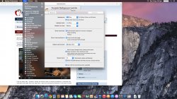
How does it look? I have the fear it will look awfully pixelated on my 27" iMac because of all the thin lines.
Got a tip for us?
Let us know
Become a MacRumors Supporter for $50/year with no ads, ability to filter front page stories, and private forums.
Yosemite on non-retina Macs?
- Thread starter iKnackwurst
- Start date
- Sort by reaction score
You are using an out of date browser. It may not display this or other websites correctly.
You should upgrade or use an alternative browser.
You should upgrade or use an alternative browser.
Looks ok for me (Early-2011 MacBook Pro 15-inch)...Fonts are a touch 'sharp', but its fine other than that.
If anything, I reckon (to my eyes), it looks better than Mavericks...But that's just my opinion.
If anything, I reckon (to my eyes), it looks better than Mavericks...But that's just my opinion.
How does it look? I have the fear it will look awfully pixelated on my 27" iMac because of all the thin lines.
It won't be any different than how Mavericks looks on non-retina Macs compared to models with a Retina screen. Since Apple uses pixel doubling on retina models, the original fonts will not be pixelated on lower resolution screens. That's one thing Apple has addressed well ever since the rMBPs were first released.
Its early days, but I have found on my cinema display it can be quite hard looking with some sharp edges as you say. I would say a small step backwards on non-retina, however on my retina Macbook display it looks gorgeous. I expect this will all be resolved in time though.
I made a quick comparison of using my mac and a screenshot i found. It does look quite thin. Not so much on the font but on the icons it is very noticable.


I have an early 2011 MBP and a Thunderbolt Display, and text looks fine on both. Nothing to worry about.
How does it look? I have the fear it will look awfully pixelated on my 27" iMac because of all the thin lines.
Right now it DOES look awful on typical 1920 x 1080p monitors.
But if you look closely, its because this early beta is NO WHERE NEAR complete in terms of design. There are jagged edges and font smoothing and gamma and so many other visual issues that have yet to be fully tweaked.
It will look a lot better on regular displays over the summer.
No need to panic. Its beta 1.
How does it look? I have the fear it will look awfully pixelated on my 27" iMac because of all the thin lines.
Actually the font on Mavericks was very harsh for non retina displays. This one on the other hand is much more universal and looks abit more like win7 font, that is, being way sharper than before without these harsh looking edges on the letters.
PS. Bold (like it was) and sharp are 2 entirely different things.
Anyone have a mid-09 13" MBP? Mavericks looks washed out on mine, so I'm interested in what Yosemite might look like.
I am running it on a cMBP 15" and it looks just fine in my opinion. Then again I don't look at my screen from inches away.
I installed the public beta on my late 2009 27" iMac, and it was blurry as heck! I couldn't get over how blurry text looked (bookmark names in tabs, etc). My first thought was that Apple will be pushing retina-enabled macs with this new release, saying how well-paired the beautiful layout will look on such a display. But what about all the non-retina enabled macs out there? Hopefully this will change by the final release.
anyone else notice blurry text on non-retina displays? FWIW I went back to Mavericks and everything immediately looked razor sharp again.
anyone else notice blurry text on non-retina displays? FWIW I went back to Mavericks and everything immediately looked razor sharp again.
I made a quick comparison of using my mac and a screenshot i found. It does look quite thin. Not so much on the font but on the icons it is very noticable.
Image
I don't know where you got that Yosemite image, but the PB is not like that, the full screen button is no longer in the bar, is the green button next to the minimize yellow button.
This is the Yosemite one and it looks pretty good.
Attachments
I have seen some smaller fonts render really bad (but not in all places), the menu when you right click a dock icon has edges that look like a chainsaw, when you open a stack the labels also render badly and a few other things among these lines. I remain hopeful that these problems are going to be fixed.
I have no idea how any of you are missing the WiFi icon.
I'm on a Late 2011 MBP and the Wi-Fi icon is very visible and easy to see.
For me, It's hard to undo years of being familiar with the way a certain thing looks, especially when I still frequently go back to my production machine with Mavericks on it. An empty wi-fi bar of signal strength on Mavericks is "bolder" than a full bar on Yosemite.
For example: Image has Yosemite up top with full signal strength, Mavericks below with wi-fi on, but not connected to a network. Translucent menu bar is enabled on both.
Attachments
Register on MacRumors! This sidebar will go away, and you'll see fewer ads.


