i'm not into design more video prod. but whoever started the rotating burst effect in commercials should quit and some up with something more original
Got a tip for us?
Let us know
Become a MacRumors Supporter for $50/year with no ads, ability to filter front page stories, and private forums.
Your not-so-favorite design Clichés
- Thread starter Yr Blues
- Start date
- Sort by reaction score
You are using an out of date browser. It may not display this or other websites correctly.
You should upgrade or use an alternative browser.
You should upgrade or use an alternative browser.
i'm not into design more video prod. but whoever started the rotating burst effect in commercials
...should be fired? im not sure what you're talking about. youtube vid example? 😀
...should be fired? im not sure what you're talking about. youtube vid example? 😀
here's an example of what it looks like:

It looks something like that, now it just goes around in a circle and then they add a logo on top
This thread is a real education for any designer, especially a new, fresh and wet behind the ears designer.....
Coming from an animation background, where we were taught that a cliché is your friend, it can be difficult getting out of that mind set.
I agree with Jim and Melrose wholeheartedly, but we have all got to make a living.
I live in the hope that someday i will be given the opportunity to design something that really says something (vague i know!), this blind hope is what keeps me going when i have to deal with clients with 'big' ideas.
🙂
PS..... I know i would appreciate more pictures in this thread, anyone else?
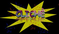
Someone (maybe me) should take the word cliche and use it as a logo combining every design element in this thread.
It makes a little sick just to look at it, but here you go.
Attachments
clichés
everything you guys mentioned sounded so cool to me until I read it in THIS thread. thanks a lot, ******S!
😀
everything you guys mentioned sounded so cool to me until I read it in THIS thread. thanks a lot, ******S!
😀
It makes a little sick just to look at it, but here you go.
*heave*

Lens Flare
Back lit 3D text (it was big around 2000 but thankfully not use as much anymore)
Animated GIFs
Rainbow gradients
Looped animated icons
The if in doubt "dropshadow diarrhea " approach
No whitespace
Comic Sans
Those stupid "emotional" images
Putting the word "Pro" after every service a company has... (Although more of a branding thing)
Spelling words like a retard in names... Nestle Expresso comes to mind (Again another stupid branding thing...)
Web site exported from Powerpoint and clients ask "Why doesn't this work?"
Just to name a few...
I bet I can think of a couple of things to add to the list:
- The frightfull overuse of "organic" texturing and primary graphics that seems to finally drift away from most designers these days.
- As some of you have allready mentioned, the mirror/puddle-effect (web 2.0 whatever) It's being used on everything it seems.
I would be nice if companies got a crash course in graphic design. I'm pretty tired of having to explain CMYK, why comic sans is not to be used and why you should never send a logo (100 x 100 px) inserted in a word document if you want it to be resized to 4 x 4 meters without me having to do extra work.
So there 😡
PS: ezekielrage_99, "dropshadow diarrhea" cracked me up, it's been 15 minutes and I'm still laughing 😀
why you should never send a logo (100 x 100 px) inserted in a word document
OMMFG, AMEN TO THAT!
I would be nice if companies got a crash course in graphic design. I'm pretty tired of having to explain CMYK, why comic sans is not to be used and why you should never send a logo (100 x 100 px) inserted in a word document if you want it to be resized to 4 x 4 meters without me having to do extra work.
OMMFG, AMEN TO THAT!
...and why you should never send a logo (100 x 100 px) inserted in a word document if you want it to be resized to 4 x 4 meters without me having to do extra work.
SO true!
I also love it when they give you whatever they want to print, and what you receive is a PowerPoint doc that don't even has the proportions right. I swear, they even ask you to print a square, but what they send you is a rectangle, but since it has included text with measures (50x50), then it is indeed a square.
PS: ezekielrage_99, "dropshadow diarrhea" cracked me up, it's been 15 minutes and I'm still laughing 😀
Thank you, I said that after a meeting with a very difficult client, it cracked up my boss and fellow workers...
All of the suggestions from the client revolved around:
1) Sequence 1 - Add dropshadow
2) Sequence 2 - Add dropshadow
3) Sequence 3 - Add dropshadow
4) Sequence 4 - Add dropshadow
5) Sequence 5 - Add dropshadow
Hence the "dropshadow diarrhea".
How about a web one; on a rollover, the link has an underline, yet the word that the link actually is has descenders, therefore the underline cuts right through them. It's one thing from non designers, but I've been on several design sites and I see this. Drives me crazy. Not really a cliche, though, I'll have to think of another besides the obvious things like Comic Sans and Papyrus.
Web stickers with peeled corners that the Web Designer Magazine is a big fan of using these!
Here's a good example...
Here's a good example...
I try and stay clear away from the obvious cliches. Other than that, most things are cliche, I just either change it up and take a different spin. I would never use the business handshake photo. But I would guess that any client would be fine with it. I never show that as an option.
Web stickers with peeled corners that the Web Designer Magazine is a big fan of using these!
Here's a good example...
I forgot the peeled-sticker look!
Register on MacRumors! This sidebar will go away, and you'll see fewer ads.