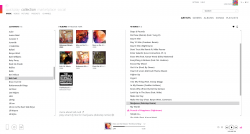
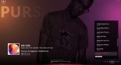
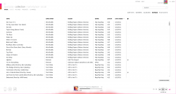
I'd not get into the device support part, because I don't own a Zune so I don't know how it syncs with the software so I'll just discuss the interface for music library. I have to say that the interface is beautiful with the Metro UI, elements that fade in/out, the auto-collage of album art, the responsiveness. Just as a music manager, Zune is WAY better then iTunes. It just looks hip, cool, artistic. Wasn't Apple supposed to be that?
Got a tip for us?
Let us know
Become a MacRumors Supporter for $50/year with no ads, ability to filter front page stories, and private forums.
Zune vs iTunes
- Thread starter KingCrimson
- Start date
- Sort by reaction score
You are using an out of date browser. It may not display this or other websites correctly.
You should upgrade or use an alternative browser.
You should upgrade or use an alternative browser.
The Zune software is actually pretty good. The problem is that MS was too late to market. By the time the Zune hardware and software was released, Apple had a 5 year head start in the market. And to be honest, the first gen Zune wasn't that great. It's too bad, though. The Zune HD is pretty good and Zune Pass is kind of cool.
The Zune software is actually pretty good. The problem is that MS was too late to market. By the time the Zune hardware and software was released, Apple had a 5 year head start in the market. And to be honest, the first gen Zune wasn't that great. It's too bad, though. The Zune HD is pretty good and Zune Pass is kind of cool.
This post pretty much hits the nail on the head.
The Zune software is actually pretty good. The problem is that MS was too late to market. By the time the Zune hardware and software was released, Apple had a 5 year head start in the market. And to be honest, the first gen Zune wasn't that great. It's too bad, though. The Zune HD is pretty good and Zune Pass is kind of cool.
A new-gen Zune HD with Mango and WiFi, with up to 96GB would be a def competitor to the iPod Touch. We NEED choices other then 1.
A new-gen Zune HD with Mango and WiFi, with up to 96GB would be a def competitor to the iPod Touch. We NEED choices other then 1.
At this point, I don't think it would matter. Even iPod sales are slumping lately because smart phones are killing the dedicated personal media device. Personally, I like to keep mine separated, but I'm weird like that.
A new-gen Zune HD with Mango and WiFi, with up to 96GB would be a def competitor to the iPod Touch. We NEED choices other then 1.
We're at the point of diminishing returns for the iPod family and its competitors. It makes little sense to pour more R&D money into a product that is at the end of its life cycle.
Zune software compared to iTunes makes iTunes look like a Leapfrog or Matel toy.
Zune is more responsive, nicer to look at, and nicer to use.
My GF who loves Apple stuff even agrees and wanted the Windows Phone zune player program on her phone.
Zune is more responsive, nicer to look at, and nicer to use.
My GF who loves Apple stuff even agrees and wanted the Windows Phone zune player program on her phone.
Attachments
Last edited:
I loathed the Zune software, and I was pretty sad about purchasing the device, because it was so clearly inferior to the iPod that came out shortly after I bought it. I would have kept it if Microsoft could have done something to increase its viability, but while the iPod got updates and iTunes became more and more flexible, the Zune software and device was stuck in time. I suppose if I had 80GB of music I could have somehow justified the purchase, but I eventually was able to sell the Zune for a pittance. iTunes is far from perfect, and certainly lacks they style of Zune's interface, but I like it a lot more overall, and my iPod is infinitely more enjoyable than the Zune.
I loathed the Zune software, and I was pretty sad about purchasing the device, because it was so clearly inferior to the iPod that came out shortly after I bought it. I would have kept it if Microsoft could have done something to increase its viability, but while the iPod got updates and iTunes became more and more flexible, the Zune software and device was stuck in time. I suppose if I had 80GB of music I could have somehow justified the purchase, but I eventually was able to sell the Zune for a pittance. iTunes is far from perfect, and certainly lacks they style of Zune's interface, but I like it a lot more overall, and my iPod is infinitely more enjoyable than the Zune.
Zune software "stuck in time"? If anything it makes iTunes look stuck in 1995.
We're at the point of diminishing returns for the iPod family and its competitors. It makes little sense to pour more R&D money into a product that is at the end of its life cycle.
Agreed. The stand alone media player is going the way of the dodo bird.
Zune software "stuck in time"? If anything it makes iTunes look stuck in 1995.
Opinion of course, just like the previous post. I liked iTunes before they planted all the iOS stuff in it. I see why they did it but I think it needs some redoing. The iTunes name is so entrenched I don't see it going anywhere anytime soon.
I have yet to find just a stand alone music catalog/jukebox player that does what I need iTunes to do.
Agreed. The stand alone media player is going the way of the dodo bird.
Which is why Apple has sold a gazillion iPod Touch & iPod Nanos. Why should I buy a freakin' phone when I need an audio player?
Which is why Apple has sold a gazillion iPod Touch & iPod Nanos. Why should I buy a freakin' phone when I need an audio player?
Dah for the phone of course!
I own a macbook pro as of last July. Though I was a Zune User from the first Zune 30, Zune Pass on the zune platform is massively awesome. I loved it and still do, the only Reason I don't now is because I'm stuck with a Zune 30 which doesn't sync with a mac and is a pain to boot into windows just for syncing it. Zune is amazing though for sure.
I own a macbook pro as of last July. Though I was a Zune User from the first Zune 30, Zune Pass on the zune platform is massively awesome. I loved it and still do, the only Reason I don't now is because I'm stuck with a Zune 30 which doesn't sync with a mac and is a pain to boot into windows just for syncing it. Zune is amazing though for sure.
Can you use the Windows Phone connector?
I like iTunes. It's functional, easy to use, but still fully featured enough that I can easily sort and keep track of thousands of files. Since iTunes integrate seamlessly with my devices, I see no other software that could provide a better user experience for me.
It was such a pain to use. I don't miss it one bit. In terms of functionality, I felt like the device and software were pretty much obsolete as soon as I started using them. I guess we all have our own opinions about style. I can think of lots of improvements I'd like to see for iTunes, but turning it into the Zune interface isn't one of themZune software "stuck in time"? If anything it makes iTunes look stuck in 1995.
Can you use the Windows Phone connector?
Nope, it only works with the Zune HD and Windows Phone 7 devices.
I like iTunes. It's functional, easy to use, but still fully featured enough that I can easily sort and keep track of thousands of files. Since iTunes integrate seamlessly with my devices, I see no other software that could provide a better user experience for me.
Yep. iTunes is so much more powerful. It is far from perfect, and not as sexy to look at, but it is pretty easy to use, and that is hugely important, especially when you consider all of the load it carries every day for me syncing everything.
I like iTunes. It's functional, easy to use
I find iTunes the most unintuitive, confusing and bloated program ever. Certainly not easy to use, I feel the current Windows Media Player is far simpler.
iTunes needs an overhaul. A redesign. A rethinking. Some useless features such as Ping cut out of it. Hell, I'd even scrap the iTunes store, movies, iOS device syncing and much more and put them features into other/separate, more suited apps and keep iTunes what it simply should just be: a music player and library.
Opinion of course, just like the previous post. I liked iTunes before they planted all the iOS stuff in it. I see why they did it but I think it needs some redoing. The iTunes name is so entrenched I don't see it going anywhere anytime soon.
I have yet to find just a stand alone music catalog/jukebox player that does what I need iTunes to do.
Agreed, itunes has gotten bloated and the features that have been added do not increase the functionality (I'm looking at you Ping). Yet while it may be bloated, I've not really found another product that does what it does so well.
I was spoiled with the itunes/iPhone integration, when I moved to an android device, I so how meager the offerings were for a mechanism to help sync my music
I find iTunes the most unintuitive, confusing and bloated program ever. Certainly not easy to use, I feel the current Windows Media Player is far simpler.
How? I am curious of your specifics on what makes it so confusing.
Back with Mac OS 9, I used the paid version of Musicmatch and then 2 months later iTunes 1.0 came out. It was very lean and clean. But because I grew with iTunes with each new release I didn't see the bloat that people talk about. It is just the nature of the last 10 upgrades. Nothing wrong with it. There is still more work that needs to be done for an iTunes 11.
I was spoiled with the itunes/iPhone integration, when I moved to an android device, I so how meager the offerings were for a mechanism to help sync my music
I agree. When I bought my Droid I was quite shocked at what I found. I think we have come so far with iTunes, we sometimes forget what it is like to be without it. Whatever its drawbacks, it handles a bewildering variety of tasks quite gracefully.
Disagree, not everyone wants a smartphone. I still see plenty of folks with ipods and plain old dumbphones, or even smartphones like BBs or even an android here and there. A friend of mine in the States has a 6g nano for sports for example but uses a Droid X as her smartphone.Agreed. The stand alone media player is going the way of the dodo bird.
Register on MacRumors! This sidebar will go away, and you'll see fewer ads.


