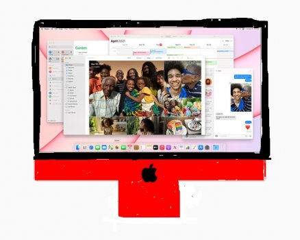
Decided to PS a black bezel and color matched Apple logo - just to see how it would look. 

Got a tip for us?
Let us know
Become a MacRumors Supporter for $50/year with no ads, ability to filter front page stories, and private forums.
2021 iMac Design w/ Black Bezels
- Thread starter mrwood
- Start date
- Sort by reaction score
You are using an out of date browser. It may not display this or other websites correctly.
You should upgrade or use an alternative browser.
You should upgrade or use an alternative browser.
Was waiting on someone to do that... 1000 times better (to me). Although I'd also want the keys and the mouse to be black too 
Yeah as much as I dislike the white bezels (mostly for the arguably worse functionality), the black bezels make the new design look almost identical to the outgoing design.
The borders are NOT white, they are light gray.

Jesus that is 1000 times better.Decided to PS a black bezel and color matched Apple logo - just to see how it would look.
View attachment 1760869
They call it light gray. It's clearly white.
Since they went through the effort to offer it with different case colors, they missed an opportunity to offer it with the option of black bezels for an extra $100 like they did the black polycarbonate MacBook over the white model.

Can one of you Photoshop nerds PRETTY PLEASE do a mockup of a saturated red chin/stand with black bezels? I'd love to see what the looks like. (also orange, if possible)
This machine would've been a total home run for me had they ditched the two-tone pastel scheme and gone with nothing bold colors + black bezels. Here's what I wish they would've done instead. (disclaimer: graphic design is not my passion)

This machine would've been a total home run for me had they ditched the two-tone pastel scheme and gone with nothing bold colors + black bezels. Here's what I wish they would've done instead. (disclaimer: graphic design is not my passion)

Was also waiting for this. I disagree with you though; I think it looks a million times better.Was waiting on someone to do that... 1000 times better (to me). Although I'd also want the keys and the mouse to be black too
To be fair, the original iMac G3, the 2nd gen iMac G4, the third-gen iMac G5, and the first Intel iMac all had white or light gray bezels. The black bezels only started with the aluminum iMacs in 2007.

I like the white bezels, having always chosen silver iPads for that reason. The yellow iMac looks awesome. Count me in. Or maybe green; can't decide.
Does it look better because it looks better, or because it’s just more similar to the same iMac we’ve been looking at for 12 years?
To me, adding the white border is just Apple trying to make the iMac look fresh when in reality, the bezel and chin isn’t all that reduced from the past 14 years. And it works imo. That black bezel mockup looks dated imo.
To me, adding the white border is just Apple trying to make the iMac look fresh when in reality, the bezel and chin isn’t all that reduced from the past 14 years. And it works imo. That black bezel mockup looks dated imo.
What I would improve over the new design:
1. If chinless is not feasible, smaller chin
2. Thinner bezels in black
3. Space gray color
4. Matching black key, etc. accessories
5. I agree having no logo on the front makes the chin look weird, I discreet logo would be welcomed
Maybe a darker option option will come with a higher-end 30" iMac or AS Mac Pro.
The abrupt removal of the logo makes the chin even more awkward, especially for anyone that's already familiar with the iMac brand. They could've added a shiny one in the same color, like they do on the iPhone Pro, iPad, and MacBooks.What I would improve over the new design:
1. If chinless is not feasible, smaller chin
2. Thinner bezels in black
3. Space gray color
4. Matching black key, etc. accessories
5. I agree having no logo on the front makes the chin look weird, I discreet logo would be welcomed
Maybe a darker option option will come with a higher-end 30" iMac or AS Mac Pro.
Well said. I think the key would be finding the right size of the logo. Keeping it smaller this time around to maintain a nice balance.The abrupt removal of the logo makes the chin even more awkward, especially for anyone that's already familiar with the iMac brand. They could've added a shiny one in the same color, like they do on the iPhone Pro, iPad, and MacBooks.
Right now the chin sorta looks unfinished as opposed to minimal.
That looks much much better!Decided to PS a black bezel and color matched Apple logo - just to see how it would look.
View attachment 1760869
Lmao, you know what this looks better than the real one.Can one of you Photoshop nerds PRETTY PLEASE do a mockup of a saturated red chin/stand with black bezels? I'd love to see what the looks like. (also orange, if possible)
This machine would've been a total home run for me had they ditched the two-tone pastel scheme and gone with nothing bold colors + black bezels. Here's what I wish they would've done instead. (disclaimer: graphic design is not my passion)
View attachment 1760955
Decided to PS a black bezel and color matched Apple logo - just to see how it would look.
View attachment 1760869
If the entire device was all black problems solved. This is such a stupid Apple move.
Im Sure it will be the best selling iMac everIf the entire device was all black problems solved. This is such a stupid Apple move.
hopefully the bigger iMac doesn’t have white bezels
Colours are fashion linked. In the UK the vast majority of car drivers choose black, white or Grey. Of course they’re convinced that their ‘polar glacial white’ is so much classier than the other ‘whites’ out there. In truth they have been convinced to forgo a world of colours. Apple, perhaps, maybe leading the way to make our world a little more colourful, embrace it folks.
The ‘pro’ models of the iMac with the successor to the M1 will obviously have ‘professional’ colours w/black bezels.
The IPP gives a huge clue as to how they’ll look.
We all need to stop judging the M1 ‘consumer/prosumer’ models as if they’re intended for Pros. They’re obviously not.
This new 24” model is obviously for light productivity (including web design etc) for:
- media / marketing / advertising / PR & other creative industries.
- home office.
- family computers
- & all those who’ve used a mac all in one for decades - in fact it very much seems to be calling out to those who bought one of the G3 iMacs.
oh look. now it looks exactly like the old one looked for the last ten years. Just in weird green.Decided to PS a black bezel and color matched Apple logo - just to see how it would look.
View attachment 1760869
Yes, much better. "White" bezels was so 11+ years ago, so if anything looks dated it is those. Who knows, maybe avocado green appliances will make a comeback too.oh look. now it looks exactly like the old one looked for the last ten years. Just in weird green.
Register on MacRumors! This sidebar will go away, and you'll see fewer ads.

