Become a MacRumors Supporter for $50/year with no ads, ability to filter front page stories, and private forums.

4sallypat

macrumors 601
Sep 16, 2016
4,031
3,781
So Calif
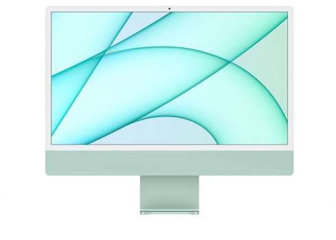
I really don't get it why people want a logo on their product. I think it looks much more sophisticated without the logo and am happy they removed it. The display generates heat, that's also why the 32" Pro XDR display has the cheese grater on the back. It's not efficient to place all computer parts behind the display because thermal throttling happens much faster. I think there's something to say for black and white bezels. I love how these look with the colors, less tech-y and more friendly in a living room or public office. If they release darker computers black bezels would look better. But to each his own.
I think it stems from the old days when the white Apple logo glowed telling everyone that they had a Mac.

Then the newer Mac took the glowing logo away and replaced it with a shiny logo instead.

Now, this iMac has no logo which is disturbing to some.

I don't know why people obsess over color, bezels, logos, etc...

I buy the device for it's intent - computing - I already know it's a Mac so I don't need to show it off - especially a device that sits on a desk not taken around town like Macbook...

If I wanted an art piece to show off, I'd hang the iMac in a frame....
 

trip1ex

macrumors 68040
Jan 10, 2008
3,230
1,899
I did a mockup too.

1619468568339.jpeg


Added black, logo and silver color.
 

ignatius345

macrumors 604
Aug 20, 2015
7,574
12,924
I'm just gonna leave this here:


I'm on the fence about replacing my 2014 iMac 5K, myself. Thinking
1) tough it out and wait for a true iMac successor to it that's at least the same size;
2) buy the M1 iMac and see if the smaller size actually bugs me or I get used to it; or
3) pick up an Apple refurbished 5K iMac from 2020 with good specs and ride that out for a few years.
 

Successful Sorcerer

macrumors regular
Nov 23, 2019
178
143
I'm just gonna leave this here:


I'm on the fence about replacing my 2014 iMac 5K, myself. Thinking
1) tough it out and wait for a true iMac successor to it that's at least the same size;
2) buy the M1 iMac and see if the smaller size actually bugs me or I get used to it; or
3) pick up an Apple refurbished 5K iMac from 2020 with good specs and ride that out for a few years.
Depends a bit if you need it now, otherwise I'd wait a few months. Later this year they'll probably release the larger iMacs. I wouldn't pick up an intel mac anymore unless you really need it to be intel for a reason. They chose the M1 direction and I think an Apple Silicon mac will be supported longer.
 
  • Like
Reactions: ignatius345

ignatius345

macrumors 604
Aug 20, 2015
7,574
12,924
Depends a bit if you need it now, otherwise I'd wait a few months. Later this year they'll probably release the larger iMacs. I wouldn't pick up an intel mac anymore unless you really need it to be intel for a reason. They chose the M1 direction and I think an Apple Silicon mac will be supported longer.
Fair points. I think I'd only get another Intel iMac 5K if mine died very soon and/or if I spotted a great deal on one. You're definitely right that the Apple Silicon ones will be supported a lot longer, but I doubt Intel support will go away too soon.
 
  • Like
Reactions: Successful Sorcerer

kmj2318

macrumors 68000
Aug 22, 2007
1,669
712
Naples, FL
The black against the pastel doesn't work for me. I've read a lot of comments saying they wish the chin had the more saturated color. I tried doing that with the black borders. It's ok, not great. I think having the front and stand the same color, looks kind of cheap. Even though the two tone is weird, I can see why they did 1) not use black borders against the pastel and 2) not use the saturated color all around. Also all this color with the black looks a lot more sporty than they were trying to go for.

imac-blue.jpg

imac-red copy.jpg
imac-green copy.jpg
 
Last edited:

Successful Sorcerer

macrumors regular
Nov 23, 2019
178
143
Fair points. I think I'd only get another Intel iMac 5K if mine died very soon and/or if I spotted a great deal on one. You're definitely right that the Apple Silicon ones will be supported a lot longer, but I doubt Intel support will go away too soon.
No intel won't go away soon but maybe you'll miss out on features. Intel doesn't have the Neural Engine cores for example. We don't know yet how those will be incorporated in the system in the future. Just like you say, if your computer works good enough for now I'd keep it and wait for the larger iMacs.
 
  • Like
Reactions: ignatius345

Jorbanead

macrumors 65816
Aug 31, 2018
1,209
1,438
The black against the pastel doesn't work for me. I've read a lot of comments saying they wish the chin had the more saturated color. I tried doing that with the black borders. It's ok. I think having the front and stand the same color, looks kind of cheap. Even though the two tone is weird, I can see why they didn't 1) not use black borders against the pastel and 2) not use the saturated color all around. Also all this color with the black looks a lot more sporty than they were trying to go for.

View attachment 1766688
View attachment 1766689 View attachment 1766690
Agreed 100% the saturated color on the front doesn’t look as good and is a bit distracting too. They neutral tones work a lot better for viewing.

I think most people here probably are not the target demographic for this iMac and that’s okay. Not every Apple product is for you. This iMac is going to sell like hot cakes because it’s fun and playful like the original iMac. It’s not meant to be this super sleek, dark, sophisticated, professional product. It’s a Mac for the family, for kids, students, for reception desks, school computer labs.
 

ZachNathan

macrumors member
Apr 25, 2014
65
100
New York, NY
No intel won't go away soon but maybe you'll miss out on features. Intel doesn't have the Neural Engine cores for example. We don't know yet how those will be incorporated in the system in the future. Just like you say, if your computer works good enough for now I'd keep it and wait for the larger iMacs.
Not to mention you immediately lose support for any sort of current/future bio-authentication (TouchID or...?). That's a huge no-no for me regarding Intel chips.
 

Lemon Olive

Suspended
Nov 30, 2020
1,208
1,324
Yeah as much as I dislike the white bezels (mostly for the arguably worse functionality), the black bezels make the new design look almost identical to the outgoing design.
Which is unfortunately why it was probably rejected for the worse design.
 

satchmo

macrumors 603
Aug 6, 2008
5,216
6,090
Canada
Yeah as much as I dislike the white bezels (mostly for the arguably worse functionality), the black bezels make the new design look almost identical to the outgoing design.

And they could have avoided that with a design that was markedly different (i.e. no chin).

But they picked slim with chin, over thick and black. Cripes, that sounds dirty.:oops: 😁
 

Jorbanead

macrumors 65816
Aug 31, 2018
1,209
1,438
One thing I don’t see people mention much is that Apple has one of the best industrial design teams in the world (they hold the record for most awards). I can guarantee that this team workshopped almost every possible concept, combination of colors, thickness, bezel vs no bezel, and have seen every variation of the iMac we could create. They very clearly made this design choice for a reason. Wether you like it or not is of course always subjective, but it’s likely people who are much smarter than all of us in this area made these decisions. We may never know for sure all of the reasons why.

My theory:

Color: Apple wants to use colors for lower-end consumer macs, and neutral/darker tones for professional macs. It would clearly distinguish the product lines and they may have a ton of market research that says consumers prefer colors, professionals prefer neutral tones. The white bezels work with the colors and have a retro vibe. Black bezels will be on the pro models.

Design: Apple is all about making bold statements and recognizable designs. If you took away the chin, or the colors, it would just be a regular display. Professionals may want this and this may come to a pro-iMac. But consumers (which this is designed for!) who don’t follow Apple like we all do would have no idea that it was an iMac. Average consumers need a visual clue that this is something special. The chin adds to that. It’s not just a display.

Thickness: if you’re an average consumer, you actually would be impressed about the thickness. My sister in law said “wow that’s super thin!” And that’s the type of reaction Apple thought of. Again, this isn’t a pro-oriented iMac. It’s made for consumers. Reception desks. Families. Kids. They don’t want a super thick piece of metal on their desk.

Conclusion: this is not made for power users. It’s not for pro’s. Yes you can certainly do professional work on this device, but it’s clearly marketed towards average consumers. Chances are if you don’t like the design, it wasn’t made for you or you don’t fit the demographic. And that’s fine. Apple computers shouldn’t just be for one demographic.
 
  • Like
Reactions: llirik and satchmo

prospervic

macrumors 65816
Aug 2, 2007
1,154
1,433
NYC
Well, be careful what you wish for! The black bezels look old-fashioned and distracting, now.
But, I agree that they should have kept the logo on front.
View attachment 1767675
imac_green_black.jpg
 

Attachments

  • imac-24-green-gallery-1.jpeg
    imac-24-green-gallery-1.jpeg
    118.7 KB · Views: 99
  • Like
Reactions: Populus

satchmo

macrumors 603
Aug 6, 2008
5,216
6,090
Canada
One thing I don’t see people mention much is that Apple has one of the best industrial design teams in the world (they hold the record for most awards). I can guarantee that this team workshopped almost every possible concept, combination of colors, thickness, bezel vs no bezel, and have seen every variation of the iMac we could create. They very clearly made this design choice for a reason. Wether you like it or not is of course always subjective, but it’s likely people who are much smarter than all of us in this area made these decisions. We may never know for sure all of the reasons why.

My theory:

Color: Apple wants to use colors for lower-end consumer macs, and neutral/darker tones for professional macs. It would clearly distinguish the product lines and they may have a ton of market research that says consumers prefer colors, professionals prefer neutral tones. The white bezels work with the colors and have a retro vibe. Black bezels will be on the pro models.

Design: Apple is all about making bold statements and recognizable designs. If you took away the chin, or the colors, it would just be a regular display. Professionals may want this and this may come to a pro-iMac. But consumers (which this is designed for!) who don’t follow Apple like we all do would have no idea that it was an iMac. Average consumers need a visual clue that this is something special. The chin adds to that. It’s not just a display.

Thickness: if you’re an average consumer, you actually would be impressed about the thickness. My sister in law said “wow that’s super thin!” And that’s the type of reaction Apple thought of. Again, this isn’t a pro-oriented iMac. It’s made for consumers. Reception desks. Families. Kids. They don’t want a super thick piece of metal on their desk.

Conclusion: this is not made for power users. It’s not for pro’s. Yes you can certainly do professional work on this device, but it’s clearly marketed towards average consumers. Chances are if you don’t like the design, it wasn’t made for you or you don’t fit the demographic. And that’s fine. Apple computers shouldn’t just be for one demographic.


While the chin does help consumers, how does that thinking extend to the pro-iMac? With a sleek and stealth space grey chassis and black bezels...punctuated by a chin. That doesn't serve a purpose in any real capacity. As you said yourself, pros would just need a display.

Look, I'm not really that fussed one way or the other. And I agree with most of what you've said, but here's the thing. Without knowing the parameters, the intended goals, and additional constraints, we're all really taking shots in the dark.

If the creative brief was to make it consumer friendly, and wanted it to carry over some visual cue with the chin, then sure, they nailed it. We just don't know what was on their top 5 or 10 must have list. There were likely compromises all around, with some executive (Jeff Williams?), making the ultimate call.
 
  • Like
Reactions: Jorbanead

Jorbanead

macrumors 65816
Aug 31, 2018
1,209
1,438
While the chin does help consumers, how does that thinking extend to the pro-iMac? With a sleek and stealth space grey chassis and black bezels...punctuated by a chin. That doesn't serve a purpose in any real capacity. As you said yourself, pros would just need a display.

Look, I'm not really that fussed one way or the other. And I agree with most of what you've said, but here's the thing. Without knowing the parameters, the intended goals, and additional constraints, we're all really taking shots in the dark.

If the creative brief was to make it consumer friendly, and wanted it to carry over some visual cue with the chin, then sure, they nailed it. We just don't know what was on their top 5 or 10 must have list. There were likely compromises all around, with some executive (Jeff Williams?), making the ultimate call.
Well we don’t know if the pro iMac will have the chin or not. One reason for a chin on the pro would be if they used the same design as the pro display. The chin would differentiate it just like it did with the Thunderbolt Display awhile back.

And I totally agree this is all just speculation which is why i said it was just my theory.
 
  • Like
Reactions: llirik

Successful Sorcerer

macrumors regular
Nov 23, 2019
178
143
That chin also has a purpose, the display produces heat. Not as much as the 6K XDR which needs the cheese grater design to cool off but still heat. Placing the computer right behind the display would generate more heat and therefore would need thermal throttling. Placing the computer below the display in the chin makes a much cooler computer,
literally, like temperature.
 

blairh

macrumors 603
Dec 11, 2007
5,972
4,472
You guys are thinking about the 27” update too much as a iMac Pro. I think it’s just going to be a larger iMac. Albeit one that looks nothing like the 24” model with respect to colors.
 
Last edited:

AustinIllini

macrumors G5
Oct 20, 2011
12,699
10,566
Austin, TX
The black against the pastel doesn't work for me. I've read a lot of comments saying they wish the chin had the more saturated color. I tried doing that with the black borders. It's ok, not great. I think having the front and stand the same color, looks kind of cheap. Even though the two tone is weird, I can see why they did 1) not use black borders against the pastel and 2) not use the saturated color all around. Also all this color with the black looks a lot more sporty than they were trying to go for.

View attachment 1766688
View attachment 1766689 View attachment 1766690
Yeah, these look awful.
 
Register on MacRumors! This sidebar will go away, and you'll see fewer ads.