Become a MacRumors Supporter for $50/year with no ads, ability to filter front page stories, and private forums.

ZachNathan

macrumors member
Apr 25, 2014
65
100
New York, NY
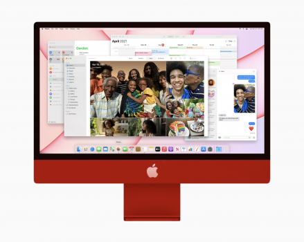
Decided to PS a black bezel and color matched Apple logo - just to see how it would look. ;)


View attachment 1760869
Not for me.... I understand the general obsession with black bezels (seeing it's benefits in the "cinematic and immersive experience" field), but good god am I glad someone had the guts to finally release a white-bezeled desktop/monitor/TV. I've been waiting for this for years, ever since I saw Her and the main character had this charming white bezeled desktop to match his muted tone future-retro 2030s apartment.

Nice mockup, but the actual product represents a vision of design I'm glad to see being experimented with.
 

llirik

macrumors member
Jul 24, 2011
57
11
Yeah as much as I dislike the white bezels (mostly for the arguably worse functionality), the black bezels make the new design look almost identical to the outgoing design.
And what's wrong with that?
 

mendosasenemy

macrumors newbie
Jun 9, 2009
22
15
Is there a technical reason we have to have the bezels?

My LG OLED TV barely has the bezels, and come to think of it I would love a design like that in an iMac...thin to the edges, with the bulk in the middle- hidden with the stand and plenty of ports. None of this, 4 ports will do nonsense.

Apple seem to have gone the other way now, moving from the Pro iMac to this slightly gimmicky, plasticky feel. I need something in between with a 27” or 32” display or is that just me?!
 

Derwinator

macrumors member
Oct 21, 2008
50
26

Attachments

  • D6FE798C-938A-4323-8BB2-CF74E36768DD.jpeg
    D6FE798C-938A-4323-8BB2-CF74E36768DD.jpeg
    1 MB · Views: 112

DanTSX

Suspended
Oct 22, 2013
1,111
1,505
The mock-up clearly illustrates why the grey bezel that Apple chose is superior.

I’ll be ordering a cremescicle orange imac on the 30th.
 
  • Love
Reactions: primarycolors

andyhansn

macrumors newbie
Apr 24, 2021
3
4
Can one of you Photoshop nerds PRETTY PLEASE do a mockup of a saturated red chin/stand with black bezels? I'd love to see what the looks like. (also orange, if possible)

This machine would've been a total home run for me had they ditched the two-tone pastel scheme and gone with nothing bold colors + black bezels. Here's what I wish they would've done instead. (disclaimer: graphic design is not my passion)

View attachment 1760955
Here you go (PS the black apple logo didn't look great):
Screen Shot 2021-04-24 at 10.41.28 AM.png
 

andyhansn

macrumors newbie
Apr 24, 2021
3
4
Can one of you Photoshop nerds PRETTY PLEASE do a mockup of a saturated red chin/stand with black bezels? I'd love to see what the looks like. (also orange, if possible)

This machine would've been a total home run for me had they ditched the two-tone pastel scheme and gone with nothing bold colors + black bezels. Here's what I wish they would've done instead. (disclaimer: graphic design is not my passion)

View attachment 1760955
 

Attachments

  • Screen Shot 2021-04-24 at 10.41.28 AM.png
    Screen Shot 2021-04-24 at 10.41.28 AM.png
    766.5 KB · Views: 106

4sallypat

macrumors 601
Sep 16, 2016
4,035
3,785
So Calif
there will soon be a sticker bundle on amazon that provides a black frame and an apple logo.
There will be tons of black, space gray, brown, maroon, teal, etc stickers for sale on eBay and Amazon.

My wife has a Cricut machine with tons of vinyl adhesive backed vinyl and can have the machine cut out a bezel and chin overlay if I wanted.

She laughed - she said, why are people complaining about the colors on the new iMac - isn't the computer used for computing - not an art object ???

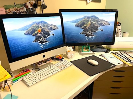
Her current craft setup: 21.5" 2019 iMac, external SSD boot drive, 27" Apple Thunderbolt second display, Cricut Explore craft cutting machine to the right:

IMG_7229.jpg

She will be receiving for Mother's Day (belated), a new blue iMac to go along with her iPhone - will still use the 2011 27" Thunderbolt display via TB3-2 adapter and use the USB ports on the back of the display for her Cricut machine.

And the SSD boot drive will be gone!
 

Attachments

  • IMG_7229.jpg
    IMG_7229.jpg
    116.8 KB · Views: 104

andyhansn

macrumors newbie
Apr 24, 2021
3
4
That looks literally worse.

It looks like something from a 90’s shopping mall vision of the future. Maybe the teenage mutant ninja turtles could use it to look up pizza recipes.
Someone earlier asked if someone who knows photoshop could render it this way. I agree. Not for me.
 

Caliber26

macrumors 68020
Sep 25, 2009
2,327
3,657
Orlando, FL
Thank you! It appears to be you're better at Microsoft Paint than I am. ?

And now that I see this, I realize the red would be too much on such a big device. Maybe Apple does know what they're doing here.
 

Successful Sorcerer

macrumors regular
Nov 23, 2019
178
143
I really don't get it why people want a logo on their product. I think it looks much more sophisticated without the logo and am happy they removed it. The display generates heat, that's also why the 32" Pro XDR display has the cheese grater on the back. It's not efficient to place all computer parts behind the display because thermal throttling happens much faster. I think there's something to say for black and white bezels. I love how these look with the colors, less tech-y and more friendly in a living room or public office. If they release darker computers black bezels would look better. But to each his own.
 

chabig

macrumors G4
Sep 6, 2002
11,460
9,326
I'm sure the usual vendors, like Colorware will soon have skins so people can change the colors of their iMacs to any desired shade and combination.
 
  • Like
Reactions: ignatius345

ZachNathan

macrumors member
Apr 25, 2014
65
100
New York, NY
I love how these look with the colors, less tech-y and more friendly in a living room or public office.
Exactly. I think we have to look at how Apple has been designing a lot of it's more stationary tech: as a fusion of discrete technologies and an almost furniture-like aesthetic (very Dieter Rams and Braun. I think we're seeing the final stages of Jony Ive's tenure). The HomePods were the first real step in this direction, with approachable and a decidedly un-techy look. I suppose you could consider the Apple TV as a forerunner of this design, but that was meant to fade away and is a different build language. Even the AirPods I would consider in line with this philosophy, albeit in a more abstract and mobile-oriented way.

These iMacs are designed to be more approachable and to be a part of the interior design of a space, rather than just "the computer in the room."

I guess that's what I love most about this design... it signals a future where tech is further integrated into day-to-day life, not as tech, but as an expressive part of the look.
 
Register on MacRumors! This sidebar will go away, and you'll see fewer ads.