Got a tip for us?
Let us know
Become a MacRumors Supporter for $50/year with no ads, ability to filter front page stories, and private forums.
3rd party widgets
- Thread starter miamialley
- WikiPost WikiPost
- Start date
- Sort by reaction score
You are using an out of date browser. It may not display this or other websites correctly.
You should upgrade or use an alternative browser.
You should upgrade or use an alternative browser.
A friendly user on Reddit helped... my answer was Forecast Bar. Small widget allows for two locations, several other widget options as well.Anybody come across a single size weather widget that shows 2 locations? I’d like a setup like world clock that reduces the number of widgets.
View attachment 963510
Based on Spotify's widget, and it's lack of ability to show the playing track, I'm guessing that Apple did not provide an API to support real time updates for music. I had hoped that they would handle music differently. Guess not. Really too bad. Maybe we'll get that in iOS 15.
A bunch of interesting apps added widget support in the recent days:
Utilities:
- Widgy [tip!]
- MFC Deck [tip!]
- Clear Spaces [on TestFlight this was without widget name in App Store it is with the name unfortunately and TestFlight is closed]
- WidgetLink
- Yidget (similar to Transparent Widget -TWid still shows widget name).
Music:
- Spotify
- Deezer
Weather:
- Ventusky: Weather Maps
- Forecast & Radar by ClimaCell
- RainViewer: Doppler Radar
- Weather Widget -Local Forecast
Finance:
- Stock Insight (was previously called Stonck)
Sports:
NRC Widgets (unofficial Nike Running widgets)
All have been added to the topic start post as well.
Last edited:
Spotify widget is out now
And it will only display recently played in two sizes.
And it will only display recently played in two sizes.
It doesn't even show recently played track but only album or playlist. Pretty weak widget. This is where, I am guessing, the limitations of the widget api are really limiting what spotify can do with it.
Nice! Now if they would only add dark mode...The New York Times added a widget in the latest beta. It will arrive soon on App Store!
View attachment 967242
I see that in the widget but I strayed off-topic, as I was referring to the app itself. The fact that they added it to the widget makes the absence of dark mode in the app all the more painful.
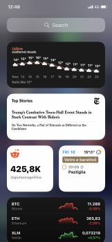
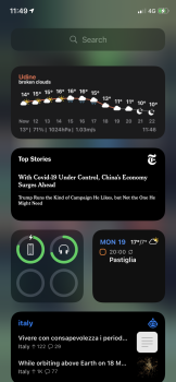
Does anyone else find it really annoying how the small sized widgets get reordered when deleting other widgets? To clarify, on my Today View screen I have a bunch of widgets. At the top I have two side by side small ones and same at the bottom, with lots of medium and large in between. If I delete one of the small widgets at the top, one of the small widgets at the bottom will be automatically relocated to the top. Why?!?
Sounds like it's all similar to how apps work on home pages -- Apple doesn't want to have blank spaces before or in the middle of things.Does anyone else find it really annoying how the small sized widgets get reordered when deleting other widgets? To clarify, on my Today View screen I have a bunch of widgets. At the top I have two side by side small ones and same at the bottom, with lots of medium and large in between. If I delete one of the small widgets at the top, one of the small widgets at the bottom will be automatically relocated to the top. Why?!?
Last edited:
Sounds like similar to how apps work on home pages Apple doesn't want to have blank spaces.
Yea, part of the standard UI interface Apple have had for years. Also the one thing that seems to be constantly asked for (for Apps to be wherever someone wants them, not for it to automatically shift up).
Yea, part of the standard UI interface Apple have had for years. Also the one thing that seems to be constantly asked for (for Apps to be wherever someone wants them, not for it to automatically shift up).
But it's terrible! At a minimum it should wait until I hit Done before rearranging my widgets. That gives me a chance to add the replacement widget which is what I am trying to do.
It sounds like with different sized widgets that basic logic of just moving things up to take up the space where it becomes available might not work as nicely. Hopefully Apple will come up with a more elegant approach to it.But it's terrible! At a minimum it should wait until I hit Done before rearranging my widgets. That gives me a chance to add the replacement widget which is what I am trying to do.
But it's terrible! At a minimum it should wait until I hit Done before rearranging my widgets. That gives me a chance to add the replacement widget which is what I am trying to do.
Again, it's the same way Apps work, they move before you hit done. If you think about it that way, it makes total sense. I agree that it might be better for it to wait, and also allow you apps and widgets wherever you want them on the screen. That may come, but people have been waiting 10 years or more for that to be a choice.
Outlook calendar widgets arrived in today’s update.
A bit underwhelmed by this - 3 different sizes of 'Up Next' events.
Again, it's the same way Apps work, they move before you hit done. If you think about it that way, it makes total sense. I agree that it might be better for it to wait, and also allow you apps and widgets wherever you want them on the screen. That may come, but people have been waiting 10 years or more for that to be a choice.
All I can say is that it is disappointing. They created something very different from app icons, and should not have used the same approach for widgets. But in general the implementation of widgets feels very 'early beta' so I shouldn't be entirely surprised.
Sounds like it's all similar to how apps work on home pages -- Apple doesn't want to have blank spaces before or in the middle of things.
I sure hope Apple will build this in since the workaround are not as nice as you want it to be.
The widget options in iOS14:
- Clear Spaces (in App Store still shows widget name, via TestFlight it was without widget name)
- Transparent Widget (unfortunately still with name of widget visible)
- Yidget - Transparent widget (unfortunately still with name of widget visible)
I think recently also Launcher added an option to add transparent icons/widgets.
The best workaround is still this Invisible iOS Home Screen Icons although it can be annoying to manually create those one by one and moving them around sometimes if apps are removed/added on the same home screen.
A lot fo the widgets are junk. I get that it is a new feature, but jeez why release one if it is so limited
Between what the widgets are limited to be able to do now and how they often aren't always up to date, it certainly seems a step back in many respects compared to the old widgets.A lot fo the widgets are junk. I get that it is a new feature, but jeez why release one if it is so limited
Glad to see that Launcher has added the ability to choose a background, and 'transparent' backgrounds, as well as a small size widget that is a single app launcher.
Why use a single app launcher widget vs the actual app icon?
Register on MacRumors! This sidebar will go away, and you'll see fewer ads.


