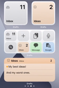
Funny enough those are 2 widgets I'm really worried about losing, Launcher and BeWeather3. Another one that has really nice interaction is WidgetCal.
Overall I continue to be extremely underwhelmed with these new widgets, the old ones were better in almost every way. I'm crossing my fingers that this is just a growth period and eventually these widgets will be improved, especially when 3rd party devs get their hands on them. But I don't think my main gripe will ever be addressed, that we lost the ability to roll up the widgets to save space.
By reading the Apple developer page about the new widgets it also mentions that the widgets in the Today View / Notification Center area will remain in iOS14 for both iOS and will remain as in previous iPadOS version there as well. Not sure how things will go in future iOS versions though.
There is no mentioning of any such limitations on the 'old' widgets from the Today View screen.
For the new widgets they do mention:
Supporting Widget Configuration and Interactivity
Offer a configurable widget when it makes sense. In many cases, people need to specify the information they want to see before a widget can display useful content. For example, people need to choose a location for a Weather widget or a stock symbol for a Stocks symbol widget. In contrast, the Podcasts widget is preconfigured to display recent content, so people don't need to customize it. If you're creating a configurable widget, avoid requiring too many settings or asking for information that might be hard for people to find. You don't have to design a configuration UI for your widget, because the system automatically generates it for you. For developer guidance, see Making a Configurable Widget.
Ensure that tapping your widget opens your app at the right location. When people tap your widget, it deep-links into your app, where you can offer details and actions that are directly related to the widget's content. For example, when people tap a Stocks symbol widget, the Stocks app opens to a page that displays information about that symbol. Similarly, when people tap a small Stocks watchlist widget, the app opens to show the complete watchlist.
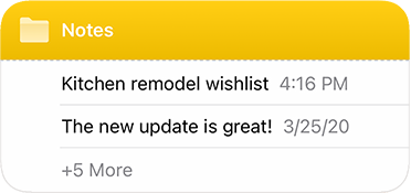
Avoid defining too many tap targets. A small widget supports a single tap target, but medium and large widgets can offer multiple targets. For example, the medium Notes widget can display several notes. When people tap one of them, the app opens to display that note.

Although multiple tap targets might make sense for your content, avoid offering so many targets that people have trouble tapping the one they want.
Designing a Beautiful Widget
Aim for a comfortable density of information. When content appears sparse, the widget can seem unnecessary; when content is too dense, the widget isn't glanceable. If you have lots of information to include, avoid letting your widget become a collage of items that are difficult to parse. Seek ways to curate the content so that people can grasp the essential parts instantly, and view relevant details at a longer look. You might also consider creating a larger widget and looking for places where you can replace text with graphics without losing clarity.


