Got a tip for us?
Let us know
Become a MacRumors Supporter for $50/year with no ads, ability to filter front page stories, and private forums.
Any way to disable font smoothing in Big Sur?
- Thread starter Ron21
- Start date
- Sort by reaction score
You are using an out of date browser. It may not display this or other websites correctly.
You should upgrade or use an alternative browser.
You should upgrade or use an alternative browser.
Thanks. Will take a look at this later today and report backYes, but it depends on what you prefer. I don't like how font smoothing looks on non-retina displays and have always disabled that option.
This works for me:
defaults -currentHost write -g AppleFontSmoothing -int 0
You have to log out (perhaps even reboot) to see the changes across the entire desktop.
I used to disable font smoothing in System Preferences → General prior to Big Sur, which is not possible anymore. Disabling it would add this defaults key to the settings. Upgrading to Big Sur removes that defaults key from the settings and thereby re-enables font smoothing, but you can still disable it.
Thanks!
This has definitely improved text rendering on my external 4K display, although it does not appear as crisp as in Catalina and previous versions of macOS. Nice improvement, nevertheless.
I don't understand why they removed the option in System Preferences.
There is another thing I noticed, this is hopefully just a bug, but in general, some UI elements aren't as sharp.
For example, this is the bottom corner of Safari.
At first, I thought it was due to my external monitor but even on my retina MacBook 15" screen, I can see the same issue.
Is anyone else seeing this as well?

For example, this is the bottom corner of Safari.
At first, I thought it was due to my external monitor but even on my retina MacBook 15" screen, I can see the same issue.
Is anyone else seeing this as well?
infinite amount of thanks for this!This works for me:
defaults -currentHost write -g AppleFontSmoothing -int 0
You have to log out (perhaps even reboot) to see the changes across the entire desktop.
I used to disable font smoothing in System Preferences → General prior to Big Sur, which is not possible anymore. Disabling it would add this defaults key to the settings. Upgrading to Big Sur removes that defaults key from the settings and thereby re-enables font smoothing, but you can still disable it.
This command does not turn off font smoothing. It changes it, but does not turn it off. And I'm not sure if I think it's worse or not. How do I turn it back on?
Before:

After:

EDIT:
To turn it back on, I used
Note the "1" instead of the "0" at the end.
I like the look with it on better than with it off.
Before:
After:
EDIT:
To turn it back on, I used
Code:
defaults -currentHost write -g AppleFontSmoothing -int 1Note the "1" instead of the "0" at the end.
I like the look with it on better than with it off.
Fonts are much nicer and more readable on my external 4K display when font smoothing is disabled. But my MacBook Pro display looks better with the default setting. I think it has something to do with the scaling and the DPI. Anyway, the values are:
0 - Font smoothing disabled.
1 - Light font smoothing.
2 - Medium (default).
3 - Strong.
0 - Font smoothing disabled.
1 - Light font smoothing.
2 - Medium (default).
3 - Strong.
You can just reset the default:This command does not turn off font smoothing. It changes it, but does not turn it off. And I'm not sure if I think it's worse or not. How do I turn it back on?
defaults -currentHost delete -g AppleFontSmoothingLooks like on my machine light font smoothing (1) is just spot on.Fonts are much nicer and more readable on my external 4K display when font smoothing is disabled. But my MacBook Pro display looks better with the default setting. I think it has something to do with the scaling and the DPI. Anyway, the values are:
0 - Font smoothing disabled.
1 - Light font smoothing.
2 - Medium (default).
3 - Strong.
Last edited:
There is another thing I noticed, this is hopefully just a bug, but in general, some UI elements aren't as sharp.
For example, this is the bottom corner of Safari.
At first, I thought it was due to my external monitor but even on my retina MacBook 15" screen, I can see the same issue.
Is anyone else seeing this as well?
View attachment 1666303
Yes, everything looks a bit blurry but also kind of rough on the built-in Retina display on my 2017 MBP 13. Its weird and kind of irritating to my eyes.
Last edited:
Thank you so much! 😁This works for me:
defaults -currentHost write -g AppleFontSmoothing -int 0
I don't know for sure, but I've read somewhere that the default in Catalina is 2 (medium).Which setting is the same as Catalina?
For those of you who are still not satisfied with fonts you can try playing around with Tinker. Not entirely sure if it works (personally getting subtle effects which might be placebo) but it's worth a shot.

EDIT: I'm not a fan of what it does but actually it does seem to work with this "old style" smoothing.

EDIT: I'm not a fan of what it does but actually it does seem to work with this "old style" smoothing.
Last edited:
For those of you who are still not satisfied with fonts you can try playing around with Tinker. Not entirely sure if it works (personally getting subtle effects which might be placebo) but it's worth a shot.

EDIT: I'm not a fan of what it does but actually it does seem to work with this "old style" smoothing.
TinkerTool is just a graphical user interface for the
AppleFontSmoothing default (“off” being 0, “strong” being 3; see also Luis Glez’ post above). The “old style” font smoothing can be enabled with this:
Code:
defaults write -g CGFontRenderingFontSmoothingDisabled -bool NOI'm not sure, but even with all these commands, the fonts on my Mac are looking like ****.
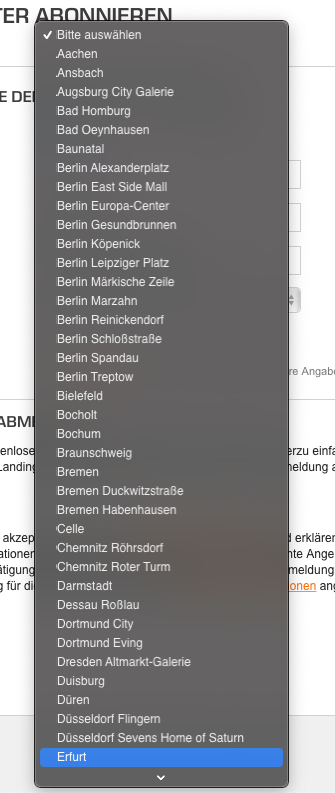
Like in the first attachment, you can see, that the first letter looks suuuper weird.
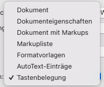
In the second is another Dropdown list, where the first letters are more crisp, then they become blurrier and after that they get more crisp again. Like WTF?
The fonts on the sidebar of the Mail App are blurry as well.
On Catalina it was a lot better. The biggest problem for me is, that I'm using the new Mac mini now, so sadly I cannot downgrade.
Attachments
Weirdly enough today just before I received notification about new post in here I've noticed that my fonts looked a bit weird even though they were fine before. Bumped up the font smoothing from level 2 to 3 and that fixed it. Either a weird bug or I'm imagining things lol.
Any chance you could list out the steps to add the code to terminal? I am new to this and what I tried doing is:Thank you for this! On my MBP 15 2015 everything looked a bit blurry, but after using this command, it's much better, everything is sharp again.
1. Open Terminal
2. Paste Code
3. Pressed the return key
4. Restarted Mac (didn't close any windows)
I didn't notice any difference and I wasn't sure if I missed a step. Thank you!
You did it correctly.Any chance you could list out the steps to add the code to terminal? I am new to this and what I tried doing is:
1. Open Terminal
2. Paste Code
3. Pressed the return key
4. Restarted Mac (didn't close any windows)
I didn't notice any difference and I wasn't sure if I missed a step. Thank you!
Try doing defaults -currentHost write -g AppleFontSmoothing -int 0 , restart, look at the fonts and then do
defaults -currentHost write -g AppleFontSmoothing -int 3 , restart and you should notice a big difference. Find the setting between 0-3 which works the best for you.
I have the same display - worked for me, far better nowso does this make fonts better for non retina displays? For example if I am using my Dell u3419w which is 3440x1440?
I still feel uncomfortable because the signal is YPbPr (Macbook Air M1). What a mess
My LG 27" 4K monitor seems a bit fuzzy compared to Windows at same scaled resolution. I will give this a shot at 0 since that supposedly helps with external monitors.
Got LG 32" 4K, running at native 4k60p with desktop scaling based on 2560x1440.
Okay, so Windows got these well-defined fonts, I hear you Apple that "you don't sacrifice typeface shape" etc.
The fact is that neither of 0-3 settings makes this 4K display that I LOVE on Windows perform fine, actually it makes me a bit nauseous(sic[k]!, low quality pun intended…).
Anyway I decided to have it tested on Linux as well, since Linux is well famed (and my experience was consistent with reports) of absolutely terrible both font and HiDPI display handling. Guess what? My KDE Plasma provides so much more satisfying experience.
Not sure if bringing subpixel AA would help but current behaviour is unacceptable. Actually fonts are better defined on 24" 1920x1200 Dell (well, of course with aliasing enabled, without it it's just jagged lines and what seems like pixel gaps ).
).
EDIT: Without AA it's very nice to look at 4K display at 1080p but that's not what I spent my hard-earned money for.
Okay, so Windows got these well-defined fonts, I hear you Apple that "you don't sacrifice typeface shape" etc.
The fact is that neither of 0-3 settings makes this 4K display that I LOVE on Windows perform fine, actually it makes me a bit nauseous(sic[k]!, low quality pun intended…).
Anyway I decided to have it tested on Linux as well, since Linux is well famed (and my experience was consistent with reports) of absolutely terrible both font and HiDPI display handling. Guess what? My KDE Plasma provides so much more satisfying experience.
Not sure if bringing subpixel AA would help but current behaviour is unacceptable. Actually fonts are better defined on 24" 1920x1200 Dell (well, of course with aliasing enabled, without it it's just jagged lines and what seems like pixel gaps
EDIT: Without AA it's very nice to look at 4K display at 1080p but that's not what I spent my hard-earned money for.
Register on MacRumors! This sidebar will go away, and you'll see fewer ads.


