It still puzzles me why they kept the chin but not the logo. They even squeezed one onto front of the Pro Cinema Display. Imagine a Porsche or even a BMW without a front badge. Yikes. 
Got a tip for us?
Let us know
Become a MacRumors Supporter for $50/year with no ads, ability to filter front page stories, and private forums.
Anybody Like The New 2021 iMac Design?
- Thread starter ThAtCaRGuY
- Start date
- Sort by reaction score
You are using an out of date browser. It may not display this or other websites correctly.
You should upgrade or use an alternative browser.
You should upgrade or use an alternative browser.
It is puzzling, but possibly someone thought it wasn’t necessary and was able to convince others of it. But it’s equally possible down the road feedback could convince them to put the logo back at some point. In that event these first M1 iMacs could become collector items simply because they don’t have the logo on the front.It still puzzles me why they kept the chin but not the logo. They even squeezed one onto front of the Pro Cinema Display. Imagine a Porsche or even a BMW without a front badge. Yikes.
The new Ford Bronco and Bronco Sport don’t say Ford anywhere on the vehicle except a small badge tucked discreetly on the tail end, much like Apple retaining their logo on the back of the new iMac. The Bronco, much like Mustang, the Jeep Wrangler, the Volkswagen Beetle and Porsche 911, is near universally recognizable without any badging.
The current iMac is the most recent evolutionary step of a design that began with the third generation iMac. It‘s as if Apple had been searching for an optimal form that could become immediately recognizable and associated with them without a word. It is their thing, at least presently, and all the whining over it will not change anything.
The 24-inch iMac is the most recent evolutionary step in Mac design since the first Mac in 1984, not just iMacs. According to a wide variety of sources, the design of the Mac even then was intended to represent a human face to encourage it to be seen a friendly and welcoming - quite successfully. The 'chin' was deliberate, and has remained a fundamental, and deliberate, part of most of Apple's most iconic desktop designs. Even headless systems such as the Iici, Performa 630, and the G4 mini had drive slots high on the front panel with a blank 'chin' beneath to maintain the design language and metaphor.
As you say, it is very clear that while Apple could have designed the current iMac to be almost any shape they wanted, they wanted it to be exactly the shape it is. 'Chin' included. While they don't have the same minute attention to detail that Jobs brought to the company, they do show all the signs of carefully considering designs - sometimes at the cost of functionality. It is hard to imagine that the iMac is the result of a mistake or a whim.
Obviously, some people don't like the result, or think they could do better, and as opinions go they are as valid as any others. But they aren't facts. And there is nothing stopping these folk from starting their own computer company in a garage, and building exactly the product they want instead of what Apple do.
Yes, the trend is to deemphasize names and logos, and rely on (sometimes exaggerated) design elements to convey the brand.The new Ford Bronco and Bronco Sport don’t say Ford anywhere on the vehicle except a small badge tucked discreetly on the tail end, much like Apple retaining their logo on the back of the new iMac. The Bronco, much like Mustang, the Jeep Wrangler, the Volkswagen Beetle and Porsche 911, is near universally recognizable without any badging.
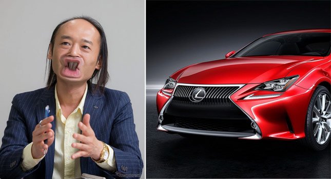
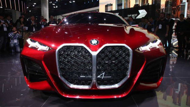
For example the latest Jeep Wrangler: "Jeep" has been removed from the front, and they rely instead on the seven-slot grille. On some of the latest BMWs, the logo is now small and almost unnoticeable - instead the BMW "kidney" grille has been made huge (almost comically so.) Likewise for Lexus, the "spindle" grille has been made massive.


Just waiting for Apple to put on a 6" chin.
Last edited:
The BMW kidney grille, along with many other makes, has indeed become comically oversized. On cars it’s meant to convey enhanced speed and power. On trucks it’s to convey toughness and machismo.
No matter where it looks comically stupid.
No matter where it looks comically stupid.
Last edited:
I loved the new iMac since I saw it on the presentation. Now that it's in my house I'm happy every time I see it
First thing that came to mind after this…
I agree and such a dumb, generic move by Apple. Looking at the front, if you never this iMac before, you would not even know it was an Apple iMac.It still puzzles me why they kept the chin but not the logo. They even squeezed one onto front of the Pro Cinema Display. Imagine a Porsche or even a BMW without a front badge. Yikes.
It still puzzles me why they kept the chin but not the logo. They even squeezed one onto front of the Pro Cinema Display. Imagine a Porsche or even a BMW without a front badge. Yikes.
Very strange move and I didn't like it at all!I agree and such a dumb, generic move by Apple. Looking at the front, if you never this iMac before, you would not even know it was an Apple iMac.
Neither have I changed my mind about it since the release either.
I can understand the similarity and playful design with the long-time-ago colourful iMacs, but even they had a logo on the front.
I really hope they will put the logo back on the larger iMacs later!
Last edited:
Me too! I was like, it’s Thanos’ grand-pappy!First thing that came to mind after this…
View attachment 1825039
As was stated above it’s not hard to see the reasoning behind it. While pretty much all AIO desktops will look alike to those who don’t follow the industry (much like cars and trucks) to those who are tuned in the iMac design is pretty much immediately identifiable even without a logo. Hence the still existent chin in particular.I agree and such a dumb, generic move by Apple. Looking at the front, if you never this iMac before, you would not even know it was an Apple iMac.
Yes, I would prefer having the logo, but it’s not a deal breaker. And it may be put back at some later point.
Being in retail I have seen this played out. Most consumers are near oblivious to changes in the computer marketplace outside of purchasing a device once every five years or so. And all companies make mistakes. Apple jettisoning all the legacy ports on their MacBooks was a dumb move and now they’re putting them back. The touchbar was a largely failed experiment and now it’s being removed.
Yeah, because that minimalist design just shouts out “Packard Bell” and doesn’t look like anything that Jony Ive ever had a hand in. </sarcasm> Seriously, though, Apple probably did market research and I’d expect a blind “what brand do you think this is” would be the first thing they’d ask.Looking at the front, if you never this iMac before, you would not even know it was an Apple iMac.
I don’t personally like the design but I don’t think I’d mistake it for anything but an iMac.
I believe it comes with a selection of Apple stickers - knock yourself out.Yes, I would prefer having the logo, but it’s not a deal breaker.
Seriously, I’m more worried about the external, proprietary, captive cable charging brick, the “sounds like a good idea until you actually think about it for 10 seconds” Ethernet port and the ridiculous port rationing on the lower-end model (I can’t believe that the cost saving of omitting 2 measly USB-C ports justifies the logistics of having two different chassis models - although all might become clear when the M1X comes around). Main worry is that those things might show up in the 5k replacement.
I like the throwback to the original multicolored iMacs. The bezel choice seems a bit odd after so many iMacs with black bezels but is also a throwback. My opinion of the design is mixed enough that I can't say whether it's good or bad, but what I can't deny is that Apple is thinking different again. This is obviously a consumer-focused Mac and not a professional-focused Mac or a Mac intended to be used by the average MacRumors poster, that taken into consideration the design is probably fine.
I'm more concerned about it having only 8 GB of base memory as that'll age these iMacs a lot faster considering it can't be upgraded after purchase.
I'm more concerned about it having only 8 GB of base memory as that'll age these iMacs a lot faster considering it can't be upgraded after purchase.
Last edited:
Omg I know right? Just give everyone the same ports and Ethernet. That’s such basic things a desktop needs and the base model is expensive enough.Yeah, because that minimalist design just shouts out “Packard Bell” and doesn’t look like anything that Jony Ive ever had a hand in. </sarcasm> Seriously, though, Apple probably did market research and I’d expect a blind “what brand do you think this is” would be the first thing they’d ask.
I don’t personally like the design but I don’t think I’d mistake it for anything but an iMac.
I believe it comes with a selection of Apple stickers - knock yourself out.
Seriously, I’m more worried about the external, proprietary, captive cable charging brick, the “sounds like a good idea until you actually think about it for 10 seconds” Ethernet port and the ridiculous port rationing on the lower-end model (I can’t believe that the cost saving of omitting 2 measly USB-C ports justifies the logistics of having two different chassis models - although all might become clear when the M1X comes around). Main worry is that those things might show up in the 5k replacement.
It's not that the empty chin makes it look like it's from a different brand, it just looks like a knock off, and I don't think stickers would do much to help thatYeah, because that minimalist design just shouts out “Packard Bell” and doesn’t look like anything that Jony Ive ever had a hand in. </sarcasm> Seriously, though, Apple probably did market research and I’d expect a blind “what brand do you think this is” would be the first thing they’d ask.
I believe it comes with a selection of Apple stickers - knock yourself out.
Omg I know right? Just give everyone the same ports and Ethernet. That’s such basic things a desktop needs and the base model is expensive enough.
Especially as - based on the iFixit teardown - the Ethernet controller is already on-board and the magnetic/power brick is just acting as a proprietary patch cable. The whole external brick/ethernet thing looks like it is 100% about making the iMac unnecessarily thin, with the various claimed "advantages" just after-the-fact rationalisations.
As for the extra USB-Cs - it's only speculation but I do wonder if the higher-end "4 port" iMac was supposed to have a M1X chip that could support more TB ports and/or extra displays (that would also explain the extra fan). We'll get some clues when the M1X machines launch and we'll see whether it does have more I/O...
Comparing the slick beautiful iMac 2017 with the new 2021 iMac, I am incredibly disappointed. There is nothing beautiful or clever about it. The colors are made for an 8 year old, the shape is boring, and why didn't they make it all screen? After all it runs on an iPad type M1 chip. No, a total miss step in my opinion. And by the way, why can't they make the stand rotate the screen into portrait at will. This would have been clever. I wait for the next design upgrade.I Was Looking At A MacRumors Comment Section On The New iMac, Mostly All Of The Comments Were "The New Design Looks So Ugly" And "Who Will Buy This?" I Just Wanna Know Who Here Likes The New iMac
If you don't care avout other people's opinion, why are you on this forum to begin with?I don't regard ANY opinion regarding the design of a product to be worth the breath that was wasted on it. It's just totally personal, and in some instances, deliberately provocative - in the same way that trolls are.
Thus, the fact that as far as I can see from pictures rather than the actual object, I like the design of the new iMac ought to be totally immaterial to anyone else. However, I do like it, and I have bought one. For me, the issue of bezels is a nonsense because when I'm using my current 27-inch iMac (which has black bezels), I'm looking at the screen, not the surround.
I would rather try knitting mud than trawl macrumors.com for subjective opinions.
If someone really dislikes the new iMac design then I guess they’ll have to wait until maybe 2031 for the next redesign.
Register on MacRumors! This sidebar will go away, and you'll see fewer ads.


