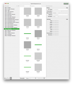
Yeah, that is weird. I don't think those are the ones then. I haven't ever tried looking for that particular place in theme files so it's quite new territory for me. Using my colorpicker program I will
hopefully try and investigate(edited because I shouldn't make promises I can't keep)
I don't think it's an actual graphical file but rather one of the many images of either the Effects panel or the Colors panel.
Lastly, I don't think that the graphics and their length has an impact on this.
The reason for the length, I found, is that if I make the graphics any narrower say just like the original CoreAnimationArchive asset (which I don't know what exactly is) I could end up with only a fraction of the length when applied. A little square for instance would only be visible because macOS doesn't accept the input it now has and doesn't stretch it like it would with its own asset.
I then just make the file the length of the largest monitor resolution on '@1x' sizes, which I've learned is the way to make the newly imported asset do its thing. As I've mentioned before, not one thing is particular to any part of the system. One asset changed might trickle its way down through the OS in mysterious ways.
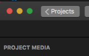
For instance, I made the mistake of exporting a caar file with some 1024x196 dimensions or thereabouts and found that in Xcode the highlight for projects in the Welcome window was only a little over half applied. It looked cool, but not what I hoped for


