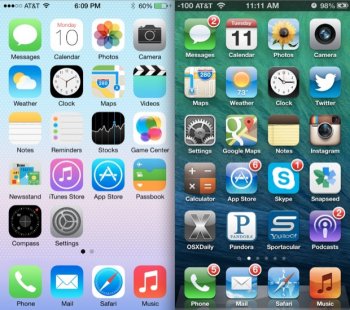
I'm kinda disappointed, we have the same lock screen for 10+ years and same home screen icons since iOS 7....how about a new font? new lock screen weather widget? same home screen icons for 6 years? why no redesign?
Got a tip for us?
Let us know
Become a MacRumors Supporter for $50/year with no ads, ability to filter front page stories, and private forums.
Are you disappointed Apple didn't refresh the lock & home screen?
- Thread starter CooKieMoNs7eR
- Start date
- Sort by reaction score
You are using an out of date browser. It may not display this or other websites correctly.
You should upgrade or use an alternative browser.
You should upgrade or use an alternative browser.

I am not disappointed at all. I spend virtually no time on the home screen at all. An iPhone is most useful when using Apps, which replace any functionality the home screen could provide.
I just don't know what would be better than the current design. If Android's all but abandoning of widgets has taught us anything, it's that consumers prefer and are comfortable with an app grid.
I think the only thing I've ever wanted from a lock screen is the "always on" feature I had from my Nokia when I went crazy and tried Windows Phone for a year.
Being able to see the time and any notifications, especially at night when turned sideways in "clock" mode was so convenient. Didn't use any battery either. They have finally incorporated the screen technology, so why not?
Being able to see the time and any notifications, especially at night when turned sideways in "clock" mode was so convenient. Didn't use any battery either. They have finally incorporated the screen technology, so why not?
Personally I'd like fewer icons which use a completely black or white background but that's just my preference.
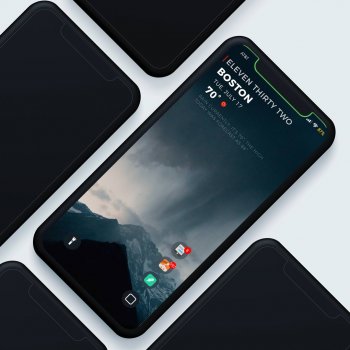
I don't really wish for a radical overhaul of either the home or lock screen - I saw someone had the idea of adding Watch complications to the lock screen which is a neat idea, but I think the overall grid concept still works well for the home screen and doesn't need change for change's sake.
I don't really wish for a radical overhaul of either the home or lock screen - I saw someone had the idea of adding Watch complications to the lock screen which is a neat idea, but I think the overall grid concept still works well for the home screen and doesn't need change for change's sake.
Yes. I know features matters more, but without a visual change my brain cannot acknowledge it. Second, I’m an adult, and I feel like I’m being catered by ToysRus with those large child-like icons. They don’t reflect ME, and that’s the issue. I don’t need a theme store, I just need them to be scaled down and freely move them around, so they’re not in my face. It’s as if your child has been taking out all its toys and tossed them on the floor when you get home from work, and to be able to put them back on the shelves would give me so much peace and enjoy my home(screen).
I’m a little disappointed. They could have at least given us the choice of five icons across or at least in the dock.
The overall "look" doesn’t bother me that much as how much time do you spend looking at your home screen as opposed to actually using apps.
The overall "look" doesn’t bother me that much as how much time do you spend looking at your home screen as opposed to actually using apps.
I'm not so much disappointed as surprised. iOS 13 should have been a major UI overhaul based on iOS UI patterns of a minor UI refresh every 4th year and major every 7th.
I'm not disappointed. I think iOS looks great overall. By iOS 6 I hated the design and wanted something new, but I haven't felt the same in recent years. It's clean and minimalist. I really only wanted a dark mode and some refinement within the apps and we got that. I would prefer some modernized home screen icons, but I don't care that much.
The carplay overhaul, however, is much appreciated. I never liked the carplay UI but the update looks promising.
The carplay overhaul, however, is much appreciated. I never liked the carplay UI but the update looks promising.
I am not disappointed at all. I spend virtually no time on the home screen at all. An iPhone is most useful when using Apps, which replace any functionality the home screen could provide.
I think that’s the whole point though. If the home screen was more interactive with the ability to add functional and useful widgets, you could see info and interact with the homescreen more, rather than opening an App for every little thing
It's a complete disaster.
I waited whole show end for just in case they forgot to show main menu changes.
same ****in home screen 7 years. god. im done with apple.
I waited whole show end for just in case they forgot to show main menu changes.
same ****in home screen 7 years. god. im done with apple.
I really wish they would adopt the same design as android and windows phone. Have a separate app list or drawer with all apps in alphabetical order.
I am not disappointed at all. I spend virtually no time on the home screen at all. An iPhone is most useful when using Apps, which replace any functionality the home screen could provide.
Exactly. Never understood why people are spending so much time staring at their home screen. Exactly as you say, it's for launching apps, which it does well.
Wait till September... the brand new iPhone XI and XI Max may offer five icons across or in the dock.
Yes, I would really like something akin to watch complications available on HomeScreens…
It would be great to be able to pinpoint some glanceable information you’d like to keep track of and not have to go to notification centers or into apps etc. etc.
For that matter I’d like to be able to put the outdoor air temperature on the top bar
It would be great to be able to pinpoint some glanceable information you’d like to keep track of and not have to go to notification centers or into apps etc. etc.
For that matter I’d like to be able to put the outdoor air temperature on the top bar
It would be nice to have more than 4 App icons in a row on the home screens, even if they squeezed 5 App icons in a row would be nice. As for the lock screen, Notifications are still a bloated mess since iOS 10; I'm over those BIG rectangular bubbles on the lock screen. I miss the the way notifications looked in iOS 9, they were neat and more streamlined, IMO.
Icons wrapping from the top rather than the bottom is also dumb. I do not want much tbh just some flexibility so I can make my home screen look less like EVERY other persons.
It is so dated it is almost embarrassing now. Watching them hype dark mode when looking at every single thing in iOS was nauseating. Take dark mode away and the changes are very underwhelming.
It is so dated it is almost embarrassing now. Watching them hype dark mode when looking at every single thing in iOS was nauseating. Take dark mode away and the changes are very underwhelming.
I don't believe I would feel any differently. I have to keep a Samsung phone for work, so I can be familiar with it. I don't find myself using widgets there either, as a phone screen is just not large enough to have enough useful data on it. Going to apps takes no times at all. The iPad is a little different, as the text and graphics can be large enough to see quick data at a glance, but it's really just an app launcher for the widgets I would use anyway. To each his own I guess.I think that’s the whole point though. If the home screen was more interactive with the ability to add functional and useful widgets, you could see info and interact with the homescreen more, rather than opening an App for every little thing
Register on MacRumors! This sidebar will go away, and you'll see fewer ads.