Become a MacRumors Supporter for $50/year with no ads, ability to filter front page stories, and private forums.
Are you disappointed Apple didn't refresh the lock & home screen?
- Thread starter CooKieMoNs7eR
- Start date
- Sort by reaction score
You are using an out of date browser. It may not display this or other websites correctly.
You should upgrade or use an alternative browser.
You should upgrade or use an alternative browser.
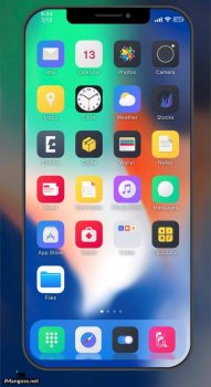
I guess a little bit, though dark mode might make things look different/ interesting enough for it to pass another year. I do think we're about due for a relatively major overhaul though. The icons have been tweaked and refined, but are largely the same as iOS 7, if they're sticking to a static grid (which I'm not that opposed to) this limits how 'fresh' the OS can really look as it's sort of the 'face' of it.
That would somehow change things on any meaningful level?give us new iconssss loll
Don’t care about eye candy. I care about privacy and a stable os that integrates with my workflow.
Yes, but I can see now that iPadOS is going to be a testbed for ui features for iOS. And I expect that they needed to get dark mode right before rolling a significant UI refresh which I expect that we’ll get next time. And maybe a calendar and mail update too!
LOLIt's a complete disaster.
I waited whole show end for just in case they forgot to show main menu changes.
same ****in home screen 7 years. god. im done with apple.
Absolutely, at least give us the same customization we can do on our watches. Pathetic really.
It's a complete disaster.
I waited whole show end for just in case they forgot to show main menu changes.
same ****in home screen 7 years. god. im done with apple.
Yeah you go to Android where almost every UI is stepping down from the widgets and going with Apple's homescreen style. That will change things for you
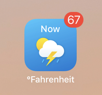
The only thing I wanted was a dynamic weather app icon that always showed the temp/conditions. I use this app now for that but it’s a hack. I watched a WWDC design session yesterday and the presenter claimed everything was redesigned, primarily because of dark mode. They introduced SF symbols - 1500 symbols/icons/glyphs that can be used across the system. It also looks like they’re using more colored circle icons for arrows, ellipses, etc. and icons are weighted heavier because dark mode kind of requires it. I think people are too focused on the lock screen/home screen and if they don’t see a major change there assume nothing was redesigned.
https://developer.apple.com/videos/play/wwdc2019/801/
https://developer.apple.com/videos/play/wwdc2019/206/
https://developer.apple.com/videos/play/wwdc2019/801/
https://developer.apple.com/videos/play/wwdc2019/206/
Attachments
Because when done properly (e.g. Windows Phone) it can do so much more.Exactly. Never understood why people are spending so much time staring at their home screen. Exactly as you say, it's for launching apps, which it does well.
And where is Windows phone (and Windows 8) today?Because when done properly (e.g. Windows Phone) it can do so much more.
This redesign talk is awfully familiar... Remember the last time we went through a redesign? Wrecked the stability of the OS for a while, and divided the fan base again. Just leave it how it is and focus on stability and new, innovative features. Not that iOS is introducing many innovative features, but I'd rather the resources go to that than to some icon.
Disappointed? Sure. New features are always nice and with the OLED screens, some form of screen info/widget would have been nice (and available on Android since the Moto X in 2014). Did I expect to get this? Up til about February, yes. But when the rumors started leaking, it was evident it was not coming (at least in June; who knows about September and the new phones!). Am I going to lose sleep over this? No way. There are so many other new features I'll never miss that. Plus, I get this same functionality on my Series 4 Watch.
Widgets are not the issue just being able to put icons where you want or a unique look and have advanced gestures on the screen too (cannot have them if your screen is full of Fisher Price style icons)Yeah you go to Android where almost every UI is stepping down from the widgets and going with Apple's homescreen style. That will change things for you
I have an iPhone xs max and a Droid and for me Android has overtaken iOS in lots of ways, still behind in some to be fair but honestly I consider myself an Android user now and apple has lost me gradually over several uninspiring updates. Mostly I just find it dull these days.
YMMV but I understand some people having this kind of reaction.
I'm not so much disappointed as surprised. iOS 13 should have been a major UI overhaul based on iOS UI patterns of a minor UI refresh every 4th year and major every 7th.
The problem with this is that there really isn’t a “pattern” for overhauls. It’s only happened once.
Sure, apps focus is important, but being able to have a better look doesn't hurt that ability at all. After all these years, the best we get is bland icons for these apps.I weight feature much more than the appearance. Features can help me get the job done while appearance... what should I say? It’s nice to have a bit of refresh, but like other people, I focus on apps more than home screen.
I'd be willing to BUY official released theme packs to customize our devices more.
The release and failure of windows 8 probably teaches someone in Apple a season to never jump to a whole new interface drastically. And I think It is a good thing.Sure, apps focus is important, but being able to have a better look doesn't hurt that ability at all. After all these years, the best we get is bland icons for these apps.
I'd be willing to BUY official released theme packs to customize our devices more.
I don’t spend all day looking at my home screen, so no.
[doublepost=1559785876][/doublepost]
[doublepost=1559785876][/doublepost]
13 of those icons are different today or don’t exist anymore.All I'm saying is for 12 years we've had these icons only, don't you guys think it's about time for a refresh?
It doesn't have to be a whole new interface. Just theme the icons like we can with j/b. It's not hard.The release and failure of windows 8 probably teaches someone in Apple a season to never jump to a whole new interface drastically. And I think It is a good thing.
For the odd chance that this happens, it will be the same thing like watch face. No third party and only Apple and select big players can design icon pack and user will need to buy them from App Store.It doesn't have to be a whole new interface. Just theme the icons like we can with j/b. It's not hard.
Which furthers the frustration and disappointment that Apple refuses to move forward other than multiyear drip feeding.For the odd chance that this happens, it will be the same thing like watch face. No third party and only Apple and select big players can design icon pack and user will need to buy them from App Store.
Register on MacRumors! This sidebar will go away, and you'll see fewer ads.


