Well, I have to thank you as well. After all you haven't discouraged me by any means, rather motivated.
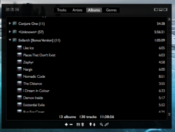
One thing I noticed is the performance drop with TableViews in general when they get bigger. Like there is serious stuttering while scrolling when the playlist occupies half the screen. But at the same time when you take a look at Xcode's instruments analysis tools with an even more complex table view, it's super smooth no matter the size. So I wonder how Apple does it. Like, do they have their own implementation of a TableView class? Or are they just using cell based TableView with a custom NSCell class?
Would be nice to find a way to make bigger table views more smooth.
Yes, I have noticed the stuttering as well. And not only have I've given it some thought, but have also attempted solutions, with no luck at all.
I think that Apple may be doing some sort of caching of table cells that have not changed over time. In other words, they may have a cell cache that they smartly invalidate and update as the data contained in cells changes, as opposed to creating the same cell over and over again every time the cell is rendered. I tried to cache table cells, but saw some weird results. In the end, I decided that it's more important to show correct data and be slow than to show the wrong data and be super smooth.
That is just one theory, of course. I don't know if the creation of table cells every time viewFor(row, column) is called is really the problem. It may be.
The main problem is ... I don't have a very good understanding of the internals of NSTableView/NSOutlineView, and I have not dug very deep into it. But, this is definitely something that would be good to improve on, as far as performance of the app goes. It could be a great research project for you ! I may also look into it someday.
Good observation !
[doublepost=1509674552][/doublepost]
Only thing I noticed is that 'shuffle' automatically deselects when 'repeat one' is selected and the other way around when 'repeat one' is active and shuffle gets selected. This probably is intended, but i think it's not how it should be.
Yes, good observation, and I'm glad you brought it up because I would like to get a second opinion on this issue. This is the intended behavior ("repeat one" and "shuffle on" are mutually exclusive and cannot both be selected at the same time), and the logic behind it is: if I'm repeating a single track, then shuffling is irrelevant. Likewise, when I'm shuffling tracks, I need to have more than one track in my queue to shuffle. I have noticed that other apps do it differently. But, to me, it would be confusing to have both on simultaneously. As a user, when I select repeat one, and then later change my mind and want to shuffle my tracks, I want the previously selected "repeat one" mode to turn off, so that it is clear what I'm doing now.
If I'm not mistaken, the two modes are, in fact, mutually exclusive, right ? What do you think ?
Now, there is obviously at least one other way to do it - I could allow both to remain selected simultaneously and just have the sequencer logic do one of the following:
1 - Choose whichever of the two was selected most recently (this would make for ugly code).
2 - Have one of the two take precedence over the other (for instance, if shuffle is selected, always ignore repeat one).
In my opinion, the above alternative solution introduces ambiguity to the user experience.
Well and CPU usage isn't the best with those animated playback indicators, but that's already a known issue.
Again, I partially agree with you. But, I want to give you a perspective that probably no other programmer will agree with (most would agree with you).
Q. Why do our computers have CPUs ? What is their purpose ?
A. To do work that we deem
useful.
Ok, next question ...
Q. If an app that plays music and shows funky animations is considered, by the user, to be "useful", then what is wrong with using up 20% of CPU ? What are we "saving" that CPU time for ? To brag, "Look, my app only uses up 5% of CPU while yours uses up 20%" ? What is the ultimate goal here ?
A. Hmm ... good question. I want to save CPU time for other more CPU-intensive tasks like photo/video editing ? Also, less CPU means less energy usage ?
Ok, yes, our computers need to multi-task, and a lot of time, we run the music app in the background, so I can't even see the funky animations, so running them is a waste of resources. Makes sense. Great !
Make it easily configurable with a button, so that when I'm playing with the app (in the foreground), I can see it, but when it's in the background, it is not wasting resources !
Final question ...
Q. Given that all MacOS computers (these days) have at least 2 cores, and many have 4 (potentially more if we're talking desktop), is 20% of one processing core too much to expend on an app that I consider useful ?
A. Hmm, now that I think about it, ... not really. If I'm on a top-end iMac or iMac Pro, that extra CPU usage is negligible.
Final verdict ...
Let's make it configurable, so that users who're running 100 Chrome browser tabs on on their Macbooks have some CPU to spare, while the Hollywood graphic designer on his Mac Pro can see the animation if he chooses to give a small part of one of his 32 cores to Aural player
")
So, you sure did a great job with those new features. Also your redesign improved the overall looks (red accent color looks nice). Not sure if i like the redesigned icons tho. They're kind of too square and not sure if that goes well with the overall rounded corners elsewhere. Also i really liked the old on/off switch in the effect panel compared to the new one, but that's just taste.
Thanks. Ok, by square icons, are you referring to the playlist window controls ? Dock and Maximize ? I don't like the maximize controls either, to tell you the truth, but I couldn't find better ones that are clearly visible to the user. I spent hours looking for better icons.
Interesting that you liked the old on/off switch ! I thought they looked medieval, or like Albert Einstein might have appreciated them, but I just never found the time/motivation to change them out
Yes, it's a matter of taste, and I prefer the newer icons
Regarding rounded corners I also did some experimentation on that as well. It's obvious that with hidden titlebar the rounded corners also get removed. But so do the resize indicators. The weird stuff started when I removed the titlebar via code instead of IB. The resize indicators were still there, but the resizing was broken and only worked visually. So the view got bigger, while the window didn't and you would click through the window unable to select it.
in the end my approach was to just make it transparent and full-size-content, so i can still have the rounded corners and I can keep the indicators. On the other hand a borderless window behaves differently when moved off-screen. For example you can't move the titlebar of a titled window out of screen on the bottom, which might be unwanted behavior, especially when toggling the effects would make the playlist go off screen. Not sure which approach is the better one.
Instead of adding a rounded container box, giving the window's content view a corner radius would have also been possible, but since it works fine with the rounded box there's probably no need to change it.
BTW, this is very important -
the way that key press events are sent to windows that have titles is very different from how they're sent to title-less windows. Make sure that, if you add a title bar, the UX does not change. I can guarantee you it will be weird. The playlist window will lose focus when you click on the main window (play button for instance), and I noticed other weird behavior. I didn't like it at all !
I like the playlist to be
and look in focus, 100% of the time. That only happens when there are no title bars. And, all the key events are sent in a predictable and consistent manner. Add a titlebar and it gets totally ****ed.
I'm not claiming that I know more about windowing than you do ... you've clearly spent some time on it and probably know more than me. I'm just saying this from the perspective of someone who has experimented with different solutions and also from a UX perspective. To me, consistent key event behavior and playlist focus are top priorities. If focus shifts back and forth, it doesn't look like the 2 windows are part of one app. The whole experience is seamless (and much better) when the app responds to events predictably no matter which window you are interacting with.
Last but not least further development stalled on my side for now (probably for a few weeks). After all you made it clear to me that there's so much more stuff i need to understand before working on a project like this. So I started educating myself more about concurrent programming, GCD, threads and queues and a lot of other stuff. Guess it'll be a long way before I can call myself a decent programmer... but that's a good thing
Again, don't let my comment dissuade you. If I sounded arrogant or condescending, I apologize. I just didn't like being told, "Hey, this doesn't work. You need to do it differently." (when, in fact, it does work). If there was a genuine problem with the code, I would have happily acknowledged it as well.
I'm also learning Swift programming and the MacOS ways of doing things, which are very different from the Core Java back-end world that I'm more used to.
Glad to have you on board this project ! Thanks again for the feedback !