I stand corrected. So, I'll rephrase: Why must the return to home screen bar be visible at all times, except for on the home screen itself?Well you see in the home screen you don't see it
Got a tip for us?
Let us know
Become a MacRumors Supporter for $50/year with no ads, ability to filter front page stories, and private forums.
iPad Pro Brand New Ipad Pro - Black Bar At Bottom Of Screen?!
- Thread starter mcf1urry
- Start date
- Sort by reaction score
You are using an out of date browser. It may not display this or other websites correctly.
You should upgrade or use an alternative browser.
You should upgrade or use an alternative browser.

I said it wasn't on there.Return to home screen bar on the home screen? That really would not make sense.
It's not just a "return to home screen bar", though.Return to home screen bar on the home screen? That really would not make sense.
If you drag upwards from the bottom of the screen part-way you get to the multitasking view.
If you swipe sideways along the bottom of the screen you can quickly swap between apps.
Notably both of these things also work on the home screen despite there being no visual cue, but clearly showing the bar there would be justified from a functionality standpoint.
So, how come Apple has deemed it unnecessary to show the bar on the home screen, when it is otherwise seemingly indispensable?It's not just a "return to home screen bar", though.
If you drag upwards from the bottom of the screen part-way you get to the multitasking view.
If you swipe sideways along the bottom of the screen you can quickly swap between apps.
Notably both of these things also work on the home screen despite there being no visual cue, but clearly showing the bar there would be justified from a functionality standpoint.
I wouldn't know, and I don't really have interest in guessing.So, how come Apple has deemed it unnecessary to show the bar on the home screen, when it is otherwise seemingly indispensable?
Notably both of these things also work on the home screen despite there being no visual cue, but clearly showing the bar there would be justified from a functionality standpoint.
As you mentioned, since the gestures work even without the Home bar, it’s not required for functionality.
I already sent feedback request to Apple regarding an option to hide the bar around a year ago (when I first got the 2021 Pro). Maybe I should send another one again…
Yes, I suppose that is what we are left to do, to guess. There is nothing obvious about it.I wouldn't know, and I don't really have interest in guessing.
I said it wasn't on there.
Fine. No need to shout.
So you clearly have no idea how iOS apps work, do you?"There's an app for that" so just wait for someone to make a always on top 1x1 pixel app that lets the user decide if the want the bar to be not shown.
I was replying to someone saying it's up to app devs to decide.So you clearly have no idea how iOS apps work, do you?
The question here is: do you believe that some dev can come up with an app that is basically a 1x1 pixel always on screen set up to never show the bar?I was replying to someone saying it's up to app devs to decide.
If the answer is yes, you clearly have no idea how iOS apps work.
As I mentioned earlier in post #44, the white or black navigation bar does not appear during full screen video. Full screen photos in the photo app don't show the line either. Also does not appear on home screen. Besides that, I have two apps that it does not appear on. So apparently devs can make the bar not show, but more importantly.....Apple could provide an on and off for it.
Homescreen..........YouTube................VLC.....................White Noise App.....Nightstand


Homescreen..........YouTube................VLC.....................White Noise App.....Nightstand
Last edited:
Did the same thing and returned my iPad Pro 11 after two days because of this. Hated the the Home Bar Line instantly and was shocked to learn it couldn’t be removed, so went back to my old iPad Pro 10.5 where everything works the same but with no fugly/distractive line at the bottom. Many apps are not programmed to hide the line (like the Economist and F1TV) and hence it becomes an eye sore and completely kills the immersiveness of content in apps. Besides, it shouldn’t be a developer responsibility to circumvent this; the Ui/UX should get out of the way when not needed.I really appreciate your response. It's been a horrible decision to have to make. Because other than this eyesore it's a fantastic piece of kit. But I've finally decided I just can't stand it. I don't think I'd ever get used to it. And it sticks in my craw that I'd have to 'learn to tolerate it' when I spent nearly £1600 [including magic keyboard]. So I've organised a return. And I'll patiently wait in the vain hope that Apple will either get rid of it [highly unlikely], give us an option to disable it or even just make it transparent, like the home button.
Not giving us an accessibility option to remove it is pure stubbornness from Apple side. Let me be equally stubborn.
No, it does appear during full screen video unless it has been explicitly coded by devs to go away. Why put that burden to the devs? Why not let the desktop/homepage UX get out of its way in apps.As I mentioned earlier in post #44, the white or black navigation bar does not appear during full screen video. Also does not appear on home screen. Besides that, I have two apps that it does not appear on. So apparently devs can make the bar not show, but more importantly.....Apple could provide an on and off for it.
Homescreen..........YouTube................VLC.....................White Noise App.....Nightstand
View attachment 2008585 View attachment 2008586 View attachment 2008584 View attachment 2008583 View attachment 2008587
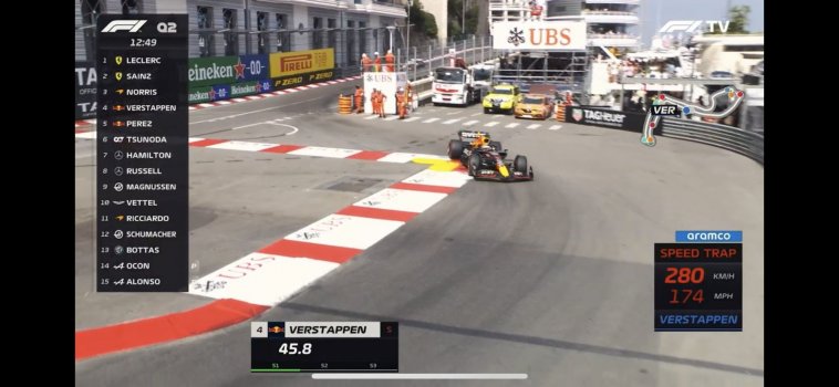
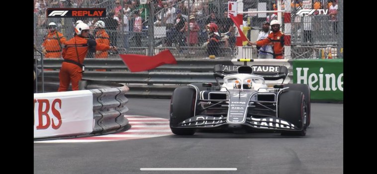
Examples from F1TV and Economist on iPhone (bar just looks bigger and thicker on an iPad - but can’t show it here as I have returned it and stuck with my iPad 10.5 where everything’s looks clean).
Attachments
-
 3A2D8B8E-A98D-402D-B04F-006835C1047D.jpeg145.7 KB · Views: 119
 -
 83A9739A-E7B3-4E13-AB0E-3159C66CDC08.jpeg137.6 KB · Views: 103
 -
 1CACD231-33CA-499A-8FBF-B3A2988A34A2.jpeg203.9 KB · Views: 115
 -
 838C8485-1B9C-4F36-8994-F44B059414A1.jpeg259.8 KB · Views: 108
 -
 8DA3758B-4521-4E6B-A4FD-A3BEF901C49C.jpeg168.5 KB · Views: 114
This nails it 👆 Coming from a devise with no home bar line makes upgrading to a new no-button iPad Pro such a huge step back in user experience.Yep. My Ipad 6th Gen doesn’t have an unsightly black bar at the bottom of the screen. Neither does my Samsung Galaxy phone. It’s unacceptable. In the future if Apple come to their senses and remove it I’ll consider purchasing another. But not until then.
Did the same thing and returned my iPad Pro 11 after two days because of this. Hated the the Home Bar Line instantly and was shocked to learn it couldn’t be removed, so went back to my old iPad Pro 10.5 where everything works the same but with no fugly/distractive line at the bottom. Many apps are not programmed to hide the line (like the Economist and F1TV) and hence it becomes an eye sore and completely kills the immersiveness of content in apps. Besides, it shouldn’t be a developer responsibility to circumvent this; the Ui/UX should get out of the way when not needed.
Not giving us an accessibility option to remove it is pure stubbornness from Apple side. Let me be equally stubborn.
I just felt for that amount of money a UI shouldn’t be marred by something so intrusive. And to not give an option to disable just blew my mind. They didn’t have the foresight to think some consumers may have a problem with it? I’ve just purchased a 2021 9th Gen 10.2 before they bring out the 2022 version. I read somewhere that it’s losing the home button. So it too will no doubt have the dreaded bar.
Bless your hearts, but anyone who returns expensive electronics because of a gray toothpick at the*bottom* of the screen needs to take Fluvox. (I should know because I once tried returning an iPad 3 because its maiden Retina Display showed blue links as purple. I kid you not: )
Is this what Apple calls one of their “Intelligent” features ? If so, let’s not anticipate anymore. I’m irate.Did the same thing and returned my iPad Pro 11 after two days because of this. Hated the the Home Bar Line instantly and was shocked to learn it couldn’t be removed, so went back to my old iPad Pro 10.5 where everything works the same but with no fugly/distractive line at the bottom. Many apps are not programmed to hide the line (like the Economist and F1TV) and hence it becomes an eye sore and completely kills the immersiveness of content in apps. Besides, it shouldn’t be a developer responsibility to circumvent this; the Ui/UX should get out of the way when not needed.
Not giving us an accessibility option to remove it is pure stubbornness from Apple side. Let me be equally stubborn.
I honestly don’t know why it bothers me so much, but it does… and along the same lines, the curved white handle in the corner of windows when using stage manager bothers me in the same way. It just doesn’t need to be there. It’s an annoying visual detail, that may serve a purpose to teach people how to use the interface, but after that it is simply visual noise. I guess what bothers me more fundamentally is the paternalistic refusal to give us the option to hide it. Apple is treating its users like children who need training wheels at all times.
It’s not so bad in light mode where most of the time it’s a dull grey. But in dark mode, it is often the brightest element on most apps/pages, a glaring white bar constantly attracting attention. Especially on the M4s, with the OLED displays that make black truly black
It’s not so bad in light mode where most of the time it’s a dull grey. But in dark mode, it is often the brightest element on most apps/pages, a glaring white bar constantly attracting attention. Especially on the M4s, with the OLED displays that make black truly black
Last edited:
Register on MacRumors! This sidebar will go away, and you'll see fewer ads.