Become a MacRumors Supporter for $50/year with no ads, ability to filter front page stories, and private forums.
Before you roll your eyes, know that this is coming from the biggest Apple fan boi. I own almost every single apple product line (except the mac pro) and yes that does include the ultra expensive Apple Vision Pro.

Apple (the Jobs era) used to have a very simple philosophy. They focus on one thing that's it. They build the best products. And part of that is saying 1000 no. They release a product only when it is ready. They add a feature only when a customer will be delighted. Their record is not always 100% perfect, sure there are misses. But you can exactly see how they miscalculated, and know that their original intention is to bring joy to customers.

Fast forward today, Camera Control is none of that. Camera Control does not bring anyone joy. It's marketing gimmick that one would expect from any other tech companies but not Apple. At best, users are different and at worst it's hair pulling level of frustration to use. Let me explain.

First, as gruber correctly pointed out. It's incredibly frustrating that pressing it does not always open the camera app. It depends on the state of the phone. If the phone is not 'activated' - i.e. on the AOD mode. Pressing it in fact does nothing. If you wake the phone - either by touching the screen, or by waiting for the accelerometer to pick up motion, then pressing it opens the camera.

Contrast this to the action button. It will always launch it no matter what.

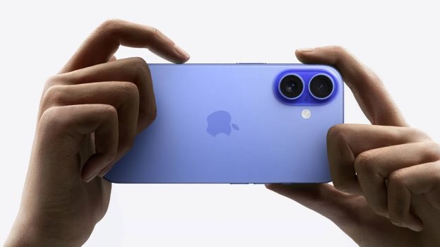
Second, the position of the button is very compromised for landscape shooting. I have larger hands but even for my index finger, it's not longer enough to be bent all the way above the iPhone frame. What you end up doing is, having the finger lay over the top right portion of the screen. One, that obstructs the screen as a viewfinder of the camera, and two it accidentally touches the screen sometimes.

Third, for almost all the half-press functions, they are vastly inferior to the on screen controls. Take zoom for example, it's physically much slower to go from 1x to 5x. Whereas by using the expanded half circle dial, you can zoom to 25x with even less time. Not to mention that with Camera Control you cannot zoom to small increments, like 2.5x.

So to put things in summary, here's where we landed

Camera ControlAction button
Launches app consistently50/50Always
Shutter controlWorks but sometimes misread as half pressesAlways
Video controlHold to recordHold to record
Zoom controlWorks but slow, coarse control, bad index finger positioningFast with on screen, granular control, perfect thumb positioning
Additional camera controls (exposure, aperture etc)Hard to access, not user friendlyon screen controls are equally hard, most users dont use it

There is in fact, no reason to use the camera control button over the action button. Other than the fact that, by degrading your camera launching experience you reclaim the action button for other uses. Which might be worth it for some users...

So this really begs the question, what is Apple doing? Well my theory is this.

I think camera control was suppose to be used with a hold action to launch. This makes it so that it launches 100% of the time, not 50. It's also suppose to be launched with a half press function that provides unique ability. Exactly what, I dont know. But it could've been, something related to cinematic mode or something. It's slated to launch later this year to control focus, but iPhone cameras have such small aperture that you have very deep depth of field all the time anyway which made no sense. They must have some other uses in mind to justify a whole hardware button built around it.

Likely what happened was, that they caved to the investor pressure of AI features. So (1) they repurposed the hold action to now be 'visual intelligence' and (2) they released this hardware/software early and dumbed down the half press feature.

So here we are, not only is Apple releasing a half complete feature (which I'm ok with) but they've butchered whatever original design concepts they had in the name of AI such that even WHEN those features are eventually complete, the end result will be crippled. In the end we will have an unnecessary hardware button to call upon AI (in additional to Siri - so now 2 AI buttons) coupled with a downgraded experience to launch camera or triggering the shutter (compared to any of the existing methods - action button, slide left on lock, press hold bottom right button)

This is where the shift in Apple’s philosophy since the Jobs era starts to show its cracks. It’s depressing, because the old Apple got right on things that no other companies were able to get right. I guess not even the Apple today.
It’s not Apple ,
It’s it’s Leader, he needs to go.

 
  • Haha
Reactions: Jumpthesnark
It is not even close to real camera. I have Nikon Z5 and 16 Pro Max. I tried to use Camera Control once and then never used it again. The implementation is just horrible and lazy. I don’t know who will be using that weird swipe controls when on-screen touch controls are much more intuitive and x5 times faster.
Exactly. A Nikon Z5 is a real camera. An iPhone… is a phone with a camera! I would hope the Nikon’s controls feel better than the “horrible and lazy” iPhone‘s.

My sincerest advice: don’t use it. Stick to the screen.
 
You can try to convince yourself that this feature is worth trying, but the truth is that it is a gimmick. I tried it for about 3 hours for testing the camera. The UX of that is just really sucks. I can tell as I’m UX designer. Also, I’m a hobbyist photographer, and this button is not even close to what photographers get used to mechanically. There are multiple issues with that:
1. This is not a camera-like button. The traverse is really small and the half-press is not really comfortable. It just feels wrong.
2. The full press is too hard, real camera buttons are much more softer. Pressing this button results in the situation when your iPhone moves, which is a HUGE problem, especially in lower light conditions.
3. The button is only usable in landscape mode, while iPhone camera is being used a lot in portrait mode too.
4. Every function that this button provides also can be performed with on-screen controls much faster then doing it with button a without moving/shaking you iPhone.
5. Having several controls doing the same thing is very un-Apple thing, it confuses the user and leads to paralysis of choice. Such situation considered as bad UX.
6. This button gives you an access to settings that mainly used by experienced photographers. Most of the iPhone users are point&shoot consumers, that never change the camera settings. They will not be using that button, because they never needed that button.
7. Experienced photographers will not use that button because it just slow. Being slow in photography means you will be missing photo opportunities.

It is the same crap as Bixby button.
See, even just that is very different from “I tried it once and never touched it again”. Crazy how people can be misled when you say things in a misleading way. I say this as a UX writer.

But I’ve also spoken to friends who are professional photographers who love it (they set it to control one function, just like you’d have a physical control on a regular camera).

I haven’t tried the button yet but i assume it would be fiddly to try control everything through it. I expect it would be useful as a shutter button and a slide control for a single function like zoom or exposure. It’s a single input, I wouldnt try to overload it with a bunch of controls.
 
I think it's fine to be skeptical or even critical of Apple sometimes. I am guilty of this myself. But I see this aversion or even hatred of new features from a lot of posters here recently. It's like they've spun themselves into a never ending cycle of complaining and hate without giving things a chance. It's like some sort of Apple Derangement Syndrome or Feature Derangement Syndrome.

I've tried the camera button for a few days now. Is it perfect? Nope. The worst thing ever? Far from it.

I look forward to Apple providing some software tweaks to make it better but it's now my primary way to use the camera. I've removed the camera button from the Lock Screen and from my home screen and launch it exclusively with the button now.
Totally. Skepticism is normal, but when people form hard opinions after proudly claiming to have only tried a thing once, I tend to think they already had their mind made up before they ever gave it a shot.

And even if the slidey part is genuinely awful, it’s still a regular shutter button. I don’t get how that could be bad short of it just not working when pressed.
 
P
See, even just that is very different from “I tried it once and never touched it again”. Crazy how people can be misled when you say things in a misleading way. I say this as a UX writer.

But I’ve also spoken to friends who are professional photographers who love it (they set it to control one function, just like you’d have a physical control on a regular camera).

I haven’t tried the button yet but i assume it would be fiddly to try control everything through it. I expect it would be useful as a shutter button and a slide control for a single function like zoom or exposure. It’s a single input, I wouldnt try to overload it with a bunch of controls.
it works really bad as a shutter button.
It works bad as camera control.
It works really good as camera launch button.

I think this article has a really good point that this button wasn’t designed to be camera control button. It was designed as a button for Apple intelligence camera features. That’s why it is on both Pro and base iPhones. And as AI features were postponed, Apple rushed this button to make it work as camera control. And even this wasn’t completed in time, because continuous focus and exposition lock were also postponed.
 
I would give Camera Control a bit more time before deciding is it a good feature or a gimmick. There’s been two kinds of complains basically:

Camera control is useful but fiddly to use
This can probably be fixed with software update

Camera control is useless gimmick like Touch Bar
This is harder to fix although not impossible (by changing functionality somehow)

Either way I think we need more time to see will people actually use it or not.

Also I don’t understand when people say that Tim needs to go. Apple has become super successful under his leadership. What people don’t seem to understand is that success can only come from revenue and profit and that can only come from people buying their products and they will only buy their products if they want them and like them. Sure there have been failures and less popular solutions like Touch Bar but overall Apple is amazing at user experience and premium products. Others don’t come even close. Also what people need to realise here is that community on MacRumors and other similar sites is that we are most vocal but very small segment. So when the man has turned Apple in 3 trillion dollar company you don’t say he needs to go because Apple hasn’t come out with gadget that niche enthusiast segment hopes for.

Be careful what you wish for. Do you really want some “innovator” to mess it all up.
 
  • Like
Reactions: G5isAlive
it works really bad as a shutter button.
How so? This is genuinely the first complaint I've see about how it works as a shutter button.

It works bad as camera control.
I've heard various version of this, but I've also heard from enough people who enjoy it that I believe this is a subjective thing. Try setting it to control one perameter, that seems to be how people are having the most success with it as far as I've heard.

It works really good as camera launch button.

I think this article has a really good point that this button wasn’t design to be camera control button. It was a button for Apple intelligence camera features. That’s why it is on both Pro and base iPhones. And as AI features were postponed, Apple rushed this button as camera control. And even this wasn’t completed in time, because continuous focus and exposition lock were also postponed.
That's a fair take. I'm sure the idea of adding an AI button superseded adding a camera button in their list of priorities, but I'm not sure how the slidey mechanic plays into that. It kinda feels like they were always going to add an AI button, but latching it onto the camera control came once they knew they could do the visual AI stuff. Either way, the AI part is the least interesting to me, plus it's still vapourware.
 
No, not kidding. You should probably tell Canon, Sony, and Nikon about the "squeezing" technique and update their manuals to reflect.

Nobody is squeezing their DSLR from "top and bottom" when using a "real" camera. I don't know anybody who wants to squeeze their iPhone in that fashion either.

Nikon manual: “Do not press the shutter-release button abruptly or sharply. Do a "Light press" with the bulb of your index finger, then squeeze to press the button slowly to the end to release the shutter. Pressing abruptly may cause camera shake.”


“Squeeze the shutter release” is a common way to refer to it. Just like it is used when discussing how to use a gun trigger and for the same reason. The point is not to press, or push or poke, but to gently squeeze the shutter release in one direction while offering force from your hand or body in the other direction so the camera doesn’t move.

I think you know this, but since you're arguing it anyway I'll point out that your DSLR is too big and heavy to hold between your shutter finger and your thumb top and bottom. That’s why the photographer in your example image is firmly holding the grip which is knurled, with the thumb behind the shutter release and the strap mount over the hand while supporting the weight from under the lens. The Nikon shutter release on that camera is not vertical, it’s angled forward, to better allow you to squeeze it against the meat of your hand behind it.

If your argument though is that we should hold our phones the way your image showed holding that DSLR, you're going to have to illustrate how that's even possible.
 
Nobody who knows what they’re doing is squeezing their camera. No need to say please. LOL.

View attachment 2429823

This is a completely inaccurate comparison on many levels.

You hold a camera differently than a phone. In this photo the photographer has a hand on the grip with a finger on the shutter button and his other hand cradling the lens. His face pressed up to the viewfinder. The camera is even on a tripod. A press downward on the shutter button is balanced by the other fingers and hand that hold the camera steady. And in this case, also the tripod.

Due to the iPhone's construction, shape and controls, you don't take pictures the same way. What you do is you hold the camera AWAY from your face with one or two hands. Thumbs on one side of the iPhone chassis and fingers on the other. In this position, squeezing the iPhone (i.e., a movement that actuates a button by drawing fingers and thumb closer together in a squeezing motion) is exactly how you can take a photo using volume button, camera control or whatever.
 
Nikon manual: “Do not press the shutter-release button abruptly or sharply. Do a "Light press" with the bulb of your index finger, then squeeze to press the button slowly to the end to release the shutter. Pressing abruptly may cause camera shake.”


“Squeeze the shutter release” is a common way to refer to it. Just like it is used when discussing how to use a gun trigger and for the same reason. The point is not to press, or push or poke, but to gently squeeze the shutter release in one direction while offering force from your hand or body in the other direction so the camera doesn’t move.

I think you know this, but since you're arguing it anyway I'll point out that your DSLR is too big and heavy to hold between your shutter finger and your thumb top and bottom. That’s why the photographer in your example image is firmly holding the grip which is knurled, with the thumb behind the shutter release and the strap mount over the hand while supporting the weight from under the lens. The Nikon shutter release on that camera is not vertical, it’s angled forward, to better allow you to squeeze it against the meat of your hand behind it.

If your argument though is that we should hold our phones the way your image showed holding that DSLR, you're going to have to illustrate how that's even possible.

You might want to re-read the original discussion. It was about "squeezing the phone from the top and bottom."

You're referencing squeezing the button on a camera. Completely different thing.

Most people, when they take a photo on iPhone, do not squeeze the phone with their index finger and thumb. It's uncomfortable. It's not natural. Heck, Apple even shows photos how they think most people will hold iPhone 16.

apple-iphone-16-camera-control-v2.jpg
Untitled3.jpg
Untitled4.jpg

When people hold iPhone 16 using a pincer grip, it covers part of the display. But the iPhone 16's button requires a firm press, making it necessary to use a pincer grip to prevent camera shake.

Untitled1.jpg
 
A core principal of Apple design, especially with the iPhone, has always been that you learn how to use something just by using it.
Sadly that’s no longer the case. Every year iOS feels more and more like android. The days of a simple, easy to use, intuitive iOS are behind us unfortunately. I feel like at this point, aesthetics aside, the absence of Scott forestall (the man behind the original iPhone OS concept) is very evident.
 
The future is now old man😂. I too was a wired headphone jack sycophant. Extolling the virtues of lossless wired audio’s superior sound quality.

Then I realized it was good enough.
I have Beats Flex for running. I have a pair of B&O H9i that do Bluetooth or wired. I strongly prefer the lossless sound quality of the wired connection.
 
Eh. This is nowhere near the first time Apple has tried some big move and had it not come out at expected in v1. But, they tend to be pretty good at iterating and improving. You're trying the first version of a new hardware interface and the first release of the iOS version that supports it. Maybe chill for one second before writing yet another 1000 word essay about how Apple Is Doomed.

Man all y'all are very dramatic, and very fond of looking back at history through rosy glasses. Apple doesn't try something new? Not innovating. tries something not available on other devices? They're lost and aimless. It's a hardware button that can be tweaked in software in the future. Maybe they'll add action button like functionality options in the future, who knows. And it's entirely optional, so what does it really matter to someone if they don't want to use it? Complaining is super cathartic though.
This 👆
 
Eh. This is nowhere near the first time Apple has tried some big move and had it not come out at expected in v1. But, they tend to be pretty good at iterating and improving. You're trying the first version of a new hardware interface and the first release of the iOS version that supports it. Maybe chill for one second before writing yet another 1000 word essay about how Apple Is Doomed.


This 👆
yes! And it they try something and it doesn’t work, they’re not afraid of calling it quits either. See: 3D Touch. But small touches are the things we take for granted. Take: TouchID. First of its kind on a mainstream device. Kind of slow, not always accurate, but iteration helped it tremendously. What was it though? Simple biometric authentication so you don’t have to type in a passcode. Camera control? A shortcut to the camera, freeing up an action button for customization. Will they iterate? Absolutely. It’ll be pressure sensing like a MacBook at some point and the friction will decrease.

Apple’s pretty expert at input interactions. Multi touch, a scroll wheel, pinch gestures, the mouse. Let them cook a little; if the control isn’t your thing, don’t use it, but it has potential and no downside.
 
Lost its way? A bit over dramatic and doom. Apple like everyone, can make mistakes with design and implementation. Under Jobs there were also many. But Jobs had less great products to compete with and without the peak Youtube reviewer economy. So the spotlight and social negative impact was much less overall vs today. AI had an unexpected meteoric rise into the public past couple years. All tech companies had to speed up their development 10 fold. This “button” is just another mistake. It will mostly be resolved in function by future software updates and will have better use case once AI finally comes out in updates over the next several months. However, i do think this button and as it relates to the camera, will meet the same fate as the Macbook Pro touchbar in 3-4 years. This is an S year of the iPhone hardware wise with an odd half baked software release due to a rush to market with AI. Thats all. Apple knows the slab iPhone has peaked and there is little else to do in its current form factor once AI is in the wild. Whether thats a shift to foldables or something else, not sure. But the button is just a last ditch effort to make this form factor more interesting and try to market a reason to uograde. They mostly failed thus far but its nothing new for them or others.
 
  • Like
Reactions: ignatius345
The reviews from blogs I think for the most part are trying to convince themselves that this is a worthwhile addition to the phone.
This is the problem with those blogs. They're just repackaging Apple Marketing campaigns because if they were impartial then they'd lose the advanced hardware. I trust Amazon reviews more.
 
How so? This is genuinely the first complaint I've see about how it works as a shutter button.
It is so firm that pressing it moves the phone slightly.
Besides the ruining the horizon it can also lead to blurry photo in night mode.
 
Sadly that’s no longer the case. Every year iOS feels more and more like android. The days of a simple, easy to use, intuitive iOS are behind us unfortunately. I feel like at this point, aesthetics aside, the absence of Scott forestall (the man behind the original iPhone OS concept) is very evident.
And the weirdest thing is that many features feel like they were designed in rush and then developed in rush. And some new features are layered on older ones, when they should be removing older ones.
The iOS feels messy now. I wish we would have a release like Snow Leopard / iOS 12. Few to no new features, bug fixes, UX improvements, refactoring, simplifying everything.
 
  • Like
Reactions: rafark
The hilarious aspect is that I am writing this from my 16PM and I don’t care about the button. I have a Bluetooth remote trigger that I always use that lives on my key ring and the new camera array does awesome.
 
  • Like
Reactions: G5isAlive
I wouldn’t take the pose of a hand model as a user guide, and I have to say it doesn’t feel unnatural to me at all. As I’ve said, I agree that the click requires too much pressure, but not to the extent that it breaks it as a feature.

Maybe it’s people who previously always used the volume button to take photos who feel most comfortable using the camera control button?

By the way, how do you press the on screen shutter button without ‘covering a portion of the display’?

I use the volume button and have since they came out with that feature. Its just another example of duplicating a feature that was already on the phone that didn't need to be created. The volume button is much easier to use and takes out the seriously ridiculous zooming and settings feature that the new "button" has.
 
And the weirdest thing is that many features feel like they were designed in rush and then developed in rush. And some new features are layered on older ones, when they should be removing older ones.
The iOS feels messy now. I wish we would have a release like Snow Leopard / iOS 12. Few to no new features, bug fixes, UX improvements, refactoring, simplifying everything.
And then 100000 people will post that Apple isn’t innovating at the software level. I’m not sure which camp should dominate here but clearly neither are and Apple is marching at its own pace which is how it has always worked
 
  • Like
Reactions: kitKAC
I use the volume button and have since they came out with that feature. Its just another example of duplicating a feature that was already on the phone that didn't need to be created. The volume button is much easier to use and takes out the seriously ridiculous zooming and settings feature that the new "button" has.

The main feature is being able to open the camera any time any place. This is key and important for me, and it is astounding that it wasn’t a feature already.
 
Register on MacRumors! This sidebar will go away, and you'll see fewer ads.