Become a MacRumors Supporter for $50/year with no ads, ability to filter front page stories, and private forums.

0000757

macrumors 68040
Dec 16, 2011
3,893
850
Not quite. Scott Forstall gave the explanation - before he was fired! - in an interview:

"We design the keynotes so that the big reveal of the product happens around 40 minutes into the presentation. When the big image of the product appears on screen, we want the time shown to be close to the actual time on the audience's watches. But we know we won't hit 40 minutes exactly."

The iPhone was announced at 9:42 ;)

Ahh, that's actually an even more clever way to do it!

I just assumed 9:41 because I remember it was around that time anyways.
 

cambookpro

macrumors 604
Feb 3, 2010
7,228
3,365
United Kingdom
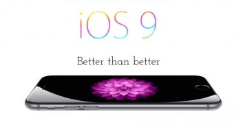
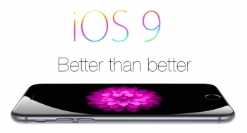
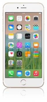
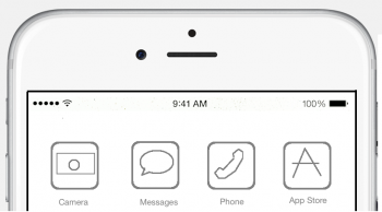
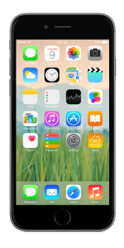
OK, here's my go.

FLS4YZH.png


OFLGqli.png


pIC2fDs.png


Only visible changes are San Francisco and the rumoured Home app.
 

EthanLMT

macrumors regular
Jan 22, 2015
176
59
This is pretty good considering I made it on a chromebook.
image.jpg
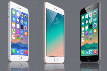
Also, I added another version with Helvetica Neue Ultralight for the text. (I know about the rumored use of San Francisco, but I personally hate how it looks on iOS, looks great on OS X and Apple Watch though :D)
iOS 9.png
 
Last edited:

MartinAppleGuy

macrumors 68020
Sep 27, 2013
2,247
889
I found the 5K version of that wallpaper if anyone wants it for their iPad or iMac:
 

Attachments

  • image.jpg
    image.jpg
    3.8 MB · Views: 832
  • Like
Reactions: rezzo

XTheLancerX

macrumors 68000
Aug 20, 2014
1,911
782
NY, USA
OK, here's my go.

Image

Image

Image

Only visible changes are San Francisco and the rumoured Home app.

Nice! Wish I had even half the talent in photo editing to do these. Never really went and figured out photoshop and such.

Makes me think of the iOS 7 rumor images way back when, I seem to recall seeing a lot of them having grass-like wallpapers. :p
 

seatton

macrumors 6502a
Nov 7, 2013
793
1,222
Seattle, WA
Here's what I came up with. I debated using San Francisco for the branding but decided to stick with Myriad. The OS use SF though. I figured I'd make a a pun on security. Securing the top spot is what I thought up.

Image

I love the wallpaper. Is there a way I can download this?
 

Chad-VI

macrumors 6502
Mar 31, 2014
255
48
Here are some iOS 9 wallpapers that would mimic the Apple style very well.
 

Attachments

  • image.jpg
    image.jpg
    687.2 KB · Views: 379

Agent-J

macrumors regular
Sep 20, 2014
148
38
"From the mind of Jony Ive... iOS 9: Perfection at last."
 

Attachments

  • mockup ios9.png
    mockup ios9.png
    107.7 KB · Views: 375

JediAlejandro

macrumors member
Oct 24, 2013
61
23
Scotland
OK, here's my go.

Image

Image

Image

Only visible changes are San Francisco and the rumoured Home app.

Just to say, love it! I'm using it my wallpaper know! It doesn't look so good when you are adjusting it but once it's set and you see it with the icons it pops! Also, kept referring back and got it to sit the same as on your demo shots! Thanks again! :)
 

Chad-VI

macrumors 6502
Mar 31, 2014
255
48
Those wallpapers are actually used by Apple in ads..

Actually, none of these are used by Apple, they are just similar, and that's why I said they mimic the Apple style. Below is the one used by Apple in ads.
 

Attachments

  • image.jpg
    image.jpg
    191.1 KB · Views: 313
Last edited:

cambookpro

macrumors 604
Feb 3, 2010
7,228
3,365
United Kingdom
Nice! Wish I had even half the talent in photo editing to do these. Never really went and figured out photoshop and such.

Makes me think of the iOS 7 rumor images way back when, I seem to recall seeing a lot of them having grass-like wallpapers. :p

Thank you :) I really like wallpapers which are to do with nature and are nice and bright and cheerful. I found all the new iOS 8 ones a bit dull - the default mountain/night sky wallpaper is probably the first default wallpaper on iOS I really didn't like, so I'm hoping they go for something a bit 'lighter' this year.

Just to say, love it! I'm using it my wallpaper know! It doesn't look so good when you are adjusting it but once it's set and you see it with the icons it pops! Also, kept referring back and got it to sit the same as on your demo shots! Thanks again! :)

Thanks! Glad you like it. I've attached just a flat picture of the iPhone I used as the basis for the mockup, so you can see how it was set a bit more easily.
 

Attachments

  • iOS 9.png
    iOS 9.png
    1.5 MB · Views: 386
Register on MacRumors! This sidebar will go away, and you'll see fewer ads.