I like the new look and the fact that it WORKS and doesn't crash every 5 seconds makes me even more happy. If you don't like the look then by all means get something else because there are other apps out there.
Got a tip for us?
Let us know
Become a MacRumors Supporter for $50/year with no ads, ability to filter front page stories, and private forums.
digruntled by iTunes 7 design
- Thread starter decksnap
- Start date
- Sort by reaction score
You are using an out of date browser. It may not display this or other websites correctly.
You should upgrade or use an alternative browser.
You should upgrade or use an alternative browser.
bousozoku said:It's smooth for me on a 1.33 GHz PowerBook with only 768 MB and with 159 albums but most of the artwork isn't there. It probably will require more tuning of QuickTime to get it to work better on Windows. However, QuickTime never seems to work well on Windows. Then again, what does? I suppose the good thing is that RealPlayer looks bad everywhere.
Yeah, the cover albums is smooth here on my iMac G4 1ghz 17in. Maybe because it supports Quartz Extreme? (However, it doesn't support Core Image)
It pretty smooth on my PC laptop, I have about 100 albums. Although, right now with the new control menu appearing in videos, it is causing some lag playing videos in windowed mode.xli_ne said:I'm more pissed off at Cover Flow. It works extremely poor on my pc, its slow and not smooth at all.
I dont know if its 'cause its a PC (its a fast machine) or because I have around 100-150 albums.
i do like the look of itunes 7 though.
I like this look better, I also liked the fact that they is putting in more emphasis on video this time round.
I welcome the new look. I like the new scroll bars as well. I'm pretty much sick and tired of aqua.
i like it, for the most part...i don't particularly like the scrollbars like many others here, look kinda fuzzy on an lcd.
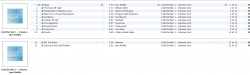
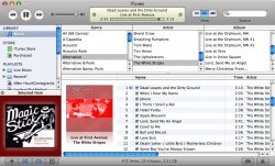
whilst i'm here, i have a question, why is my library showing this album in two seperate parts?? i've messed with the id tags etc and i cannot get it to go to one album...it's a little thing, but it's bugging the heck outta me
whilst i'm here, i have a question, why is my library showing this album in two seperate parts?? i've messed with the id tags etc and i cannot get it to go to one album...it's a little thing, but it's bugging the heck outta me
Attachments
Lau said:Just a mockup. I'd love to have it (and the rest of OSX) looking like that, so if anyone knows how to do it, I'd be very grateful.
Of course it's possible. Grab yourself a copy of ThemePark and open iTunes.rsrc.
You're looking for resource 288 and 290 for selection color, resource 304 for column headings, resources 1025 thru 1131 for the gradients and all of the PNGf fork for the scroll bars. UNO uses this method, as opposed to ShapeShifter's haxie method, to provide skinning abilities. I can do a quick proof-of-concept, if you're truly interested. Interestingly, they did leave the aqua widgets in there. The high-res shots of all the iPod models are quite nice, too.
decksnap said:Does anybody know where in the system I can dig up the old .pngs for the play/ff/ buttons of iTunes 6? They didn't seem to be inside the iTunes 6 pacakge contents. I guess this is because they are shared with Quicktime and such.
What, you mean these attached to this post?
As another poster said, they're stored in iTunes.rsrc and you'll need a program similar to the aforementioned ThemePark to extract and replace them. Just for the hay of it, I added them to show how they look. I didn't copy all the items back in, but you get the general idea. (they upped the header control by 1 pixel, so the aqua ones have to be modified. Haha.)EDIT: I was rather bored I guess, and I did everything but the checkboxes and sliders. If you want the replacement .rsrc file, I can upload it. This will be broken with any and every iTunes update, though (Which simply involves recopying the modified .rsrc file into iTunes.app). There's not a lot you can do about the bottom buttons, unless you were to make your own metallic ones.
Attachments
Lixivial said:Of course it's possible. Grab yourself a copy of ThemePark and open iTunes.rsrc.
You're looking for resource 288 and 290 for selection color, resource 304 for column headings, resources 1025 thru 1131 for the gradients and all of the PNGf fork for the scroll bars. UNO uses this method, as opposed to ShapeShifter's haxie method, to provide skinning abilities. I can do a quick proof-of-concept, if you're truly interested. Interestingly, they did leave the aqua widgets in there. The high-res shots of all the iPod models are quite nice, too.
What, you mean these attached to this post?
EDIT: I was rather bored I guess, and I did everything but the checkboxes and sliders. If you want the replacement .rsrc file, I can upload it. This will be broken with any and every iTunes update, though (Which simply involves recopying the modified .rsrc file into iTunes.app). There's not a lot you can do about the bottom buttons, unless you were to make your own metallic ones.
Hey you rock, man. Thanks.
So is it just the quality of your screengrab or are the aqua scrollers you put back in darker than normal ones?
PS> That looks SOOOOO much better than what they've foisted on us. Can't wait to fix mine when I get home from work.
decksnap said:Hey you rock, man. Thanks.
So is it just the quality of your screengrab or are the aqua scrollers you put back in darker than normal ones?
PS> That looks SOOOOO much better than what they've foisted on us. Can't wait to fix mine when I get home from work.
No problem.
The color difference is likely due to my colorsync profile; the snapshot was taken on my LCD monitor. But I used all the standard Aqua resources from the system .rsrc files (Extras.rsrc and Extras2.rsrc) and the iTunes 6 .rsrc file. I will fix up those checkboxes and EQ sliders when I get home from work and then post instructions + the .rsrc file for you. I'll likely just attach it to this post or something, unless there are a lot more replies to the thread, to bar any further bumping of the thread.
I can't stand the look of iTunes 7. I hate it so much, I uninstalled 7 from my PC and put 6 back on, and never installed 7 on my Mac.
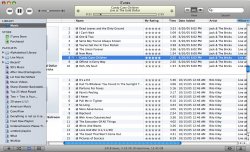
My main gripes with the design are the dull theme in general, the ugly grey buttons, the moving of the browse button to the bottom, the removal of the eq button and it's keyboard shortcut, the textual burn cd button, the ugly grey scroll bars, the ugly source menu on the left with all it's wasted space, the crappy album art importer(iTunes art importer for the PC works many times better), the sluggishness of it on a system with 2 gigs of ram and a graphics card better than the ones in the Mac Pro, and probably some other stuff I have forgot.
Yes I know, that was a crappy run-on sentence.
The only thing good about iTunes 7 was the gapless playback, but that wasn't even worth it.
Edit: And iTunes 7 decided to try and automatically sync my whole library to my iPod without asking me. Man that pissed me off. /rant
L
Lau
Guest
Lixivial said:Of course it's possible. Grab yourself a copy of ThemePark and open iTunes.rsrc.
You're looking for resource 288 and 290 for selection color, resource 304 for column headings, resources 1025 thru 1131 for the gradients and all of the PNGf fork for the scroll bars. UNO uses this method, as opposed to ShapeShifter's haxie method, to provide skinning abilities. I can do a quick proof-of-concept, if you're truly interested. Interestingly, they did leave the aqua widgets in there. The high-res shots of all the iPod models are quite nice, too.
Thanks very much. i shall get a-editing.
No problem, Lau. I think you'll find that it's actually a really fun and easy process once you dive in.
EDIT: Finished as much as I'm going to do with this; I completed it to my satisfaction, but if anyone else has anything else I will be glad to do what I can. Also, there is no Graphite version of this, though I will probably do one for myself soon.
List of changes are as follows:
- Source list color is same as Mail.app, iPhoto
- Source list selection gradient is same as Mail.app
- Column headers are reverted back to Aqua
- Browse headers are converted to Aqua (though they've always been metal)
- Volume knob reverted back to blue when clicked
- iTunes Store trailcrumbs are reverted back to Aqua
- Sliders, Scrollbars are reverted back to Aqua (The scrollbar bug still exists, and there's not a lot I can do about that. It has to be set somewhere other than the .rsrc file.)
- View button is now Aqua, to unify the header.
To install:
1. Close iTunes.
2. Go to /Applications and right click on iTunes.app and left-click on "Show Package Contents"
3. Open Contents, then open Resources
4. Locate the iTunes.rsrc file and right-click on it, and then select "Duplicate" -- this will create a backup of your current iTunes.rsrc file should anything go wrong.
5. Download the new iTunes.rsrc file from here (~2.2 megabytes). Extract and copy the new iTunes.rsrc file to /Applications/iTunes.app/Contents/Resources (where your old iTunes.rsrc file was).
6. Open iTunes.
To uninstall:
1. Rename iTunes.rsrc to iTunes.old and move your backed up iTunes.rsrc file back in.
2. Open iTunes.
NOTE: Since this is stored in iTunes.app, it will be broken by any updates of iTunes. Just follow the same process to reapply.
Attached are images of the final version. If you're interested in doing some of this yourself, you can download the tiff versions of the custom made icons I had to make (and some of the iTunes 6 buttons) here (~270 kilobytes). That's only a segment of them because I only started to become more organized about this near the end; the rest you'll need to pull out of the rsrc file.
Attachments
THAT'S AWESOME. Thanks! I was just mucking around in resknife and I couldn't figure out the scrollbar part.
What's weird is your scrollbars ARE darker than normal. Are you running Tiger? Take a look at a screengrab below of yours vs. the normal ones. It kinda throws the whole thing off.
So - the two obvious things that are missing from your tweaked resource-
- The headers for the browse panes are still metal and not aqua
- The background color of left pane isn't yet the blue of mail, iPhoto, etc.
Attachments
And if I'm just going to point things out for the benefit of us all (sorry, I do appreciate the work) there's something funky going on with the background of the aqua scrollers. You have to look closely at a smaller sized one to notice. It's like the stripes are scaled down with the size of the bar.
You're right, decksnap. I'm going to have to find out why my scrollbars are darker; I'm running Tiger on a MacBook and iMac G3. I'll try it on my iMac G3. If all else fails, I will just use your screenshotted scroll bars as reference, as the rest of my system matches those darker blue scroll knobs.
The other bugs are probably due to my 2 am photoshopping -- iTunes 6 used standard controls, with 7 they've chopped them apart into segments that aren't necessarily logical. But I will resolve them tonight. Thanks for the bug reports. Never thought to check the Browse function and didn't even think to modify it to look like Mail.
The other bugs are probably due to my 2 am photoshopping -- iTunes 6 used standard controls, with 7 they've chopped them apart into segments that aren't necessarily logical. But I will resolve them tonight. Thanks for the bug reports. Never thought to check the Browse function and didn't even think to modify it to look like Mail.
Well don't put yourself through all that work on my account. Looking at it now, it's going to be a real hack job to get the scrollbars right anyway, because nothing is the same size.
I was happy enough when I changed the source panel background to match the other apps. It takes some of the dinge off.
I was happy enough when I changed the source panel background to match the other apps. It takes some of the dinge off.
decksnap said:Well don't put yourself through all that work on my account. Looking at it now, it's going to be a real hack job to get the scrollbars right anyway, because nothing is the same size.
Yeah, the problem with the scrollbars isn't the caps like I initially thought, it's the fact that somewhere outside of the resource file, the size for the middle part is hardset at about 6 or so pixels, with each endcap being about 13px each. So, when I use the standard sized OS X endcaps, it puts gaps between the middle and the endcap, but if I extend the endcap to accommodate for those size differences, it's static and so it doesn't "move" when scrolled.

This is why it's looking crunched down and the stripes aren't showing up too well. If you'll notice, by default, iTunes 7's smallest scrollbar size is larger than any other standard OS X application. Apple did a strange number here, I guess. I didn't notice any particular mask in the resource file that would accommodate for this, so... I can only guess it's set somewhere else. There's no real way around this, I don't think, except to set the end caps at 13px each and living with the small moving scrollbar area.
Anyroad, I'm still uncertain as to why the color difference is there -- the color is uniform on my MacBook and iMac G3, so I'm not sure. Otherwise I've updated nearly everything else that you suggested, the source list is now reflective of Mail, including selection gradients.

And, like I said, I will be adding in an Aqua view button and metal bottom buttons for my own sake.
I will be updating that hosted rsrc file for anyone interested in the future.Wow. You. Are. A. Genius.Lixivial said:EDIT: I was rather bored I guess, and I did everything but the checkboxes and sliders. If you want the replacement .rsrc file, I can upload it. This will be broken with any and every iTunes update, though (Which simply involves recopying the modified .rsrc file into iTunes.app). There's not a lot you can do about the bottom buttons, unless you were to make your own metallic ones.
It looks like part of the program was made by Apple and the other part was made by Linux's bonehead design team. The very first thing I noticed after installing was the new scroll bars, they are just a shocker. Then it took me awhile to realize they replaced the aqua buttons with the same crappy gray look.
If it wasnt for the new browsing and ipod features then I would have uninstalled this ugly thing.
If it wasnt for the new browsing and ipod features then I would have uninstalled this ugly thing.
Some people are never happy. Fine, whatever cranks their turkey, as it were.
But....Life is such.
But....Life is such.
Register on MacRumors! This sidebar will go away, and you'll see fewer ads.