Become a MacRumors Supporter for $50/year with no ads, ability to filter front page stories, and private forums.
Oi, thank the Maker! My eyes were killing me!

I lived with it because I needed my fix of Five Iron Frenzy and Polaris (it's all pipe!), but thanks to Lixivial, I may now resume my regularly scheduled iTunes experience. Thank you. :D

Now if only we could undo Apple's horrible redesign of some of the Store elements, sprucify the web pagey-looking iPod loading screens, and kill the capitalization everywhere. Iiighlity. :rolleyes:
 
evoluzione said:
i like it, for the most part...i don't particularly like the scrollbars like many others here, look kinda fuzzy on an lcd.

whilst i'm here, i have a question, why is my library showing this album in two seperate parts?? i've messed with the id tags etc and i cannot get it to go to one album...it's a little thing, but it's bugging the heck outta me :(
Try the compilation checkbox. Select all the tracks, then Command-I. Look in the lower left-hand corner. Check it and pick Yes. This worked for me.

About fuzzy scrollbar ... i think it's a bug. It goes unfuzzy when I make it bigger. Picture of fuzzy scrollbar included for those not in the know. Click to see the horror.

Picture 4.png
 
I must admit it's a bit dark. No doubt it'll grow on me. Maybe Apple will start putting pentagrams and bloody skulls on version 8? :D

Yep, definitely kinda dark. And a bit bland. The scroll bars need patterns, and we need that brushed aluminium look back. Don't mind the loss of the blue bubbly scroll bars, but they need to be replaced with something more interesting than the ones now.
 
Sorry to hijack this thread one last time, but I just wanted to notify those few interested that I finished my version of aquafied iTunes 7. Instead of writing up another long post, I simply modified this post here (post #42 in this thread). All you have to do to update is redownload the file and recopy it in.

Perhaps a new thread was a better idea for that, but all the relevant information was already in this thread, so... :) For those that use it, I hope it works out for you. I ended up doing it because, while I initially loved the iTunes 7 interface, once I used it in OS X I wanted Aqua back. In Windows, I do love the new look, but not in OS X.

Thanks.
 
maxrobertson said:
By the way, I Don't know if anyone has posted this, but I just found a picture of a pre-release version of iTunes on Daring Fireball. It's so Windowsesque I cannot even comprehend how this got into a prerelease version! http://docs.info.apple.com/article.html?artnum=60984
um, that's a link to an apple help document on neavigating to an Ipods about menu to find out what version of iPod firmware you have:confused:
 
Lixivial said:
No problem, Lau. I think you'll find that it's actually a really fun and easy process once you dive in.
Thanks man, made my day.
 
wmmk said:
um, that's a link to an apple help document on neavigating to an Ipods about menu to find out what version of iPod firmware you have:confused:

Up until a few hours ago it showed a beta version of iTunes 7 that was very different. (the shot at the bottom) It has since been updated..
 
Lixivial said:
Sorry to hijack this thread one last time, but I just wanted to notify those few interested that I finished my version of aquafied iTunes 7. Instead of writing up another long post, I simply modified this post here (post #42 in this thread). All you have to do to update is redownload the file and recopy it in.

Perhaps a new thread was a better idea for that, but all the relevant information was already in this thread, so... :) For those that use it, I hope it works out for you. I ended up doing it because, while I initially loved the iTunes 7 interface, once I used it in OS X I wanted Aqua back. In Windows, I do love the new look, but not in OS X.

Thanks.

Thanks lixivial.

There is also at least one other version out there. This one on Macupdate has more accurately colored scrollbars, but seems to suffer from the same sizing glitches. I also don't like their buttons on the bottom. I think I'll have to use some sort of crossbreed.

AguaT
 
really? that's really weird, because it works surprisingly well and is very smooth on my PC, which has no dedicated video card and a 2 Ghz celeron. I was actually surprised that it worked at all.

xli_ne said:
I'm more pissed off at Cover Flow. It works extremely poor on my pc, its slow and not smooth at all.


I dont know if its 'cause its a PC (its a fast machine) or because I have around 100-150 albums.


i do like the look of itunes 7 though. :D
 
maxrobertson said:
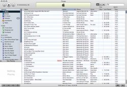
yeah, here's the picture I was talking about (I saved it because I knew they would get rid of it eventually)
Thanks. That version of iTunes looks so much nicer than the public release. Do you think Leopard will sport that look? I hope so! :)
 
maxrobertson said:
yeah, here's the picture I was talking about (I saved it because I knew they would get rid of it eventually)
That's very nice maxrobertson

Better looking then mine so far... I've got a way to go.
 

Attachments

  • iTunes_white.jpg
    iTunes_white.jpg
    38.1 KB · Views: 134
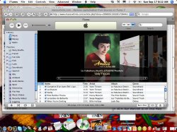
I hate the new look too, and used a freeware app called AguaT to change it back to a more eye pleasing Aqua. even the icon was replaced with the old green one - which i prefer!

I then used this tip from Macosxhints to remove the capitals from the sidebar.
:D
 

Attachments

  • itunes.jpg
    itunes.jpg
    108.6 KB · Views: 138
though i may have ambivalent feelings towards this update, in the end i still end up not liking it too much....
 
Register on MacRumors! This sidebar will go away, and you'll see fewer ads.