Become a MacRumors Supporter for $50/year with no ads, ability to filter front page stories, and private forums.

mocman

macrumors regular
Original poster
May 8, 2004
214
0
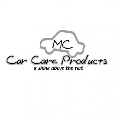
I am starting up a new business for making car care products. Such as tire shine and shampoos etc. I am trying to get my logo locked down to no avail. But here is my start and please feel free to show me the direction to go in. Thanks MC

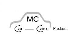
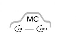
My business name is " MC Car Care Products "
 

Attachments

  • Logo -  Logo_1stlogo.jpg
    Logo - Logo_1stlogo.jpg
    79.6 KB · Views: 177
Keep the "MC Car Care Products" all the same type face and the same size, and preferably on one line.
 
First of all dont design on a black background. Secondly don't use Arial as it is most design apps default font and makes any design work seem like you couldn't be bothered to use a different typeface. That might sound a bit harsh but thats how I feel about Arial as well as it is just plain fugly. ;)

Try not to use gradients or very subtle touches like the highlights and lines within the sphere because when you apply the logo to something small like a business card you are going to lose the clarity and can end up with something that looks very poor. Try designing it using just black then when you are happy add colour.

Pay attention to the dimensions of each object. As it stands if you reduced the size of your logo to fit on a business card for example even though the sphere may look ok size wise the size of your text would end up being very small.

Forget about your phone number until you have cracked the design of your logo. The phone number is not part of your logo and will just cause you more problems to solve.

Design the logo, then try a few compositions on a business card including your phone number and address etc. Try keeping your logo separate from the contact info to allow maximum impact of your logo and clarity of the information you are offering.

For more impact I would suggest a heavier (bolder) font and kind of agree with bartelby about keeping the text on the same line.

Hope this helps. :)
 
I'm just messing about and with a black background it's quite hard to get the sphere to look central in the image.
Here's 2 versions. (I may have changed my mind about the 1 line :eek:)
Picture 1.png

Picture 2.png

EDIT: Looking at them, stick with one line.
 
1st - what is that purple blob supposed to represent exactly (it looks like a purple photography lightbulb to me), it doesn't have a any relevance to cars or car care products from my perspective.

2nd - nothing wrong with using Arial, I've used it in my business logo, its just the way you've used it which doesn't look very good in my view, so try some different fonts.

3rd - I don't actually like the logo colour scheme either.
 
You have an extra space in the phone number before the last four digits. I think incorporating the MC inside the circular logo is the way to go.
 
a little more.........tweaking
 

Attachments

  • Logo -  Logo_1stlogo.jpg
    Logo - Logo_1stlogo.jpg
    97.3 KB · Views: 96
2nd - nothing wrong with using Arial, I've used it in my business logo, its just the way you've used it which doesn't look very good in my view, so try some different fonts.

Arial is a bad (uglier) copy of Helvetica. If you find yourself wanting to use something resembling Arial, go for the real thing. It's a lot nicer.
 
diff color
 

Attachments

  • Logo -  Logo_2stlogo.jpg
    Logo - Logo_2stlogo.jpg
    125.1 KB · Views: 109
one more............
 

Attachments

  • Logo -  Logo_3stlogo.jpg
    Logo - Logo_3stlogo.jpg
    137.7 KB · Views: 115
Ooh my poor eyes

Go back and re-read the suggestion about not using excessive gradients and effects, especially on text.

The direction you are going, you'll only be able to buy the most expensive, photo type business cards, 'cause it just won't come across on standard cards, letterhead, envelopes, etc.

One hint - if it doesn't work properly in black and white, then you have to simplify it.
 
diff font and I will work on the above statement.thanks
 

Attachments

  • Logo -  Logo_4stlogo.jpg
    Logo - Logo_4stlogo.jpg
    123.3 KB · Views: 117
ummmm.......
 

Attachments

  • Logo -  Logo_5stlogo.jpg
    Logo - Logo_5stlogo.jpg
    80 KB · Views: 131
getting close I hope..........
 

Attachments

  • Logo -  Logo_6stlogo.jpg
    Logo - Logo_6stlogo.jpg
    73.9 KB · Views: 103
The prototype designs are improving since the first one.. I would stick with the last one and use Myriad Pro (Apple's Font) ;)

Edit -- Lose the Disney font in the slogan.
 
In my opinion...

It now looks like a surf wear shop logo. Loose the slogan, save it for a shop or leaflet.

Personally, I take pride in my car. The products I use (Autoglym etc) all have a very 'clean' design. I'd settle on a market, eg race cars, family cars, high performance cars, and tailor your logo to that.

Secondly, the design as it stands doesn't convey 'cars' to me. It's very abstract and reminds me of the CoreImage/CoreVideo/CoreAudio logos. These work, however, because there is no 'touchable' real world CoreImage. Cars are very touchable.

How about a piston, a wheel on an angle or glossy paintwork?

AppleMatt
 
Arial is a bad (uglier) copy of Helvetica. If you find yourself wanting to use something resembling Arial, go for the real thing. It's a lot nicer.

Can't see any reason to go changing the font to be honest, at the size the text is the differences (atleast on my letters) is minimal if there are any at all, combined with the weight/thickness of the font I'm not going to go changing it all for no reason, besides I don't feel like paying for a font (which I'll likely use once) that is already available to me albeit as a copy :rolleyes:

Now back to the 'new' designs.

Orange - hang on I'll just look at the sun to get my eyesight back - thats dire sorry

Later ones - better but you seem to be 'stuck' in a set design. Get some paper and a pencil/biro and draw out some ideas in solid colour and lines. Play around with some placement of the text, different ideas for the 'logo', look at whats already out there.
 
a little more now I have headache........
 

Attachments

  • Logo -  Logo_8stlogo.jpg
    Logo - Logo_8stlogo.jpg
    54.5 KB · Views: 108
I think I've worked out whats really making the designs look rubbish to my eyes.

Do you really need products on there. Can you use MC Car Care

Just for an idea (not very good in my opinion) but it shows what I mean.
 

Attachments

  • Untitled-1.jpg
    Untitled-1.jpg
    12.6 KB · Views: 107
  • Untitled-2.jpg
    Untitled-2.jpg
    11 KB · Views: 104
Register on MacRumors! This sidebar will go away, and you'll see fewer ads.