Become a MacRumors Supporter for $50/year with no ads, ability to filter front page stories, and private forums.
shadows in the words?? I also thought of the car logo a little bigger and lower the opacity....I will try a little bit later....thanks for all the replies......MC
 
mindbrain...........you think I would be posting on here for info if I had money to hire a designer......??
 
At least he is trying, give him a break

If you are so good why not put a suggestion in?

But like many have said it does look better with out the shadows

He actually did give a suggestion, a pretty good one. The logo is important, and there are people very skilled who can do the job—heck probably even here right now reading this thread.

Doesn't have to be that expensive either.

Edit: you say you don't have money for a designer. Why not just not have a logo until you can afford one?
 
Edit: you say you don't have money for a designer. Why not just not have a logo until you can afford one?

I second that, and add: why not just have a logo until you have some sort of a customer base? Your first customer don't care about your logo, they want a better car care experience for a better price.

When you have more work than you alone can handle and you start hiring, then I would say it is time to worry about logos and other things.
 
another
 

Attachments

  • Logo -  Logo_9stlogo.jpg
    Logo - Logo_9stlogo.jpg
    32 KB · Views: 79
You're definitely heading in the right direction, MocMan, and way to be persistent. Don't get discouraged by a few negative comments. I go through 25+ variations of a logo before I find the perfect one, so you just need to be patient and avoid settling on a logo you're not happy with. It really is a reflection of your business, and the more professional it looks, the more professional you're going to appear to your customers. Keep at it, even if it takes a few weeks--it will be worth the wait.

As for your logo, here are my comments / suggestions:

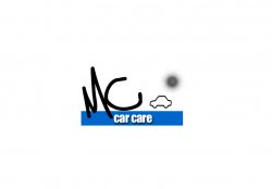
First of all, great job on ditching all of the layer styles and colors. Save those for after you get a solid, black and white logo going. Once you do, I think the effects could really add something if you go with a glossy feel. Glossy is usually overrated and sometimes seen as unprofessional, but given that your product revolves around making cars shine, I believe it would be appropriate. For example, Logitech is one company that has a solid black and white logo that they can print on mouses and speakers where color cannot be used, and then they have a fancy, colored logo that they use for everything else:

Logitech%20logo.jpg


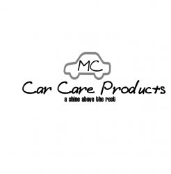
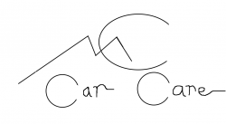
I really think your font choice is what's hurting the logo the most. Slim, hand-written fonts are some of the hardest fonts in the world to work with, especially in logos. Yes--you can make them work--but it's going to be a challenge. Have you experimented with Helvetica, yet, as others have mentioned? It's a great font and the possibilities with the various font styles are endless. If you're not a fan of that font, try other fonts that have numerous font styles (light, regular, medium, bold, black, etc) Experiment with making MC Car Care bold, and Products in a light font underneath. Experiment with your kerning (the gap between the letters) and making MC Car Care tight, and products really spaced.

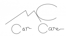
Another aspect that I feel is missing from your logo is a sense of... "togetherness", for lack of a better word. I feel like you have a word here, a word there, and nothing to bring it all together. Take a look at how these logos are tied together:

41PDNVTG1YL.jpg
mac_logo.gif


Also notice how both of these logos would look great in black and white, but yet they look great fancied up. (Note: I imagine both of these companies are your competition, so you don't want to make anything that makes a customer think, "Hey, that reminds me of Meguiar's logo!"). Sometimes it's good to take a look at other logos to get ideas, and to see what works and what doesn't. When you have time, stop by a book store and take a look at a book like "Logo Lounge", which is filled with nothing but thousands of logos. It may help spark an idea for you.

One more thing: MC Car Care Products is plenty long enough for a logo. Ditch the phone number and the slogan--it's just too much text for one logo, and it's going to be impossible to read when scaled down. There are other places to include your slogan and contact information other than in your logo.

I would throw something together for you as an example, but I really think you're getting closer with each version, and you know your company far better than I do. If you get discouraged to the point of settling, shoot me a PM and I'd be happy to help you out some more.

Keep it up, Mocman--you're definitely getting there. Now, any tips for me for cleaning off hundreds of tiny sap spots from the hood of my car that fall from the tree in my yard? :confused:
 
thanks CRSpeedy for some direction as I need it. I concur on the neg stuff but it comes with the posting.........i am not a professional.....here is another direction but may replace the sun in the back ground with some sort of car:rolleyes:
 

Attachments

  • Logo -  Logo_b10.jpg
    Logo - Logo_b10.jpg
    123.3 KB · Views: 91
mocman

That is getting there. A great improvement.

I've been following the thread from when you first asked for advice, I would agree with most of it.
 
I would say you need to get the name shortened down to some really good looking abbreviation in the logo. I had this problem once when I was doing a logo as the company name was massive. Think about getting it shortened then work it into the logo.

The car idea logo I though looked good, was clean but again the name spoilt it.
 
Mocman think about what your company offers and how you would portray that visually. From what I can gather you offer products that clean and protect your vehicle.

Attached is a VERY quick logo that you must not take literally but use it as a basis for something better. In it I have depicted protection (circle around car) and cleanliness (shiny star thing) and it is also using only one colour which means the logo will work well in say a phone book ad or newspaper advert. If you have a logo with various colours and gradients all over the place it will not replicate well in certain situations and will make your company look unprofessional.

Once you have settled on a design that works well in black and white then you can add colour. In the attached instance for example you could make the car, circle and shiny star thing blue and the text could be a lighter shade of blue or something.

If a logo can be simplified then its not working to its full potential. Come up with an idea then simplify, simplify, simplify!
:)

Take in all criticism, good and bad, learn from it and create something better.
 

Attachments

  • Picture 1.png
    Picture 1.png
    7.4 KB · Views: 664
Just got home from the masters so now I get to work a little more tonite. Anyway thanks for the input on the logo.
The reason that I really am staying away from the "car care" only is because I will be making all the products for car care and some to industries such as cleaning and degreaser. I feel that if I go with car care it will seem that I will be detailing the car etc. I will try another later on tonite and post and i think that I have come a long way since yesterday thanks to all of you guys.......MC
 
a little of the past.........
 

Attachments

  • Logo -  Logo_b11.jpg
    Logo - Logo_b11.jpg
    36.8 KB · Views: 90
you dont have money to hire a designer, but you have money to start a business with your own line of products?

that's uncalled for and has nothing to do with this thread.

to the OP: I like your most recent design. I think it may look better if the sun shape were on the car and if the word "products" was removed.
 
hey bowzer, after looking at your site maybe you need hire a pro web master. But thanks for your concern...........
 
i think you definitely need a logo that suggest an automative nature, not just a pretty symbol. Something like this. (3 slightly different versions)
 

Attachments

  • delete me.png
    delete me.png
    20.5 KB · Views: 83
  • delete me 2.png
    delete me 2.png
    19.5 KB · Views: 73
  • delete me 3.png
    delete me 3.png
    19.5 KB · Views: 81
Just got home from the masters so now I get to work a little more tonite. Anyway thanks for the input on the logo.
The reason that I really am staying away from the "car care" only is because I will be making all the products for car care and some to industries such as cleaning and degreaser. I feel that if I go with car care it will seem that I will be detailing the car etc. I will try another later on tonite and post and i think that I have come a long way since yesterday thanks to all of you guys.......MC

If you are referring to my post I did say don't take it literally. It was to show how car care and cleaning can be shown visually I.e. In a logo. You still seem to be going in circles at the moment and some input you have taken onboard isn't the best of quality and your logo is still coming across amatuerish, no offence. I'm offering professional advice, its ok if you don't use it thats your choice, I'm just trying to help. I admire your persistence in achieving what you desire.
 
I've no vested interest in whether you succeed or fail, nor whether you take on board the advise offered so would hope I'm objective. As I've said before, I do have a strong interest in car care. That would be my only bias affecting my posts, however I would presume it's a positive bias as I am a potential customer.

I think your transition from the abstract orb logo to the concrete car was the best step you made - a definite big jump, well done. I also think MacboobsPro has conveyed visually what I was trying to say before, with a bit (lot...) more expertise! I'd certainly consider that to be your strongest starting point so far. The logo has a clear boundary, it's neat, it is consistent (same font, single shade) etc etc.

Language is very powerful. If you want to stray away from the 'car care' imagery, take it out of your company name. And either way, loose "products." Everything is a product; shoes, tomatoes etc. You don't see 'Apple Computer Products', 'Canon Printer Ink Products'. The implication of something being a product is in its name.

AppleMatt
 
Here is a little diff.......also thanks for the directions as I feel that I am finally getting somewhere.
 

Attachments

  • Logo -  Logo_b1.jpg
    Logo - Logo_b1.jpg
    49.1 KB · Views: 69
  • Logo -  Logo_b2.jpg
    Logo - Logo_b2.jpg
    36.4 KB · Views: 82
  • Logo3.jpg
    Logo3.jpg
    22.3 KB · Views: 70
What is it with the MC, you have used that same cheap, badly drawn style on several of them now. It does the designs no favours and theres no way I would think that using that font is going to give me a good quality finish to my car care.

You also seem to be going around in circles, several of us (who do design for a living) have given you advice about which is best etc yet you seem to keep ignoring it :(.

Go through this thread, bullet point the advice given and then try and design a logo around it.
 
Register on MacRumors! This sidebar will go away, and you'll see fewer ads.