Got a tip for us?
Let us know
Become a MacRumors Supporter for $50/year with no ads, ability to filter front page stories, and private forums.
don't laugh to much.......
- Thread starter mocman
- Start date
- Sort by reaction score
You are using an out of date browser. It may not display this or other websites correctly.
You should upgrade or use an alternative browser.
You should upgrade or use an alternative browser.
really hate to be rude, but
Honestly, if you don't have the money to hire a designer, you don't have the wherewithal to start a business.
What next, a free formulator, a free printer, free advertising space, a free attorney, a free
Hey, send me a free computer, and we'll talk.
mindbrain...........you think I would be posting on here for info if I had money to hire a designer......??
Honestly, if you don't have the money to hire a designer, you don't have the wherewithal to start a business.
What next, a free formulator, a free printer, free advertising space, a free attorney, a free
Hey, send me a free computer, and we'll talk.
I wasn't refering to the use of MC but the font that was being usedLeviG the MC is my initials and I think that it is mandatory in my logo.
 Your name and hence your initials are not mandatory in your business name, thats a decision you made. My business has no reference to my name in any way manor or form (except on letters for signing etc).
 And if that is the case explain why you are still using drop shadows when several people have suggested not doing so, plus some of the last couple of designs have gone back to gradients which we said move away from due to cost of printing!!Also I think I am listening very well since the inception of my first logo
You're not prepared to pay for your design so atleast take notice of us designers.
LeviG the MC is my initials and I think that it is mandatory in my logo. Also I think I am listening very well since the inception of my first logo. Here is another one also.....Thanks
That's much better than your original ones. Getting better. If I get time later, I'll see what I can whip up.
LeviG the MC is my initials and I think that it is mandatory in my logo. Also I think I am listening very well since the inception of my first logo. Here is another one also.....Thanks
I'm confident that LeviG was speaking to the style "MC" was in, and not its very being in the title of the company. The typeface that you choose to use for this application should convey "clean, professional, authoritative" while the MC in most of your iterations has conveyed "whimsical, fun, light-hearted, a tad irresponsible." It was much more suited for a toy or game than a product that wishes to be taken seriously.
EDIT: Gosh, I'm slow this morning...
Honestly, if you don't have the money to hire a designer, you don't have the wherewithal to start a business.
Tell this to my grandparents, who have operated their own small business for 20 years without ever having a logo or identity. They seem to be doing just fine.
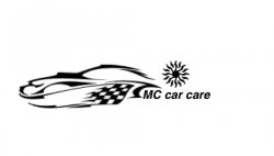
I am trying other fonts but have thousands to choose from any suggest? Here is one more before I leave for work....mc
oh yea czardonic: I have owned and operated a biz for 18 years and needed no logo. It kills me that people like you never do anything in life on their own. You are the type that pays someone to change a lightbulb in your apartment. Anyway thanks for your time.........LeviG your right, along with alot of others on the forum and I will tweak a little more tonite.........mc
oh yea czardonic: I have owned and operated a biz for 18 years and needed no logo. It kills me that people like you never do anything in life on their own. You are the type that pays someone to change a lightbulb in your apartment. Anyway thanks for your time.........LeviG your right, along with alot of others on the forum and I will tweak a little more tonite.........mc
Attachments
You're definitely headed in the right direction, Mocman.
I'm not sure if you're actually designing the entire logo yourself, or if you're getting the clipart from online (no problem with that), but if you are going with the second route, make sure you get it from a website that allows it, and one that you can download in a vector format. Speaking of vector, what program are you designing the logo in? Do you know about .eps and .ai file formats? If not, I'd be happy to help you out in those areas as well, because it's absolutely crucial with a logo.
One website that may help you out is StockXpert, which is a stock photo website where you pay $1-$10 to download images for your own use. Now, there are numerous disadvantages to using one of these in your logo (such as other people being able to use the same image in their logo, if they so chose), but it could be an option for you.
Here's my quick 5 minute job, which is FAR from great, but may give you a better idea of what I meant about using different font styles / sizes and kerning.
Attachments


Getting better. I don't like the geometrical symbol? Is that meant to be a sun? It's a bit distracting. Is there a reason you included it? BTW, good for you to keep at this, despite what may seem to you to be criticism.
I don't like the geometrical symbol? Is that meant to be a sun? It's a bit distracting. Is there a reason you included it? BTW, good for you to keep at this, despite what may seem to you to be criticism. 

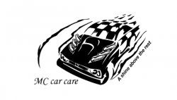
This is by far the best one I've seen so far. I'd be happy with that for a final design. Give CRSpeedy $100 for his 5 minutes and consider yourself lucky you got a wonderful logo from such a expert designer that meets all your requirements (including the inclusion of the word 'products') for such a cheap price. Bargain.
Better than paying an average designer $1000 for 20 hours work creating a brief and ending up with something half as good.
Are you kidding? I mean...the best so far, yea but uh....ummm oh nevermind
I think it's the best one so far too. Though I would say that the car silhouette is a bit too subtle. If there was a bit sharper bend going from the hood to the windshield then it would be better IMO.
Greg
Give this software a try - Business Card Composer
Also some quick pointers (sorry for any repeats):
- Stay away from Arial, Times New Roman, Papyrus and Comic Sans fonts
- Don't put too may effects, stay away from gradients, drop shadows, lens flare (bad, very very very bad) and other stupid smelly over used filters. (Trust me it will look better without).
- No photo backgrounds
- Web safe colours (another no no).
Kind of off topic but it looks as though a little spec work is happening here....
http://no-spec.com/
- Don't put too may effects, stay away from gradients, drop shadows, lens flare (bad, very very very bad) and other stupid smelly over used filters. (Trust me it will look better without).
Most of the filters are used for polishing a turd anyway, meaning people use them to try to make something that is just mediocre look better. It rarely successfully works. Filters are evil little things!
Certainly not my intention, and I apologize if it came across that way. I wrote a rather long post filled with comments and suggestions, and only threw together a five minute logo as an example to show what I mean, instead of just telling it. I admire the persistence of MocMan, and I looked at the situation as helping out a new designer, rather than providing free spec work to a client looking for handouts.Kind of off topic but it looks as though a little spec work is happening here....
http://no-spec.com/
Feel free to remove my input and mock-up if you feel it was inappropriate.
i agree with tomato: pay crspeedy $100 for the logo. then pay him another $100 for a colored version. then focus on your core business and products. at that point you're wasting valuable time by playing around with logos.
congrats to crspeedy. as customer i would look at the products after seeing that logo. this one can become a classic if your products stand the test of time. and it can be modified over time to go with fashion.
just imagine to have different colored spraystripes for different product lines down the road. not everybody will like it but it's good. and if your products hold up then you're fine.
Mocman..your designs all have the same faults, BAD TYPE.
Seriously, CRS designed a piece in 5 mins that is 10x better than anything that you came up with, reason? It utilizes symbols and elements from the company in a SIMPLE form..the type is not over dominating the symbol, and vice versa.. The clip art you are using is lame..sorry to be so harsh.
logos like these are not cheap to come by.. I really think you should PM him and discuss paying him some $ to get some elements he created in that design... otherwise, you're completely lost man.
If not, pm me and i'll talk about what I can do for my time spent...
Mocman..your designs all have the same faults, BAD TYPE.
Seriously, CRS designed a piece in 5 mins that is 10x better than anything that you came up with, reason? It utilizes symbols and elements from the company in a SIMPLE form..the type is not over dominating the symbol, and vice versa.. The clip art you are using is lame..sorry to be so harsh.
logos like these are not cheap to come by.. I really think you should PM him and discuss paying him some $ to get some elements he created in that design... otherwise, you're completely lost man.
If not, pm me and i'll talk about what I can do for my time spent...
classy
First he admits that he cannot pay anyone and he just wants advice.
Then you come around and tell him he's horrible and then you ask for money.
some of the biggest no-nos in logotype design:
1. NO drop shadow or glows
2. NO script or hand-written looking fonts
3. NO "core web" fonts unless you really know how to make them look good. Otherwise they will look cheap. Arial and Comic Sans are huge no-nos. They look unprofessional to design professional and average customer alike. Choice of type is one of the easiest things you can do to look like a professional instead of an amateur.
Finally, some positive advice: design with type first. Come up with some logos that look powerful and cohesive only using letters, and then if you still find it necessary to introduce graphic elements to the logo, introduce them so that they complement the letters, not distract from them. Make sure your graphical elements add meaning and power to the overall design, otherwise they shouldn't be there.
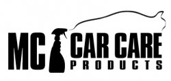
Personally I feel there is too much going on in your designs. The graphic elements are too busy and the font choice has tendencies towards being over-stylised. I also think there is too much in the way of text. A slogan is unnecessary in a logo, and the use of the word products is redundant.
Here's what I came up with in a few minutes (I took the liberty of changing the text from Car Care to Auto Care, as there is no real reason to limit your products to just one side of the motor industry). I'm not 100% happy with it, but you get my gist...

or

Here's what I came up with in a few minutes (I took the liberty of changing the text from Car Care to Auto Care, as there is no real reason to limit your products to just one side of the motor industry). I'm not 100% happy with it, but you get my gist...
or
classy
First he admits that he cannot pay anyone and he just wants advice.
Then you come around and tell him he's horrible and then you ask for money.
Point out where I said $ or Money, Thanks.
As a graphic designer, this thread pains me. I'm up out.
Register on MacRumors! This sidebar will go away, and you'll see fewer ads.