Become a MacRumors Supporter for $50/year with no ads, ability to filter front page stories, and private forums.

xgman

macrumors 603
Aug 6, 2007
5,697
1,425
I think that 90% of people just don't care how windows are managed: they store all their icons on the desktop, all of their apps are constantly running (they just close windows, they don't quit the apps) and when a window is hidden behind another, they think the window doesn't exist so they click on the app icon to open the app, which brings the already-open window to the front. .

I see you know my wife. :D
 

CodeBreaker

macrumors 6502
Nov 5, 2010
494
1
Sea of Tranquility
Consider Spaces:

all-spaces-plus-expose.jpg


… and Mission Control:

View attachment 325407

In the first screenshot, I can see ALL open windows, in all spaces, at once, in the largest possible size they can fit. Pressing Space over each one will make that one even bigger.

In the second screenshot, try to quickly tell which is the current desktop (tip: it's the one with the white border around the thumbnail). Moreover, try to quickly preview other windows, on other desktops. You can't. You have to swipe to those desktops one by one, linearly. THEN you really lose track of which desktop you're on now.

Another issue is this: no, I don't instinctively know what app the window I'm looking for is in. Sometimes I have a PDF open in Safari, and another PDF in Preview. All I know is that I want to get to a certain PDF, I don't remember which was the one in Preview and which was in Safari. What if I have 4 Pages documents open on 4 different desktops, clicking "Pages" in the dock will only show me one of the documents. If I want to use App Exposé, I need to first click Pages in the dock, which will yank me to another desktop, and THEN activate App Exposé, and then choose the window I want, which will probably also yank me to yet another desktop.

The only thing I like about Mission Control are the gestures. But why couldn't Apple just implement gestures to control Spaces? 3-finger swipe up/down/left/right to navigate between spaces, 4-fingers-up to enter Spaces Overview Mode (like top screenshot), and 4-fingers down to enter Exposé without entering Spaces. Why not?

I think that in Mission Control, it's extremely confusing that the top thumbnails are a different size than the large "current desktop" in the middle, which, in case you're in a full screen app, isn't even your current desktop, but rather Desktop 1 for some baffling reason.

Basically, in Mission Control, there is absolutely no way to see all your open windows at once if you have more than one desktop, while in Snow Leopard there is. To me, that makes Snow Leopard's window management better, no matter what.

This has forced me to limit myself to two spaces at the most. So I don't have to search for a window. Really, what kind of crazy man would murder Spaces?
 

Saturn1217

macrumors 65816
Apr 28, 2008
1,360
1,048
However, if you use a bunch of different apps to open the exact same content you might prefer the old Exposé way. But I never understood why people do this anyway. Seems pretty disorganized and requiring more apps to be opened and closed, therefore more messy and more RAM and CPU resources used, more organization needed, and more apps to learn. Doesn't seem very productive overall to me in comparison in the long run.

For the record even though I dislike a lot of things in Lion/ML MC is far down the list and I do appreciate some of the benefits over Expose/Spaces (although I would prefer the SL way)

But seriously?! People who use more than one app to open the same content don't do it for fun. We use more than one app because different apps do different things...

Ex: I will open up a pdf file in preview if I want to highlight it. I will open it up in adobe reader if I need to fill out a form that isn't supported by preview or if I want to check cross platform compatibility...I will open a jpeg in photoshop if I want to edit it but I will open the same jpeg in preview if all I want to do is view/rotate it. This seems extremely reasonable/essential depending on your work flow so I don't understand why you think people would be making their lives more complicated just because they can...(I hope I don't sound rude)

Windows management in OSX has always been less than stellar (yes expose has its downsides too). I am disappointed that with MC Apple chose to make things worse rather than really sitting down and trying to make things better. It is hard to manage multiple windows for the same application in OSX (this is not Lion specific). Sometimes that is exactly what people need to do to get work done. I would love to see Apple attempt to address this without all the overly cutesy graphical clutter that they seem to trend towards these days...
 

Basic75

macrumors 68020
May 17, 2011
2,122
2,464
Europe
I don't care how they fix it, but we need some sort of feature to see all windows for all open apps with a press of a button


The way that Expose and Spaces worked (also together) in Snow Leopard wasn't bad, only issue was the limitation to a mere 4 x 4 = 16 Spaces, but at least there was a grid...
 

stevemiller

macrumors 68020
Oct 27, 2008
2,057
1,607
Yep, this is exactly how I work. Snow Leopard's Expose just wasn't very useful in my opinion but Lion/Mountain Lion's MC was a godsend. Look folks, the difference is clear. If you are app centric like KnightWRX explained above, then Mission Control is awesome. Best productivity enhancer for an OS I've seen in a long time.

However, if you use a bunch of different apps to open the exact same content you might prefer the old Exposé way. But I never understood why people do this anyway. Seems pretty disorganized and requiring more apps to be opened and closed, therefore more messy and more RAM and CPU resources used, more organization needed, and more apps to learn. Doesn't seem very productive overall to me in comparison in the long run.

And that model is going to be more difficult as time goes on because it seems Apple is moving more to the app centric model rather than the document centered one in more places. iCloud for example is app centric. You have a presentation to work on, you switch to Keynote and open your presentation from there. And what's cool about the newer way is that you don't even have to remember what file you were working on because it should be right there in front of you after opening or switching to the Keynote app.... even if you just rebooted.

Same thing for other apps. Working on HTML code for example, the idea is to just switch to the app first rather than the document first. The document should then be there waiting for you and if there are a bunch of them, App Exposé in Lion makes it really easy to find the one you want rather than Snow Leopard's Exposé which would instead throw up ALL windows which doesn't make sense when you are already on the desktop/app you're going to be working with. And again this works best if you have already decided that Coda or Dreamweaver or whatever is your HTML editor of choice as then you always know which app to switch to for that particular kind of document and that particular type of document isn't spread across different App desktops.

In other words, Lion and Mountain Lion's desktops are more App centric with their related documents neatly organized along with them. Which is how iCloud is also set up to work. Over time, most apps will have moved to accommodate this workflow by integrating Lion's new features. And if you aren't adapting, you will miss out even more on the productivity gains we're already experiencing.

Of course you can stay with Snow Leopard and the old way of doing things but others will be passing you in productivity and efficiency as time goes on and they adapt to the more efficient workflows. For now, experience and muscle memory might serve you well but that never lasts in the grand scheme of things. Just ask those who didn't want to learn a new workflow when Leopard/SL was released.

how does making mission control favour app-centric searches become a productivity gain? if you want to find an app, you've always had the dock AND command+tab at your disposal. and if you're properly gonna be OCD about that kind of organization, i'd think those clean lists of app icons would be preferable to the additional visual clutter of multiple piles of document windows (ew documents, who'd want to search for those?). you are saying people should search for app first, document second, but apps in mission control are most strongly visually defined by a single document at the top of each collected pile.

if i may make a modest proposal, maybe we should just take things a step further and completely do away with multiple documents open at once. work on one, close it and then open the next. nice and clean. actually lets get rid of multiple windows of any kind for that matter. full screen apps do seem to be the future. come to think of it, even multitasking is just another word for mental unfocus. i guess even iOS has gone too far in that regard... hopefully they'll give us another productivity boost and scrap multitasking from iOS6 :)

ps. yes i know my snark meter is off the charts here, but i just feel like i'm living in bizarro land when taking a really useful feature for finding an open document and reducing it to essentially a listing of running apps (which as i pointed out, already existed in no less than 2 other forms) is considered the best productivity enhancer of recent times.
 

thejadedmonkey

macrumors G3
May 28, 2005
9,240
3,499
Pennsylvania
how does making mission control favour app-centric searches become a productivity gain? if you want to find an app, you've always had the dock AND command+tab at your disposal. and if you're properly gonna be OCD about that kind of organization, i'd think those clean lists of app icons would be preferable to the additional visual clutter of multiple piles of document windows (ew documents, who'd want to search for those?). you are saying people should search for app first, document second, but apps in mission control are most strongly visually defined by a single document at the top of each collected pile.

if i may make a modest proposal, maybe we should just take things a step further and completely do away with multiple documents open at once. work on one, close it and then open the next. nice and clean. actually lets get rid of multiple windows of any kind for that matter. full screen apps do seem to be the future. come to think of it, even multitasking is just another word for mental unfocus. i guess even iOS has gone too far in that regard... hopefully they'll give us another productivity boost and scrap multitasking from iOS6 :)

ps. yes i know my snark meter is off the charts here, but i just feel like i'm living in bizarro land when taking a really useful feature for finding an open document and reducing it to essentially a listing of running apps (which as i pointed out, already existed in no less than 2 other forms) is considered the best productivity enhancer of recent times.
Well, actually if Apple did this, all the MS fanboys would be complaining that Apple copied Windows 8

And just go to any windows forums to see how much they like that :rolleyes:
 

WSR

macrumors regular
Jun 9, 2011
249
2
Guys, just found this: http://switchstep.com/ReSpaceApp

Havent tried it, because I Love me SL...but it would be cool if you could test it, and tell if it brings the space-experience back !

Thanx

I know I've sen someone mention this app before.
Try searching the forum and you should be able to find more info on it.

I'm still with SL also. So I don't know how well it works. The impressions I got was that it's not perfect, but it might work for some.
 

ixthy

macrumors member
Apr 14, 2010
30
1
I have tried respace app, but I don't like it. No active corners and no all windows expose is a deal breaker for me.
 

klaxamazoo

macrumors 6502
Sep 8, 2006
438
0
I have tried respace app, but I don't like it. No active corners and no all windows expose is a deal breaker for me.

The developer comments in the forums show that he is making progress toward that functionality. I'm pretty sure he is aiming at a good 10.5/10.6 style Expose/Spaces clone.
 

Spanky Deluxe

macrumors demi-god
Mar 17, 2005
5,285
1,789
London, UK
Guys, just found this: http://switchstep.com/ReSpaceApp

Havent tried it, because I Love me SL...but it would be cool if you could test it, and tell if it brings the space-experience back !

Thanx

Excellent! One step closer! I hate Lion as it is right now. The opening windows where they closed thing is good and all and there are loads of things that are nicer but usability has seriously decreased. It feels like Vista vs XP to me and I'm sure I'm not alone in this.

All windows exposé was what made me switch to mac in the first place. It was when I saw how you could switch between open windows in Tiger that I became hooked. Not only that but it's the biggest selling point I've used to switch my friends - many, many of them. They all now, like I, strongly dislike Lion due to the bastardisation of Exposé. Those of them that used to use Spaces hate Lion even more.

Doing actual work on Lion has become a real chore compared to Snow Leopard. I usually have at least ten safari windows, about ten textedit windows, several TextWrangler coding windows, Matlab, 4-10 terminal windows, MSN, Skype, Twitter and Mail open. It used to be easy to find the particular Safari window I wanted or the textedit note that I wanted. Now it takes an awful amount of clicking to do what was a one click operation (move to hot corner to expose, then click on what I want). What's even better is it was just as effective on my 30" ACD as it is on my 15" MBP.

If anything, features such as the restart-windows-on-reboot just exacerbates the problem as I often have several unneeded windows open from my previous shutdown so there's even more clutter.

I can't understand why Apple would destroy Spaces and Expose like this. All they had to do was leave an option for 'classic Expose and Spaces' and we would have been happy. It's not like they would have had to recode anything, just copy and paste the Snow Leopard code.

As it stands, Mac OS X is not fit for purpose for production purposes for a good number of people. It could be fixed with the addition of a simple check box.
 

Cougarcat

macrumors 604
Sep 19, 2003
7,766
2,554
If anything, features such as the restart-windows-on-reboot just exacerbates the problem as I often have several unneeded windows open from my previous shutdown so there's even more clutter.

This is fixed in ML. If you check the box when restarting, it'll stick.
 

WSR

macrumors regular
Jun 9, 2011
249
2
I can't understand why Apple would destroy Spaces and Expose like this. All they had to do was leave an option for 'classic Expose and Spaces' and we would have been happy. It's not like they would have had to recode anything, just copy and paste the Snow Leopard code.

As it stands, Mac OS X is not fit for purpose for production purposes for a good number of people. It could be fixed with the addition of a simple check box.

I 100% agree. This is the #1 reason I'm still with SL, and will be in the future.
 

rheb1026

macrumors member
Jun 19, 2011
44
0
Taxachusetts
I 100% agree. This is the #1 reason I'm still with SL, and will be in the future.

I'm in the same boat. I liked a lot of things about Lion when I tried it out, but I switched back to SL because of spaces and expose. If they integrated that option into Lion I'd never look back
 

kemo

macrumors 6502a
Oct 29, 2008
821
201
Guys, just found this: http://switchstep.com/ReSpaceApp

Havent tried it, because I Love me SL...but it would be cool if you could test it, and tell if it brings the space-experience back !

Thanx


Looks promising, though. Anyway I have no success to get it running on Mountain Lion DP2 :)

----------

I'm in the same boat. I liked a lot of things about Lion when I tried it out, but I switched back to SL because of spaces and expose. If they integrated that option into Lion I'd never look back

Many of us still keeping SL as their main OS, and I believe they will for a long time, because of Expose, and I would stay even longer if they would add iCloud support for SL. PhotoStream would be great though.
 

thearmlesswonde

macrumors newbie
Apr 6, 2012
6
0
This has forced me to limit myself to two spaces at the most. So I don't have to search for a window. Really, what kind of crazy man would murder Spaces?

Seriously I have to strongly agree. People's argument that client's mission control feature is equivalent to the exposed a/spaces feature in Snow Leopard is lacking experience or understanding of what this really does.

I am also forced to use Snow Leopard without upgrading because I would be looking at a major setback and productivity. I love the ability to hold Adobe Photoshop file on the left of my screen and automatically extract over to the illustrator program I have opened an adjacent cell or grid.

As far as stacking up white windows on top of one another, that's just annoying. If I had three Microsoft Word or iWork pages open up at the same time I want to see them all at same times I can remember which one I meant to go back and type something.

Sure on a laptop this white feature might come in handy, what's the point of owning a Mac Pro if you can't be a pro ? needless to say that I am disabled on one of my arms so swiping is just not going to be feasible.

Maybe if we get millions of people to complain to Apple about this problem will finally give us a choice between Mission control in the spaces feature that would be reasonable. Even if it eats up memory, Just by more lol

also you can re-arranger spaces while looking at the grid by holding cursor down and dragging the grid space were ever you would like. You can also grab individual windows while looking at this space in the grid view and also drag them to other spaces without moving the grid space.

Bottom line, mission control is a flop just like Vista. It should only be used by lightweight users.

----------

Looks promising, though. Anyway I have no success to get it running on Mountain Lion DP2 :)

----------


Many of us still keeping SL as their main OS, and I believe they will for a long time, because of Expose, and I would stay even longer if they would add iCloud support for SL. PhotoStream would be great though.


I have tested out this feature on my Mac Pro laptop and it is something fun to play around with and somewhat practical for a laptop user. However it could not handle running for Adobe CS5 programs and alternate between them seamlessly. It is a good start I think but still has a very long ways to go. Perhaps a year.

It is also missing a lot of the features. It overlaps the grid on top of your existing window instead of zooming out and fading to a solid blue screen with a simple grid showing all open windows like in the Snow Leopard version. You also can't drag windows to other grids or rearranged grids themselves while looking at it. A lot of the functionality is very basic, which I do understand that is just the start like I said.
 

D-a-a-n

macrumors 6502
Mar 22, 2010
306
301
Hi all,

This is my first ever post to this forum. I have a 2011 Mac Mini which is my first Mac since 1999 and my first experience with Mac OSX ( I used to be an administrator of a big Mac network in the 90s and I owned a blue iBook). I mostly use it for music (Live and Logic + Lemur and some other stuff on my iPad. I am quite blown away by the ease of configuring wireless Midi and other esoteric stuff) but since I am also a closet Linux geek, I am getting to know the the more hardcore Unix side of Mac OSX too.

Anyway, to the point. I have never seen this mentioned anywhere on the forum, but if you do cmd-tab to switch between apps, and then press up- or down-arrow while switching, it will take you into expose for the selected app, and allow you to select any window, regardless of which desktop it's on. This should at least solve the above-mentioned issue. If you continue to press cmd-tab in expose, it will take you from app to app, showing all windows for each one.

Daniel

[Edit: I just realized this is the Mountain Lion forum. I was talking about how it works in Lion. No idea if this is still valid in ML]

That is amazing! Did not know that one..
 

WSR

macrumors regular
Jun 9, 2011
249
2
Hi all,

This is my first ever post to this forum. I have a 2011 Mac Mini which is my first Mac since 1999 and my first experience with Mac OSX ( I used to be an administrator of a big Mac network in the 90s and I owned a blue iBook). I mostly use it for music (Live and Logic + Lemur and some other stuff on my iPad. I am quite blown away by the ease of configuring wireless Midi and other esoteric stuff) but since I am also a closet Linux geek, I am getting to know the the more hardcore Unix side of Mac OSX too.

Anyway, to the point. I have never seen this mentioned anywhere on the forum, but if you do cmd-tab to switch between apps, and then press up- or down-arrow while switching, it will take you into expose for the selected app, and allow you to select any window, regardless of which desktop it's on. This should at least solve the above-mentioned issue. If you continue to press cmd-tab in expose, it will take you from app to app, showing all windows for each one.

Daniel

[Edit: I just realized this is the Mountain Lion forum. I was talking about how it works in Lion. No idea if this is still valid in ML]


Also works in Snow Leopard.
 

FlatlinerG

Cancelled
Dec 21, 2011
711
5
Personally, I think Lion is great and that MC is a great step up from Expose & Spaces. If you constantly have one space for a whole bunch of files, of course you are going to get confused, it's basically a desk with overlapping files..

Use full screen apps when possible, and limit each desktop to a couple of documents.

The only real way to make something work for you is to completely embrace it and work with what you have to make it functional. Whining about missing the past isn't going to get you anywhere. If you don't like the current setup, apple.com/feedback and hope that enough people feel the same way.
 

baryon

macrumors 68040
Oct 3, 2009
3,903
2,972
Personally, I think Lion is great and that MC is a great step up from Expose & Spaces. If you constantly have one space for a whole bunch of files, of course you are going to get confused, it's basically a desk with overlapping files..

Use full screen apps when possible, and limit each desktop to a couple of documents.

The only real way to make something work for you is to completely embrace it and work with what you have to make it functional. Whining about missing the past isn't going to get you anywhere. If you don't like the current setup, apple.com/feedback and hope that enough people feel the same way.

Full screen apps are not a solution: there is no way to see the desktop, and any popup dialog and window easily gets lost behind the full screen app, never to be found ever again. Moreover, full screen apps appear on the rightmost side of all your desktops, which is completely confusing and illogical to me. This is why I don't use full screen, even though it would be a good idea if it worked.

I have one space per app, mostly, and I end up with lots of spaces. Swiping between 6 spaces is annoying, since it's all linear. In Snow Leopard, you could just go to any desktop in one or two steps, even when you had loads. Moreover, Spaces in Snow Leopard helped you to VISUALLY remember locations of desktops: you could remember things like "Safari is ABOVE Mail" or "Photoshop is to the LEFT of Bridge", etc… Now that's pretty much gone.

I am whining about losing something, because I don't see WHY this is necessary. It's like someone suddenly deciding that you no longer have the internet. Sure, our parents lived fine without it. But once you've experienced it, you no longer want to live without it, especially if there is no logical REASON to live without it.
 

3282868

macrumors 603
Jan 8, 2009
5,281
0
This has forced me to limit myself to two spaces at the most. So I don't have to search for a window. Really, what kind of crazy man would murder Spaces?

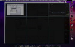
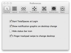
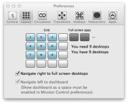
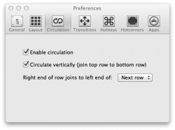
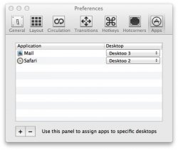
TotalSpaces is a few days from 1.0 release, beta testing 0.9.9 now between Lion and Mountain Lion. It is FANTASTIC! Works exactly as Spaces did prior to Lion. Some screen shots attached. I use dual displays, support for dual displays is coming in the 1.0 release as well as other features.
 

Attachments

  • TotalSpaces.jpg
    TotalSpaces.jpg
    280.8 KB · Views: 143
  • Preferences 5.jpg
    Preferences 5.jpg
    34.5 KB · Views: 113
  • Preferences 4.jpg
    Preferences 4.jpg
    47.2 KB · Views: 91
  • Preferences 3.jpg
    Preferences 3.jpg
    31.9 KB · Views: 94
  • Preferences.jpg
    Preferences.jpg
    38.2 KB · Views: 104

FlatlinerG

Cancelled
Dec 21, 2011
711
5
...
Moreover, full screen apps appear on the rightmost side of all your desktops, which is completely confusing and illogical to me. This is why I don't use full screen, even though it would be a good idea if it worked.
...

You know that full screen apps, and desktops for that matter, can be rearranged right?
 

Basic75

macrumors 68020
May 17, 2011
2,122
2,464
Europe
You know that full screen apps, and desktops for that matter, can be rearranged right?

Yes, but only manually, i.e. since the assignment of apps to spaces is gone you are forced to manually rearrange every time you launch something, else you mind-map is off.

(And this is ignoring other productivity reducing facts like that I am now forced to a 1D mind-map where previously I could use a 2D arrangement of spaces.)
 

CodeBreaker

macrumors 6502
Nov 5, 2010
494
1
Sea of Tranquility
TotalSpaces is a few days from 1.0 release, beta testing 0.9.9 now between Lion and Mountain Lion. It is FANTASTIC! Works exactly as Spaces did prior to Lion. Some screen shots attached. I use dual displays, support for dual displays is coming in the 1.0 release as well as other features.

I am using it since a week, and it is awesome. The only gripe with the current version is full screen apps. But regarding spaces, they got it right. And they will definitely cover full screen apps in coming versions.
 
Register on MacRumors! This sidebar will go away, and you'll see fewer ads.