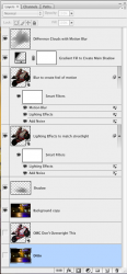
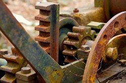
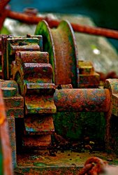
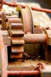
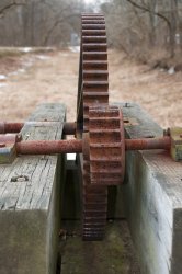
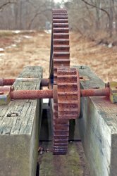
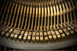
As I said before....... The colors and texture on old machines can be rich butt often get lost "on film." I like these compositions but wanted to see more texture and color. As I started to play, I liked what was coming out as I over emphasized things. I did everything in PSE.
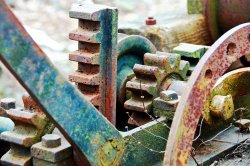
In the first one, I wanted just to bring up more of what was there. I imagined what I might see if I was looking at the artifact in good diffuse light. Here is what I did (and hopefully Dale's teacher would give me an"A" because of the detailed recording

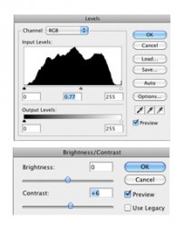
): Using levels, I adjusted the green and blue just a bit (0-251 and 0-249 respectively) to bring out a little more of the rust and patina. Then I darkened highlights 10%, increased midtone contrast 10%, and applied the equalize adjustment filter.
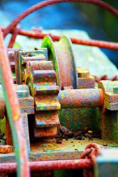
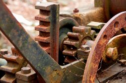
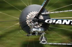
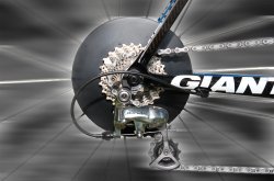
I tried the same thing with the second but it still did not work so I went further knowing it would look not real. I tried to walk a line of not making it look cartoonish. For this one I made the same adjustment to the blue and green. I adjusted hue and saturation to the following values: hue = 0, saturation = +60, lightness = -10. I then applied the equalize filter, darkened highlights by 4% and increased overall contrast 50%.
This is the first time I've done this much PP so I am interested in feedback on my efforts.