Become a MacRumors Supporter for $50/year with no ads, ability to filter front page stories, and private forums.

PCMacUser

macrumors 68000
Jan 13, 2005
1,706
25
Awesome pics by everyone!

I have to say, though, I'm still surprised that very few people do HDR on non-architectural pics. I'm experimenting with HDR on my macro pics. Here's the latest result:

This looks really great.

I like HDR for landscapes, because it's like having studio-quality lighting for the whole world.
 

Blckberl

macrumors newbie
Dec 23, 2008
2
0
How to take pictures with High Dynamic Range?
I saw some stunning pictures using HDR, but i dont know what are the steps of coming along an image using that technique.what is needed? how is it done?
 

R.Youden

macrumors 68020
Apr 1, 2005
2,093
40
My attempts from London today (first try and they look OK):

3189060574_1f2a725195.jpg

3189066338_c7008bbcfa.jpg

3188234155_3b9e739cd0.jpg

3189085504_6850afe6d7.jpg
 

Nicholie

macrumors regular
Jul 6, 2008
115
0
Huntsville, Al
I'm just now beginning to "think HDR" when I do photos, but I wanna keep them realistic looking. Not over use the "Harry Potter slider" as Scott Kelby called it. Here's one recently.

3185357355_2a8cebc176.jpg
 

wheelhot

macrumors 68020
Nov 23, 2007
2,084
269
HDR I did of my friend's new 2009 TSX. This was really only my second HDR attempt, I think it turned out pretty good.
Thats really good, I love how it look so artsy like some artist drew and painted it.

Anyway here's mine. I send it for printing already (turn out lovely, now I need to look for an old theme photo frame) and I think I posted it in photo of the day somewhere (can't remember), but I'm certain I didn't post it here :)

3158821884_df11390170_b.jpg
 

Driver

macrumors member
May 1, 2008
31
0
Rollingwood, Tx
Just Google 'HDR Techniques' or something along that line. There are plenty of ways. Most people use Photomatix software and there's some stuff on their site as well.
 

Evangelion

macrumors 68040
Jan 10, 2005
3,376
184
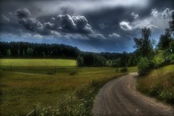
I did some experiments regarding the thread here, and came up with this.

Feedback is appreciated :).
 

Attachments

  • karjalohja-tonemapped-orton.jpg
    karjalohja-tonemapped-orton.jpg
    766.8 KB · Views: 1,342

Evangelion

macrumors 68040
Jan 10, 2005
3,376
184
IMHO it's way too dark.

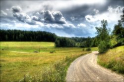
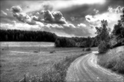
Well, I think that if it's overtly bright it becomes.... distracting. It kinda screams attention. But I'm actually working on alternative versions of that picture, so I'll give it a shot :)

EDIT: here's a "lighter" version of the image. I'll try B&W next.

EDIT2: and here's the same image in B&W. I dunno about it....
 

Attachments

  • karjalohja-tonemapped-orton.jpg
    karjalohja-tonemapped-orton.jpg
    881.2 KB · Views: 104
  • karjalohja-tonemapped-ortonBW.jpg
    karjalohja-tonemapped-ortonBW.jpg
    453.5 KB · Views: 112

PimpDaddy

macrumors 6502
May 9, 2007
359
75
Well, I think that if it's overtly bright it becomes.... distracting. It kinda screams attention. But I'm actually working on alternative versions of that picture, so I'll give it a shot :)

EDIT: here's a "lighter" version of the image. I'll try B&W next.

EDIT2: and here's the same image in B&W. I dunno about it....

Much better :). Both pictures looks really nice compared to the first version you made, but they look really soft when viewed larger which IMHO doesn't do any good for the picture.
 

Evangelion

macrumors 68040
Jan 10, 2005
3,376
184
Much better :). Both pictures looks really nice compared to the first version you made, but they look really soft when viewed larger which IMHO doesn't do any good for the picture.

The softness is there because I tried applying the Orton-technique to the picture, giving it somewhat "dreamy" appearance. The originals are not soft at all.
 

zebbz

macrumors member
Sep 11, 2008
94
0
London
i very rarely post my photos on here as i feel i still have much to learn

but would like some feedback on this image


i tried to go for quite an unreal look as i very much loved how the clouds were looking that day, and how the shadows came out
but someone said to me that it looks horrible as theres too much colour saturation and contrast

so i'd like some other peoples' thoughts on it

thanks
 

thr33face

macrumors 6502
May 28, 2006
381
0
test from today:


observations:
should've corrected CA before merging.
the red channel is clipped (right part of clouds). the blue one is too, but only on some dark tones.
dull, flat things stay that way (building right).
pushed the blues too much in the upper left corner.
wind causes blurry grass ;)

exposures used are these:

they are -4 / -2 / 0 / +2
 
Register on MacRumors! This sidebar will go away, and you'll see fewer ads.