Become a MacRumors Supporter for $50/year with no ads, ability to filter front page stories, and private forums.

Mike Boreham

macrumors 68040
Aug 10, 2006
3,931
1,909
UK
Love it. Example, I now have a multitask Stage Manager group which opens three windows with a single click: my Barclaycard app, my Personal Finance app, and a calculator. Doesn't matter if it isn't one of the four most recently used..... clicking on any one of the three in the Dock brings all three apps to the foreground.

People really need to try Stage Manager for themselves, and try it with an open mind, look for the solutions to what you can't apparently do at first, not for what it can't do. Learn all the little things that make it more usable than superficial impressions. A lot of its behaviour is difficult to describe and sounds clunky when written down.

I was in the tried superficially category initially but now use it all the time on my 12.9 M1 iPad, and it has been a significant step forward.
 

Retskrad

macrumors regular
Apr 1, 2022
201
673
Stage Manager is different from the traiditional window management of MacOS. IPadOS is not MacOS and it makes sense why iPad window management is completely different.

People who want the iPad to be Mac should just buy a MacBook. For the rest of us who like the iPad, we don’t want to turn the it into a Mac.
 

rkuo

macrumors 65816
Sep 25, 2010
1,308
955
It's not simply different, it's objectively bad. Read any in depth review (try macstories - https://www.macstories.net/stories/stage-manager-ipados-16-1-review/).

It keeps changing the user intent, it makes windows arbitrarily go away into a different space after a set limit, some layout bugs keep popping up with apps, the left side "stage" takes a ridiculous amount of space on a space constrained screen ... the list goes on and on.

Yes, any sort of additional multitasking feels like a breath of fresh air, but the implementation here is awful and isn't excused by the core addition of multitasking.
 

Mr. Awesome

macrumors 65816
Original poster
Feb 24, 2016
1,243
2,881
Idaho, USA
It's not simply different, it's objectively bad. Read any in depth review (try macstories - https://www.macstories.net/stories/stage-manager-ipados-16-1-review/).

It keeps changing the user intent, it makes windows arbitrarily go away into a different space after a set limit, some layout bugs keep popping up with apps, the left side "stage" takes a ridiculous amount of space on a space constrained screen ... the list goes on and on.

Yes, any sort of additional multitasking feels like a breath of fresh air, but the implementation here is awful and isn't excused by the core addition of multitasking.
I’ve read reviews, but more importantly I’ve used it myself and have experienced none of the problems you mention. What do you mean by “changing the user intent”? People don’t seem to notice that the left side list disappears when you have open windows filling that space.
 

cwosigns

macrumors 68020
Jul 8, 2008
2,266
2,744
Columbus,OH
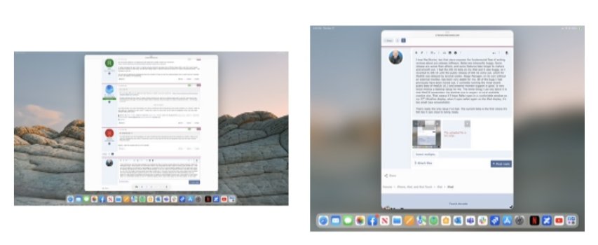
I love MacStories, but that piece exposes the fundamental flaw of writing reviews about pre-release software. Betas are inherently buggy. Some releases are worse than others, and some features take longer to mature and smooth out. I had the iOS 16 beta on my iPad and it was buggy, so I reverted to iOS 15 until the public release of iOS 16 came out, which for iPadOS was delayed by several weeks. Stage Manager, on its own without an external monitor, has been very stable for me. All of the bugs I had previously have been ironed out. I’ currently running the most recent public beta of iPadOS 16.2 and external monitor support is good. It very much mimics a desktop setup for me. The worst thing I can say about it is that iPadOS remembers the window size in respect to total available monitor size. That means if I have Safari open in a comfortable window on my 27” UltraFine display, when I open safari again on the iPad display, it’s too small (see screenshot—UltraFine browser on left, iPad on right).

That’s really the only issue I’ve had, and I am leaving feedback for Apple. The current beta is the first where it’s felt like it was close to being ready.
 

Attachments

  • 93AC53A9-C260-421A-ADB1-C2E85B8F8B9D.jpeg
    93AC53A9-C260-421A-ADB1-C2E85B8F8B9D.jpeg
    66.9 KB · Views: 85
Last edited:

The Game 161

macrumors Nehalem
Dec 15, 2010
30,992
20,174
UK
Yes, it’s still a little buggy sometimes, but it’s still a brand-new feature that necessitates a complete redesign of window management while still maintaining backwards-compatibility with Split View and SlideOver for users who prefer to use those - it’s bound to be buggy for a while. Ultimately it has come leaps and bounds since Beta 1, and it’s in a perfectly usable state at the moment. The only bugs I’ve experienced on the current release are a couple minor visual glitches.

Stage Manager fulfills its intended purpose perfectly - it brings resizable window support to the iPad in a way that offers a compromise between the fine-grained control you have on macOS and the necessity of an intuitive touch-first interface for the iPad. This is what we’ve been asking for for years, and now that we finally have it it seems nobody is truly excited about it like I am.
Resizing isn’t amazing but issue is the comparison will always be to macOS.

for me it has time and a place. I won’t use it all the time but if I want to browse youtube while on safari or twitter I works well
 

rkuo

macrumors 65816
Sep 25, 2010
1,308
955
I’ve read reviews, but more importantly I’ve used it myself and have experienced none of the problems you mention. What do you mean by “changing the user intent”? People don’t seem to notice that the left side list disappears when you have open windows filling that space.
Changing the user intent meaning i do something and instead of doing it, it does something else. Often as in not letting me resize or place windows where I put them, forcing windows to overlap, etc. One example is I open one window, then try to put it off to the side so that I can put another window in the remaining space. Nope, Stage Manager forces you to center a single window. Complete nonsense.

The other issues mentioned here (and a dozen more in the review) aren't "your opinion" or "my opinion". They are fundamentally broken things that objectively exist.
 
  • Like
Reactions: Jezak and Wizec

Ludatyk

macrumors 603
May 27, 2012
5,972
5,141
Texas
Changing the user intent meaning i do something and instead of doing it, it does something else. Often as in not letting me resize or place windows where I put them, forcing windows to overlap, etc. One example is I open one window, then try to put it off to the side so that I can put another window in the remaining space. Nope, Stage Manager forces you to center a single window. Complete nonsense.
It’s not necessarily broken… its the way it was designed.

Per @Mike Boreham explains perfectly….
People really need to try Stage Manager for themselves, and try it with an open mind, look for the solutions to what you can't apparently do at first, not for what it can't do. Learn all the little things that make it more usable than superficial impressions. A lot of its behaviour is difficult to describe and sounds clunky when written down.

For instance… I’m aware that if I’m on “stage” and I have 3 apps open, then when I select a different app from the dock.. it immediately turns into a new stage. So, to combat that.… when I have 3 apps open on stage I’ll drag the new app.

I’m sure most users would expect selecting a different app will place it on the existing stage… but Stage Manager wasn’t designed that way. But who knows… it might eventually evolve into it.
 
  • Like
Reactions: Mr. Awesome

rkuo

macrumors 65816
Sep 25, 2010
1,308
955
It’s not necessarily broken… its the way it was designed.

Per @Mike Boreham explains perfectly….


For instance… I’m aware that if I’m on “stage” and I have 3 apps open, then when I select a different app from the dock.. it immediately turns into a new stage. So, to combat that.… when I have 3 apps open on stage I’ll drag the new app.

I’m sure most users would expect selecting a different app will place it on the existing stage… but Stage Manager wasn’t designed that way. But who knows… it might eventually evolve into it.
Bad design and UI exists. Making excuses for it is silly.
 
  • Like
Reactions: Jezak and Wizec

Mike Boreham

macrumors 68040
Aug 10, 2006
3,931
1,909
UK
It's not simply different, it's objectively bad. Read any in depth review (try macstories - https://www.macstories.net/stories/stage-manager-ipados-16-1-review/).
Federico is obviously extremely thorough and competent, but he is a power user pushing the limits, and probing for flaws. It is good that he does and it can only help improve the product. But inevitably it is a glass half empty assessment by concentrating on what it can't yet do and its current problems. It does not convey how much can be done with it and how useful it is to non-power users like me. When you're thirsty you don't reject a drink because the glass is only half full.

I feel it is a great shame that the article is stopping people from even trying Stage Manager for themselves, and potentially discovering how useful it is, even at this stage.
 
Last edited:

Kierkegaarden

Cancelled
Dec 13, 2018
2,424
4,137
Yes, it’s still a little buggy sometimes, but it’s still a brand-new feature that necessitates a complete redesign of window management while still maintaining backwards-compatibility with Split View and SlideOver for users who prefer to use those - it’s bound to be buggy for a while. Ultimately it has come leaps and bounds since Beta 1, and it’s in a perfectly usable state at the moment. The only bugs I’ve experienced on the current release are a couple minor visual glitches.

Stage Manager fulfills its intended purpose perfectly - it brings resizable window support to the iPad in a way that offers a compromise between the fine-grained control you have on macOS and the necessity of an intuitive touch-first interface for the iPad. This is what we’ve been asking for for years, and now that we finally have it it seems nobody is truly excited about it like I am.
I agree — for me, it is the best multitasking solution, and my favorite feature of the iPad. It still allows for full screen app use, and SM can easily be turned off in Control Center — users can swipe down and tap the icon if they start to have a panic attack.

I haven’t had any bugs using it on my M1 12.9. But I think what could have reduced some of complaints is if they pulled back a bit on the scale of the feature — instead of resizing windows by dragging the corner, they could have had two preset window sizes, and they could have dropped multiple apps per stage. I just use one per stage, and I set the window size and don’t adjust it. Some of the complaints may be related to how windows resize compared to what we’re used to on a desktop OS.
 

Ludatyk

macrumors 603
May 27, 2012
5,972
5,141
Texas
I agree — for me, it is the best multitasking solution, and my favorite feature of the iPad. It still allows for full screen app use, and SM can easily be turned off in Control Center — users can swipe down and tap the icon if they start to have a panic attack.
This! And it goes unnoticed too. Because devs strategized when to implement SplitView or SlideOver… Stage Manager circumvent this and allows users to multitask with full screen apps.
 

The Game 161

macrumors Nehalem
Dec 15, 2010
30,992
20,174
UK
i think people just want it to replace all usage. I think there is a time and a place for stage manager to work effectively. My main usage would be to watch youtube and keep an eye on twitter and browse the web for example. seems the best way to use the multitasking.
 
  • Like
Reactions: Booji

Traverse

macrumors 604
Mar 11, 2013
7,711
4,491
Here
Aside from some very specific scenarios, I don’t see where it offers much value over split screen and slide over on the iPad display. Now I bet use with an external display will be game changing for iPad power users.
 

Traverse

macrumors 604
Mar 11, 2013
7,711
4,491
Here
That chart is trying to make things appear more complicated than they actually are.

Step 1 - Pick the new iPad model you want.
Step 2 - Decide if you want cellular.
Step 3 - Decide on the SSD size.
Step 1 is now surprisingLu difficult for all those who DON’T browse these forums.
 
  • Like
Reactions: wolfe48

rui no onna

Contributor
Oct 25, 2013
14,921
13,274
I love MacStories, but that piece exposes the fundamental flaw of writing reviews about pre-release software. Betas are inherently buggy.

I'm running 16.1 stable now and I sometimes get a bug where Stage Manager windows (in my case, Messages and Notes) would resize sporadically. The bottom part of Messages where you compose/type text isn't accessible. I need to hard reset the iPad to fix the issue.
 

Mark Stone

macrumors 6502
Mar 20, 2022
497
551
In its case.
I don’t hate Stage Manager, but really it’s redundant. Multitasking on a modern iPad is already easy (especially from a Magic Keyboard), and SM merely changes the ui. One problem, however, is that a couple of corporate apps I use (the Wells Fargo Bank app, and PayPal) freeze when SM is activated - so moving financial data from the apps to my check register spreadsheet requires SM to be turned off. But I don’t hate it, it is just “extra” and needs some glitches cleared up. 😊
 
  • Like
Reactions: Mr. Awesome

sunking101

macrumors 604
Sep 19, 2013
7,423
2,659
I like it so far and am glad it is there - even if it is still buggy I prefer that they have released it relatively early rather than having to run a beta image to check it out. If y'all don't like it, just turn it off.
What’s the difference between releasing a buggy early version and releasing a BETA?
 
Register on MacRumors! This sidebar will go away, and you'll see fewer ads.