Become a MacRumors Supporter for $50/year with no ads, ability to filter front page stories, and private forums.

ZircoBen

macrumors regular
Original poster
Jul 12, 2015
186
200
Utah, USA
Safari 15 is a downgrade. Let me tell you every reason why:


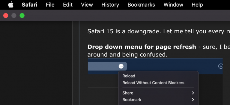
Drop down menu for page refresh - sure, I bet 90% of people don't regularly use this, but it's annoying. It'll leave a lot of people looking around and being confused.
1624424928383.png


Putting the cursor to the top to access the Menu Bar covers the tabs and buttons - this is something that used to be just the third party browsers on macOS and a reason why I exclusively used Safari. I hate the jarring transition from the tab bar to THIS.

1624424365140.png


There's no tab title? (on the active tab) - While this isn't a dealbreaker, it is odd. Sometimes the tab title can contain information that is useful, like the sound icon or the notifications on a tab; which you can definitely argue are less important on the active tab. Even so, it leaves a void just seeing the URL.

1624424454172.png


The URL sitting to the left just looks weird too? Maybe I just need a few days...
1624425075868.png


Anyways,
I don't love this. I hope Apple addresses these things and gives us an option to use the old style tab bar in particular.


Any thoughts on this?
 

Attachments

  • 1624424348950.png
    1624424348950.png
    93.7 KB · Views: 165
Last edited:
The point was to invite a discussion; of course everything above is my personal preference.

I’d love to hear your thoughts on Safari in Monterey 😁
 
The point was to invite a discussion; of course everything above is my personal preference.

I’d love to hear your thoughts on Safari in Monterey 😁
But you've already stated with no open mind that you don't like Safari 15. If another member states that they love it that won't change your opinion. Where's the common ground here? I hate red, I prefer blue. I hate blue, I prefer red. It doesn't make for a healthy discussion if the OP starts a thread saying he/she doesn't like said Apple product and list all the reasons why but still wants to hear other's opinions. Nothing productive can come out of this.

Had you stated, "There's a few things that I'm not finding productive or easy to use in Safari 15, do others have a different experience or am I missing something?". That would spark for a good discussion but you basically closed the thread for discussion by saying, "Safari 15 is a downgrade. Let me tell you every reason why:"
 
I was hoping for some back and forth, some opinions here; and I thought my own strong opinion would provoke a good discussion. I misjudged the MR forums audience I guess. Learning experience.
if you want an animated discussion (which macrumors forums excel at), ask for opinions, don't condemn something, then demand that people tell you why you might be wrong.

just suggesting that an open conversation starts with an open mind (anyway, that's my humble opinion)...
 
if you want an animated discussion (which macrumors forums excel at), ask for opinions, don't condemn something, then demand that people tell you why you might be wrong.

just suggesting that an open conversation starts with an open mind (anyway, that's my humble opinion)...
I dig it! Thanks for the advice. I’m a noob here and I’ll consider that for the future.
 
  • Like
Reactions: Tuli
I dig it! Thanks for the advice. I’m a noob here and I’ll consider that for the future.
cool, but... on the other side of things, if you want to say just what you feel... that's ok too. the forum is full of people who just say what they want, regardless of consequences (i would <cough> be one of those people)... 🤣
 
  • Like
Reactions: ZircoBen
I totally agree with you on the page refresh stuff; would be nice to have that icon in the address bar back. Otherwise, I really like it visually. I love that the menubar almost disappears and some webpages are more immersive because of it. It's also very cool that with this Safari Technology Preview I didn't lose any bookmarks or extensions like in the past. It's painless to try out the new Safari that way (I'm using the Preview with Big Sur). I haven't played around with tab groups yet but I do want to try that out.
 
i'm also running safari technology preview (day 2), and it is weird watching the address window move around, but will give it time. i added key commands (option-back arrow, and option-forward arrow) to switch between tabs, which helps.

otherwise, so far, am into the new version...
 
I've sent some feedback already about it, and I agree about the reload button, and ALSO the TLS padlock icon which appears at the END of a URL. So if your URL is too long to fit in the window, you don't see the padlock, can't click on it to get TLS info, etc. And yet they're totally able to show the reader view, translate button separately from the "..." button...

Maybe they expect me to not to show the full URL...

Contrary to my expectation when I first saw the preview at WWDC, and thought the URL/tabs would annoy me more, it's the address bar/reload/etc buttons treatment that got me going back to Safari 14.
 
I totally agree with you on the page refresh stuff; would be nice to have that icon in the address bar back. Otherwise, I really like it visually. I love that the menubar almost disappears and some webpages are more immersive because of it. It's also very cool that with this Safari Technology Preview I didn't lose any bookmarks or extensions like in the past. It's painless to try out the new Safari that way (I'm using the Preview with Big Sur). I haven't played around with tab groups yet but I do want to try that out.
I totally agree. As I'm using it more, I do like the way that the whole bar just turns into part of the website and feels so immersive! It's definitely cool, but I have to say I wish it was a blur rather than the transparency - seeing lines and elements of the website through the bar is sometimes distracting:
1624492093245.png
 
I totally agree. As I'm using it more, I do like the way that the whole bar just turns into part of the website and feels so immersive! It's definitely cool, but I have to say I wish it was a blur rather than the transparency - seeing lines and elements of the website through the bar is sometimes distracting:
View attachment 1797072
That looks like a bug, in fact I don't get any transparency when the website header colour matches.
 
I have to agree. So far I am just not a fan of this update to safari. I much prefer the tab bar being separate from the url/search bar.

I also think it too quickly goes to the Favicon, and it also seems to not stick with where you are in the tabs, I have opened a new tab and it isn't even shown.

I also hate how you can't pull your active tab out to a new window, only closed tabs, since the X appears over the favicon when you go to select it.

And yes the no 2 clicks to reload or right click and select reload in the tab is not as convenient as a reload button.

Honestly I just wish Safari would add the ability to use tree style tabs so they are always readable!
There is a "fix" for that that was posted in another thread. I hated that so much, the URL Bar moving around with the tab, my god that was annoying.

Here is a link to the "fix"


https://twitter.com/i/web/status/1404621345112084483
 
you can select "never use background color in toolbar" in safari preferences>advanced. i'm getting used to the search bar movement (or, to be more accurate, it bothers me less over time), but i would prefer if i could pin it to the left....
 
  • Like
Reactions: mikecwest
Yea problem is who knows how many versions of the beta will retain this ability. And could just go back to Big Sur's normal version to not have the new tabs.
sure, but at some point you'll either: update to monterey, and adapt to the new safari; update to monterey, and, with every new beta or final release, re-do whatever trick currently gives you the earlier safari; or... just stay on big sur.. just for safari.

personally, the more i live with it, the less it bothers me (i admit to being not thrilled with the search window moving around). but, 2 weeks from now, or a month, or.... whatever, i know it won't matter, because i'll be more focused on work, and life. :cool:
 
  • Like
Reactions: mikecwest
sure, but at some point you'll either: update to monterey, and adapt to the new safari; update to monterey, and, with every new beta or final release, re-do whatever trick currently gives you the earlier safari; or... just stay on big sur.. just for safari.

personally, the more i live with it, the less it bothers me (i admit to being not thrilled with the search window moving around). but, 2 weeks from now, or a month, or.... whatever, i know it won't matter, because i'll be more focused on work, and life. :cool:
I don't think I can ever get used to that bouncing around, I like my fixed pinned tabs. The more I tried to like it, the less I did.
 
I don't think I can ever get used to that bouncing around, I like my fixed pinned tabs. The more I tried to like it, the less I did.
fwiw, if you've already decided that, then you probably never will adapt. i just find i'm not focused on the address window, but the page i open. plus, who knows? it's beta 1; maybe apple will give us some options (like locking the search window in place).
 
fwiw, if you've already decided that, then you probably never will adapt. i just find i'm not focused on the address window, but the page i open. plus, who knows? it's beta 1; maybe apple will give us some options (like locking the search window in place).


I am more concerned a out the tabs, I frequently need to click between two particular tabs while doing my work, with the tabs jumping back and forth, it causing extra work by moving around all over the place....The one on the left is work email, (annoyingly, they do not allow connection so email apps, only web based connections) the one on right is a case management system. If those two tabs sit fixed, it is so much easier. I have no need or desire to see the URL of those paticular tabs....as they never change in a meaningful way. I have shortened my favorite links to short titles for commonly used stuff like the TM is my timesheet...I have over the last 16 years adapted and modified my system for maximum ease...


Screen Shot 2021-06-24 at 6.10.08 PM.jpg
 
I am more concerned a out the tabs, I frequently need to click between two particular tabs while doing my work, with the tabs jumping back and forth, it causing extra work by moving around all over the place....The one on the left is work email, (annoyingly, they do not allow connection so email apps, only web based connections) the one on right is a case management system. If those two tabs sit fixed, it is so much easier. I have no need or desire to see the URL of those paticular tabs....as they never change in a meaningful way. I have shortened my favorite links to short titles for commonly used stuff like the TM is my timesheet...I have over the last 16 years adapted and modified my system for maximum ease...


View attachment 1797551
am confused; the order of tabs in the tool bar doesn't change (fyi. i've also set up simple key commands: option-left arrow to switch to the left tab, option-right arrow for the right; makes it easy to switch between open tabs).

but why not just line things up in the favorites bar? those icons won't move, and easy to switch between them.
 
Register on MacRumors! This sidebar will go away, and you'll see fewer ads.