Got a tip for us?
Let us know
Become a MacRumors Supporter for $50/year with no ads, ability to filter front page stories, and private forums.
Identify this font
- Thread starter Doctor Q
- Start date
-
- Tags
- discussions fonts
- Sort by reaction score
You are using an out of date browser. It may not display this or other websites correctly.
You should upgrade or use an alternative browser.
You should upgrade or use an alternative browser.
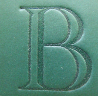
The picture is from a brochure, so ignore the 3D effect.
Allowing for the fact that the emboss might have distorted the letterform very slightly, the weights look exactly right for Academy Engraved.
More characters might help with a definite ID.
Cheers!
Jim
It's one of the many, many weights of Futura. on a by-eye comparison, my money is on Future Heavy.
Cheers!
Jim
It's one of the many, many weights of Futura. on a by-eye comparison, my money is on Future Heavy.
Cheers!
Jim
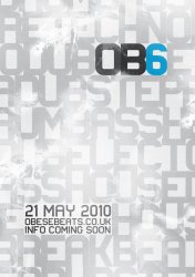
It turns out, it is Myriad Pro [Semi bold]. Thanks nonetheless Jim, I appreciate it
It turns out, it is Myriad Pro [Semi bold]. Thanks nonetheless Jim, I appreciate it.
You're not wrong. My apologies.
Cheers
Jim
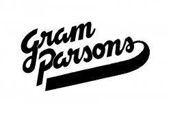
From the newly lost iPhone thread: what is the font in the top shot?
Mmm. That's pretty hard to see! If I squint and look at it sideways, it kinda looks like American Typewriter but that's very much a guess ...
Cheers!
Jim
Am I drunk or did Microsoft make something nice?
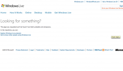
Ok, I just saw this on a Windows Live error page. At first I thought it was a new font, it was simple, clean and I liked it. Then I realized it was a Microsoft page and that it might just look nice in comparison to the rest of the page. I had a second glance, cropped it and now it just looks like a boring old font to me. However, I cannot find it in my collection and am left wondering if maybe it is something new.... or if the 2 bellinis I had with dinner affected me more than I thought they would.
If someone could just please shed some light on this and help me determine whether this font means Microsoft finally got a decent designer or if I'm a just bit tipsy and finding beauty in mediocrity surrounded by dated design.
Attachments
My God! Those are horrible!
Cheers
Jim
Maybe, but their readers LOVE that stuff.
Besides, everybody needs a change of scenery now and then!
From This Is Fly.com
I'm guessing these are some freebie web fonts.
Maybe, but their readers LOVE that stuff.
Besides, everybody needs a change of scenery now and then!
That bottom one looks like it says HNQXORE to me!
Cheers
Jim
That bottom one looks like it says HNQXORE to me!
Cheers
Jim
Guys. I KNOW typography. My buddy Phil Baldus, was a nationally renowned typsetter back in the Golden 80's.I own his 'BIG BOOK'. I own and use Fontographer. I know fonts. Why are you dissing a face just because you are stuck on ID'ng variations of Caslon, Times, Helvetica etc? There are some very useful headline faces out there if you can stand to get out of a rut now and then. Not every font needs to be instantly readable. Ask the Gamers out there what I mean.
Sorry to rant but you made me get 'hot under the collar'.
Not every font needs to be instantly readable.
Perhaps not instantly, but at least vaguely readable is something of a pre-requisite in a font. I also know typography and would certainly use more abstract or flamboyant fonts -- perhaps in combination with something more traditional, playing one off against the other, but my primary concern is always going to be readability.
Don't assume that because I have a differing opinion, it's because I don't know any better.
Cheers
Jim
Register on MacRumors! This sidebar will go away, and you'll see fewer ads.


