Become a MacRumors Supporter for $50/year with no ads, ability to filter front page stories, and private forums.

clukas

macrumors 6502a
May 3, 2010
990
401
Im also a fan with what they are doing with the News & Music apps. I actually like the new typography. Having used iOS 10 for a while day now, Im loving the new widgets, although I'm still not 100% on their design. It also appears that some animations should be sped up, especially when opening folders, I like the new animation but its too slow.
 

Shawzborne

macrumors 6502a
Jun 12, 2013
699
67
They ruined notification centre and widgets. You can only see 1 line previews in notification centre alerts and widgets for example philips hue you could have almost unlimited scenes now you can only have 4
 
  • Like
Reactions: jonobin

mattoligy

macrumors 6502
May 15, 2010
396
191
Cloud 9
I really like most of it. The font size and boldness looks a little old age pensioner, which isn't a bad thing but the option to choose your preferred font size would be welcome! Other than that and a few other bits of nitpicking I feel it is really fresh!

They ruined notification centre and widgets. You can only see 1 line previews in notification centre alerts and widgets for example philips hue you could have almost unlimited scenes now you can only have 4

These are the kind of things that will likely be addressed as the betas progress.
 

furbzv1

macrumors 68000
Sep 17, 2014
1,569
1,238
i do like the look of iOS 10 but i wouldnt call it beautiful.. fonts are little big here and there.. but i do like the direction they are headed
 
  • Like
Reactions: scapegoat81

bushido

Suspended
Mar 26, 2008
8,070
2,755
Germany
those big ass bubbles everywhere tho ... might as well not even bother calling them "banners" anymore.

Notification Center or whats left of it seems cluttered and looks hideous. not so much "at a glance" anymore
 

Mikey44

macrumors regular
Mar 6, 2012
167
557
You know, I agree with most of the sentiment here. It's not particularly great design. I see it, I understand it, but it's not, in my opinion, great design.

In fact, when I really stopped and though about it, the new Apple Music really reminds me of this:
zube-hd-apps-03.jpg

img_1339.png

Admittedly this isn't the best picture, but it highlights some of what I am referring to.

This was from Zune HD which came out in 2009. It's been almost 7 years, and Apple is now starting to borrow some of these ideas anyways.

Do I think Apple will go to tiles ever? Heck no, but this is where it starts.

After the Zune HD came out, and it was considered a popular interface because it was different interface. Microsoft then decided to go and turn out a Windows Phone OS based on it, and then eventually move it over to their desktop platform.

Anyways, those are my 2 cents.
 

Frankied22

macrumors 68000
Nov 24, 2010
1,787
594
You know, I agree with most of the sentiment here. It's not particularly great design. I see it, I understand it, but it's not, in my opinion, great design.

In fact, when I really stopped and though about it, the new Apple Music really reminds me of this:
zube-hd-apps-03.jpg

img_1339.png

Admittedly this isn't the best picture, but it highlights some of what I am referring to.

This was from Zune HD which came out in 2009. It's been almost 7 years, and Apple is now starting to borrow some of these ideas anyways.

Do I think Apple will go to tiles ever? Heck no, but this is where it starts.

After the Zune HD came out, and it was considered a popular interface because it was different interface. Microsoft then decided to go and turn out a Windows Phone OS based on it, and then eventually move it over to their desktop platform.

Anyways, those are my 2 cents.


This whole new music app is just...I can't even...

It's atrocious. It's a mix of zune and the old beats music app with all the beauty of iOS stripped out. The targets are so big it's like a jitterbug and the lack of dynamic coloring from albums is disappointing. Just look at that mini player at the bottom. What is even going on there? Why is there an atrocious grey shadow tint on it? Were people really that confused with the old style or didn't realize you could tap/slide it up that they felt they needed to overemphasize it as a separate UI element with a terrible shadow? I could go on and on but it's all personal opinion. That whole redesign just looks like a hot mess to me. Enough to were ill just switch to a different service/music app.
 
  • Like
Reactions: danieldavis3643

SoYoung

macrumors 68000
Jul 3, 2015
1,545
955
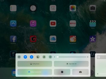
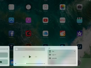
What I dont like is when a company do changes just for changes. Notification centre didn't need to be changed, it worked fine like it was. It was part of the original design of the redesign on iOS 7. Now, not only the new notification center dont look great, its also look completely out of place with the rest of the whole OS. Same thing with the new control center.

Apple music just become another blindly all in white app now. The iOS 9 version is way more dynamic with different colors and all.
 
  • Like
Reactions: Benjamin Frost

0000757

macrumors 68040
Dec 16, 2011
3,893
850
I don't think it's beautiful at all. I like some aesthetic elements but the notifications are so awkward and not intuitive.

Really? I think the notifications are much better looking. I was never a fan of iOS 7-9's notifications. The new ones are like the Apple Watch. I think that's great. I like how they hover like Android's and Windows Phone's. That's nice too.

I really like most of it. The font size and boldness looks a little old age pensioner, which isn't a bad thing but the option to choose your preferred font size would be welcome! Other than that and a few other bits of nitpicking I feel it is really fresh!

The font size is definitely bothering me. It's like they're trying to cater to people who pull out their reading glasses to look at their phone, haha. :p (No offense to people here who do that!)

I agree for the most part. I like the big fonts in News and the Notification Center, but in Music it definitely is uncomfortable.

The Widgets are horrible

They look/function the same as they did in iOS 9?

You know, I agree with most of the sentiment here. It's not particularly great design. I see it, I understand it, but it's not, in my opinion, great design.

In fact, when I really stopped and though about it, the new Apple Music really reminds me of this:
zube-hd-apps-03.jpg

img_1339.png

Admittedly this isn't the best picture, but it highlights some of what I am referring to.

This was from Zune HD which came out in 2009. It's been almost 7 years, and Apple is now starting to borrow some of these ideas anyways.

Do I think Apple will go to tiles ever? Heck no, but this is where it starts.

After the Zune HD came out, and it was considered a popular interface because it was different interface. Microsoft then decided to go and turn out a Windows Phone OS based on it, and then eventually move it over to their desktop platform.

Anyways, those are my 2 cents.

That's a little ridiculous. They both have squares but otherwise look NOTHING alike. With that logic the last major iTunes refresh (I think 11? Maybe 10?) Should have reminded you of it because of the squares of album art. This is a MAJOR stretch.
 

sawah

macrumors 65816
Sep 13, 2010
1,126
686
I so far really love the update! There are a few small bugs but obviously those will be squashed at a later date. I love the idea and layout of the widgets and the music app looks pretty cool. Now give me dark mode and I'll be happy for life. Can't stand how white everything has to be.
 
  • Like
Reactions: Breezygirl
Register on MacRumors! This sidebar will go away, and you'll see fewer ads.