Can‘t reproduce. Had a fresh install test device where nickname Notifications came in, so I went to the contact settings and turned that toggle off (prefer nickname) and it‘s back to the full name setup.Messages notifications now ignore if you have a nickname set for that contact and will display the contacts first/last name listed.
Got a tip for us?
Let us know
Become a MacRumors Supporter for $50/year with no ads, ability to filter front page stories, and private forums.
iOS 15: All the little things
- Thread starter ErikGrim
- WikiPost WikiPost
- Start date
- Sort by reaction score
You are using an out of date browser. It may not display this or other websites correctly.
You should upgrade or use an alternative browser.
You should upgrade or use an alternative browser.
- Status
- The first post of this thread is a WikiPost and can be edited by anyone with the appropiate permissions. Your edits will be public.
New to Safari-
You can now pull down to reload a webpage, just like you would in Mail.
Love this as they buried the reload button under the ellipses and I often find myself needing to reload a webpage.
Overall, I’m liking the increased emphasis on swipe gestures in iOS 15. They need some work obviously, but they should be smoothed out over the beta cycle.
I'm still getting to grips with the new FaceTime controls. One thing I've noticed is that the picture of me often shrinks to half the size, focussed on my face/head. I really like this, as it gets it out the way. I don't know whether this is automatic or because I move the pic around (it defaults to bottom left and I usually move it top right).
Edit: Somehow, it did it again. My pic went to a square and is half the size of the usual rectangle. I've still no idea how I did it.
Edit: Somehow, it did it again. My pic went to a square and is half the size of the usual rectangle. I've still no idea how I did it.
Last edited:
How do we tab through app controls on iPadOS? And what are the keyboard shortcuts for multitasking?
Not sure what you mean by the first question. Keyboard shortcuts for multitasking are the globe key + left or right arrow keys. You can discover these by holding the CMD key while on the Home Screen.
Not sure what you mean by the first question. Keyboard shortcuts for multitasking are the globe key + left or right arrow keys. You can discover these by holding the CMD key while on the Home Screen.
Om the Magic Keyboard and the Folio, Glode and Left Arrow takes you from where you are in to the last app
Here’s when I hadn’t seen until now:
1. Images in handwritten notes let you combine handwriting and images in handwritten notes. Just drag images into the drawing area, then position, resize, or even draw directly on them.
For me, this is a game changer!
EDIT: it works but I’m what is probably a bug, you have to start your ink annotation outside the image. Still huge potential here
Last edited:
Not sure what you mean by the first question. Keyboard shortcuts for multitasking are the globe key + left or right arrow keys. You can discover these by holding the CMD key while on the Home Screen.
Full keyboard navigation
Navigate through an app using the keyboard for enhanced productivity. Use the tab key to highlight text fields and buttons, all without taking your hands off the keyboard.
Using the tab key to navigate through fields in an app is app dependent. That is possible now in apps that have elected this.
has the Mail app been redesigned? Does it support @ mentioning prople like Outlook?
No and no, unfortunately.
I hate the look of the new notifications. The huge icons centered vertically really bother me. I liked the small icon with the app name next to it a lot better. It looks cleaner and more organized. Now with the big icon in the center, each notification will look slightly different which I don't like.
I actually think it looks cleaner this way...and you get more of them on a page. But tastes differ and your position is just as valid as mine!I hate the look of the new notifications. The huge icons centered vertically really bother me. I liked the small icon with the app name next to it a lot better. It looks cleaner and more organized. Now with the big icon in the center, each notification will look slightly different which I don't like.
Now, don't get me started on Safari on iPhone. That's a usability nightmare. iPad is ok...not great, but ok.
Kinda makes me wish we had a toggle for which types of notifications you want.I actually think it looks cleaner this way...and you get more of them on a page. But tastes differ and your position is just as valid as mine!
Now, don't get me started on Safari on iPhone. That's a usability nightmare. iPad is ok...not great, but ok.
The vertically centered icons look a bit jarring. I think having them align with the top would probably look a bit better (thats how I implemented notifications in a web app at work, Apple literally did what I did there with big contact pictures and app pictures).I actually think it looks cleaner this way...and you get more of them on a page. But tastes differ and your position is just as valid as mine!
Now, don't get me started on Safari on iPhone. That's a usability nightmare. iPad is ok...not great, but ok.
And I like them centered as it lends some symmetry to the entire notification panel. It really is simply a matter of preference.The vertically centered icons look a bit jarring. I think having them align with the top would probably look a bit better (thats how I implemented notifications in a web app at work, Apple literally did what I did there with big contact pictures and app pictures).
In the process of "preparing" this post, I did just long press a calendar invite. I definitely like the new pop out invite-handler (pops out to the right of the notification, rather than below). It also feels "lighter" than the old style handler did.
I guess, but I also have contact photos off in messages too. I don't like big icons all over the place.And I like them centered as it lends some symmetry to the entire notification panel. It really is simply a matter of preference.
In the process of "preparing" this post, I did just long press a calendar invite. I definitely like the new pop out invite-handler (pops out to the right of the notification, rather than below). It also feels "lighter" than the old style handler did.
Why? Why must it be app-dependent?Using the tab key to navigate through fields in an app is app dependent. That is possible now in apps that have elected this.
I hope that the menus being on the right changes. Having the notification centered with the actions centered underneath makes more sense due to the notifications coming from the top center on the iPad as opposed to top right on Mac. The increasing lack of ambidexterity in Apple’s UI design just doesn’t sit well with me. At least they’re not quite as bad as Android on Pixel phones. Yet.I definitely like the new pop out invite-handler (pops out to the right of the notification, rather than below). It also feels "lighter" than the old style handler did.
I even capitalised the IN 😛 This seems to indicate, as discussed, that Siri knows I am in a certain part of my home where I would normally open TikTok (which I do)
Idk about that…I think it means to say “Based on your location—in your home.” As in, you’re currently in your home so I’m showing you this based on that location.
Probably so the app can declare areas for keyboard highlighting rather than guessing (eg if they implemented a custom button iPadOS might not know whether that’s something to click or not)Why? Why must it be app-dependent?
Wouldn’t it make sense for the function to be template-dependent then?Probably so the app can declare areas for keyboard highlighting rather than guessing (eg if they implemented a custom button iPadOS might not know whether that’s something to click or not)
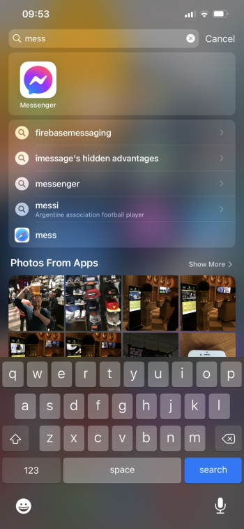
I use Spotlight to access a few apps, in this case, Messenger.
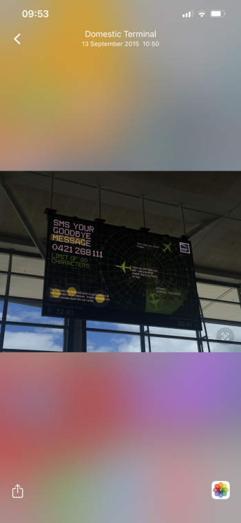
With the addition of Photos in Spotlight, I’ve wondered why a certain few photos appear as I search “Mess..” to open up the app.
Turns out that a small orange indicator shows you where that text was indexed from. Nice touch!
With the addition of Photos in Spotlight, I’ve wondered why a certain few photos appear as I search “Mess..” to open up the app.
Turns out that a small orange indicator shows you where that text was indexed from. Nice touch!
Attachments
Register on MacRumors! This sidebar will go away, and you'll see fewer ads.


