

Lotsacaffine
macrumors member
The top toolbars are driving me crazy. I hoped they would improve on this design throughout the betas, but I haven't noticed any significant improvements since joining db 1.
Here are the updated developer docs for versions 27:
Yet, they seem to deviate from their very guidance and use the hard style on interfaces that are relatively stagnant (like list views with minimal "variety of contexts") and the soft style (blurred) style on complex interfaces. I'm glad the soft style isn't whiplashing between light and dark like it was on versions 26.
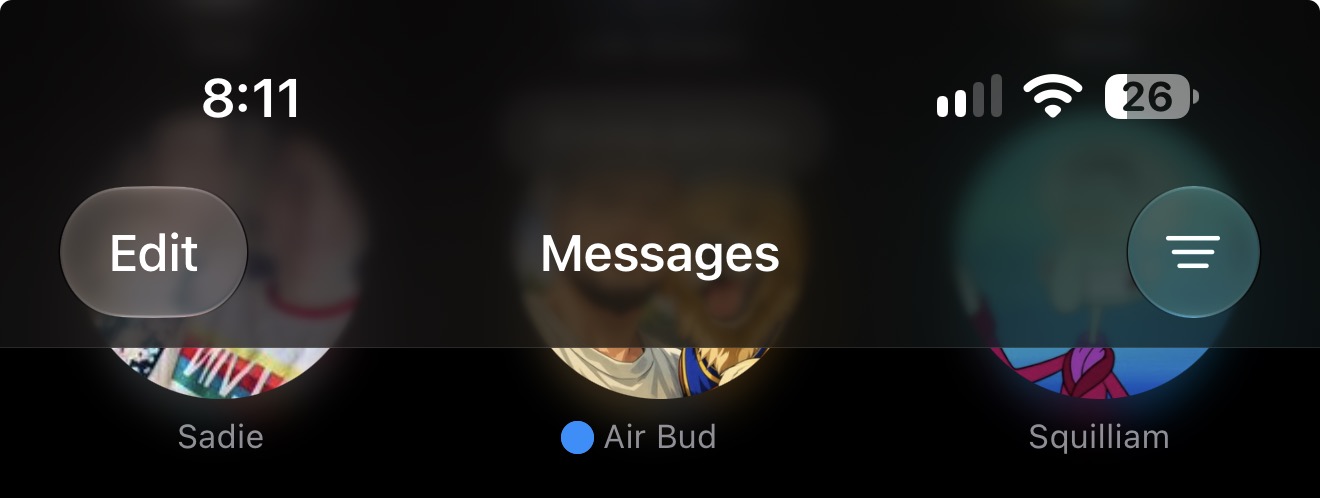
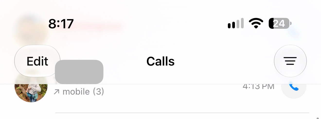
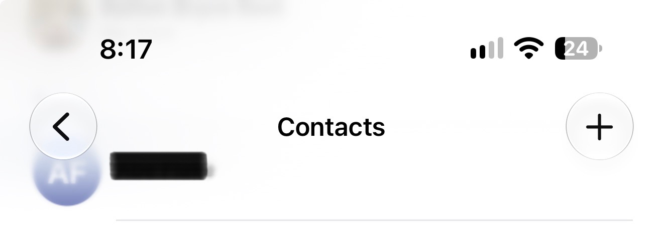
That said, I can't determine any clear consistency behind this iterative implementation of Liquid Glass. Messages is a great example. Why does it need an opaque top toolbar just to provide opacity for the word "Messages". After 20 years, I think people find it obvious that the page showing them a list of names/numbers and previews of messages they've sent and received is probably the Messages app. Other times, the same app will present views of the same type with different styles (Yeah, I'm looking at you Phone).
Here are a few examples -
Messages and Mail:
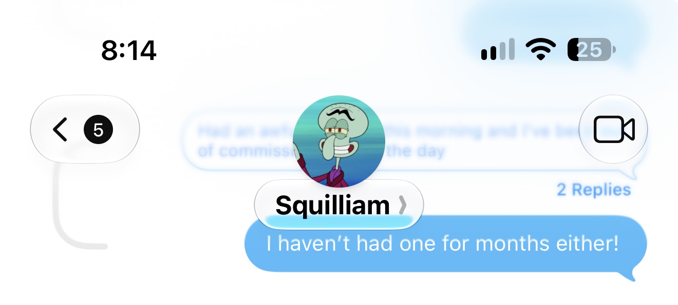
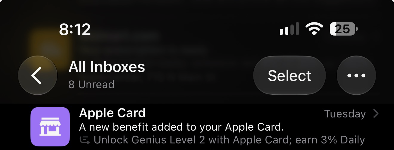
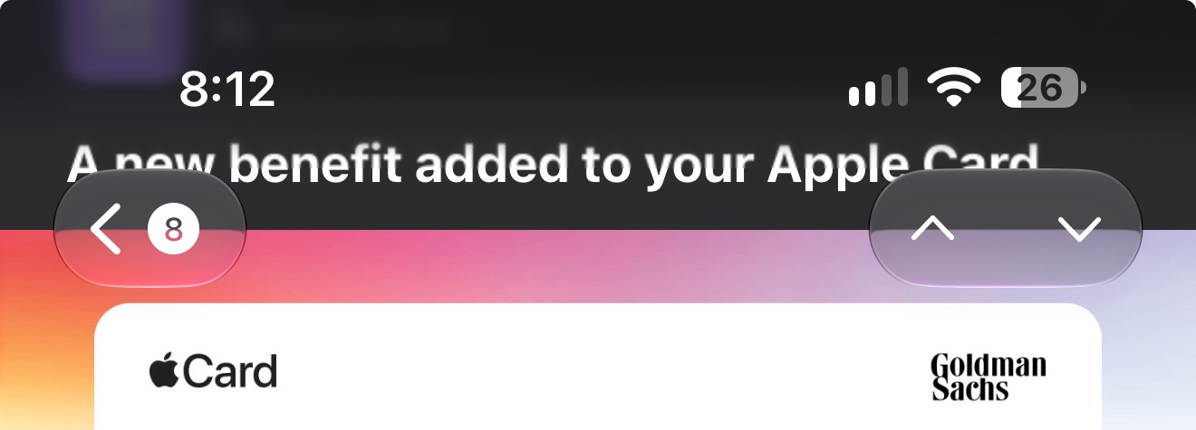
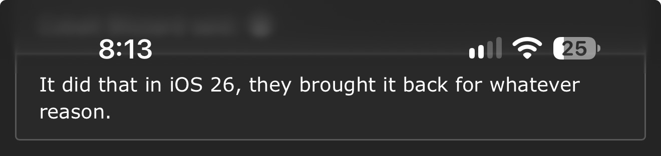
Hard style on message lists, soft view (intermittently hard in mail) for individual messages
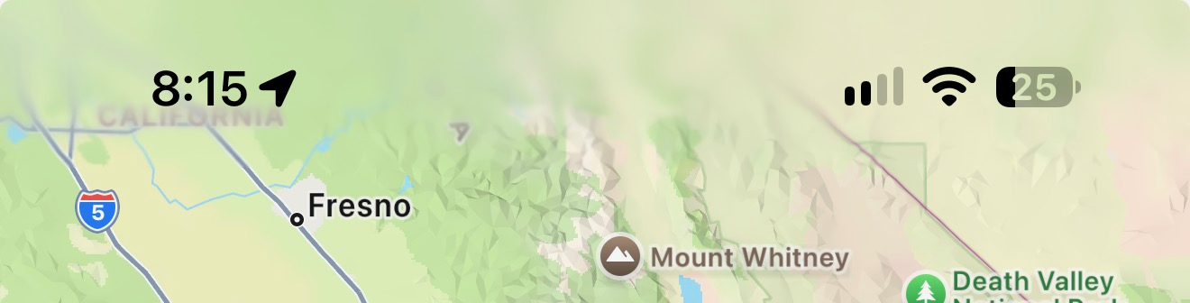
Safari and Maps:
Soft gradient limited to the very top edge.
Photos:
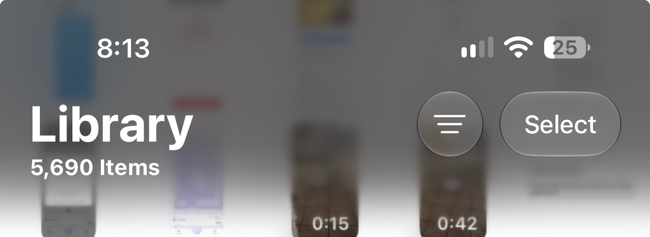
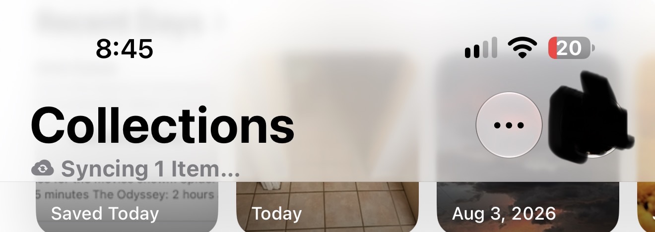
Apparently, library always has a dark gradient blur irrespective of system appearance now 🤮. Collections has the hard style, which at least respects system appearance.
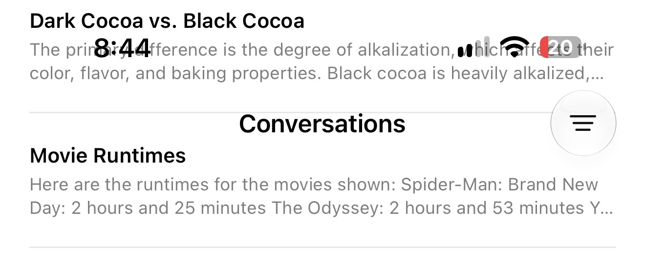
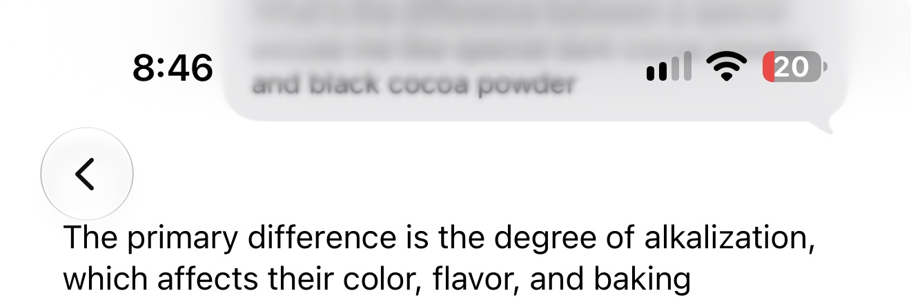
Siri:
Looks like the hard style with missing opacity on the conversation view. Soft style on message view.
Reminders:
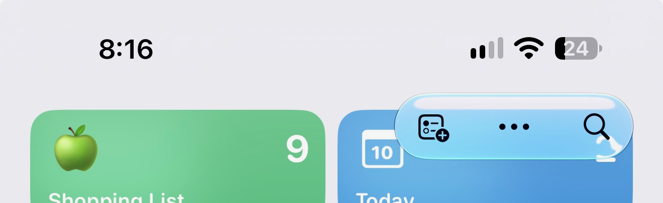
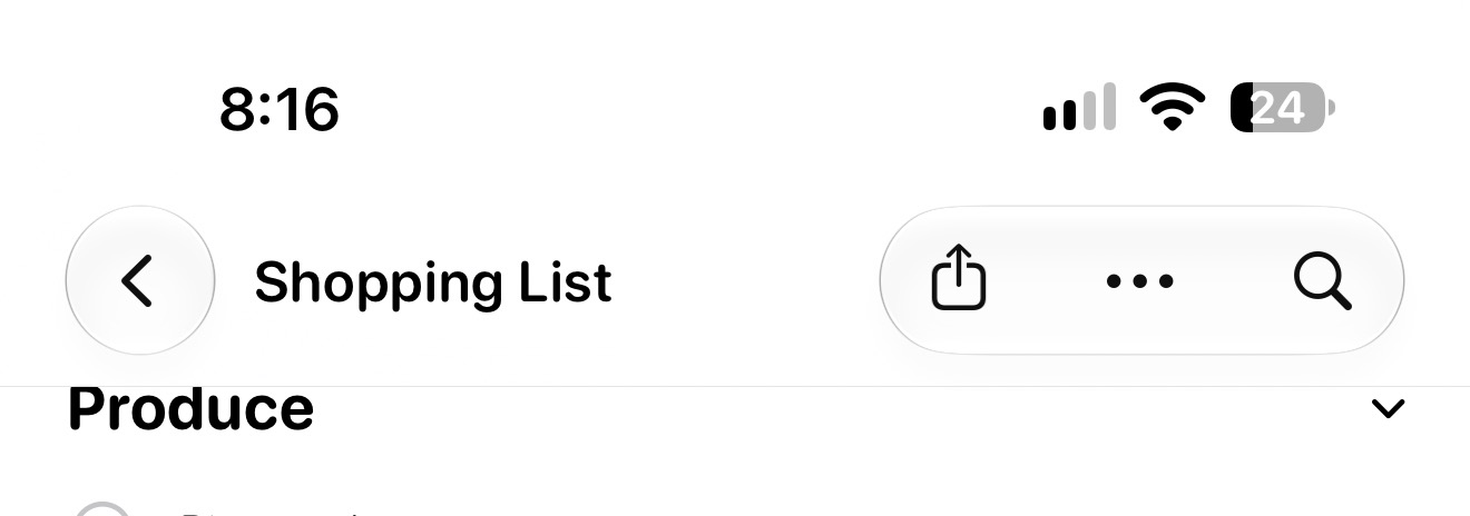
Soft style on list view, hard style inside individual lists.
Phone:
Hard style on Calls page, soft on Contacts page.
Music (and Podcasts):
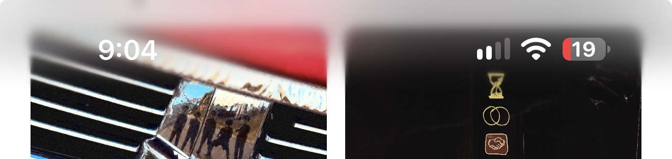
Soft style, though the entire top toolbar just disappears until you scroll back to the top of the view.
I thought Liquid Glass was supposed to promote consistency...
Here are the updated developer docs for versions 27:
Prefer the automatic scroll edge effect style. Where possible, use the default automatic style of the scroll edge effect. This style provides a more opaque visual separation for top toolbars that contain a large number of controls, text that appears outside of Liquid Glass controls, and pinned table headers. If you use the soft scroll edge effect style instead, thoroughly test your interface to ensure your controls maintain legibility in a variety of contexts.
Yet, they seem to deviate from their very guidance and use the hard style on interfaces that are relatively stagnant (like list views with minimal "variety of contexts") and the soft style (blurred) style on complex interfaces. I'm glad the soft style isn't whiplashing between light and dark like it was on versions 26.
That said, I can't determine any clear consistency behind this iterative implementation of Liquid Glass. Messages is a great example. Why does it need an opaque top toolbar just to provide opacity for the word "Messages". After 20 years, I think people find it obvious that the page showing them a list of names/numbers and previews of messages they've sent and received is probably the Messages app. Other times, the same app will present views of the same type with different styles (Yeah, I'm looking at you Phone).
Here are a few examples -
Messages and Mail:
Hard style on message lists, soft view (intermittently hard in mail) for individual messages
Safari and Maps:
Soft gradient limited to the very top edge.
Photos:
Apparently, library always has a dark gradient blur irrespective of system appearance now 🤮. Collections has the hard style, which at least respects system appearance.
Siri:
Looks like the hard style with missing opacity on the conversation view. Soft style on message view.
Reminders:
Soft style on list view, hard style inside individual lists.
Phone:
Hard style on Calls page, soft on Contacts page.
Music (and Podcasts):
Soft style, though the entire top toolbar just disappears until you scroll back to the top of the view.
I thought Liquid Glass was supposed to promote consistency...


