Become a MacRumors Supporter for $50/year with no ads, ability to filter front page stories, and private forums.

monaarts

macrumors 65816
Original poster
Jan 16, 2010
1,168
51
Kennesaw, GA
So I wasn't allowed to post YouTube links apparently so here are some screenshots instead....

For a class we have to come up with either a new product for a company or re-work a product for future release... So I chose to design iOS6 for the iPhone (might add iPad in later).

So anyways, here are some of the new features and/or updates I have come up with so far, I hope you like. If you have any ideas please let me know and I will create a screenshot of what that might look like :D

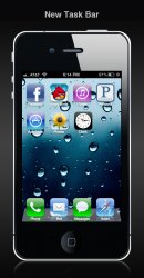
New Task Bar
The new task bar has been redesigned to have a more consistent look throughout iOS and now includes the Notification icon that will glow a different color when notifications are available in the notification bar. Nothing too major here.

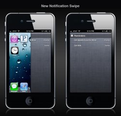
New Notification Gesture
Instead of swiping from the top of the screen down, like you currently would in iOS, the new gesture is from the far right of the screen to the left (like it is in Mountain Lion now). This will create a uniform feel and look between iOS and OS X... It also plays into the next feature I have added...

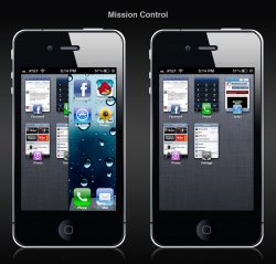
Mission Control
iPhones are currently being used with more apps than they could have ever been imagined to do when iOS was first created, so we have decided to blend OS X into iOS with Mission Control. With a gesture from the far left of the screen to the right you can access the Mission Control window which allows you too see what apps you are running with an actual preview window of the app.

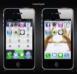
Launchpad
People are looking to access apps on their iOS devices quicker than they currently can so we made it easier. By pinching with 2 fingers and your thumb you will see Launchpad (an exact replica of your Homescreen).

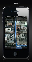
New Maps App
Finally, a real navigation app on your iOS device. This new application features 3d technology that Apple gained access to when it acquired C3 Technologies late last year. Get voice navigation with Standard, 3D, or Hybrid maps and have all the same great features that can currently be found in Maps.

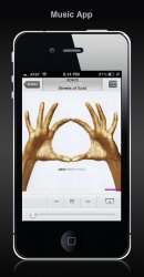
New Music App
We have redesigned the Music App to introduce a more unified interface between the iPad and iPhone.

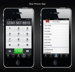
New Phone App
We have redesigned the Phone App to give you a better, more user friendly interface that is also more consistent across iOS and OS X devices.
 

Attachments

  • new-task-bar.jpg
    new-task-bar.jpg
    338.8 KB · Views: 592
  • new-notification-swipe.jpg
    new-notification-swipe.jpg
    512.5 KB · Views: 468
  • mission-control.jpg
    mission-control.jpg
    573 KB · Views: 446
  • launchpad.jpg
    launchpad.jpg
    424.8 KB · Views: 383
  • maps.jpg
    maps.jpg
    312.4 KB · Views: 413
  • music-app.jpg
    music-app.jpg
    249.9 KB · Views: 407
  • phone.jpg
    phone.jpg
    403.2 KB · Views: 400
Last edited:

DoFoT9

macrumors P6
Jun 11, 2007
17,586
100
London, United Kingdom
I started making the video and posted what I had so far in the forums but it got removed because of 'self promotion'. :mad:


- Joe

Your title is mis-leading, that's why. if you mentioned a project for school or whatever it would be more ok.

I do like the ideas though, however UNlikely they are ;)
 

monaarts

macrumors 65816
Original poster
Jan 16, 2010
1,168
51
Kennesaw, GA
Your title is mis-leading, that's why. if you mentioned a project for school or whatever it would be more ok.

I do like the ideas though, however UNlikely they are ;)

The thread I had wasn't misleading at all... apparently you just can't post videos to your own youtube channel. :p

Thanks though! I have a few other ideas that I just either haven't figured out how to illustrate properly or haven't had the time to yet:

- Airdrop
- Active Apps
- Facebook Integration
- A new unlock screen, with notifications
 

tbl

macrumors member
Jul 14, 2010
60
5
While most of these seem pretty logical, I don't think the Launchpad gesture concept is very useful. You bill it as a quicker way for people to access their apps -- but considering that the home button's primary purpose is to return the user to their springboard, it really might not be that much quicker. I do however, see potential in your concept as a systemwide gesture to return the user to their springboard, much like the 5 finger pinch that's currently available for iPads.

Thanks for providing us with your ideas! Keep working at them, they seem pretty good. :D
 

monaarts

macrumors 65816
Original poster
Jan 16, 2010
1,168
51
Kennesaw, GA
While most of these seem pretty logical, I don't think the Launchpad gesture concept is very useful. You bill it as a quicker way for people to access their apps -- but considering that the home button's primary purpose is to return the user to their springboard, it really might not be that much quicker. I do however, see potential in your concept as a systemwide gesture to return the user to their springboard, much like the 5 finger pinch that's currently available for iPads.

Thanks for providing us with your ideas! Keep working at them, they seem pretty good. :D

I agree with what you say about the Launchpad, however, Apple likes to have the least amount of buttons possible on a device and this could start the process of removing the home button. ;-)
 

shazzam

macrumors regular
Apr 19, 2010
162
5
I love what u came up with. It all fits very nicely with iOS and I can see most of it as an improvement.
 

cambookpro

macrumors 604
Feb 3, 2010
7,228
3,365
United Kingdom
I like the new maps, music and phone apps, and also like the ideas of Mission Control and the task bar. However, the Notification Centre from the side would be horrid.

It's at the top for a reason - it's much harder to accidentally to a gesture top to bottom than side to side. The reason it's like that on a Mac is that the screen is bigger and you have more precision with a trackpad/mouse.

Also don't think Launchpad would be that practical, home button seems easier.

Other than those minor niggles, great job!
 

NJFP

macrumors 6502
Feb 18, 2009
358
28
I liked it all, thanks. Can't please everybody, that's why there's chocolate AND vanilla.
 

SteveAbootman

macrumors 6502a
May 12, 2008
618
96
This is good stuff. Mission Control would be a great improvement on the current way of viewing active apps. Hope to see some of these in future iOS releases!
 

Kahnyl

macrumors 68000
Feb 2, 2009
1,584
2
Mostly pretty logical stuff. I like the contacts list. They might wait until they stop selling lower resolution devices to redesign the UI like that.
 

lamboman

macrumors 6502
Aug 13, 2011
394
2
I think that the designs that you have come up with for Contacts and Mission Control are great. However, the pinch and swipe gestures that you have come up with simply don't work, merely because they would get in the way of app gestures. And as for Launchpad on any iOS device, you're replicating a replication of iOS. Surely there is no faster gesture than pressing the home button to get exactly what you are looking for?

Good concepts though.
 

monaarts

macrumors 65816
Original poster
Jan 16, 2010
1,168
51
Kennesaw, GA
Wirelessly posted (Mozilla/5.0 (iPhone; CPU iPhone OS 5_0_1 like Mac OS X) AppleWebKit/534.46 (KHTML, like Gecko) Version/5.1 Mobile/9A405 Safari/7534.48.3)

lamboman said:
I think that the designs that you have come up with for Contacts and Mission Control are great. However, the pinch and swipe gestures that you have come up with simply don't work, merely because they would get in the way of app gestures. And as for Launchpad on any iOS device, you're replicating a replication of iOS. Surely there is no faster gesture than pressing the home button to get exactly what you are looking for?

Good concepts though.

Thanks for the feedback!

Thanks for the comments everyone else, too!

Any ideas or concepts that any of you would like to see come real?
 

monaarts

macrumors 65816
Original poster
Jan 16, 2010
1,168
51
Kennesaw, GA
Wirelessly posted (Mozilla/5.0 (iPhone; CPU iPhone OS 5_0_1 like Mac OS X) AppleWebKit/534.46 (KHTML, like Gecko) Version/5.1 Mobile/9A405 Safari/7534.48.3)

Jare said:
Your launchpad idea is a direct copy of mine, the only difference is you're stating a gesture to activate instead of an icon.

https://forums.macrumors.com/threads/1313988/

I do like some of your other ideas though.

What is the point of Launchpad in your concept? Nothing, it's just there for the sake of being there. I implemented it because I removed the entire "app screen" in my concept.

My thought on it was so you don't have to click the home button and then search. Apple wouldn't Get rid of the apps on the home screen. Sometimes I double click the home butting and click a previous app to make it quicker - so my idea would be even quicker.
 

JUiCEJamie

macrumors 6502a
Mar 22, 2011
817
223
Mission Control, especially on an iPad would be an interesting idea.

But dude, just create a less misleading title and place a video online!
I wanna see :)
 

monaarts

macrumors 65816
Original poster
Jan 16, 2010
1,168
51
Kennesaw, GA
Wirelessly posted (Mozilla/5.0 (iPhone; CPU iPhone OS 5_0_1 like Mac OS X) AppleWebKit/534.46 (KHTML, like Gecko) Version/5.1 Mobile/9A405 Safari/7534.48.3)

Jare said:
Wirelessly posted (Mozilla/5.0 (iPhone; CPU iPhone OS 5_0_1 like Mac OS X) AppleWebKit/534.46 (KHTML, like Gecko) Version/5.1 Mobile/9A405 Safari/7534.48.3)


My thought on it was so you don't have to click the home button and then search. Apple wouldn't Get rid of the apps on the home screen. Sometimes I double click the home butting and click a previous app to make it quicker - so my idea would be even quicker.

Nah sorry that still doesn't make sense. I still see it as you copying my exact style of launchpad and saying "i created it because I'm adding a gesture!"

Launchpad in your concept serves absolutely no real purpose. I kindly ask that you remove it or at least make it look different then mine (maybe make it full screen without a dock or something).

Cheers.

Seriously dude?? I created it and copied it from my Mac, I didn't even see your version before I made it. Just because you don't think there would be a need for it doesn't need I need to remove it. Sorry.
 

monaarts

macrumors 65816
Original poster
Jan 16, 2010
1,168
51
Kennesaw, GA
Wirelessly posted (Mozilla/5.0 (iPhone; CPU iPhone OS 5_0_1 like Mac OS X) AppleWebKit/534.46 (KHTML, like Gecko) Version/5.1 Mobile/9A405 Safari/7534.48.3)

Jare said:
monaarts said:
Seriously dude?? I created it and copied it from my Mac, I didn't even see your version before I made it. Just because you don't think there would be a need for it doesn't need I need to remove it. Sorry.

Mine is being turned into a Cydia tweak, you copied the EXACT same style. What difference did you make other then a gesture?

Because it would be completely dumb to have them all in a folder AND some on the home screen. What purpose would that serve? More clicks... That's about it. Sorry dude, but I didnt copy anything from you... As I said - I copied it from OS X, apparently the same place you coppied it from. Besides, people on your thread seem to agree that it would be pointless.
 
Register on MacRumors! This sidebar will go away, and you'll see fewer ads.