I don't like the idea of swiping left/right to get to notifications or mission control. It's too easy to accidentally trigger that if you just wanted to go left and right on the home screen, and a few new people might panic and start calling their sons for help. I think up-down for notifications, as it is now, is good and mission control should use a down-up motion. This is a bit more logical since the multi-task tray already starts at the bottom, so mission control can be visually explained as an extension of multi-tasking interaction.
Got a tip for us?
Let us know
Become a MacRumors Supporter for $50/year with no ads, ability to filter front page stories, and private forums.
iOS 6 "Preview"
- Thread starter monaarts
- Start date
- Sort by reaction score
You are using an out of date browser. It may not display this or other websites correctly.
You should upgrade or use an alternative browser.
You should upgrade or use an alternative browser.
You still have icons on your home screen AND launchpad. Direct copy.
Regardless let's keep this out of the thread so people can comment on your other actual concepts. Check your PM box. I will no longer reply to this thread.
If it is this big of a deal, patent your idea.
Not crazy about the notifications change but all the rest is an improvement. I especially like the maps
Love the mission control idea. Would like to see this implemented in iOS 6. Some really nice work OP.
Honestly, I feel like quite a few of these are just changes for the sake of changes.
However, the one I *do* like, I REALLY like... and that's the Mission Control idea.
I'd personally recommend a three fingered swipe up the screen to activate (A bit like the gesture in OS X). A "regular" swipe up (Notification centre in reverse) would feel weird I think...
The Notification Centre swipe works and feels ok because there's nothing to tap on at the very top of the screen. At the very bottom of the screen, however, there's the dock, and I think starting a swipe there would feel weird.
The three finger swipe is a gesture that isn't really used in the iPhone, so you could do it anywhere on the screen, rather than having to aim at a specific spot.
Mine is being turned into a Cydia tweak, you copied the EXACT same style. What difference did you make other then a gesture?
You're complaining about being copied over a jailbreak feature? HAHAHAHAHAHHAHAHA!
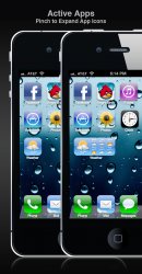
I think it was your Video I managed to catch but you seem to missing the things that made it interesting. Well one hinted at Active Apps, with the abilty for the app icon to be expanded to take up more icon slots.
The one I really liked was the Pre-app idea you demo'd, I think you called it "contextual". The idea that an app could have a pre-start mode that could well present the info the user was after without firing a full app start. Or at least get part of the task done while the app pulls itself back to life in the background.
For document based apps this could be really amazing, for other quick info apps like a weather it could be all they need as an interface.
I do like mission control but think the swipe in from side is a more natural gesture, maybe if it was way for it to be combined with search in a logical way it might be a goer.
Edited to add: Sideways home screen seems like ordinary idea from the iPad made bad on the iPhone.
I'd like it more on the iPad if the dock stayed where it was the icon stayed in the same spots and just rotated 90º.
Last edited:
I think it was your Video I managed to catch but you seem to missing the things that made it interesting. Well one hinted at Active Apps, with the abilty for the app icon to be expanded to take up more icon slots.
The one I really liked was the Pre-app idea you demo'd, I think you called it "contextual". The idea that an app could have a pre-start mode that could well present the info the user was after without firing a full app start. Or at least get part of the task done while the app pulls itself back to life in the background.
For document based apps this could be really amazing, for other quick info apps like a weather it could be all they need as an interface.
I do like mission control but think the swipe in from side is a more natural gesture, maybe if it was way for it to be combined with search in a logical way it might be a goer.
Edited to add: Sideways home screen seems like ordinary idea from the iPad made bad on the iPhone.
I'd like it more on the iPad if the dock stayed where it was the icon stayed in the same spots and just rotated 90º.
That was the video I made but I haven't figure out a way to put the Active Apps in an image properly.
- Joe
The thread I had wasn't misleading at all... apparently you just can't post videos to your own youtube channel.
Really...you don't see how this thread title is misleading? You do understand the meaning of the word 'preview' don't you? Hell, you could just put single quotes around it and I would've been happy.
/end overt rant
Mockup != Preview. Previews are official.
Sideways Home Screen
You can now view your home screen sideways. Notifications and Mission Control also work sideways.
View attachment 326445
IMO this actually illustrates why Apple never gave the iPhone home screen a landscape mode like the iPad. You can't fit the same number of apps on a page. Not with all that wasted space around the dock.
One thing you did change in your idea for mission control was that originally, mission control was always in the back, the other stuff was swiped out of the way. When you changed the gestures, mission control is now dragged over whatever is already on the screen.
It's a small difference, but I liked the original way for that better. I think the swipe from the bottom is better, but I liked the animation for it originally better. Mission control is everything going on with your device, it would seem to make sense for it to be "under" everything that's happening on your phone.
It's a small difference, but I liked the original way for that better. I think the swipe from the bottom is better, but I liked the animation for it originally better. Mission control is everything going on with your device, it would seem to make sense for it to be "under" everything that's happening on your phone.
One thing you did change in your idea for mission control was that originally, mission control was always in the back, the other stuff was swiped out of the way. When you changed the gestures, mission control is now dragged over whatever is already on the screen.
It's a small difference, but I liked the original way for that better. I think the swipe from the bottom is better, but I liked the animation for it originally better. Mission control is everything going on with your device, it would seem to make sense for it to be "under" everything that's happening on your phone.
HAHA I agree... I will play with it a little later. Thanks for the feedback.
Notifications WON'T happen.
Mission control... Maybe.
I would think a two finger swipe to the left could make sense since 1. its the same as mountain lion & 2. they did steal the idea from android and this could be a way to avoid any "patent" issues.
I would think a two finger swipe to the left could make sense since 1. its the same as mountain lion & 2. they did steal the idea from android and this could be a way to avoid any "patent" issues.
Apple would present newton as prior art of notifications.
new notification
same as previous but in background of home screen instead of foreground.
mission control
same as previous but in background of home screen instead of foreground.
awesome!
First of all, even changing it to "preview" isn't really any less mis-leading. This is a concept or mockup. Nothing like a preview, not even a "preview". In saying that, I'd love to see a youtube video for some of your concepts.
Secondly, anything that requires more than one finger to do what I would call a basic task (such as launch a service, go back to home screen etc.) won't work on an iPhone. A phone should be a one handed device (probably the biggest argument for the screen size to remain as it is and why we don't see 5 finger pinch on iPhones). Obvious exception would be pinch to zoom, but that isn't what I would call a basic task, or accessing a service like notifications/dashboards. If you're looking at photo's or in a web browser, your focus is more likely fully on your device.
I like the revamp of the music app, don't really see the same "revamp" in your phone mockup though - which I would like to see.
Mission control, I like the look of the snapshots you have, especially with the app icon in the bottom, but i don't like the access method.
Maps; I personally think that what is shown almost is pointless. Street view would be fantastic instead though! Who knows how long until we can access that quickly (dl speed etc).
Hope that helps feedback wise.
Notifications, Folder Covers, and Active Apps
Active Apps
By pinching an app icon, it can be stretched from 1 tile to 2, 3, and/or 4 depending on developers specifications. It can also display real-time information like temperature or time.
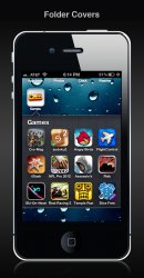
Folder Cover
You can use any photo from your photo app or any photo copied from apps like safari as a folder image.
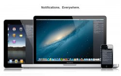
Notifications
Notifications are now accessed by swiping from the far right hand side of the screen. It brings all macs, iPads, iPhones, and iPod touches even closer.
Attachments
Register on MacRumors! This sidebar will go away, and you'll see fewer ads.


