Become a MacRumors Supporter for $50/year with no ads, ability to filter front page stories, and private forums.
Status
Not open for further replies.
Well considering the button worked Pre-iOS7 perfectly, then started having problems moment I put on iOS7 on it.
Holding power button down also works which cries out iOS issue not Hardware to me.

Glad I am not the only one. I still have my bug report open with Apple about it. Not sure if they are doing anything about it :s. Weird thing is my iPad Mini works perfectly fine, so it must be the iPhone specific, either that or randomised bug.
Phuu.... yes. I have the exact same problem. Didn't arrive immediately after upgrading did it? Was wondering if my phone was at fault or if it was beta 3.

Seems to be a hardware failure. I took mine into the Apple Store and got a replacement phone due to hardware failure.
 
Did anyone else notice that the icons move a little with the parallax effect now? I thought it was just the background moving, but I just noticed today that the icons move around a little as well (it's easiest to see in the first row of icons, they move about a couple mm). I hadn't noticed this in previous betas.
 

Attachments

  • image.jpg
    image.jpg
    15.2 KB · Views: 1,945
Last edited:
It looks like hotspot now puts a number with the icon on the top bar showing how many devices are connected.

But that's just on the lockscreen.. I wish they incorporate this on the home screen too... Or atleast in app screens...
 
I don't have iOS 7 yet but been following this thread for a while to keep tabs on what is in store once iOS7 does indeed go public.

So far, apart from a few of the dodgy colour of the some of the icons (the one for settings looks hideous - what were they thinking..?!!), for the most part, iOS 7 looks good!

I think the only thing which I truly dislike is the frosted part along the bottom part - i.e. the dock area! Why did they go with the decision to make this all frosted and big like this?! The shelf dock of iOS6 looks so much better and cleaner and hardly takes up any space on the screen.

The frosted Dock takes up way too much screen and will also effect the wallpaper underneath....!

Is this just me or do other people think the same..?!

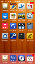
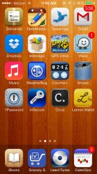
I agree with you completely. The frosted dock completely ruins any wallpaper that has an orangish color, because it (the dock) takes on an ugly salmon color. I think they should fix this by making the dock tinted rather than frosted. Here are a couple of before-and-after pictures to illustrate what I have in mind.
 

Attachments

  • 2013-08-03 11.00.51.png
    2013-08-03 11.00.51.png
    1.2 MB · Views: 144
  • dock4.jpg
    dock4.jpg
    163.4 KB · Views: 158
I agree with you completely. The frosted dock completely ruins any wallpaper that has an orangish color, because it (the dock) takes on an ugly salmon color. I think they should fix this by making the dock tinted rather than frosted. Here are a couple of before-and-after pictures to illustrate what I have in mind.

The frosted one looks better to me. It creates more of a separation between the docked apps and all the other apps. Shouldn't be too hard for them to add an option in the setting though. Kind of like the OS X Menu bar situation.
 
The frosted one looks better to me. It creates more of a separation between the docked apps and all the other apps. Shouldn't be too hard for them to add an option in the setting though. Kind of like the OS X Menu bar situation.

I really wouldn't mind the frosted look so much if it didn't ruin so many good wallpapers. Any wallpaper with a brownish or orangish tint ends up making the dock an ugly color. It works much better with wallpapers that are predominantly shades of blue or green.
 
Did you upgrade to BETA 4? If so did this fix it for you? Hasn't for me :S

Yep. Didn't fix it. As some other stated in this thread it seems like the issue is a faulty button. This is a known problem to the iPhone 5 and Apple might very well replace the phone. Haven't given them a call yet, as I can live with the problem. When I press the lock button on its left side it locks every time, whilst pressing on the middle or to the right doesn't work.
 
...cheers for that Volce;)

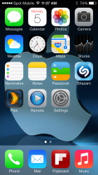
To be honest - it looks way better on my iPhone 5 with iOS6. See below:

Image


The shot you have posted seems to have the Apple logo zoomed in way too much - is that just how iOS7 sets the wallpaper?!

Well your background choice was for ios6...
Now u pick a background that takes advantage of ios7 schema to look good.
U match your shirt to your pants too look good. U change your pants .. U change your short too..
 
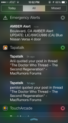
Not sure if iOS 6 had this too but I just got an amber alert.

I can't click on it to get more information about it though.
 

Attachments

  • GrWy.png
    GrWy.png
    392.2 KB · Views: 181
Not sure if iOS 6 had this too but I just got an amber alert.

I can't click on it to get more information about it though.

Me too .. On ios 6...
Wonder if all smart phones get it? Or is it only iphone?
In any case i think it is very effective!
 
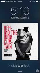
Press the home button when on the lock screen with music playing to display a large clock.
 

Attachments

  • Photo 115.png
    Photo 115.png
    588.8 KB · Views: 148
Status
Not open for further replies.
Register on MacRumors! This sidebar will go away, and you'll see fewer ads.