Become a MacRumors Supporter for $50/year with no ads, ability to filter front page stories, and private forums.
Status
Not open for further replies.

lagwagon

Suspended
Original poster
Oct 12, 2014
3,899
2,759
Calgary, Alberta, Canada
I've posted these in another thread but decided to make it's own topic to share.

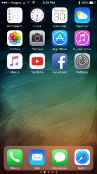
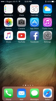
The idea behind it is to have the Docks look updated to match and fit more in line with other aesthetics changes made in iOS 10. Such as the new Notifications, Widgets and Control Centre. I feel the same Dock from iOS 7, 8 and 9 no longer fit the overall aesthetics in 10. So I made 3 variations of the concept.

This one is my favourite of the 3 I made (the other two variations should be thumbnails below that are clickable)

IMG_1183.PNG
 

Attachments

  • IMG_1182.JPG
    IMG_1182.JPG
    705.6 KB · Views: 2,261
  • IMG_1181.JPG
    IMG_1181.JPG
    701.5 KB · Views: 2,125

GreyOS

macrumors 68040
Apr 12, 2012
3,358
1,694
OP's make me thing the dock is now swipable because it looks like a folder or a control centre card now- is that part of his proposal?

The one above which is like macOS grounds it so I think it's preferable.
 

lagwagon

Suspended
Original poster
Oct 12, 2014
3,899
2,759
Calgary, Alberta, Canada
iPad version

ipadDOCK.jpg

[doublepost=1467360107][/doublepost]
OP's make me thing the dock is now swipable because it looks like a folder or a control centre card now- is that part of his proposal?

The one above which is like macOS grounds it so I think it's preferable.

No that is not part of my "proposal". It falls more in line with other iOS 10 aesthetic changes. Less things are edge to edge now in iOS 10 (as I mentioned in the OP. Notifications, Widgets and Control Centre) and the obvious rounded corners.

Add in a complaint seen often that the current iOS 7-9 Dock covers too much of the wallpaper. This doesn't totally solve that issue but does reveal more than it does currently (especially in landscape on an iPad)
[doublepost=1467360316][/doublepost]
I might be okay with something that looked a bit more like the dock in macOS.
d0236114a2b430958f3936132bf22150.jpg

I thought about going that route, but ultimately iOS 10 has been moving away from edge to edge/attached things, so I went with the direction I posted. One thing about your image. Not enough was removed from the two sides IMO. Part of the "change" is to help reveal more of the wallpaper.
 

GreyOS

macrumors 68040
Apr 12, 2012
3,358
1,694
Very humble response

All the examples you gave of these rounded boxes are touch interactive- you can swipe on them, scroll them etc. That is the impression I get from your redesigned dock, but it doesn't behave like that, so I think it's not respecting the design language. Good effort though.
 
Last edited:

Threejw

macrumors member
Jul 13, 2014
75
46
I love the idea, u'v just solved a major design flow in the ipad!

Maybe remove the text below each app in the dock?. since its the user's fav apps i don't think labels are needed.
 
Last edited:

lagwagon

Suspended
Original poster
Oct 12, 2014
3,899
2,759
Calgary, Alberta, Canada
Very humble response

All the examples you gave of these rounded boxes are touch interactive- you can swipe on them, scroll them etc. That is the impression I get from your redesigned dock, but it doesn't behave like that, so I think it's not respecting the design language. Good effort though.

I can see how one may get confused a bit from the iPhone version I made. Because I only use half page home screens. My iPad version does represent it a bit better (at least I think so)

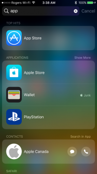
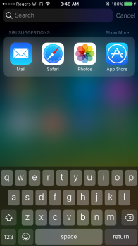
Another area the same identical design has been applied is Spotlight. (See screenshot) Search results and even before entering in a search the Siri Suggested apps looks identical to my Dock. The design is all over the place in iOS 10. To me it just seems logical to change the Dock to follow suit.

I respect your opinion, but I just don't get the same impressions you do that it looks swipeable or whatever. The Dock has been in the same spot since iPhone OS 1, everyone knows what and where it is.
 

Attachments

  • IMG_1185.PNG
    IMG_1185.PNG
    575.5 KB · Views: 780
  • IMG_1186.PNG
    IMG_1186.PNG
    522.3 KB · Views: 846

oftheheavens

macrumors 68000
Jul 9, 2008
1,988
498
cherry point
I had to pull out my phone to see what the difference was between current and your idea. Your idea looks okay but if they change it I hope that it would be something more drastic and completely different.
 

mattoligy

macrumors 6502
May 15, 2010
396
191
Cloud 9
I love the iPad version, it looks so much better, especially with a beautiful wallpaper such as the one you're using! Back when I used to jailbreak I often did so solely to modify areas such as the dock and icon layout etc, these days I don't have time for Jailbreaking and all the hassle it brings but my point is, people shouldn't have to Jailbreak for basic and simple functionality!

A few options towards customisation in this area would go a long way to solving multiple problems!

For example, a great accessibility option would be to offer a few different icon layouts and sizes to suit different needs, such as...

Small App Icons (More Per Page)
Medium App Icons (Traditional Layout)
Large App Icons (Less Per Page)
This would also be very beneficial towards different screen sizes, such as the iPad Mini and the iPad Pro! This leans very much towards accessibility and the fact it is being neglected frankly is outrageous.

A simple option in the Settings App to toggle the dock "off" for those that would rather not use it would be nice also! And maybe the option to turn on a scrollable dock...
 
Last edited:
  • Like
Reactions: Costee

theyearof84

macrumors member
Jul 11, 2008
80
145
Reality
I've posted these in another thread but decided to make it's own topic to share.

The idea behind it is to have the Docks look updated to match and fit more in line with other aesthetics changes made in iOS 10. Such as the new Notifications, Widgets and Control Centre. I feel the same Dock from iOS 7, 8 and 9 no longer fit the overall aesthetics in 10. So I made 3 variations of the concept.

This one is my favourite of the 3 I made (the other two variations should be thumbnails below that are clickable)

View attachment 638400

Only problem visually I see is the padding on the bottom next to the text is way too tight. With even padding on the top and sides, having the bottom sit that close to the text looks... strange.

Overall I am not a fan of the button'y approach they've given everything lately. Edge to edge was much more clean as it give extra space to the stuff that matters most -- the content. Adding more visual noise to iOS seems almost like a step back, by now people should know how to get around within the OS and being overt with their interactions to me signals a dumbing down of the entire user experience.
 
  • Like
Reactions: mpavilion

AppleFan91

macrumors 68000
Sep 11, 2012
1,813
3,827
Indy, US
At first I was like nah but now it's kinda grown on me and makes the current one feel out of place for some reason haha
 
  • Like
Reactions: dcp10

lagwagon

Suspended
Original poster
Oct 12, 2014
3,899
2,759
Calgary, Alberta, Canada
I love the iPad version, it looks so much better, especially with a beautiful wallpaper such as the one you're using! Back when I used to jailbreak I often did so solely to modify areas such as the dock and icon layout etc, these days I don't have time for Jailbreaking and all the hassle it brings but my point is, people shouldn't have to Jailbreak for basic and simple functionality!

A few options towards customisation in this area would go a long way to solving multiple problems!

For example, a great accessibility option would be to offer a few different icon layouts and sizes to suit different needs, such as...

Small App Icons (More Per Page)
Medium App Icons (Traditional Layout)
Large App Icons (Less Per Page)
This would also be very beneficial towards different screen sizes, such as the iPad Mini and the iPad Pro! This leans very much towards accessibility and the fact it is being neglected frankly is outrageous.

A simple option in the Settings App to toggle the dock "off" for those that would rather not use it would be nice also! And maybe the option to turn on a scrollable dock...

I agree it looks better on the iOS version. Seems to fit better and in an odd way lessens the "wasted" space look because it doesn't stretch over to the edges, making you assume there should be more apps above along with the stretched out Dock.

Only problem visually I see is the padding on the bottom next to the text is way too tight. With even padding on the top and sides, having the bottom sit that close to the text looks... strange.

Overall I am not a fan of the button'y approach they've given everything lately. Edge to edge was much more clean as it give extra space to the stuff that matters most -- the content. Adding more visual noise to iOS seems almost like a step back, by now people should know how to get around within the OS and being overt with their interactions to me signals a dumbing down of the entire user experience.

I agree the padding on the bottom is a bit tight. I didn't spend a whole lot of time with it to be honest. Just enough to get the idea across. I'm sure that if it would even happen that they would make it identical to how it looks for Siri Suggested apps in Spotlight (see a screenshot of that a few posts up.)

At first I was like nah but now it's kinda grown on me and makes the current one feel out of place for some reason haha

That was exactly my thinking when I made them. Current iOS 7-9 dock now seems a little out of place with all the other changes made in iOS 10. (If you look at the Siri Suggested apps when you pull down Spotlight, that's how I think it should look. Which is nearly identical to what I did. Screenshot of Siri Suggested apps in Spotlight a few posts up if you're unable to look on your device.)
[doublepost=1467395529][/doublepost]
Only problem visually I see is the padding on the bottom next to the text is way too tight. With even padding on the top and sides, having the bottom sit that close to the text looks... strange.

I agreed with your comment in my previous post. But wanted to add something.

On the other hand, if you look at the current Dock we have, the padding at the bottom is pretty much just as tight as what I made (because I just layer masked it and just moved it up) But I suppose that changes once detached from the bottom and should give the text more room.
 
Last edited:

trifid

macrumors 68020
May 10, 2011
2,078
4,949
Agreed that the dock appearance needs a revamp, but I'd replace it with something else. Something darker like OSX's dark mode would be a nice change I think.

slbt9Rk.png
 

Yun0

macrumors 68000
Jun 12, 2013
1,561
828
Winnipeg, Canada
i like it. or apple to give us some basic even, customization of it. maybe we will see some change to it within the at least 4 more betas (at best/worst depending how u look at it) ios 10 is going to have before sept (assuming release then).

would u also be willing to post or pm an iphone 6/plus version of that wallpaper if u have it?
 

lagwagon

Suspended
Original poster
Oct 12, 2014
3,899
2,759
Calgary, Alberta, Canada
Agreed that the dock appearance needs a revamp, but I'd replace it with something else. Something darker like OSX's dark mode would be a nice change I think.

slbt9Rk.png

I agree a dark dock would be fantastic. The ever elusive Dark Mode. Personally I like it detached from the screen rather than attached like on a mac in macOS, but I would gladly accept it if it went the macOS style instead of what I mocked up.

i like it. or apple to give us some basic even, customization of it. maybe we will see some change to it within the at least 4 more betas (at best/worst depending how u look at it) ios 10 is going to have before sept (assuming release then).

would u also be willing to post or pm an iphone 6/plus version of that wallpaper if u have it?

I don't remember the resolution on it, it for sure fits 4.7" not sure about 5.5" (I grabbed it a very long time ago and was just something I swapped to for the mockup.)

IMG_0918.JPG
 
  • Like
Reactions: trifid and Yun0

RTG4869

macrumors newbie
Jul 20, 2015
22
5
While its true that iOS 10 has been moving away from edge-to-edge design in lots of places I don't think they should do that with the Dock. It looks like a notification that I want to dismiss. I like aijuo's design better, gives me the feel that it 'belongs' to the screen rather than a notification that doesn't.
I do wish they let us swipe on the Dock for a different array of apps, that would be useful.
 

lagwagon

Suspended
Original poster
Oct 12, 2014
3,899
2,759
Calgary, Alberta, Canada
Common thing mentioned is a macOS like Dock. So here they are. Though i'm still a bit puzzled on how one would confuse "detached" as a notification or something else. The Dock has always been in the same location since the very beginning, everyone knows what those icons at the bottom are for and what it is (it's been 10 years!) Also I've never seen a notification come from the bottom. However, like I've said before. I would be happy either way (like my original ones or the mac like ones below)

iOS10DOCKv4.jpg


ipadDOCKv2.jpg
 
  • Like
Reactions: RTG4869

Yun0

macrumors 68000
Jun 12, 2013
1,561
828
Winnipeg, Canada
i think iphone should allow at least 5 icons instead of 4, like an old (?) cydia tweak i used back in the iphone 4 days..

ipad could & should easily allow an additional 2 icons, as well as on the general home screen, theres TOO MUCH space sitting there to be utilized, for those who would like to utilize it..
 
  • Like
Reactions: adrianlondon
Status
Not open for further replies.
Register on MacRumors! This sidebar will go away, and you'll see fewer ads.