Here you go.
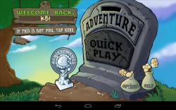
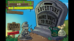
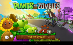
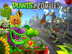
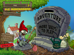
The first is Plants vs Zombies.
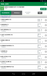
Second is the TAB Australia app, there's some blurry/stretched assets throughout, the Runners/Pools buttons are just one example.
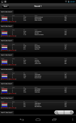
Third is the Billabong Live app. The magnification buttons are blurry (the nice couldn't-be-more-obvious-that-this-is-a-crap-iphone-port 'back' button isn't exactly sharp either), as are the background textures used in other screens of the app.
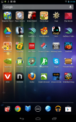
Fourth is one of my homepages, I picked this one as it has a real mix of sharp and blurry icons (and none of my email widgets). Compare how sharp Horn, TDKR and Swiftkey are to Vevo, Firefox, Plants vs Zombies, the useless League Now, Dominos (I got this for a pizza deal they were doing for Android devices and it didn't work properly

) etc.
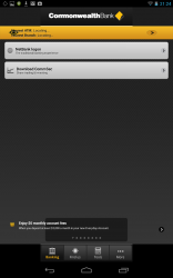
Fifth is the Commonwealth Bank's app. There's some pretty obvious stretched and blurry assets there.
I can only attach five at a time, so that will do for now.
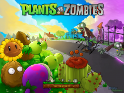
Arstechnica also noted that "icons and images that haven't been optimized for high-resolution displays are still going to look a bit blurry" and gave this as an example:
Image
Btw, I know the iPhone and iPad still suffer from this in a few places too, but does that bode well for the multitude of Android resolutions out there? If iOS developers, who only have to do a tiny handful of resolutions, still can't get it 100% right, I wouldn't exactly be feeling confident about Android getting close.


