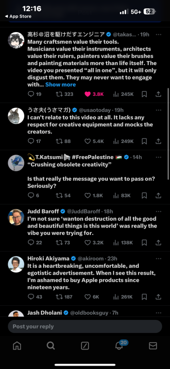
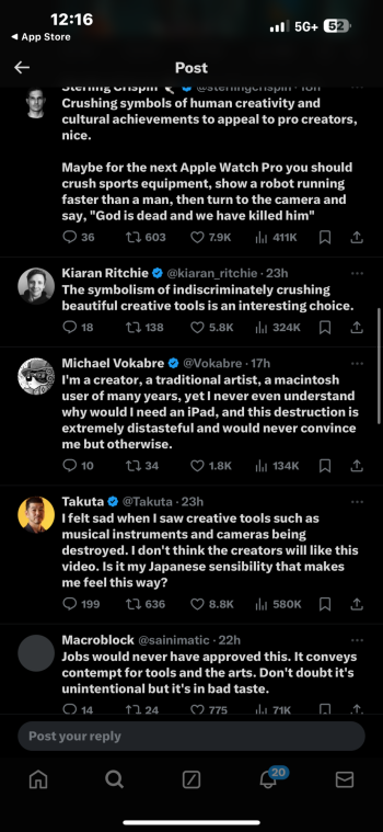
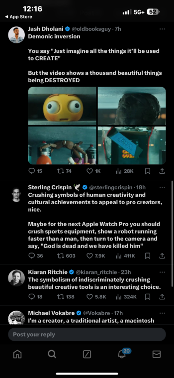
Pfff so much overthinking and politically correct observations… it’s a funny ad in my opinion. It’s a pity they didn’t go with my pitch for a commercial where Tim would use a steamroller to go over a complete orchestra in order to promote Logic 2… Now that would have people talking!
Become a MacRumors Supporter for $50/year with no ads, ability to filter front page stories, and private forums.
iPad Pro iPad Pro “crush!” ad getting criticism in Japan
- Thread starter hektor6tygr
- Start date
- Sort by reaction score
You are using an out of date browser. It may not display this or other websites correctly.
You should upgrade or use an alternative browser.
You should upgrade or use an alternative browser.
I don’t like the ad. Just seeing all those things destroyed. I don’t like it. I get the point they’re making. I also think it’s at odds with the Apple stance on the environment too….recycle / re-use. It’ll get talked about which meets one of the objectives of an ad…
They ignored all my creative ideas….Its not like they are flattening puppies or anything.
It isn't necessarily about being offended. I despise political correctness, but I also dislike shock value for the sake of it -- and that was my reaction to this ad: "Let's destroy a bunch of stuff to get a reaction from people!" What would have conveyed the message better, IMO, would have been for all the stuff to digitally morph into the iPad as the crusher compressed it, thereby implying that all your physical creative tools have been preserved but converted to digital form. But hey, it's just a silly ad. If I were truly offended, I'd say, "Apple will never get another penny from me! I'm switching to Windows and Android!" 
Personally, I found the sight little animated beings having their heads crushed somewhat disturbing.
Last edited:
My opinion as a southeast Asian who also spent a lot of time in the USA:
1. Is this advertisement playing on TV, or just a one time web advert? If it's a web advert or a promo video, it's not a big problem.
2. Analogies are connected to culture. The American culture would quickly understand this analogy ("look at all the things the iPad can do!"). I don't think the Japanese culture will have the same understanding, since the creative tools are passed down generation to generation. The view of this commercial may be "ignore tradition and art, and embrace western technology". That might come off as off putting or tone deaf.
I don’t get how anyone took away that the ad is “destroying” anything. I watched it as “we’ve squeezed all your creative tools into this single device”
🤷♂️
🤷♂️
I'm guessing the puff of smoke.I don’t get how anyone took away that the ad is “destroying” anything.
As a musician, it was a little painful to watch, but things broke just a little too perfectly so I don't think it was really destroying much, if anything. I get the point of it and it is kind of a clever reference to a popular trend of putting various items in a press to see what they do as they are crushed...
There won’t be any ads, if companies worry about offending some one. Some like, some don’t, and czng please every one.
What about the famous 1984 Apple ad. It is conceptual, not to be taken literally. The message is disruption, destroy old ways.First off I’d wager it’s not cgi. The weird giant finger operating the iPad in their commercials is cgi. The hydraulic press sequence is a composted shot but it’s almost certainly using practical elements. More likely they are art department created props and not fully functional versions of those things.
But all of that is besides the point anyway.
cgi or not, the implication of showing traditional creative tools getting destroyed in favour of the iPad IS an understandable visual to critique.
I don’t think anyone is missing the message they were going for - a variation on the phone/ipod/internet communicator beat from the original iPhone reveal. And the hydraulic press emphasizes the idea of how all of these tools are “compressed” into such a compact package. That all makes perfect sense.
But nuance in how an idea is expressed matters. the gratuitous shots of these items being destroyed, however they were achieved, do communicate a certain disrespect to the tools and disciplines you’d think they’d want to be showing in a more reverential light, given the audience they’re targeting. And as mentioned, it also feels weird for a company that touts sustainability to visualize it this way. Lastly, just from a super literal read, I kinda laughed when I saw it because I was like “oh, so apple’s saying the iPad contains a bunch of broken stuff?”
I’m not here fuming and saying to boycott anything. But to those here dismissing people for critiquing an ad… that’s a weird take imo. Media literacy and criticism is a valid and I’d argue important thing for people to do.
“It’s just an ad bro” is hand waving away how much culture is influenced by the imagery we are bombarded with. I mean as someone in the creative industry, thinking about this stuff IS part of my job, and that’s who this ad is supposedly speaking to.
If anything, people should be happy with the Ad. In a world of AI, the iPad is still a tool that needs to be operated manually. Digital Music and Art are legitimate mediums as well as their physical counterparts. If you don't like it, then don't buy it and use it. AI should be what people are concerned about. This is just petty.
I thought it was a great ad.
All of those tools squised into one device.
All of those tools squised into one device.
I don’t know how this garbage ad got past the brainstorm stage but everyone involved should be fired.
The destruction of musical instruments, cameras, art.. how does anyone approve this?
Yes, I get that the concept is “all this fits in here”, but JFC there are better ways to convey that…
Worst ad Apple has ever had.
Fire everyone.
The destruction of musical instruments, cameras, art.. how does anyone approve this?
Yes, I get that the concept is “all this fits in here”, but JFC there are better ways to convey that…
Worst ad Apple has ever had.
Fire everyone.
A far better way to convey the point would have been to have all the tools, instruments, art come out of the iPad.It isn't necessarily about being offended. I despise political correctness, but I also dislike shock value for the sake of it -- and that was my reaction to this ad: "Let's destroy a bunch of stuff to get a reaction from people!" What would have conveyed the message better, IMO, would have been for all the stuff to digitally morph into the iPad as the crusher compressed it, thereby implying that all your physical creative tools have been preserved but converted to digital form. But hey, it's just a silly ad. If I were truly offended, I'd say, "Apple will never get another penny from me! I'm switching to Windows and Android!"
Sadly.
It's needlessly destructive. It doesn't convey a positive message at all.
If they want to say that all those things go into the new iPad, they should pack them into a warehouse and then, compress the warehouse until it's the shape of the iPad.
Most of the world will probably say that it's typically American to destroy.
If they want to say that all those things go into the new iPad, they should pack them into a warehouse and then, compress the warehouse until it's the shape of the iPad.
Most of the world will probably say that it's typically American to destroy.
They are basically reusing old ideas that were initially voiced by Steve Jobs. Here are Steve’s words from the 2007 iPhone introduction:I thought it was a great ad.
All of those tools squised into one device.
I mean, since 2007 everyone who had ever tried using their iDevice already knows it is an all-in-one device that can make music, edit videos and shoot photos on the go.
People in this thread have mentioned that what has probably happened is that iPad sales were not going well so they decided to bring back attention with this “shocking” tactic
I honestly can’t/don’t believe people are taking an ad this seriously.
I really hated it. The irony is that what iPad, Apple, smartphones, consumer tech in general has done - destroyed real art. Instead of creating real art like playing real instruments and drawing on physical canvases all “art” is now restricted to be made on iPad. People sit looking at their screens making stuff that other people then look on their screens  And stakeholders at Apple and other companies laugh on the way to the bank. I bet art they consume isn’t (made) on iPad…
You seem to have enough time to be here and criticize criticism so.Right.
Well it's like everything isnt it. There will always be people who will jump in and criticise things where the original intent was symbolic and not literal.
Sadly people like to virtue signal when they can do it loudly and publicly to 'make themselves look good'.
What nonsense. The ad is a paradigm for 'compressing all these things into a super thin ipad' - very clear and obvious.
Im amazed that people have enough free time to put finger to keyboard to criticise an ad.
It was an absolutely **** add, bashing the instruments that brought people so much joy over the centuries. Apple's so blind they didn't see the irony of crushing all these colourful tools with a monolithic boring block of steel.
oh for goodness sake.You seem to have enough time to be here and criticize criticism so.
It was an absolutely **** add, bashing the instruments that brought people so much joy over the centuries. Apple's so blind they didn't see the irony of crushing all these colourful tools with a monolithic boring block of steel.
I really like this take! A number of people will default to "this generation is offended by everything!" or "everything has to be PC now", but from what I've seen people from various backgrounds and age groups are reacting negatively. It's just a divisive ad from the start.It isn't necessarily about being offended. I despise political correctness, but I also dislike shock value for the sake of it -- and that was my reaction to this ad: "Let's destroy a bunch of stuff to get a reaction from people!" What would have conveyed the message better, IMO, would have been for all the stuff to digitally morph into the iPad as the crusher compressed it, thereby implying that all your physical creative tools have been preserved but converted to digital form. But hey, it's just a silly ad. If I were truly offended, I'd say, "Apple will never get another penny from me! I'm switching to Windows and Android!"
I hold these two thoughts in my head at the same time:
1. It was weird to see Apple glorify destruction of so much art-related stuff. I found it offputting.
2. This is a totally empty controversy. In three months no one will remember ever seeing this ad.
1. It was weird to see Apple glorify destruction of so much art-related stuff. I found it offputting.
2. This is a totally empty controversy. In three months no one will remember ever seeing this ad.
Register on MacRumors! This sidebar will go away, and you'll see fewer ads.


