Become a MacRumors Supporter for $50/year with no ads, ability to filter front page stories, and private forums.

Tr55

macrumors member
Sep 23, 2021
40
47
?? Not sure what you mean. It doesn't show up icons. It shows up as a list under the URL bar. Here's a screenshot under MacOS, but is similar in iPadOS..
OK thanks, I get what you did now, I’m will try it out later.

I am currently on my other iPad, running iPadOS 14. No way I am upgrading that one yet.
 

GDF

macrumors 68000
Jun 7, 2010
1,506
1,587
Under iPadOS..
Good idea and just tried that, but wish the bookmarks graphic icons would show up next to the favorite. Really can’t believe someone at Apple is that clueless to just bury bookmarks in portrait mode. Still is not corrected in 15.1, so maybe it will not be.

Have told my Dad to hold off upgrading, because will really confuse the heck out of him.
 
  • Like
Reactions: neliason

jdvenice

macrumors newbie
Sep 24, 2021
1
1
I'm also unhappy about the bookmark thing... (I've been using the Product Feedback page a bit over the last 24 hours. That digital circular bin is working hard! :) )

It seems to me that the iPadOS 15 designers have a fundamental misunderstanding of how many people use "Bookmarks" vs. "Favorites".

First... Bookmarks tend to operate on the currently selected tab. This is what makes Bookmarklets work.

Second... Favorites are something, to me, are associated with opening a new tab. You press the + icon, you get a new tab with a nice, two dimensional list with color icons for your Favorites.

Because of these traditional roles, the primary list you have in "Bookmarks" tends to be different than your primary list in "Favorites". (For me, there is absolutely no overlap.)

I think the simple way for Apple to fix this is to just add a direct bookmark icon/button near the Sidebar icon and just have it work like a menu. You tap the bookmark icon, the menu list appears, you tap a bookmark and your current tab is changed to that bookmark's URL and the "menu" disappears. If you press the Bookmark icon again, the menu should appear again--but it should remember where you are in your tree.

In terms of workarounds?

As someone suggested, you could try to move all of your bookmarks to "Favorites" and put all of your favorites in subgroups and then turn on the Favorites bar. But in my opinion, this just goofs up your Favorites when you press the + icon.
 
  • Like
Reactions: Edd70

Jim Lahey

macrumors 68030
Apr 8, 2014
2,733
5,664
I'm also unhappy about the bookmark thing... (I've been using the Product Feedback page a bit over the last 24 hours. That digital circular bin is working hard! :) )

It seems to me that the iPadOS 15 designers have a fundamental misunderstanding of how many people use "Bookmarks" vs. "Favorites".

First... Bookmarks tend to operate on the currently selected tab. This is what makes Bookmarklets work.

Second... Favorites are something, to me, are associated with opening a new tab. You press the + icon, you get a new tab with a nice, two dimensional list with color icons for your Favorites.

Because of these traditional roles, the primary list you have in "Bookmarks" tends to be different than your primary list in "Favorites". (For me, there is absolutely no overlap.)

I think the simple way for Apple to fix this is to just add a direct bookmark icon/button near the Sidebar icon and just have it work like a menu. You tap the bookmark icon, the menu list appears, you tap a bookmark and your current tab is changed to that bookmark's URL and the "menu" disappears. If you press the Bookmark icon again, the menu should appear again--but it should remember where you are in your tree.

In terms of workarounds?

As someone suggested, you could try to move all of your bookmarks to "Favorites" and put all of your favorites in subgroups and then turn on the Favorites bar. But in my opinion, this just goofs up your Favorites when you press the + icon.

I think the best workaround is for Apple to fix it. There’s no reason why a) the sidebar doesn’t automatically close when you tap a bookmark, or b) reopen in the same place it was last closed, or c) have a visible button to close it manually from inside a bookmarks folder. It should also open automatically when a new tab is requested if this is how the user last had it configured.

I get that the sidebar now has new functionality but there’s no reason to break the old functionality that has been working for years. An operation that once required two taps now requires seven. There is no excuse for this. It’s the worst example of screwing up a UI I have ever seen. I have submitted feedback but I’m not confident Apple will do anything about this issue. It must be intentional.
 

w5jck

Suspended
Nov 9, 2013
1,516
1,934
I think the best workaround is for Apple to fix it. There’s no reason why a) the sidebar doesn’t automatically close when you tap a bookmark, or b) reopen in the same place it was last closed, or c) have a visible button to close it manually from inside a bookmarks folder. It should also open automatically when a new tab is requested if this is how the user last had it configured.

I get that the sidebar now has new functionality but there’s no reason to break the old functionality that has been working for years. An operation that once required two taps now requires seven. There is no excuse for this. It’s the worst example of screwing up a UI I have ever seen. I have submitted feedback but I’m not confident Apple will do anything about this issue. It must be intentional.
Totally agree. Jobs was the worst SOB at insisting everyone do it HIS way or no way. I was hoping Tim would be better, but it doesn’t look like he is. We are still given what Apple thinks is best, and they rarely listen to us. My workaround was to downgrade my iPad Air 2020 back to 14.8, and to keep my iPad mini 5 at 14.8, and turn to off Updates in Settings on both. If they fix the messed up Bookmarks and Tabs in Safari and the Home screen garbage, then I might upgrade again, otherwise I’ll stay at iPadOS 14.8 until hell freezes over.

The thing I do most on my iPads is surf the internet when I’m in the Living Room away from my MacBook Pro. As long as Safari is so screwed up, then iPadOS 15 won’t be an option for me. I use Safari because it is so much easier than any web browser at staying synced across two iPads, an iPhone, and two Macs. I really don’t care for any of the alternative browsers.

I have no issues with iOS 15 on my iPhone XR so I’ll keep it.
 

Cicero101

macrumors newbie
Sep 21, 2021
3
3
I hate it too. But in case you miss the work-around above, some of us are starting to use "favourites" instead of "bookmarks" to file frequently visited links. Then enable the favourite bar. It works quite well. While I still think the sidebar button is a bug/bad design choice, the favourite bar is working out really well for me.
I have far too many bookmarks, in folders, to run them in an undifferentiated long list in favorites. This is a nightmare. My 12.8 iPad Pro is my basic work device. I spend 6 hours a day on it. And now this.
 
  • Like
Reactions: gank41

Tr55

macrumors member
Sep 23, 2021
40
47
I have far too many bookmarks, in folders, to run them in an undifferentiated long list in favorites. This is a nightmare. My 12.8 iPad Pro is my basic work device. I spend 6 hours a day on it. And now this.

Same here, I have a large number of bookmarks which I have linked to my Windows PCs. They have been carefully curated over many years and organised in nested groups going down many levels in some cases.

The new sidebar design does not seem to acknowledge my use case exists. As I said earlier, Apple must assume the correct way to use the iPad is in portrait mode, very iPhone centric. No wonder it took so long for iPadOS to arrive with its grudging support for traditional desktop features.

Apple are just as bad as Microsoft were back in the day, everything then revolved around Windows and nothing could upset that gravy train.

Also Safari is unusually buggy in 15, I am having all sorts of problems writing this post, auto capitalization often doesn’t work, the spellcheck is all over the place, editing is difficult. It generally sucks compared to IPadOS 14.
 
  • Like
Reactions: gank41

atmuwben

macrumors regular
Nov 9, 2013
104
50
The show all tabs button (four squares) is gone (or rather moved to sidebar).

I’ve been absentmindedly hitting an invisible show all tabs button. Turns out it’s pinch with three finger. I completely forgot about that gesture.
 

avonord

macrumors regular
Mar 8, 2007
201
65
I have far too many bookmarks, in folders, to run them in an undifferentiated long list in favorites. This is a nightmare. My 12.8 iPad Pro is my basic work device. I spend 6 hours a day on it. And now this.

You can put them in folders though. See my screenshots several posts up. Not sure if you can have subfolders..

Edit: I just tried. You could. If you have nested folders, wouldn't that work for you?
 
  • Like
Reactions: Cicero101

Cicero101

macrumors newbie
Sep 21, 2021
3
3
You can put them in folders though. See my screenshots several posts up. Not sure if you can have subfolders..

Edit: I just tried. You could. If you have nested folders, wouldn't that work for you?
Thanks for the tip, but it’s so 90s when most of the things you did with computers were work arounds because of the crappy hardware and/or software. Apple in 2021? Seriously?
I use my favourites for favourites, and don’t want to lose them as a sacrifice for an Apple stuff up. I’d rather use another browser.
Security updates prevent me from going back to iOS 14.
 

Don MC

macrumors member
Nov 25, 2010
98
49
Finland
The show all tabs button (four squares) is gone (or rather moved to sidebar).

I’ve been absentmindedly hitting an invisible show all tabs button. Turns out it’s pinch with three finger. I completely forgot about that gesture.

What do you mean? Mine is still there (up to the right).

4D4FA415-12C8-4C48-A561-DFC3F774D1A8.jpeg
 

Don MC

macrumors member
Nov 25, 2010
98
49
Finland
So it seems. Good find. Another bug maybe?


*********************************************************************
687D31CF-851A-4A03-BF1E-975A32697162.jpeg

*********************************************************************
63489A1B-3E6D-4139-84ED-B42E8355AAC1.jpeg

*********************************************************************
 
  • Like
Reactions: atmuwben

Jim Lahey

macrumors 68030
Apr 8, 2014
2,733
5,664
Not a fan of the compact tab bar. The titles become truncated all too easily and the whole browser page then looks a total mess. Interesting that Apple were keen to increase the viewable webpage size but then chose to not autohide the sidebar or allow the user to hide it themselves without first backing out through the folder structure of their bookmarks with half a dozen more taps 🙄
 

Edd70

macrumors 6502
Feb 16, 2018
397
903
An issue with bookmarks started for me many OS versions ago. Can’t remember which version but my bookmarks stopped auto hiding after the update. So when I clicked on a bookmark, the bookmarks remained. They wouldn’t go away when I clicked on another part of the screen either. I suddenly had to click on the bookmarks icon to make them go away. It was an extra step and I tried everything to no avail. I eventually gave up and lived with it.

This is about 5 times worse. I always figured they would fix the above problem with an update randomly. Wow, was I wrong. I don’t think it’s a bug, people. I think the decision makers use iPads in portrait mode. Why use landscape when you have a MacBook kicking around (I don’t have a MacBook).
 
  • Like
Reactions: Zazoh

Zazoh

macrumors 68000
Jan 4, 2009
1,516
1,121
San Antonio, Texas
I don’t think it’s a bug, people. I think the decision makers use iPads in portrait mode. Why use landscape when you have a MacBook kicking around (I don’t have a MacBook).
I agree. The Apple logo tells you the default orientation. I’m normally fine with it and that is my complaint on the larger iPads as the keyboards only attach in landscape mode which is not the way I want to interact with documents.

But web view is almost always landscape. I guess Apple needs to decide if they are making tablets for portrait mode or landscape. Because either way they haven’t accounted for both scenarios.
 

Lakeguy

macrumors newbie
Sep 27, 2021
4
4
And in what universe is the greyed out item the active selection? I realize this is my first post, and I’ve been an Apple user since 2003 and have lived thru some clunkers, but this change to Safari bookmarks and tabs is by far the worst.
 
  • Like
Reactions: Zazoh

kdoug

macrumors 65816
Jun 2, 2010
1,025
195
Iowa City, IA USA
Any updates or fixes? Even my new iPhone Pro 13 still has the bookmarks tab. Why doesn't my Mini? It's a deal breaker without it because I'm not going push a tab 7 or 8 times.
 

kdoug

macrumors 65816
Jun 2, 2010
1,025
195
Iowa City, IA USA
Update,
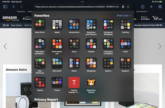
I just found out there is a workaround that makes it much simpler. Under settings, Safari, school down to the general section you'll see favorites which you you select and change/check to bookmarks Menu folder. When you do that and select the address, search box on Safari it'll bring up your bookmarks. You're welcome!
 

Jim Lahey

macrumors 68030
Apr 8, 2014
2,733
5,664
Update,
I just found out there is a workaround that makes it much simpler. Under settings, Safari, school down to the general section you'll see favorites which you you select and change/check to bookmarks Menu folder. When you do that and select the address, search box on Safari it'll bring up your bookmarks. You're welcome!

Nice tip for some but it’s not really a workaround. You can only select one folder for a start, and for people that use their favourites as actual favourites, it breaks their favourites. Not knocking your suggestion but it definitely isn’t a fix for this problem by any stretch.
 
  • Like
Reactions: gank41

GDF

macrumors 68000
Jun 7, 2010
1,506
1,587
Update,
I just found out there is a workaround that makes it much simpler. Under settings, Safari, school down to the general section you'll see favorites which you you select and change/check to bookmarks Menu folder. When you do that and select the address, search box on Safari it'll bring up your bookmarks. You're welcome!
Thanks - been doing that for a while on beta. It works ok, but much prefer just having a standard bookmark bar. Still don’t get why Apple has it on iPhone iOS15, but don’t think it is needed for iPad iOS15. What are they possibly thinking?
 
  • Like
Reactions: kdoug

kdoug

macrumors 65816
Jun 2, 2010
1,025
195
Iowa City, IA USA
Nice tip for some but it’s not really a workaround. You can only select one folder for a start, and for people that use their favourites as actual favourites, it breaks their favourites. Not knocking your suggestion but it definitely isn’t a fix for this problem by any stretch.
You serious? The hell it's not. One click in the title box and every folder appears. Favorites, not favourites btw aren't broke and still displayed under the search bar. It's a fix until Apple decides to put the bookmark icon back on the toolbar.
 

Attachments

  • D99E8030-F058-4F3E-A416-3D6A9318CE15.png
    D99E8030-F058-4F3E-A416-3D6A9318CE15.png
    1.8 MB · Views: 159
Last edited:

Tr55

macrumors member
Sep 23, 2021
40
47
You serious? The hell it's not. One click in the title box and every folder appears. Favorites, not favourites btw aren't broke and still displayed under the search bar. It's a fix until Apple decides to put the bookmark icon back on the toolbar.
It only works as you say if you have nested all your non favourite links under one folder and organised your links optimally for this fix. I haven’t but I could I suppose but then it will be crap on my desktop PC.

Possibly a good solution if you don‘t have many links and folders.

The best solution if Apple don’t fix this in 15.1 or 15.11 is simply to switch to Chrome browser. I will give Apple a month then I’m out.
 
  • Like
Reactions: gank41
Register on MacRumors! This sidebar will go away, and you'll see fewer ads.