Ordered on 9/13 and mine has said Oct 2-18 forever. No updates. Not sure I want to keep this order anyway. Are the sides smooth and not grippy? That would bug me.Has anyone that submitted an order on Amazon for a spigen Ultra Hyrbid T MagFit in frosted black for an iPhone 16 pro max heard anything? I ordered mine 2 weeks ago and haven’t heard anything at all, I think I’m going to just cancel my order at this point.
Got a tip for us?
Let us know
Become a MacRumors Supporter for $50/year with no ads, ability to filter front page stories, and private forums.
You are using an out of date browser. It may not display this or other websites correctly.
You should upgrade or use an alternative browser.
You should upgrade or use an alternative browser.
- Status
- The first post of this thread is a WikiPost and can be edited by anyone with the appropiate permissions. Your edits will be public.
Oh so this is the main case you are rocking at the moment?There’s a couple of folks who have a Nudient. They are good cases. It’s a Swedish company so shipping can take a while. I used them for the iPhone 14 Pro Max. I had a Native Union case and a Caudabe for the 15. It feels good to hold. Magnets have been an issue with them in the past but I think they solved that issue the last few years. Apparently the silicone is suppose to be better from years last . I won’t know that until a few months haha
So it has a silicone feel?
Need to buy a case for my sis 16's Pro and a lot of the cases out right not are either disappointing or have the exposed button cutout.
Thank you for the pictures.View attachment 2428164View attachment 2428165View attachment 2428167
There you go. And it feels sturdy to hold enough. Feels great
Just waiting for mine to show up some day.
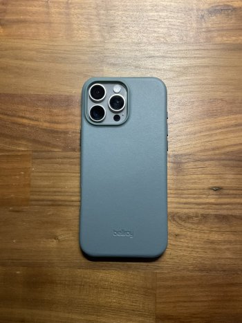
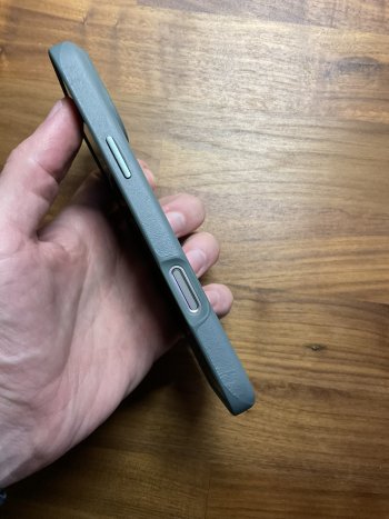
thanks for posting this. Was thinking about getting it.Bellroy "Agave" on Natural Titanium. Surprisingly Very happy with it.
It looks a lot more grey than their website pics?
I feel Mous did such a good job everywhere else with the Limitless besides the huge cutout. I love how thin it is now and the way they smoothed the corners out. The make the MagSafe a tad stronger and make a button for camera control, it will be one of the good ones.
I hate Mous. For 2 launches, they have twice delivered the wrong case for another phone. Maybe the third time is the charm ?I feel Mous did such a good job everywhere else with the Limitless besides the huge cutout. I love how thin it is now and the way they smoothed the corners out. The make the MagSafe a tad stronger and make a button for camera control, it will be one of the good ones.
Yessir, silicone feel. This is my main one for now. Thinking about a few other optionsOh so this is the main case you are rocking at the moment?
So it has a silicone feel?
Need to buy a case for my sis 16's Pro and a lot of the cases out right not are either disappointing or have the exposed button cutout.
For Apple Silicone Case, the CC button is too flush with the case. Quite a little too easy to activate the button. Also, screen lip with screen protector is too little. I am liking Otterbox Lumen a little better. Grippy TPU sides, tighter fit than ASC, more recessed CC button (makes it less likely to activate), more screen lip. What I didn't care for is the PC hard back. If there is microfiber lining on the back for the lumen like what beats case did, it would be 100% perfect!
For those who have Spigen Ultra Hybird T, how are you liking the button? I read some review that the button will wobble.
For those who have Spigen Ultra Hybird T, how are you liking the button? I read some review that the button will wobble.
Under Settings>Camera>Camera Control, setting Launch Camera to Double Click will solve this for you.Quite a little too easy to activate the button.
By picking up the phone. All the other buttons are on the top half of the phone. This is on the bottom half where you hold it, and when there’s a button it’s very easy to accidentally press when picking up the phone. I hit it accidentally all the time when I have the Apple silicone on.How do you accidentally press the button, and why is it any different from any other button the phone has?
Looks nice! Is it darker than what the website shows? It seems like it, which I like. How’s the material(I assume TPU) around the camera button cutout? Pretty flexible/flimsy?Bellroy "Agave" on Natural Titanium. Surprisingly Very happy with it.
It takes quite a bit more than “picking up the phone” force to trigger the button. I’m sitting here trying to make it happen and in no way would I ever come close to squeezing the phone so hard as to trigger the camera control. Interesting. 😆By picking up the phone. All the other buttons are on the top half of the phone. This is on the bottom half where you hold it, and when there’s a button it’s very easy to accidentally press when picking up the phone. I hit it accidentally all the time when I have the Apple silicone on.
waiting for your thoughts, been eyeing the sunsetIt's why I went for the full coverage version of the case, which has the gold ring (plus only a cutout around camera control). I'll show pics when it gets here. It looks good, though!
Supcase claimed that the copper rods used in the CC button on their case will not scratch the button on the iPhone.
I'm sure they did, but do you know where they've said that? I'm also worried about the rods scratching the Titanium when putting the case on, but it, like the sapphire crystal, is harder than copper as well so it should be good all around.
I'm sure they did, but do you know where they've said that? I'm also worried about the rods scratching the Titanium when putting the case on, but it, like the sapphire crystal, is harder than copper as well so it should be good all around.
Picked up the fuchsia silicone apple case today. The case feels so luxe on the phone.
Just rolled the dice with the Smartish Gripmunk. I'll leave some impressions after I get it tomorrow.
It's the only case besides the Apple silicone I will spend any $ on at this point. Seems we need to wait to see how companies end up dealing with this camera cutout controversy.
How did Smartish do, if you don't mind me asking?
I remember the 12 Pro launch, when Smartish's buttons were so darn rigid, they sent us all new cases.
This quick review seemed to praise it:
But the two color tones on the back look a little more pronounced this year.
Um ok. I must be imagining the 15-20 times it’s happened then.It takes quite a bit more than “picking up the phone” force to trigger the button. I’m sitting here trying to make it happen and in no way would I ever come close to squeezing the phone so hard as to trigger the camera control. Interesting. 😆
How did Smartish do, if you don't mind me asking?
I remember the 12 Pro launch, when Smartish's buttons were so darn rigid, they sent us all new cases.
This quick review seemed to praise it:
But the two color tones on the back look a little more pronounced this year.
I was planning to post some pics and full impressions when I have some more time (I'll just post pics next time). But early thoughts after a few days are -- I really like the Smartish Gripmunk a lot (I have a 16 PM BT).
Fit is very good overall. Edges are snug (a little bit of play around camera cutout but nothing overly concerning) and there's a decent sized lip on the front for lying the phone face down. Cutouts on the bottom aren't precise, just box cutouts. But they are centered and the usb-c cutout is large, and overall have nice smooth rounded edges, so great pinky comfort. Buttons are cut-outs/non-floating but feel good. Feel in the hand is excellent overall - really appreciate the types of matte cases that leave no fingerprints or smudges, and the grooved sides add to the overall grip. Magsafe magnet strength is very good too, no issues.
The camera cutout though...5/10. It takes a bit of muscle memory to get used to pressing the button when you need to, but once you have it down, using its full function (pressing and swiping) isn't a problem. I'd much rather prefer a button cover. One less ingress/scratch point and less finger gymnastics would be much preferred.
You know it's a good case when you actually enjoy holding your phone and playing around with it while it's in your hand. I love having the Gripmunk on my phone. For now it's replaced my Apple silicone. I'm not sure I can go back to the slippery feel of the Apple case, despite it having the camera button cover.
So overalll for me 8-9/10. For $20 this case is a banger. A covered camera button would make this my main, no question.
I got the black tie affair (all black) version, so I can't speak to the colored cases unfortunately.
Settings > Camera > Camera Control > Double Click to Launch Camera.By picking up the phone. All the other buttons are on the top half of the phone. This is on the bottom half where you hold it, and when there’s a button it’s very easy to accidentally press when picking up the phone. I hit it accidentally all the time when I have the Apple silicone on.
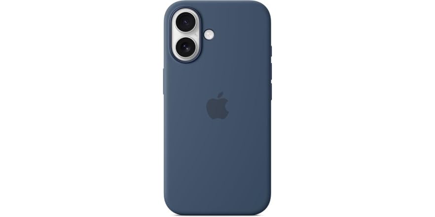
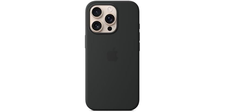
The best case for the 16 series are already discounted on Woot. wtf is going on.
 electronics.woot.com
 electronics.woot.com

 electronics.woot.com

Apple iPhone 16 Case with MagSafe and Camera Control
Apple iPhone 16 Case with MagSafe and Camera Control

Apple iPhone 16 PRO Case with MagSafe and Camera Control
Apple iPhone 16 PRO Case with MagSafe and Camera Control

Apple iPhone 16 PRO MAX Case with MagSafe and Camera Control
Apple iPhone 16 PRO MAX Case with MagSafe and Camera Control
Register on MacRumors! This sidebar will go away, and you'll see fewer ads.


